When pursuing a new career path in design, people often stumble upon two terms.
User Interface design and User Experience design. Let’s look at the difference between UI and UX design. Why it’s not the same thing & why it’s good to understand them in pursuing a career change.
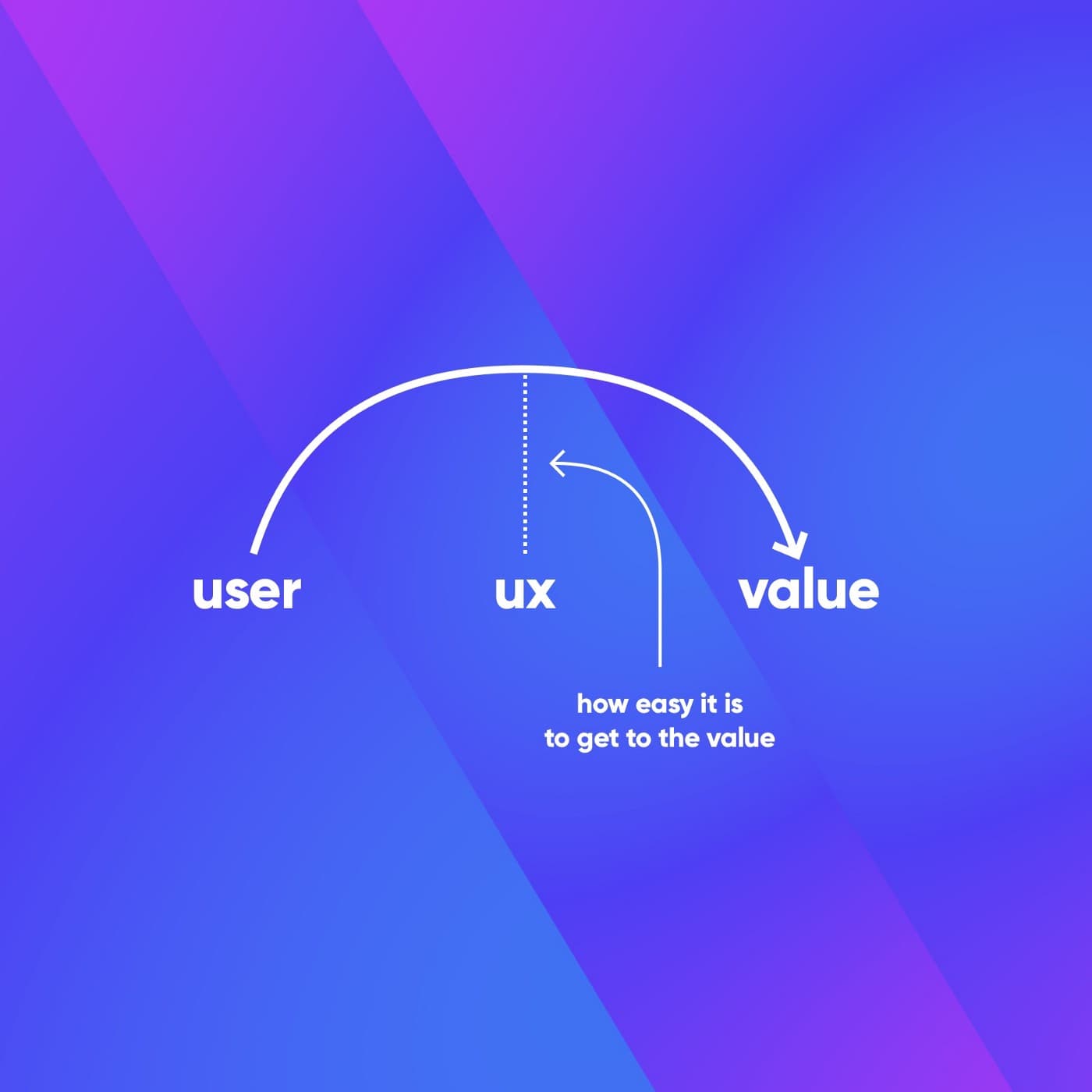
User Experience design (or UX) is all about making apps and websites easier to use and better at selling. For the purpose of this article, we won’t talk about UX or UI outside of the tech field, meaning we’ll stick to the mobile apps and website examples/scenarios.
User Interface (or UI) refers to the visual and interactive elements of a digital product. In our case, the app or website. It is the things that users see and touch — think buttons, icons, typography, colors, layout, etc.

So, let’s clarify what each area is without all the fancy words around it. So, if you’re not a designer, I've got you.
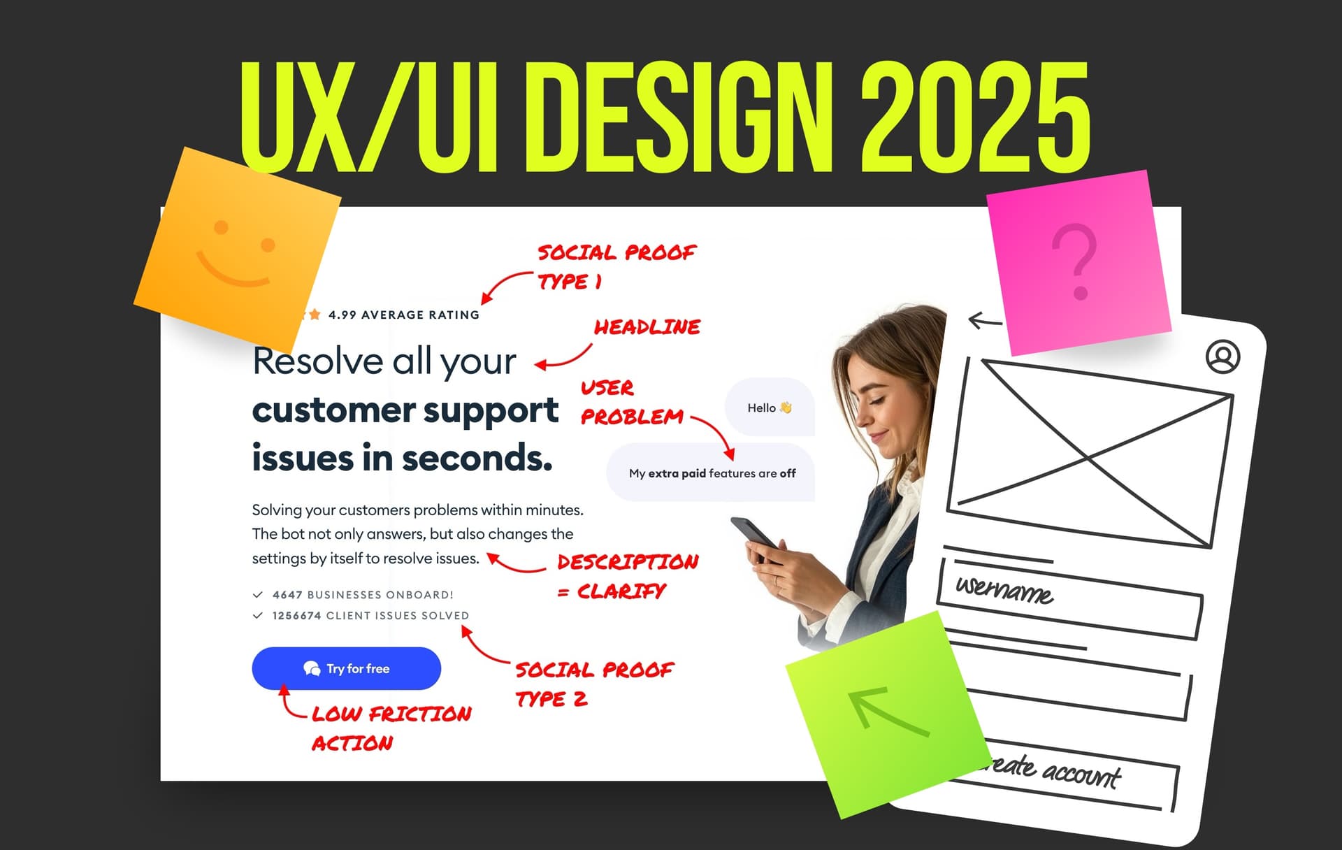
What is UX design about?
If you Google a little, you will find that many articles speak about UX as the “research part”. UX is all about the user and competitive or quantitative research! Or so they say.

Let’s be honest with ourselves; very few people who call themselves UX designers actually do that. Yes, there are positions in the big companies solely focused on research.
So if you’re going to work at Apple or Google, you may specialise and actually get to this specific position.
For most of us out there, it’s not just numbers and endless research. User experience is all about driving sales and making users happy. As Michal said in this article.
The research
In simple terms, UX is really about understanding the problem and asking a lot of questions. You start with research to identify the problems the client has. Well, the client and the users, since if the user is not happy, the client isn’t either.
Happy users = more sales
So you do a little bit of research; for example, the writing on the website is not clear, or the button is missing, so there’s no way to buy the product.

Simple things like that contribute to the UX of the product, and it doesn’t always have to be super complicated.
User personas
This term is thrown around a lot, especially in the popular Google UX course. You create personas for everything. Personas are basically users of different backgrounds that would buy your product. They are created to understand the needs of a customer.

In the real world, it’s not really a thing. I’ve done it probably once or twice for more complex projects. It’s not created often unless the product is complex, there’s a budget for it, and time for testing.
Don’t take me wrong; it’s good to practice getting in minds of the users, and this helps the beginners to do that, but…
Most of the time, there isn’t time for it
You can see personas in the case studies from junior designers. That are sticking to the bullet list and going down by it without much thought. Basically, trying to follow the “perfect UX design process”. There is none
Information Architecture
We can push it even further, and after researching and understanding the problem, we can map out the Information Architecture (or IA).
IA is a map for the designer, developer, and essentially everyone involved. Information Architecture outlines all the steps and logic of the site.
What leads where, how many screens each step should have, essential features & most importantly, if it all makes sense.

At three.design, we do Information Architecture a lot, especially with complex projects. It helps us to understand if the direction we’re going makes sense.
If there is all logic that’s needed and if there’s something missing from the business perspective.
Information Architecture is a fancy term for basic thinking. Many designers these days lack this skill, and I’m not talking about drawing maps.
Basic logic seems to be dead, and everyone focuses on the visual side of things.
This is sad, and we’re trying to bring it back and make designers aware of thinking first and designing second. So, if you want to practice IA, you can do so here at Square One.
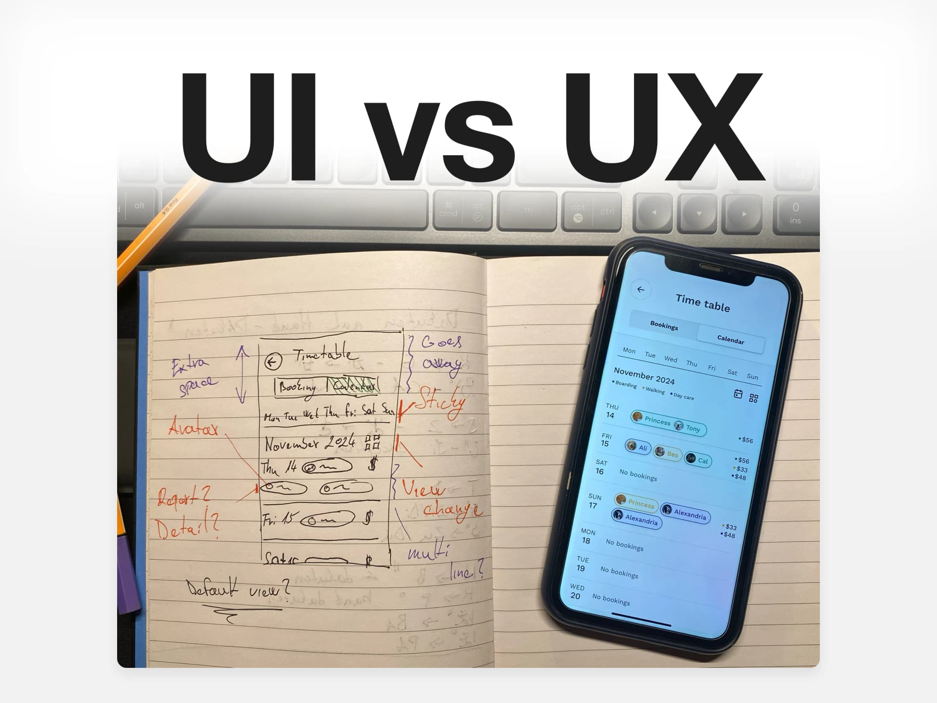
Wireframes & prototypes
With all that covered, we can move on to wireframes and prototypes. Yes, we’re not done just yet. If you’re new to the design field, you may think
There’s more? Do I have to do all of this?!
No, you don’t, but it’s good to be aware of it. Nowadays, I’m a firm believer in skipping low fidelity = wireframes. I think they are a thing of the past.
To clarify, a wireframe or a low-fidelity wireframe is how the design will look in black and grey. There are no icons, text is usually a lorem ipsum (which is useless), and it’s essentially all just boxes.

We very rarely do wireframes, usually, we jump straight into high fidelity. Yes, there are cases where the product is very complex, and it’s better to first do a quick draft.
Just to see if you and the client are on the same page about his product.
With that being said, it’s good to know what it is, but it’s being used less and less. Again, you will see wireframing in case studies mostly from juniors. In reality, you rarely do it.

That brings me to the last thing: prototyping. It’s the thing that brings the design to life. You click a button, and fancy animation appears, rockets and stars and shiny colors.
Yeah, no. Again, we rarely do this. Most of the time, if the client wants a prototype, it’s a simple click → to the next screen to visualize the product more, and that’s it.

Ain’t nobody got time for fancy shooting things and complex animations. Most of the clients at least don’t
You may also argue that prototyping is at the edge of both UI and UX. Since it’s a very visual thing, but it also relates to how the product feels and overall experience.
Copywriting
Last quick mention is copywriting, that is also part of the UX. Again a very good skill to have these days, since people have no idea about how to write and use lorem ipsum everywhere, please don’t.

It’s all AI and simplified and unleash! These fancy words mean nothing and are too vague. It’s all about ego boosting and likes on social media.
Nobody these days cares about a good copy. Which is sad, since good copy is the core of your product.
Learn to write good copy and you’re already 90% there.
What is UI design about?
User interface design (or UI) is often confused with UX. They are not the same and some might say a complete opposite.
The truth is that UI is a specialised subset of UX. While UX is all about the research and logic, UI is all about the graphics.
It’s easy to explain this on a game. Imagine you’re playing a video game. As we said, UX is how the whole game feels, and if it makes sense.
UI is all the stuff you see and touch on the screen: the buttons you press, the cool icons, the colors, and how everything looks.

So, UI is about what you see, and UX is about how it feels. They work together — UI makes it pretty, UX makes it work. Now that I’ve summarised it all in 100 words, we can end it here.
Just kidding, let’s explore it a bit more.
Mood board & page layout
Just as the UX starts with research, UI usually starts with a mood board and page layout. It’s very simple.
We go out on the internet and look for inspiration. Colors, typography, layouts, and so on.
Once we have a solid idea of what we want to do, we can start drafting out the layout for the design, a landing page header for example.

We know we want to have a title, secondary text, a button, and some kind of visual most of the time. Easy right?
The colors
With the layout we’re starting to lay out the foundation of the visual identity for the app or website. Now it’s time for choosing colors.
Usually, colors are based on the field we’re working with. For example, a UI designer can use color psychology to invoke certain emotions.

Like: the color blue may feel friendly & trustworthy to some. The color yellow combined with black will feel luxurious and expensive.
The color red will most of the time remind us of an error or danger/destructive action. These are the basic principles we’re used to on a daily basis. That doesn’t mean they can’t be broken.
The Typeface
Once we have the colors and overall mood set, we can go and select our typeface. Now one crucial thing.
Typeface is not a font
While a typeface is a set of design features for letters and other characters, a font is the variation in weight and size of a typeface. A font family is a group of related fonts.
Too complex, so let me simplify, a typeface is a big family of letters that all look related. It’s the vibe or style of the text.

A font is a specific member of that family. For example: Comic Sans is a typeface, but if we take Comic Sans Bold 12-point, that is a font. This is important, many designers misuse these terms.
Got it? Good, now back to choosing our typeface. A typeface is usually chosen based on the brand feel. We can have more rounded typeface or more sharp ones.
There are also basic recommended typefaces free to use for beginners. So there is no need to spend hours and hours searching for a good fit. Most people use Inter anyway and it’s fine.
With layout, colors and typography, we’re already starting to create a visual identity of the brand. Which is important to keep consistent.
The animations
Now again, this is most of the time a job of interaction designer or someone else than UI designer, but when there is none it’s a part of it.
When it comes to animations, it’s important to lay things out with a clear idea in mind. It can’t be too long or have too many things.
Animation is meant to be simple and make the product unique without crossing paths with UX and ruining everything.

Good example is Duolingo, which most of you may know. Duolingo does it all very well. They have strong visual identity, good UI and UX but…. The animations are a tad bit too much and sometimes can be annoying.
Sure it makes the brand unique, but at the expense of time or breaking the flow here and there a little. Some may like it, some may hate it.
But, what I wanted to say is that if you’re going to do animations, it’s mostly for the developer to see your vision or help them.
Since not everyone sees the world the same as we do, sometimes it can be hard to imagine things. So, making a simple animation or transition that is unconventional will help the developer a lot.
Design system
This is another one of the words that is thrown a lot when researching UI design and the whole process. A design system is like a big rule book that keeps everything in a project looking and working the same way.

It ensures consistency across all devices and all states. Design system makes sure every piece is the same and they match together. It includes colors, typeface and fonts, buttons, icons, states, etc.
Airbnb is probably the most famous when it comes to design systems. If you google a little, you will find design systems of different brands that are free to look at.
Do you need to know how to create design systems?
No…
Does your client need a design system? In 99% of cases, they really don’t and most of the time it’s just something they’ve heard on the internet and want it. For most clients it’s useless.

A simple style guide with a few buttons and colors will do. A proper design system may take from 6 months to up to a year to build.
It’s a complex thing and people do specialise in design systems for a reason. There are very few designers I know that do it well.

Again, not every company can afford a person working on design system for 6 months + straight.
Do I have to do both?
If you’re just starting, yes absolutely. When switching to a new field, you should strive to be generalists and not specialise in one or the other.
In 2025, the more you know and can do, the better you are = more likely to land a job.
A good UX designer has to be a good UI designer and vice versa. Now don’t get me wrong, if your app has great UX and sh!tty UI it’s better than the other way around.
I’ve seen ugly products perform way better than the pretty ones with bad UX.
However, these days, people like pretty and a first impression is important.
Beautiful things just sell better, that’s the way it is. So I strongly suggest focusing on both and going above and beyond what we’ve talked about here.
The better you are, the more things you’ll be able to learn and master. The more you master, the better you will get paid. It’s easy math, the more you know, the higher your value is.
I hope you enjoyed this article and have a beautiful day!