Course outline
3:33 min
Intro
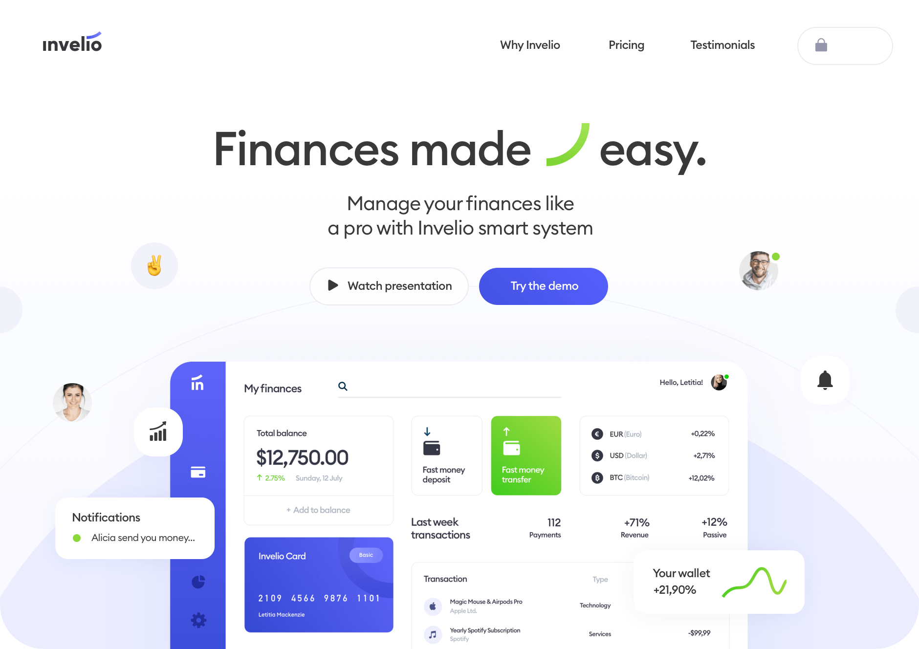
What is the course about, how we approach landing page designs and what you need to be aware of before you start.
28:21 min
Writing
Never start your designs with the visuals. They need to start with a plan and that plan is best to be done outside of your design tools - without distractions.
47:17 min
Textframe
Textframe is a mix of a low-fidelity wireframe and a high-fidelity typography and layout. It allows for a much better understanding on how to structure the text further, write better copy and expand the message.
50:26 min
Header
Header is the most important part of the landing page because it’s the first thing people see. It needs to be both engaging visually, and carry a message that makes your users interested to learn more.
38:10 min
Header - versions
Learn how to create multiple variations of the header and how you can get inspired by other websites and incorporate that inspirations into your own work.
20:09 min
About us / social proof
After a visually heavy and engaging part, let’s give our users a breather and create a more minimal, easier to focus section talking about the product with included social proof. Of course in a couple potential versions!
73:10 min
Features
Features are the main focus of any landing page. They must convey the message in a way that’s informative, engaging and makes the users interested in finding out more.
24:54 min
Features - versions
Learn how you can show the most important sections in multiple ways, including showcasing real-world products alongside software.
27:48 min
Pricing & Testimonials
Two sections that require completely different approaches. Pricing has to be clear, readable and primarily functional, while in testimonials it’s good to focus on the human touch. Let’s explore how to do these right.
13:03 min
CTA’s & Footer
A couple of ways to create smaller CTA sections and a clear, readable and functional footer with tips on how to use the knowledge from the course to experiment further on your own.
What will you learn after the course?
After the course you'll become one of the unicorn designers that know how to make landing pages.
TextFraming
We always start our landing page designs with text framing. It’s a mix of low and high-fidelity wireframing that allows for much better content creation processes.
Red Square Method, but bigger
The best alignment technique for mobile projects now come to the web with some tweaks to work with the larger canvas and around the visual decoration.
Key visuals
Learn the basics of graphic design and decoration positioning to WOW your users and create a lasting impression. That includes multiple options for each section!
Layout, grid and more
Learn how to structure the layout, font sizes and grids for the much larger canvas. How to use whitespace to your advantage, so the project never looks boring or empty.
My Landing workflow
I will share with you my entire high-fidelity lp design workflow, based on landing pages viewed by millions of users and created for both startups and Fortune 100 companies.
What is SquarePlanet?

What is SquarePlanet?
It`s an educational platform with both paid and free content for designers and developers. We will be adding new featured, articles and materials in the coming weeks.
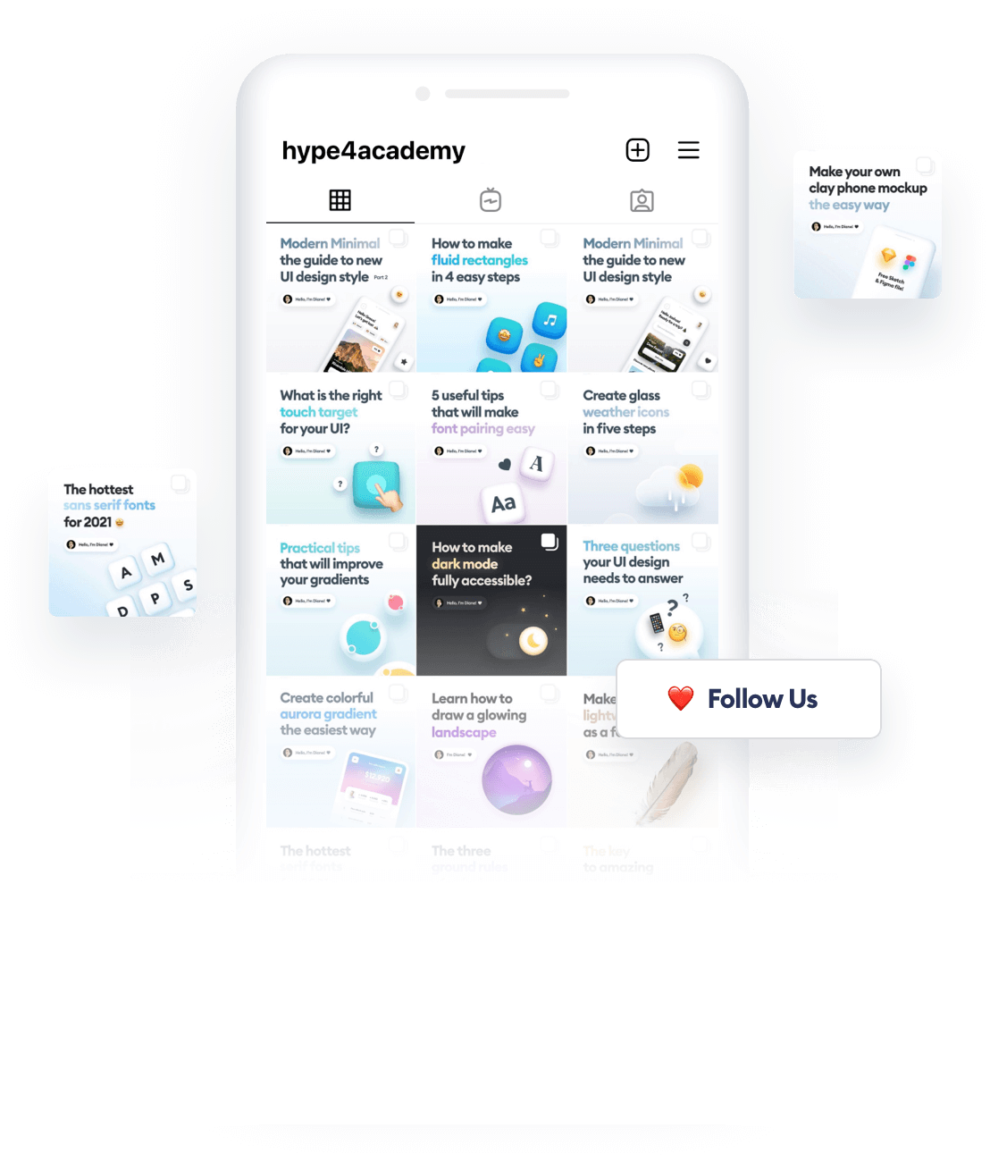
Psst. We post very cool content on our Instagram:
@malewiczhype
News from the designer world packed in quick and helpful tutorials, that you won’t find anywhere else. Follow us to grow as a designer!


