Course outline
3:17 min
1. Introduction
Why it’s good that most of UI design is boring.
14:42 min
2. Grid, Colors, Type
It all starts with setting up the colors, grid and picking fonts.
45:44 min
Buttons
3. All you need to know about making buttons and more.
51:13 min
4. Textfields
Build inputs, dropdowns, multi-select boxes, calendars…
56:00 min
5. Small stuff
Radios, Checkboxes, Sliders, Toggles, Tags and more.
25:07 min
6. List items
Lists are a very popular design pattern. Let’s explore them!
14:56 min
7. Cards
Greatly reusable components for multiple purposes.
23:21 min
8. Tabs and Navs
Universal mobile navigation patterns starting point.
23:18 min
9. Detail Pages
Showcase a service or a product in a reusable way.
24:16 min
10. Hierarchy
Learn how to define hierarchy in early stages of design.
29:44 min
11. Present like a pro!
Show your design library and components in a beautiful way.
Bonus Materials
7:17 min
Components - Figma
The complete basics of using Components in Figma.
9:42 min
Symbols - Sketch
The complete basics of using Symbols in Sketch.
6:56 min
Hierarchy Strips
How to design with this unique annotation method.
22:08 min
Figma Basics
Complete basics of Figma - start here if you’re new!
Get Designing User Interfaces 20% cheaper using the code: boringUI20 ☝️
What will you learn after the course?
After the course you’ll have a good understanding of the fundamental elements of UI design and UI components.
Hierarchy Strips
Learn this unique method that shows you understand the design decisions behind your projects and know how to guide the user to the desired action.
Red Square Method
We will be using the Red Square Method to learn alignment by hand - it’s really important to train your eye first before you jump into auto-layouting tools.
Fonts, colors, spacings
How many fonts to pick? How to choose the right colors? How to space it all out? All of these questions and more are answered within the course with direct examples.
It all starts with a grid
I’ll show you which grid works the best for most UI design and why. Then we’ll apply that grid to all of our elements for maximum design consistency and an easy way to expand it.
And more
We’ll explore the basics of Components (Figma) and Symbols (Sketch), how to annotate a design for developers and for your portfolio, beautiful presentation and more!
What is SquarePlanet?

What is SquarePlanet?
It`s an educational platform with both paid and free content for designers and developers. We will be adding new featured, articles and materials in the coming weeks.
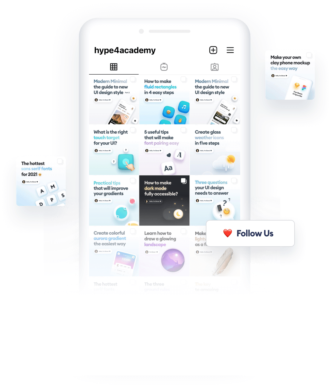
Psst. We post very cool content on our Instagram:
@malewiczhype
News from the designer world packed in quick and helpful tutorials, that you won’t find anywhere else. Follow us to grow as a designer!


