I’ve decided to make this series a bit more open and not restricted to the community itself. On a daily basis, I see eye candy designs on “X”. Most of them, as you might have guessed, don’t make any sense.
They’re using fancy words, italics, and there’s no meaning behind anything at all.
Just today, I saw a post that had a gradient design, and this headline
Clarity in complexity
Thanks for letting me know what the website is about! What in the duck does that even mean? So please, don’t do that.
Before we dive into it, I might say some things that some people might find offensive. I want to say that I’m not trying to start any beef, and what I say is what I believe in and have tested or picked up from people I’ve worked with or admire.
Design is subjective and personal, as it should be.
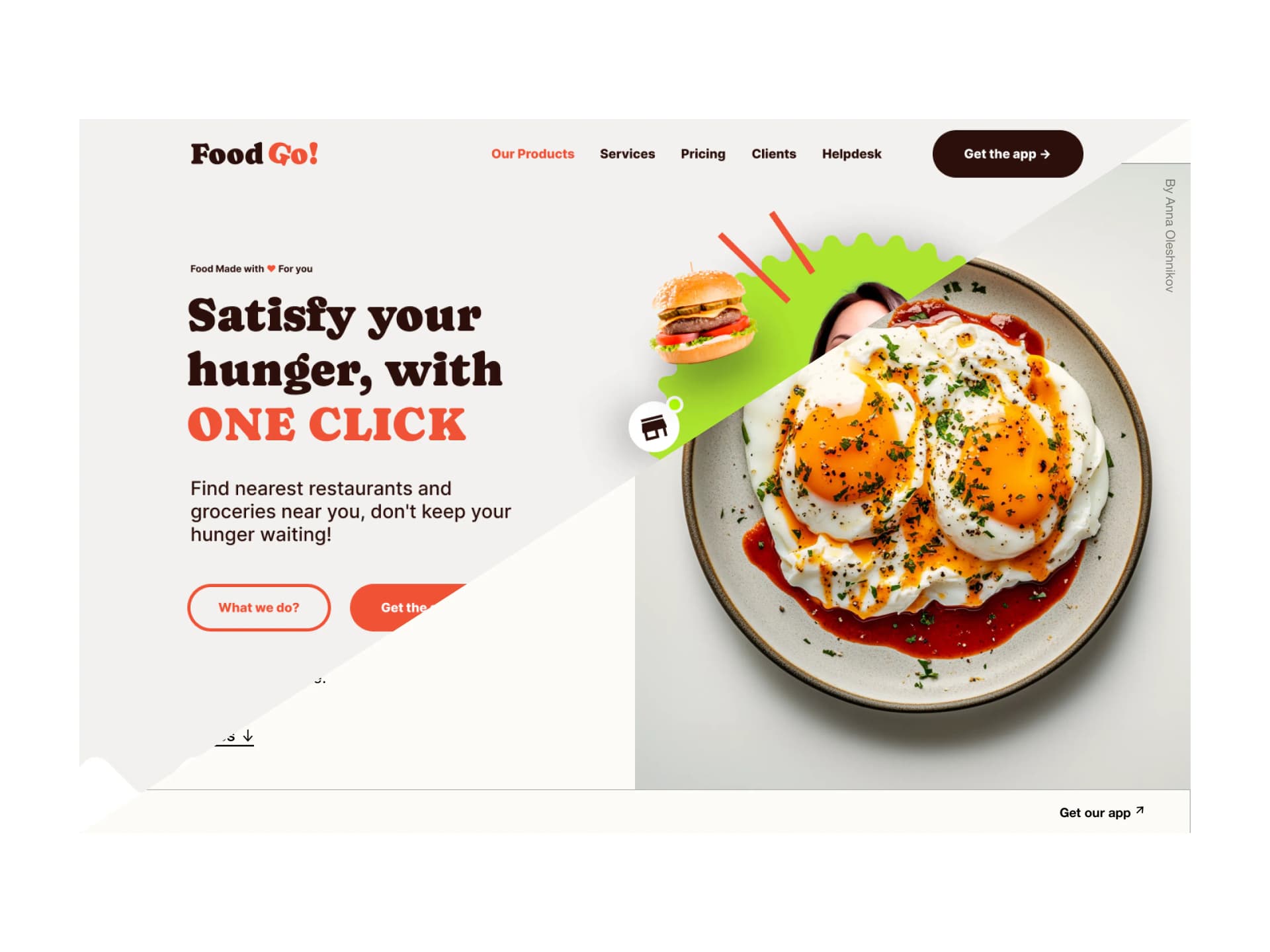
The design

If we look closer, there are some issues we can highlight right away. The biggest thing is the copy, the customer has no clue what the product does.
What’s the value? Why should I use it?
There’s, of course, other stuff like a purple shadow coming from a white button, and there are some questions about the dashboard, but nothing is as important as the copy itself.
How to do this right? Be brief and clear. Write what it is actually about. The secondary texts tell us way more than the title, and it’s barely visible.
Yes, it looks pretty. It has those lovely gradients in the background and a made-up dashboard that probably doesn’t make much sense.
But… once you look closer, you have no clue what this thing is actually about.
Let’s fix it

Now let’s see some of the decisions and fixes I made. First of all, I didn’t copy the whole idea. I’ve made something new but with a similar style in mind.
Top navigation
I removed the button; in the original design, it has way more attention than the main CTA, we can remove it, and the button can appear once the user scrolls down.
The copy
See the difference? Instantly, after one second, you know that this is; A restaurant management tool. I’ve also made the secondary text shorter. Added those fancy words like SAVE HOURS! and all that stuff.
Yes, in some cases, you will have long copy; some clients need it. Here, not so much.
The buttons
In the original, the button didn’t stand out. On top of it, it had a weird purple shadow below a white button.
When it comes to buttons, always try to match the shadow with the color.
Meaning if it’s white, the shadow is grey. That’s how the real world works and how we perceive it. It’s a small detail, but it all adds up. I’d also argue that this design is so visual that we can have a simple flat button.

Gradient Blobs
It’s a good practice to make the side on which the main CTA is on more “Catchy”. Meaning that the red-ish color will catch your eye more than the blue, and it’s closer to the button. Lead the user where you want them. Which is usually the button.
The dashboard
It should make sense, and all the things around it are associated with the whole theme. This is important as it fills the space and ties it all together.
The bottom
Here we’re hinting at a scroll. You see it and you know there’s something more there. But there’s nothing wrong with having social proof there either. It’s a matter of taste mostly.

This is how you can do it to maximize the output.
You’re actually thinking about the design instead of making pretty useless pictures
It trains your eye and mind to subconsciously spot these little things and make better decisions.
What do you think?
That’s it for today! Thank you for your time I hope you enjoyed this episode. Have a beautiful day
Liked the article? Share it!

