In a year and a half of mentoring at Square One, I’ve noticed people tend to make the same mistakes over and over again. To put an end to this, I’ve created a new series
Weekly Redesigns
Where I will take the designs from our community, fix them, and put a unique personal touch on the submissions so you learn something in the meantime.
Today, we will fix the design from our Daily UI challenge by Sofi.
If you’re new here, I’ve also recorded a video for this, which you can find here.
The design

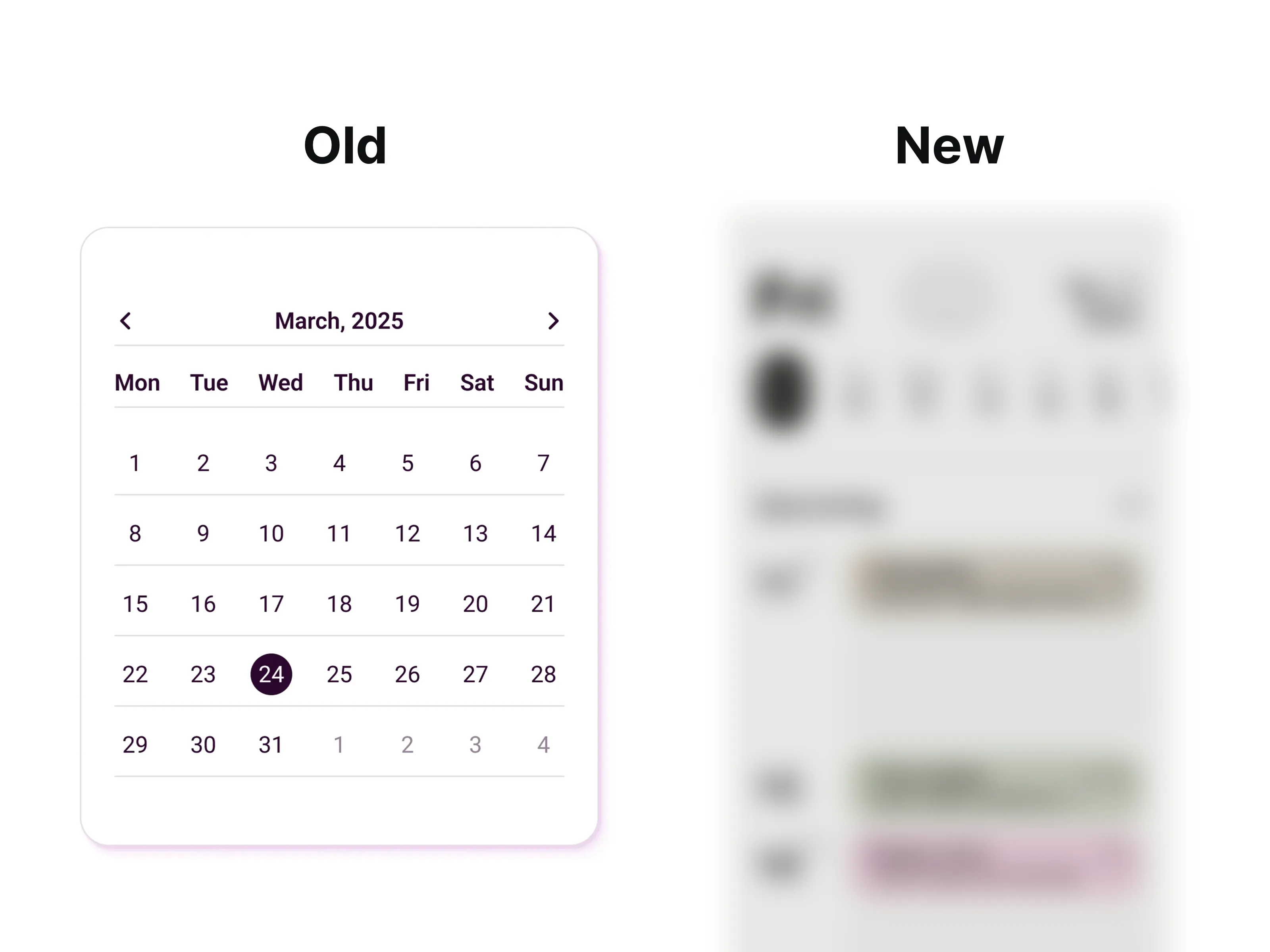
Everyone uses a calendar, but have you ever designed one? For me, calendar designs are one of the tedious things in the life of a designer. We’ll go over why I feel that way in a bit. First, we have the design to be reviewed.
Before you read through the whole article, see what I did. You can take a look at the design, pause for a second, and think about what’s wrong with it.
How would you fix it?
What doesn’t work and why? If you want to become a better designer, it’s good to practice this on your own…daily.

Let’s go over what the issues are, shall we? First of all, designing calendars is tough and, as I said, tedious.
You have to watch out for a lot of little things. Making sure the touch target is big enough, ideally 44pt +. Visually aligning the numbers. No, you can’t just use your autoalign tool and call it a day; it will look off.
You have to go over each row and add decimals so it all looks good, then go over each column and do the same.
Yes, I can tell if you’re lazy and didn’t put much thought into it. The 0.5pt difference is big and everyone can see it if they’ve been designing for a while.
Next item on the list is the uneven margin on the sides. It’s a quick and easy fix, fortunately. Lastly, let’s address those grey lines breaking the design.
Do we need them? Why do we need them?
No, we do not. We can compensate for it with the amount of white space. For those who do not know what white space is.
We’ll just make the spacing bigger so the design can breathe and there’s no need for those separators.
Fixed design
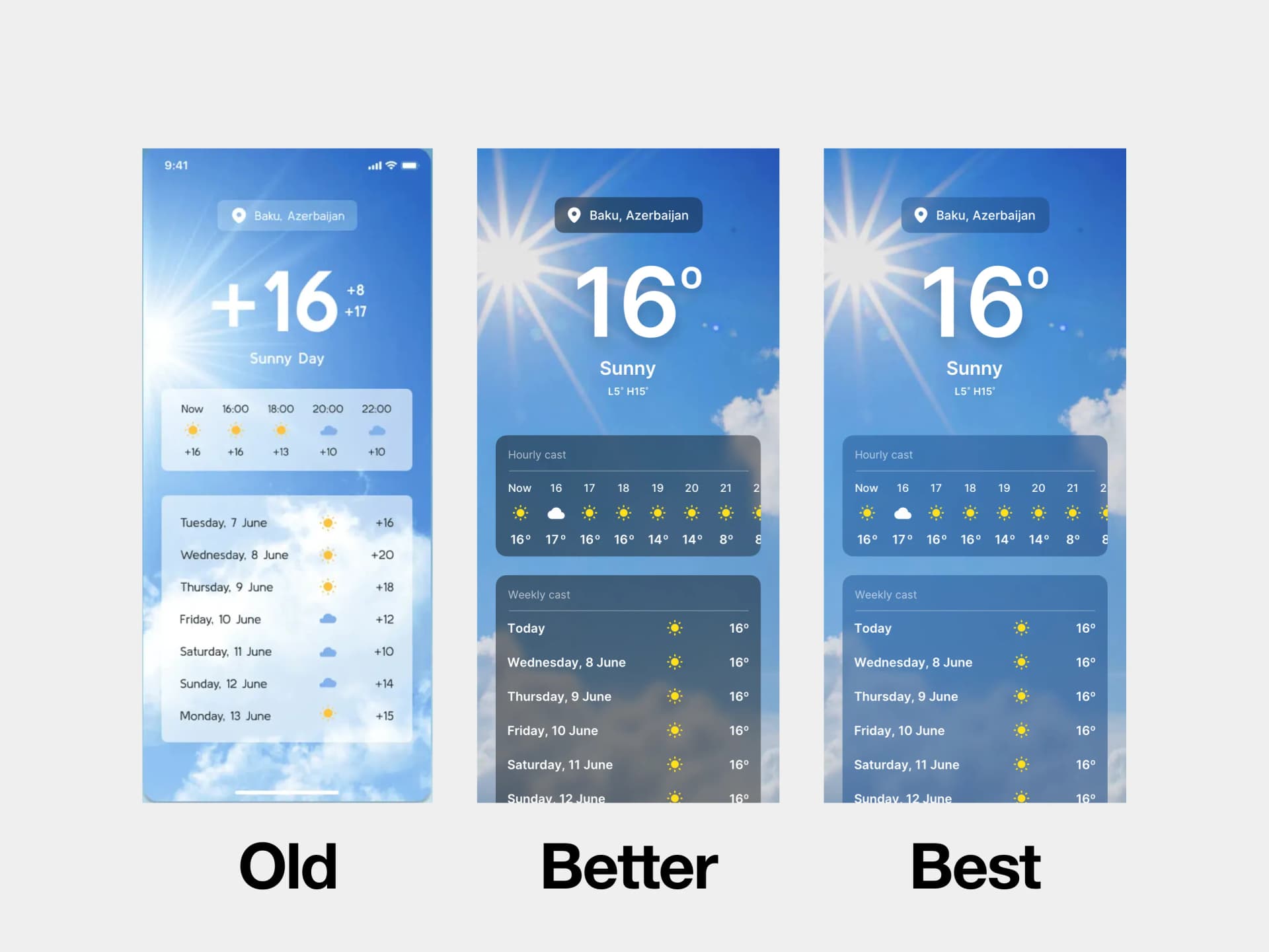
Let’s start from the top. I’ve added a rectangle around those chevrons. This serves a nice purpose of hinting at the touch target to the user.
So they know, they don’t have to be so precise, the box is big. Many designers forget about these little things, but I've got you people with big thumbs!
The next one is the month and a year. I’ve made it bigger. Simply to differentiate it from the rest and give the design some hierarchy.
As you can see, I’ve removed the grey lines. As I said, we don’t need the,m and instead I’ve added more space between the top section and the months. They’re even now

I’ve used a different calendar design for the image above, simply because I already had those annotations done. They’re quite the same, as you can see.
When it comes to the individual dates. The easiest is to make a 44x44pt rectangle and duplicate it multiple times, as you can see. This ensures a proper touch target and a nice spacing.
Now the hardest part is to align the things optically. Take your time and don’t rush this; literally every number has a decimal position. Meaning they’re not full points but like X= 31.35, for example.

This ensures everything is nice and spot on. Plus, you’re training your eye to spot these little details. Almost nobody does this. I see those badly aligned buttons from Figma with autolayout every day… stop it.

Lastly, we do not need more than 3 fonts. That’s it. Make it simple, there’s no need for 5 font sizes and weights.
My variation
Making variations for things like these is tough. Everything you can think of has already been done. Yet… I like to challenge myself and come up with interesting, unorthodox ideas. It keeps me sharp.

Here’s the concept. Rebuild a little bit and put it inside an iPhone. At the top, we have a big day alongside the year.
Under it, we can scroll through multiple days and see what’s waiting for us. I’ve also added a bit of “mode” into the text. Meaning I’ve played with multiply, plus lighter, and these kinds of things to make it match the color it’s behind.
This is mainly to ensure the contrast is better, and it all lives in harmony.

As you can see, it makes a tiny bit of difference, but that’s what adds up to the whole experience.
Plus, once set, you can change just the bg color and the text will automatically fit into it.
Those striped boxes are your free time, of course. Now, I could have added a plus inside or a little text so another event can be added and so on… there’s a lot to tinker with.
In the end, I enjoyed this very much, I think it’s way different than a normal calendar and that was the point. To be creative.
What do you think? Did I make it better?