In a year and a half of mentoring at Square One, I’ve noticed people tend to make the same mistakes over and over again. To put an end to this, I’ve created a new series
Weekly Redesigns
Where I will take the designs from our community, fix them and put a unique personal touch on the submissions so you learn something in the meantime.
Today, we will fix the design from our Daily UI challenge by Walter
If you’re new here, I’ve also recorded a video for this, which you can find here.
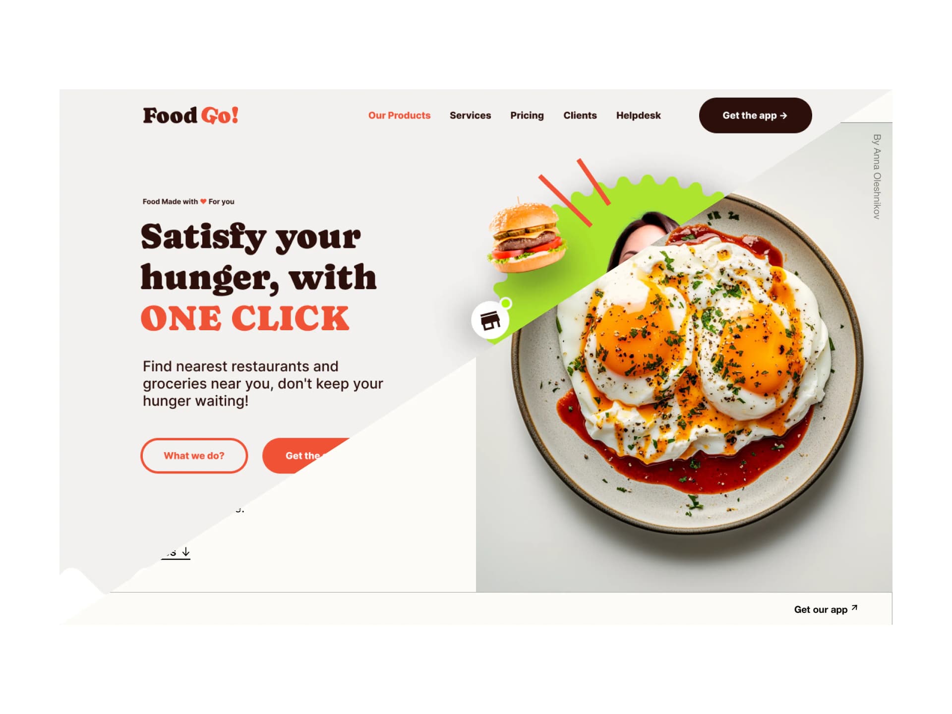
The design

A Food Go, is a made-up brand for our Landing Page challenge at square.one. It’s all about, you guessed it, food.
Food Go helps you keep lists, recipes, and other information in one place. This is the second version of the design, meaning Walter has already received feedback from our mentors.
Before you read through the whole article, see what I did. You can take a look at the design, pause for a second, and think about what’s wrong with it.
How would you fix it?
What doesn’t work and why? If you want to become a better designer, it’s good to practice this on your own…daily.

Before we start, Walter reached out to me after the video and explained some of his decisions to defend his design.
So, before I go into the Why and What I’d change, here’s a bit of the explanation behind his decisions.
My choice of shape and font was intentional. I wanted to break the “app” vibe a bit. Work with a fat font and that wavy pattern to represent something made with care, handmade instead of squares and circles that. I thought, how can I bring overall with colors and shapes something that looks healthy but still a design that make you kinda hungry.
This is already better than 99% of the designs I see online. There’s a thought and reasoning behind it, and he can explain the WHY. Meaning, things are not random.
I did tell Walter that it’s great and the design is not bad at all. If he wants to keep those chunky fonts, heavy weights, and stuff, it might be good to explore more of a brutalism kind of direction. That way, things might click more.

Let’s start from the top. I changed the weights to be thinner and made it all neutral. So there’s no distraction at the top for the user from the overall flow.
I’ve also made the button outlined and not filled.

The heading and secondary text were totally fine. The one thing I did change is the outlined button. It was too thick for the font inside. So I’ve made it a little thinner to match the label weight inside.

When it comes to the illustration, it is good to tone the shadows down a lot. The design is very visually heavy. Meaning we have to be careful with everything else, not to overdo it.
I added a gradient to the circle to ease up on the visual aspect of things and make it feel lighter, turned down the shadows, and that’s basically all it needed.

This way, the left and right sides don’t fight with each other, but live in balance. Nothing is overpowering, and the eye of the user is guided through the design as we want it.
My variation
Before I started my variation, I already had some things in mind, so it all makes sense. I knew I wanted to animate it, and I wanted to change the direction of the bran,d too.
Instead of focusing on the app, I switched the focus to the food and recipes. That way, there’s no need to download the app, and the user can search and find everything that’s needed on the website.

So I removed all the visual clutter and switched the focus to where I wanted. To the big Yummy image.
While the image is doing the work, I chose a sans serif typeface for the logo to make it look more elegant, and finished it all with an Explore recipes button with an arrow hinting at a downward animation once clicked.

Then I took the design to Jitter and played with animation and timings to get it all right. It’s important to think about the user here; if the animation is too long, it will bother the user and leave a bad impression.
In the end, I enjoyed this a lot, and I might even create the whole thing later on. What do you think? Did I make it better?
That’s it for today! Thank you for your time. I hope you enjoyed this episode. Have a beautiful day