In a year and a half of mentoring at Square One, I’ve noticed people tend to make the same mistakes over and over again. To put an end to this, I’ve created a new series
Weekly Redesigns
Where I will take the designs from our community, fix them, and put a unique personal touch on the submissions so you learn something in the meantime.
Today, we will fix the design from our Daily UI challenge by Aynura
If you’re new here, I’ve also recorded a video for this which you can find here.
The Design
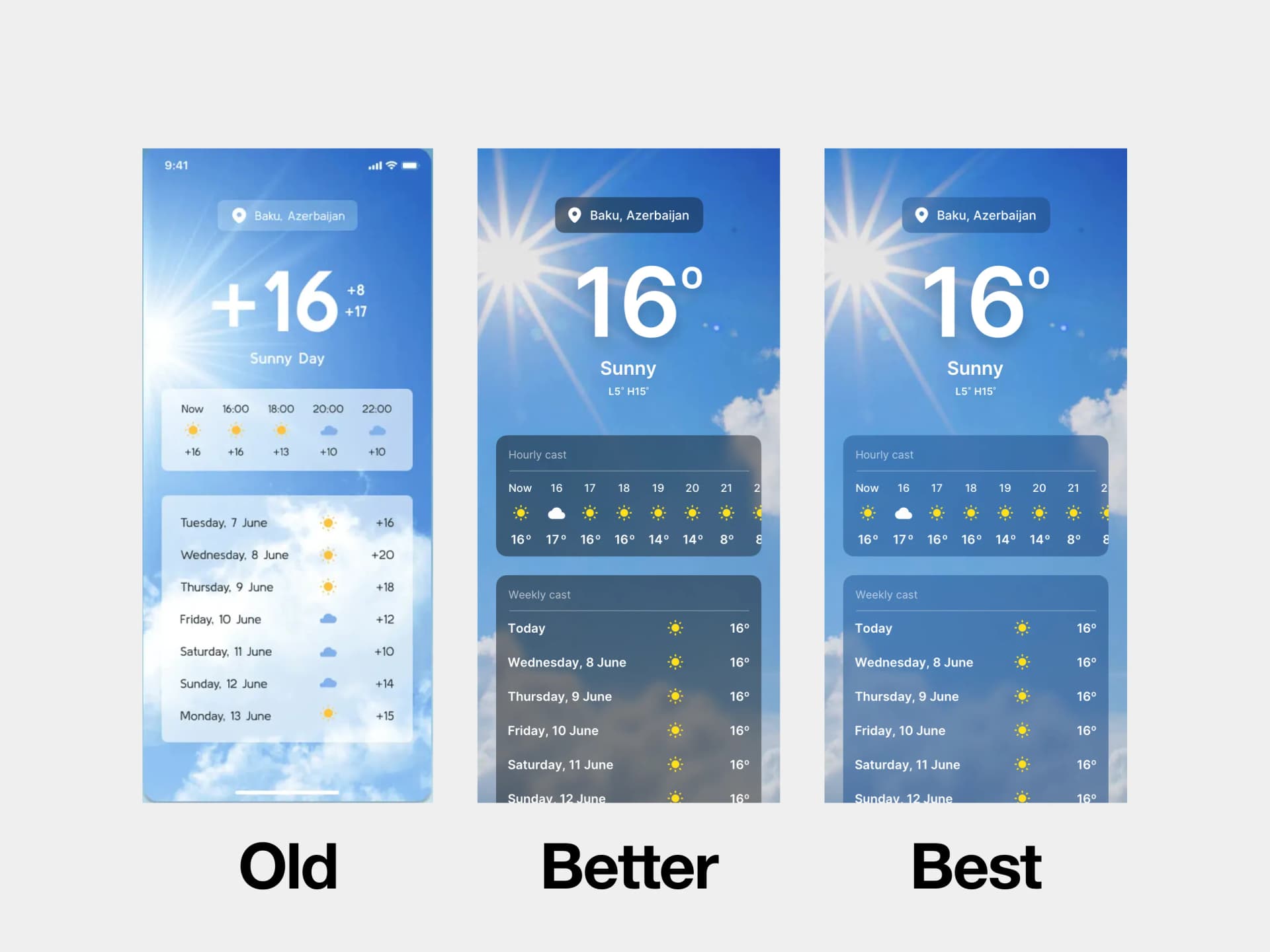
This is one of the trickier designs in the challenge. It’s not every day you’re tasked with creating a weather app. I bet most of you have never designed it.
Before you read through the whole article and see what I’ve done. You can take a look at the design, pause for a second, and think about what’s wrong with it.
How would you fix it?
What doesn’t work and why? If you want to become a better designer, it’s good to practice this on your own…daily.

As expected, we are facing a couple of contrast issues. Mainly inside the glassmorphic cards.

As you can see, the original design has different font colors. The big number at the top is white while the rest is dark.
On top of it, there’s + everywhere, for no reason. We can tell it’s sunny and warm if there’s no “-”.
Apart from those glassmorphic cards that need a bit of tweaking, the icons aren’t as visible as they could.
With this photo choice, it was very tough to get it all right, and it was a great attempt, so that’s why we’re here to make it better.
Fixed Design

Let’s first lay down the foundation for the glassmorphic effect. Once we have it, we can just copy and paste it and be done with it.
This is also the trickiest part of tweaking the values, opacity, and blur.
Remember, we’re looking for a universal solution. The background can change depending on the weather outside. So it’s best to test this with multiple images.

Then we can add the big temperature below our location and the rest of the information. You can notice a subtle drop shadow below the text.
This is perhaps one of the very few examples where I’d encourage the drop shadow.
Generally, a drop shadow on text makes it look ugly and actually lowers the readability. In this case it makes the contrast better. Be careful to make it subtle enough and not overdo it.
Another thing to look for is to visually align the Celsius. Having it next to the number makes it look visually uneven if centered. So we have to eye it and move it off center to make it look okay.

With the hourly cast element, I’ve revised it a bit. There were two reasons for it.
The original design didn’t have a hint to scroll to see the whole day
There was no label to tell the user what this is exactly.
The revised design checks both of these boxes. It’s important to hint at the scroll to the user. Otherwise, the user won’t even think about it. Make it easy for them.
If you’re following iOS guidelines, you may even use odd sizes for the text here, like 13–17. I didn’t so I chose 14–18 font size for the texts here.

The last element is pretty easy. You can just copy and paste and edit it a tiny bit. In my opinion, it would be better to shorten the days to “Wed, Thu, Fri”.
And add a progress bar to show the coldest and highest temperature, but since we’re sticking as close to the original as we can I didn’t do it.

That would be it for the redesign, but we can go even further. Notice the difference between the left and right images.
If we decide to add a little hint of that blue background, it looks way better.
It also acts more realistically, and how it would look in the real world. These little things add to the overall user experience, and you should train your eye to spot them.
My Variation
A variation of a weather app? You may think…
Adam, there’s no way we can make it different.
Yes, we can. I love to push boundaries of editorial design and how far the art can go. How about we make a minimalistic editorial weather app?
What would that look like? Well, in my opinion, something like this.

We remove a lot of the information, since we want it to be minimalistic and show just the most important stuff.
Like;
Current Temperature
Rain approximation
Air quality
Wind
At the top, we have the place, the highest and lowest temperature of the day, and below it all, an abstract illustration of a sun with a time indication.
Below is the most important info, and we can, of course, make it more personal. Add a personal message and show more days under a button.
Without worrying about contrast or glassmorphic effect at all.
That’s it! What do you think? Did I make it better?
That’s it for today! Thank you for your time I hope you enjoyed this episode. Have a beautiful day