In a year and a half of mentoring at Square, I’ve noticed people tend to make the same mistakes over and over again. To put an end to this, I’ve created a new series
Weekly Redesigns
Where I will take the designs from our community, fix the,m and put a unique personal touch on the submissions so you learn something in the meantime.
Today, we will fix the design of our Landing Page challenge by Himani
If you’re new here, I’ve also recorded a video for this which you can find here. Apologies, but the sound got messed up, I will fix that for the next episode.
The design
Hously is a made-up company from our challenge that turns old houses into new ones. Hence the headline — Reimagined.
Before you read through the whole article and see what I’ve done. You can take a look at the design, pause for a second, and think about what’s wrong with it.
How would you fix it?
What doesn’t work and why? If you want to become a better designer, it’s good to practice this on your own daily.
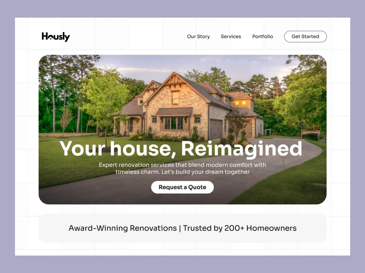
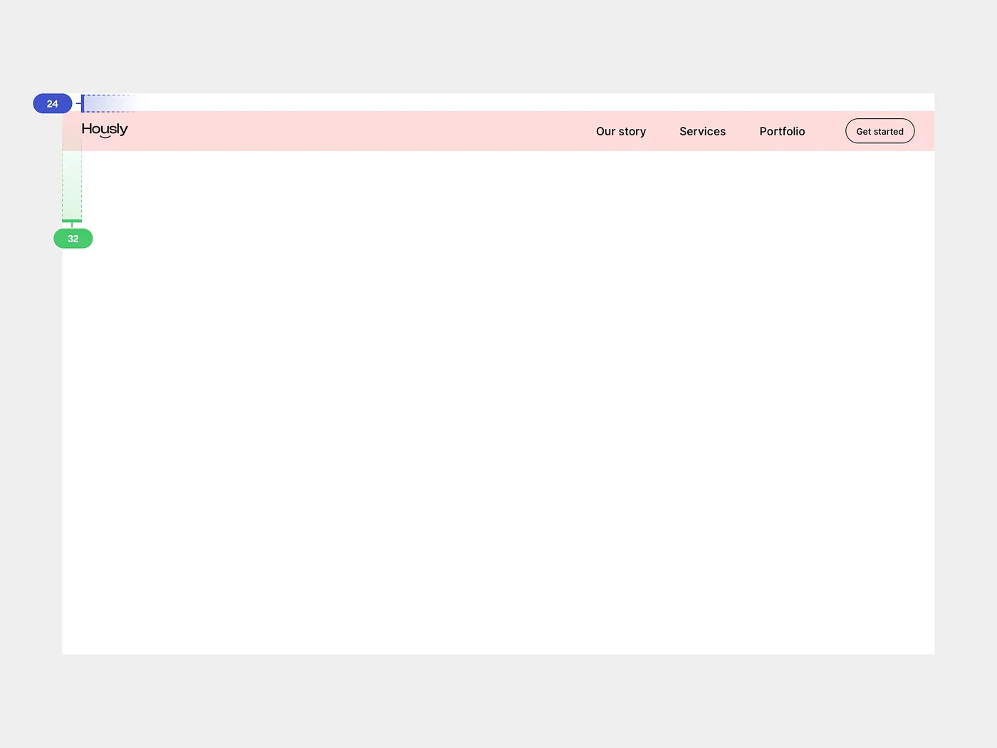
This design is quite solid if you ask me. There are a couple of issues that need polishing, but overall this is a very solid submission. Good job, Himani!
So what are the issues that I can see right away that need changing?
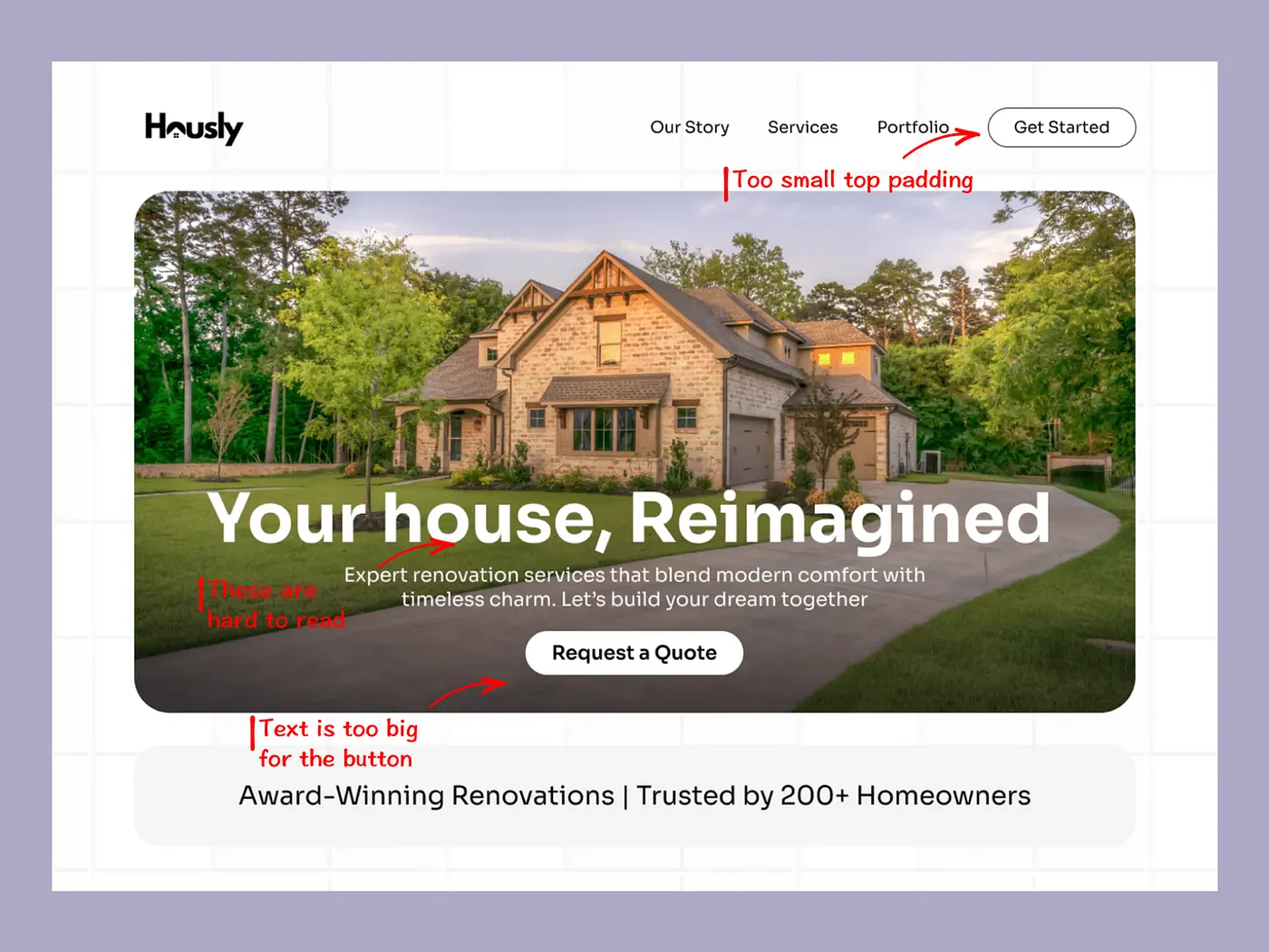
The first thing I notice is the button. It’s way too small, and the text is way too big. This is a recurring theme in many designs I see daily. Give it some white space, make the margins bigger!
Let it breathe
Another thing is the contrast. The headline might be okay-ish but the small text is a bit hard to read to my taste.
You can see there’s a linear gradient going on, but sadly, it needs some tweaking to be perfect. These things are tough to do and require lot of practice and training your eye to get it right.
Lastly, the design could use more white space. Meaning it’s all squished together without much room to work with. I understand why, you want to show the house most and foremost.
But…
It’s better to rework the composition or idea if you can’t give the elements the space they need.
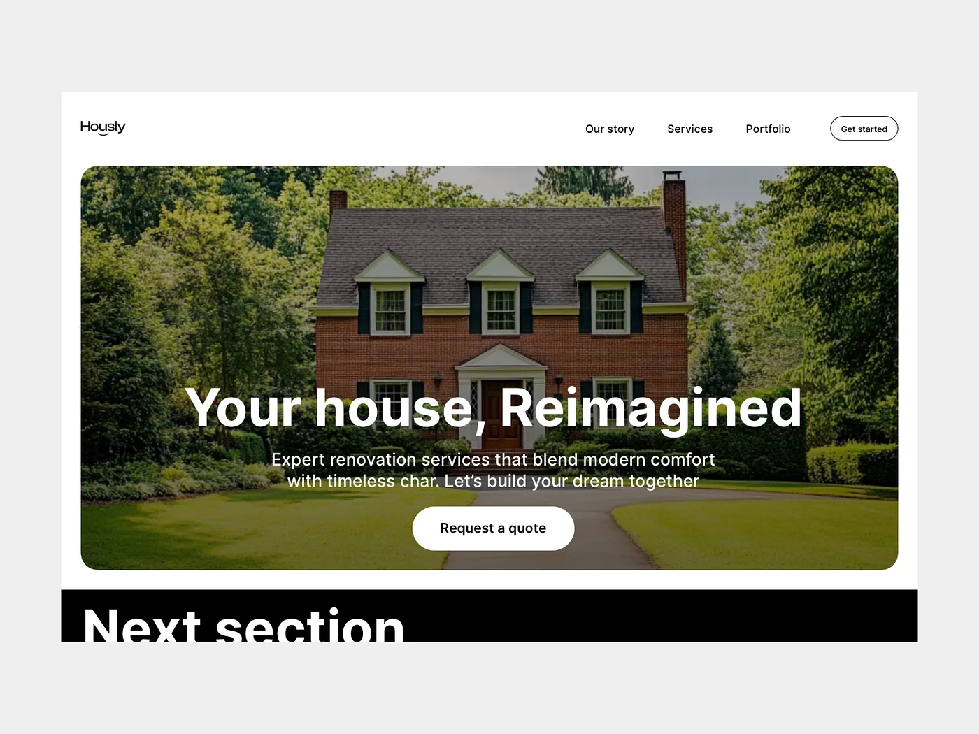
Fixed design
I like to start from the top to the bottom. In this case, it’s the top navigation. A good rule of thumb is to make a rectangle to fit the content inside.
That way, you can show the devs the touch target and it’s easier for them to build as well since this is the “div” for them.
Usually I like these about 40–80pt ish. In this case, we’re starting 28pt from the top, and the div is 64pt in height.
Then, visually align all of the elements inside. The logo will be trickier to align. There’s no need to be afraid of decimals.
I like my designs to be pixel perfect, so most of the time I do push it beyond just pixels.
With the navigation done, we can move to the hero of the design. The image. In this case it’s a good idea to have small margins from the side. You can see that in the original design there are big margins.
That’s okay most of the time, but in this case it’s important to show as much as possible. Meaning we can break the rules here and start with 32pt from each side.
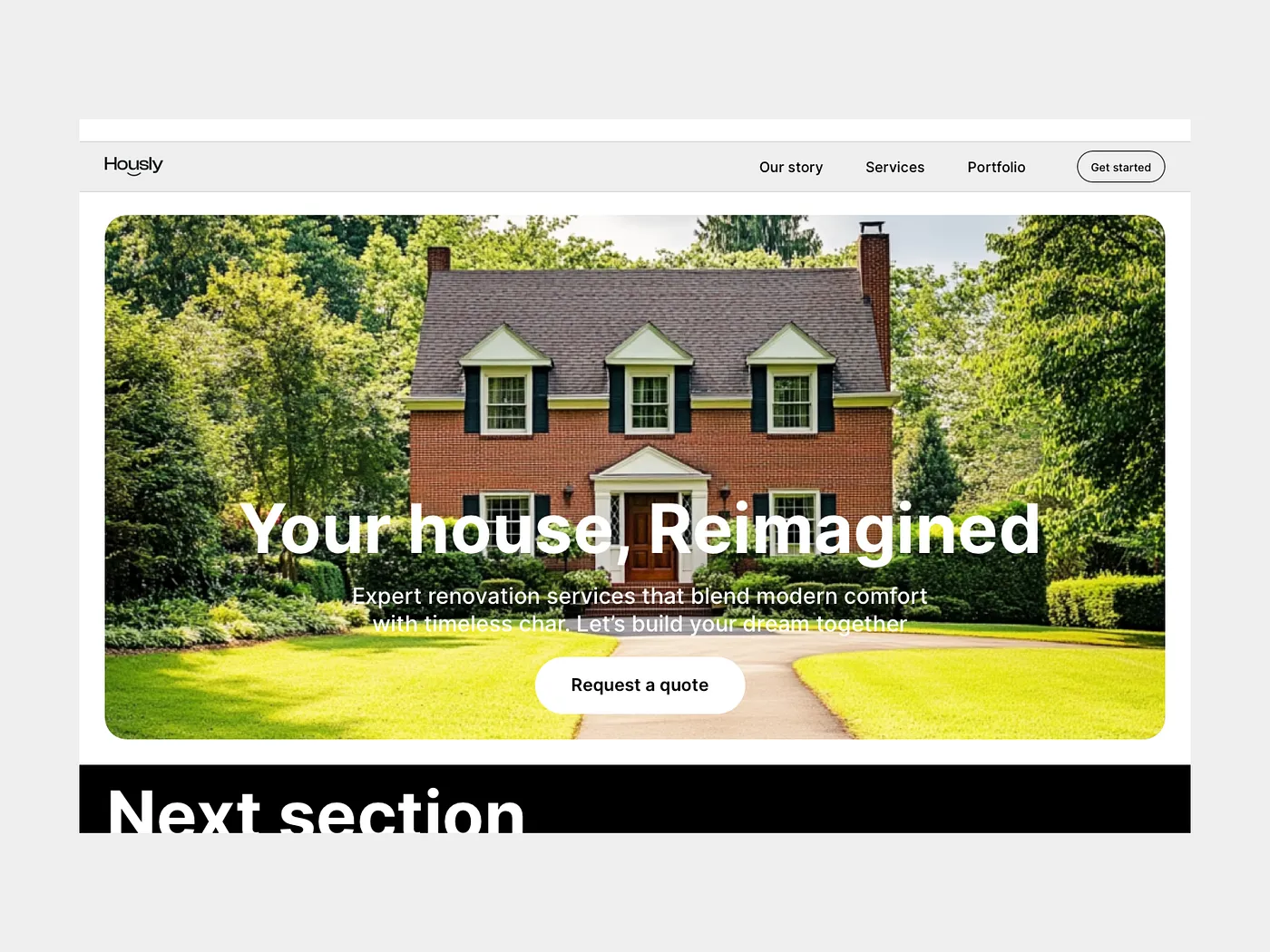
This allows us to show more of the picture + have less work with breakpoints since 32 is widely used for mobile and tablet.
We can’t forget to put an overlay on top of the image, so the heading and paragraph have enough contrast.
To finish this, we can make the button bigger and let it breathe more.
All that’s left is to hint at the next section and we’re done!
Variations
Remember me mentioning that the headline and other elements take up a lot of space and covering the image?
We can experiment with other variations, for example left left-aligning the text. Making it smaller and letting the “property” shine.
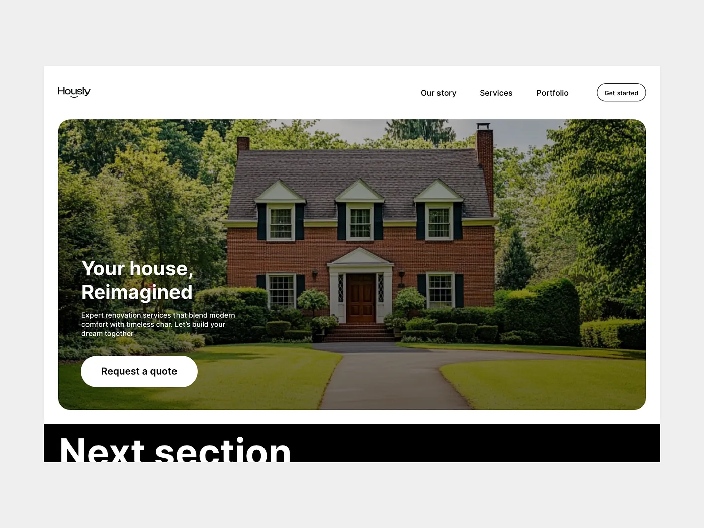
In this variation, I did just that. You can see how it immediately pops way more. The focus is shifted to the image instead of the big headline and button.
After that, you see the button and then the headline and text, or at least most people do.
Of course, there can be further tweaking to the dark overlay so it lets the house shine even more, and so on. I think you got the point and how to switch focus if you need to.
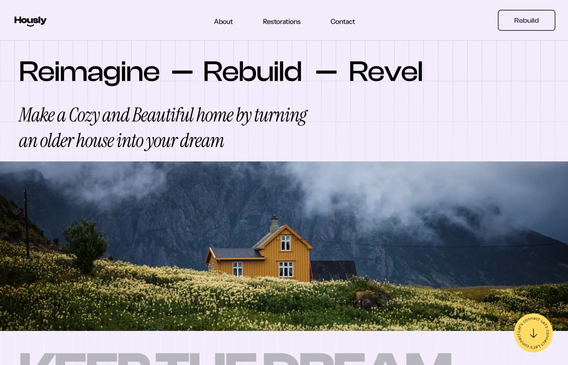
My variation
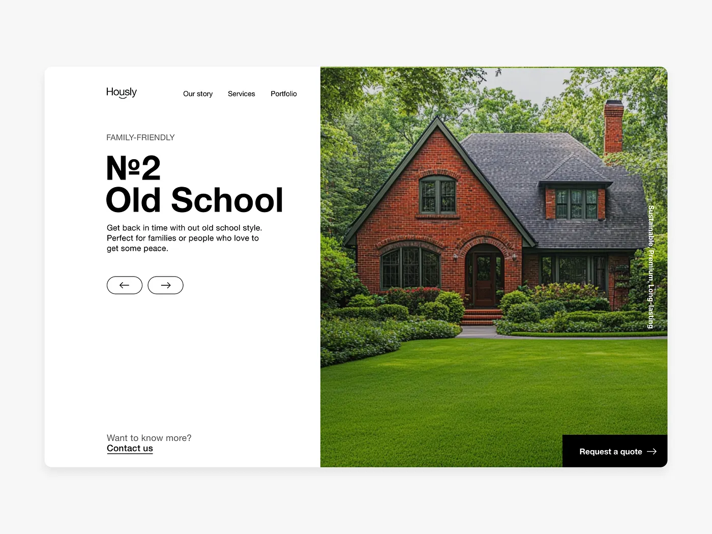
As with the previous episode, I always do my take on the design that we’re trying to fix. I try to stick as close to the original design as possible and point out the mistakes.
In this variation I can go wild and experiment much more. That’s exactly what I did. You can see this design is way different.
I’ve decided that I do not want to play with overlays and other stuff. It’s too tedious to do. So I’ve changed the layout completely.
That leaves me with great contrast on the left, while keeping the nice and big visual on the right.
I’ve also moved the button to the bottom right corner, and instead of a button, I’ve added arrows under the headline and text.
This allows the user to filter through more houses without ever scrolling.
If the user is interested, they can either contact the company or request a quote.
That’s it! What do you think? Did I make it better?
That’s it for today! Thank you for your time I hope you enjoyed this episode. Have a beautiful day