In a year and a half of mentoring at Square. I've noticed that people tend to stick to dark mode more than light mode.
They get too comfortable in dark mode… and when we design a challenge in light mode, people have big problems with contrast, touch targets, and basics in general.
That’s the reason this series was born. I will take the designs from our community and fix them.
Today we will fix the design from our Landing Page mobile breakpoint challenge by Shukrdesign
By the way, I’ve also recorded a video about this, which you can find here.
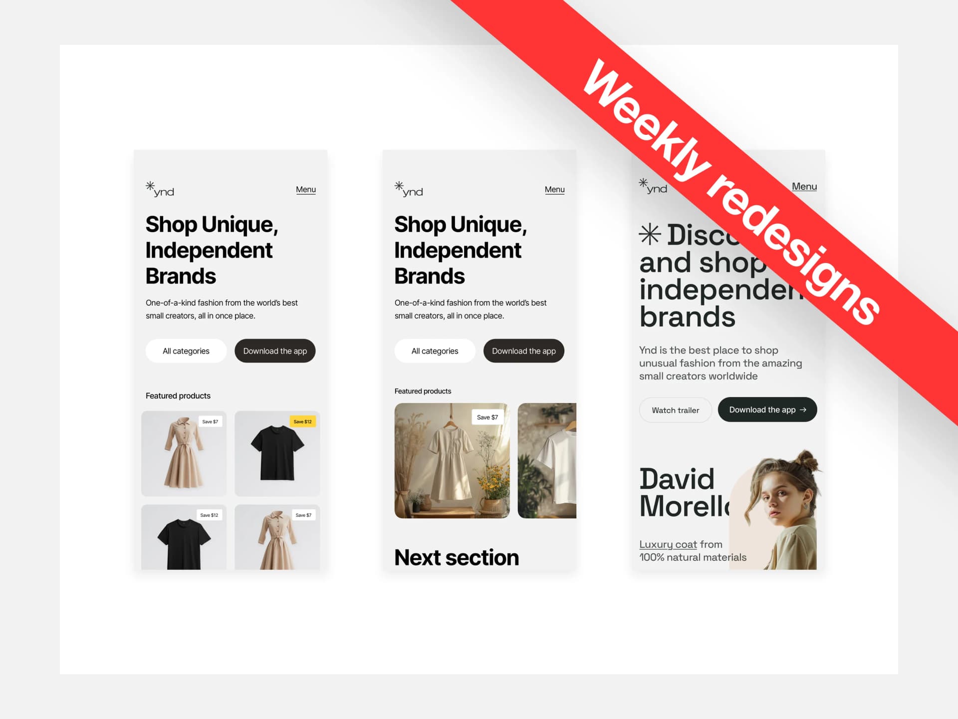
The Design
Before you read through the whole article and see what I’ve done. You can take a look at the design, pause for a second, and think about what’s wrong with it.
How would you fix it?
What doesn’t work and why? If you want to become a better designer, it’s good to practice this on your own daily.

There is more than one issue with this design and I hope you see at least some of them. If not, don’t worry we’ll go over them.
Let’s dissect the design and see what’s wrong with it.

Not again…Godrays
I see this way too often in almost every design nowadays. We’ve moved from clouds to god rays because they’re “cool.”
The thing is, everyone hopes that adding god rays to their designs will automatically make them awesome and cool looking, with thousands of likes raining from the skies.
Well…I might have bad news for you…
Not only does it not make sense, in this case, but it also feels out of place. I’m sorry to bring the bad news but, it doesn’t save the design from a bad foundation to begin with.
Yes, they do have their place in designs or in presentations, but you should first learn:
Presenting the design on a grey background, front view without any angles.
If you do that, there is nothing you can hide behind. Every flaw or mistake will be seen and clear as a day.
On top of it, I do present my designs like that, because I like how simple and clean it looks.
Fixed Design

We’re starting at the top. We have 63pt from the top that will stay empty. This is a safe area for most iPhones and it serves as a space for the notch. We’ll align the logo and create the menu right under it.
The menu will be 16pt in size. This makes it nice and reasonably big to see.

With a “text type” of a menu like this, it’s important to think about the dev and add an invisible touch target of 40+pt in height. This makes sure it’s easy to tap and accessible.

As for the title and the small text, they are okay as they are. All I’ve changed is a capital “O” since it’s a sentence, and adjusted the spacing a tiny bit. Other than that, the top part didn’t need any more changes.
The buttons however did, they were too small to tap. When it comes to mobile it’s better to have big buttons. 48, 52, or even 60pt buttons are totally fine as long as they look visually good and fit into the design.
I’ve also made the buttons full-screen width, to get rid of that weird emptiness on the right side.

I didn’t like the 4-grid with product cards in the design. The purpose here is to show the products and make it catchy.
The grid is making the products too small and a bit chaotic as well. There’s a lot to focus on all of a sudden.
So, I decided to make it into a carousel. The important thing is to make the second product stick at least 30–50% of the width. That makes it very clear for the user to see something is there.
The last thing I’ve changed is the “tag” inside the card. If you want to make something inside the card, it should be a message like “Best-seller” or “Save $7” not hearts and ratings.
That might work on the desktop breakpoint, not on mobile
It removes visual clutter, makes more sense, and gives a clear message to the user. The last thing I’ve changed is the spacing between sections.
There’s more space now, the design can finally breathe a little. It’s also more digestible.
I think I don’t need to mention why I decided to remove the blue and the blur at the bottom. That should be very clear by now.

A second version
Most of the time, there is more than just one solution to a problem. This is no exception. Some of you might be asking
But… what if I want to keep the grid in there?
Well, then we have to do a bit more work than V1. Starting with the product. In the previous design, you can see those nice visuals in a room, with flowers and other clutter. Sure it looks good, but most of the time this is not the way to go.
In a real client project, you often want the focus to be solely on the product.
Nice big product = more sales = happy client
What I did was — take the products into another tool, remove the background, and unify the style.
This makes the design super clean and consistent in and out.

Let’s talk about that grid for a moment. If you really want to go with the grid… then we have to break some rules, literally. It should break our side margins.
So we’re going from 24pt to 15pt for those product cards. Why? Well as I said before we want the products to be as big as possible.
This allows us just that and with the combination of taking it to another tool, unifying the background and lighting… it actually works.
There is no visual clutter, everything is big and consistent and the spotlight is on the product/s.
On top of it, it already creates a hint to scroll, that wasn’t there in the main design.
Be unique
Everything I’ve done above was stick to basics and keep the design simple and conversion-focused. If you’re not a beginner anymore you can experiment with things.

That’s where the third version comes in. It’s bold, different, and breaks the rules here and there, but it works.
The first thing that sets the mood is the typeface. A different, more elegant typeface can immediately change the mood.
Another thing is how playful the design is, the logo is incorporated into the title and instead of cards, we have a model with a coat and bold look.
The text also breaks the traditional practices, being hidden behind and in front of the model, adding more depth to the design.
In the end, there is no right or wrong when it comes to approaching this design as long as it makes sense, is readable, the contrast is there and your foundation is spot on.
That’s it for today! Thank you for your time I hope you enjoyed today's episode and see you next week!
Have a beautiful day!
Liked the article? Share it!

