close menu button
đź‘‹

Hello there!
Log into the academy:

In order to log into your academy profile, please provide your email and password

Forgot password?

Did you previously use

Don’t have an account yet?

A guide to the Modern Minimal UI style

Functional, readable, sleek, and sexy.

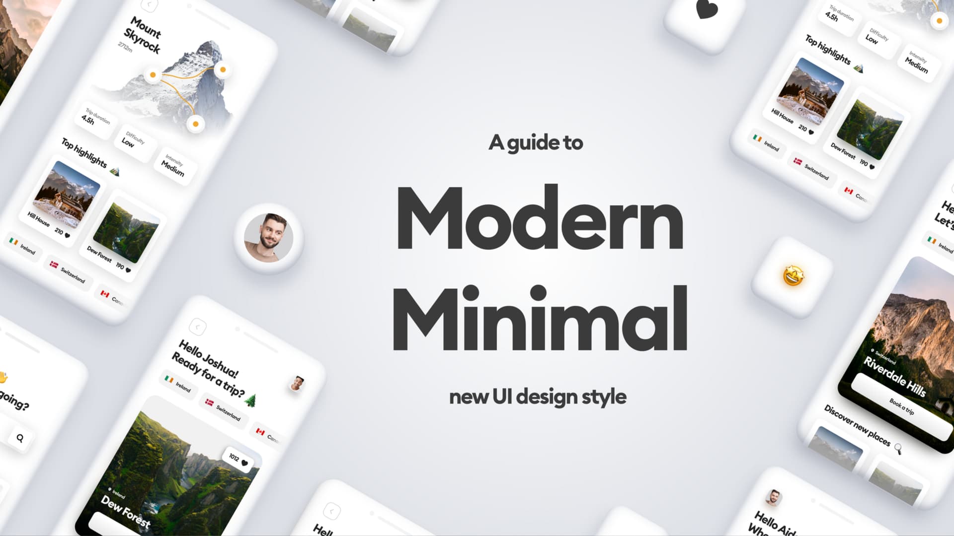
There wasn’t a thing like this one until a long time and I feel like I’ve been waiting for a new, functional, and visually appealing design style to emerge. And it stole my heart completely.

I’ve been witnessing similar design style patterns in many interfaces. These interfaces looked extremely good — they were eye-catching and readable but friendly and not too extravagant. I thought they were a perfect in-between of being good-looking and functional at the same time.

Because that’s the main problem with design trends — they look mesmerizing, but you can’t really make a fully functional product using them (no doubt that neumorphism or glassmorphism is not accessible enough to use on a daily basis).

So, I called this design style “Modern Minimal”. It’s minimalistic comparing to the other design styles, but at the same time is not as dull and boring as old Material Design or Flat. You can spot many inspirations from the different styles in it (like skeumorphism and glassmorphism, even!) but as you will see, it all works together and it doesn’t exceed certain level of visual complexity.

So, let’s get to it!

The characteristics

I did some visual representation of mobile screens in Modern Minimal design style, to show you the most significant factors of it. In general, Modern Minimal style embraces the following characteristics:

1. Bright backgrounds and whitespace
2. Subtle roundness on UI elements
3. Big, readable headings
4. Real-life photography
5. Thoughtful use of colors
6. Focus on contrast
7. Limited use of effects
8. Small details, often illustrated

Examples

1. Bright backgrounds and whitespace

UI8, UGEM, UI8, UImartin(ig), UI8

Left to right: UI8, UGEM, UI8, UImartin(ig), UI8

In modern minimal, the whitespace is king. The whole content of the interface is most often presented on a white or a very bright background. The thoughtful use of whitespace makes the interface look clean, fresh and aesthetically pleasing in general.

2. Subtle roundness on UI elements

Left to right: UI8, Plainthingstudio, Vishnu Prasad, Permadi Satria Dewanto, Ghulam Rasool

The UI elements in Modern Minimal style are subtly rounded. It makes the interface look more organic and friendly.

If you know the latest craze called Clubhouse, you’re probably familiar with their rounded avatars. They make the whole product look more original and distinctive!

Personally, I’m a big fan of rounded corners (they are more pleasurable for our eyes contrary to the sharp ones). The trick is to not overuse the roundness, but rather save it for certain elements, like buttons and containers. The radius of the corners shouldn’t exceed certain values (better slightly than fully rounded — this rule doesn’t apply to the full rounded buttons though).

3. Big, readable headings

Dasraaz (IG), UI8, Dmitry Lauretzky, tino.agency, Shakuro

I love those big, fat headings! They are also making the interface look more modern. You can choose between sans-serif or serif, but personally, I’d recommend sticking to the popular geometric sans-serifs like Gilroy, Sofia Pro, Lufga, or Circular. You can also try Pulp, Gordita, Visby, Konnect, Geliat, Galano or +Jakarta Sans.

4. Real-life photography

Left to right: sajon007 (IG), Fandhitya Giovani, qclaydesign (IG), soltanimediauiux (IG), Glebich (IG)

Yes! Modern Minimal embraces real-life photography.

I’ve predicted the comeback of the real-life photos in my article about 2021 Design Trends. It was inevitable — everybody is slowly getting sick of all the childish 3D renders, flat people, and hand-drawn scribbles. Real-life photos have one big advantage — they simply look “real” and they bring a touch of reality to digital products.

My own research studies on the projects I’ve been working on also clearly show, that users prefer photos to illustrations, cause they look more serious and they relate to real-life experiences on an emotional level.

5. Thoughtful use of colors

Left to right: UI8, Den Klenkov, arminmhmmdi (IG), Fatih Takey, Manuel Rovira Design (IG)

Modern Minimal style is often very minimal when it comes to colors. They are mostly reserved for the most important actions and/or accents on elements.
Thanks to that, the interface is pleasurable to look at, since no big splashes of colors scream for attention of the user all the time.

6. Focus on contrast

Left to right: UI8, Shakuro, Upnow Studio, UI8

One great thing about Modern Minimal is its accessibility (that one thing that most styles suck at apparently). With enough contrast we can easily differentiate background from the elements, understand the visual hierarchy and use the interface with ease.

7. Limited use of effects

Left to right: UI8, albertomacherelli (IG), Plainthingstudio, Rudi Hartono, Sajon009 (IG)

Modern Minimal draws inspiration from many different styles and effects. Subtle colorful shadows, blurred aurora backgrounds, embosses and even glassmorphic elements are welcome — to some healthy extent. Thanks to that, the interface can remain readable and visually uncluttered.

8. Small details, often illustrated

Left to right: UI8, divivgroup (IG), uimartin (IG), uiinterceptor (IG), Tran Mau Tri Tam

What I also really like about Modern Minimal is the attention to details. Despite it’s minimalistic form, it accepts small friendly elements — icons, emojis and other graphic elements such as patterns and collages, that mix up real-life photos with illustrations. The use of the graphical elements that we’re all used to using on a daily basis, makes the interface more welcoming and fun.

To sum it up

I really love the vibe of the Modern Minimal style. It embraces everything that makes the interface functional, but also friendly — and when it comes to the UI design, it’s definitely the biggest challenge.

It doesn’t really jeopardize accessibility in any way — which makes it a style that you can use on a daily basis, and not just for the Dribbble shots. I’ve already made some real-life projects inspired by this style in our company— and it really works! Right now I’m working on our agency website redesign and I’m basing the visuals on this style, too.

The interfaces should be minimalistic, which makes them more usable. But they should also induce all kinds of positive emotions (read my article about the emotional design here) through being aesthetically pleasing. And Modern Minimal style connects both.

I hope this article will inspire you to try something new. As always — thanks for reading and happy designing!


Liked the article? Share it!

twitter iconlinked in iconfacebook icon

Similar articles

ui trends for 2077

UI trends for 2077

Read article
The world is running on bad UI

The world is running on bad UI

Read article
Tesla Bot and Creative Work

Can the Tesla Bot replace a designer?

Read article