Welcome to the fourth part of the UI Design basics. This time we’ll cover the screens you’ll likely design for. This is also a part of the free chapters from Designing User Interfaces.
99% of UI = pixels on a screen*
The 1% is for voice interfaces, and possibly neural-link connections in the near future.
UI design is all about displays. Based on the fact that the UI is everything we see, it’s essential to understand what do we watch it on.
In the early days of the web, it was quite simple — you designed somewhere between 640 x 480 and 800 x 600 pixels. We can, of course, go back even farther — to the first Macintosh or Xerox’s very first Desktop-UI but those UIs, but let’s assume old school color CRT’s as our base here. That is also the time when I started designing for the web (1998)
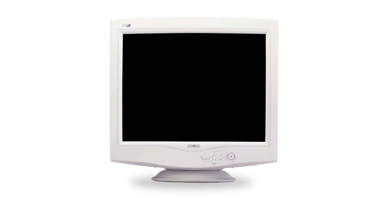 I had one of those :)
But that was the late 90’s, and things started rapidly changing after that. Most of the displays of that era had similar resolution ranges, were super heavy, and couldn’t display too many colors. The also had low refresh rates that resulted in subpar scrolling experience. The displays of that era often limited what websites could achieve visually.
Since we are now living in a tech-world of millions of pixels and millions of colors, we need to understand the screens we design for today. The technology leaped forward since the early internet days. Nowadays, the phone you are holding in your hand has a resolution that didn’t exist twenty years ago.
 A quick comparison. A typical late 90’s CRT display had about 1/6 the resolution of the current iPhone that’s much smaller in size.
PPI or Pixels per inch
At some point, 72 pixels per inch became the display standard for those CRT displays and it was the case for a long, long time. Right now both our laptops and our mobile devices have much higher resolutions and pixel densities.
But what is the difference?
The resolution is the number of individual pixels the display has. For example the first iPhone had a 320 x 480 base resolution. Apple decided, that this resolution should be enough for a comfortable interface, so it set a baseline of a 1x density for the platform.
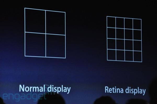 Source: Engadget
That all changed with the introduction of the iPhone 4 with its retina display. The premise was the pixels were so dense you couldn’t easily see the individual ones anymore. A base (or 1x) resolution was the same as the previous iPhone, but the pixel density was a multiplier of that resolution resulting in sharper text and images. The iPhone 4 doubled the number of pixels to 640 x 960, but the actual design of elements was kept at 320 x 480 and upscaled on the device.
Ok, but why was it still behaving like 320 x 480? Why didn’t they simply use 640 x 960 as the “viewable resolution” ?

A project designed for an older device would be 2x smaller on a newer device. That would make it impossible to comfortably use.
After the iPhone 4’s 2x pixel count, we started seeing 3x, 4x, and larger pixel densities in both phones, tablets, and laptops.
For example, the modern day iPhone X used a 375 by 812 base resolution, but its actual pixel count is three times larger (3x) at 1125 by 2436.
To give an example — if you’re designing a button, you need to make it at least 44p high. That means that designing at 1x it will be 44 pixels (at 1x a pixel is the same as a point) while at 2x it will be 88 pixels, but still 44 points in your design.

Since the UI’s we design are all inside vector-based tools, we don’t need to worry about actual resolutions anymore. The base resolution of 1x serves as a template that works on low-density screens and is sharper and more precise in high-density ones.
But you don’t need to remember this
Most design tools provide you with a 1x template for all the popular screen sizes. You just design at 1x, and the coded interface scales up automatically. What a relief! 🥳
But keep in mind that there is fragmentation.
What is fragmentation?
Sadly a growing number of screen resolutions end up with a very fragmented display landscape. We design for TVs, laptops, tablets, phones, watches, and IoT devices, which requires a lot of planning and device-specific modifications for the design to work.
The first questions to ask when starting a design is what kind of screen it is going to work on and what’s the typical viewing distance.
A TV app should have higher contrast and more significant UI elements than a mobile phone app, mostly because it’s often used from across the room, while a phone app is just inches away from the face.

Apple iPhones have 5 different possible resolutions at the moment.
But the place where fragmentation hurts the most is from within one device category. The most ubiquitous one — the mobile phone — has so many potential resolutions and aspect ratios that there is no way to make one design fit all. There are dozens of screen resolutions outlined in the Google Play store for Android-based mobile devices. Apple used to have a more consistent set a few years ago, but has since then abandoned the path and went towards individual resolutions for nearly all the devices.
How to fight fragmentation?
The only way to fight (and win) with this trend is to design at the smallest possible resolution, at least until it becomes legally obsolete. Then switch to the next smallest one.
In simpler terms: Don’t design for the iPhone Pro Max specifically. Design for an iPhone Pro.
Range and reach
In mobile devices, it is also essential to think about the average reach. A randomly pieced together interface can be complicated to use with one hand and lead to frustration.
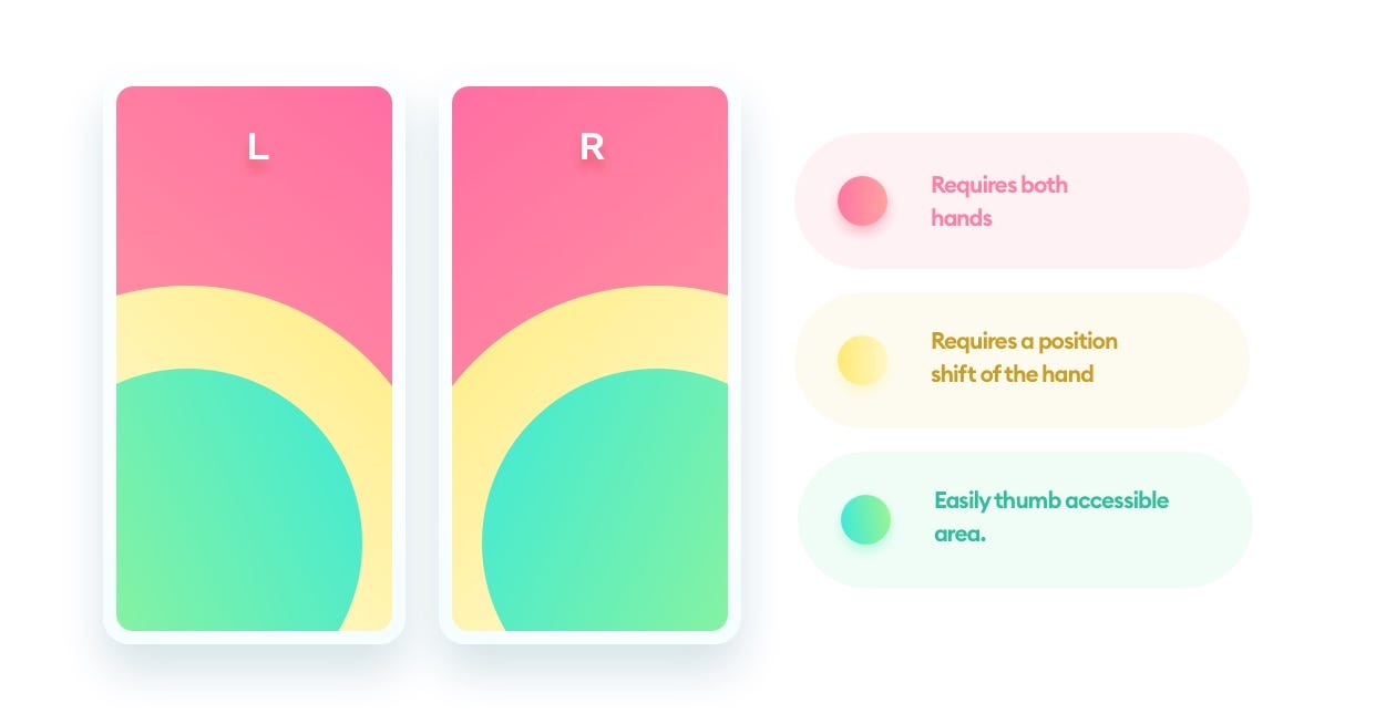
We assume that the typical phone usage pattern is a single hand holding the phone with the thumb of the same hand doing most of the on-screen work.
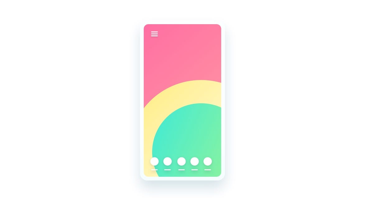
Reach can also help determine how easy it will be to navigate the product. The popular hamburger menu design pattern is in the least favorable spot imaginable for right-handed users.
Bottom aligned tabs are, in most cases, the easiest way to design menus and should be considered for nearly every product as the first choice.
Main takeaways
Here’s all you need to remember about designing for all types of screens:
Always design for the 1x pixel density
All design tools have the right screen sizes built right in (no need to remember them)
Make your main navigation easy to reach on mobile devices
In the next article from this series we’ll cover artboards and frames — the space in which you’ll be doing the actual designing.
Liked the article? Share it!
