During our explorations of the most common problems in user interfaces we were often facing a brick wall of client’s indifference.
But who doesn’t want to have a perfect product? Why?
The recent years have been a “craft” revolution. Beer, food, furniture, even ice cream — they’re all “craft” now.
Why aren’t designs “craft” in so many cases and why their owners don’t care?
We asked.
Grid lines and lengthy, jargon filled explanations simply bounce off their cognitive dissonances and they reorder what they think to tame it. Processing all that information is hard, so it’s a lot easier to dismiss it as long as the product “works” and “sells”.
We have to stop talking UX to humans.
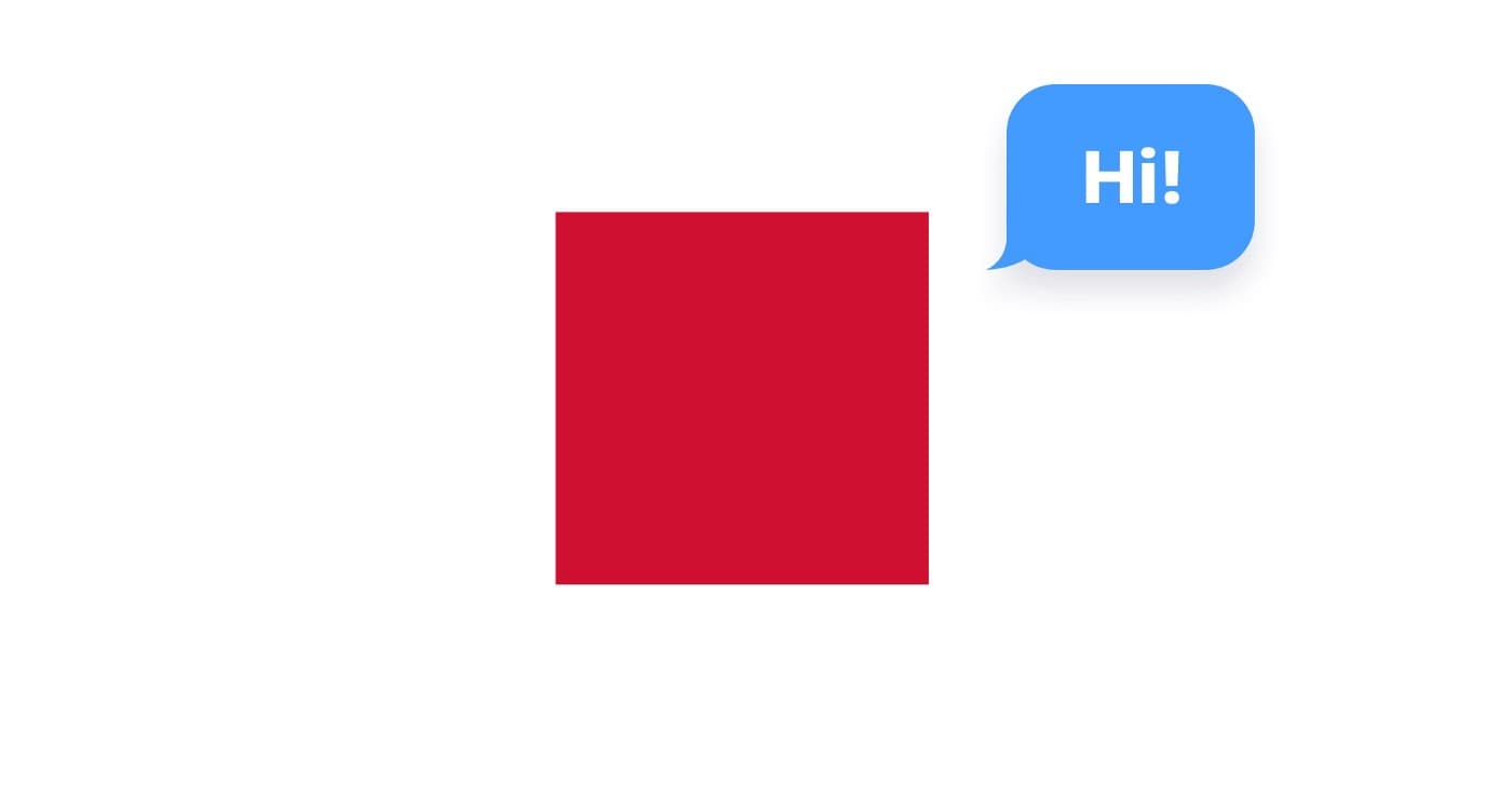
Enter — the red square.

The red square gives people something tangible. Something they can understand right away. It’s a shape. It has a color. It’s like a lego brick making lanes in their imagination highway.
But also…
It’s a dumbed down, simplified grid-setting method I devised to break through that wall of indifference. It’s an anchor. ⚓️
Our brains like to navigate safe waters.
User Experience has long been about making products work better for humans. Part of User Experience is the User Interface design — which in turn through clarity, readability and aesthetics builds trust. But User Experienceas a field was made without thinking about all of it’s users. 🤯

Photo by Alvaro Reyes on Unsplash
To bump up the rates and make us designers feel special, we devised a code of sorts — which we use to mask simple to understand truths. We communicate with jargon daily, and most of the time our ego likes it when the client listens in bewilderment assuming we’re doing “science and stuff”.
In many cases of course we are. After all UX is science. In other cases we use heuristics … 😖
Heuristics? 🧐 Really?
It has a nice ring to it when talking to a client. His puzzled face bumps up our egos a bit. 🤔 But it’s better to say “things we already know”. This is both a red flag and a red square all rolled into one.
Talk like a person, not an encyclopedia.
Of course it doesn’t have to go over the top in the other direction either. No worries, you can use some fancy lingo here and there. Just don’t overuse them. Let the results (of research or of your successful redesign) speak volumes about your work quality. Not fancy words. Your clients are the users of your UX process. Make their user experience good. 🙏
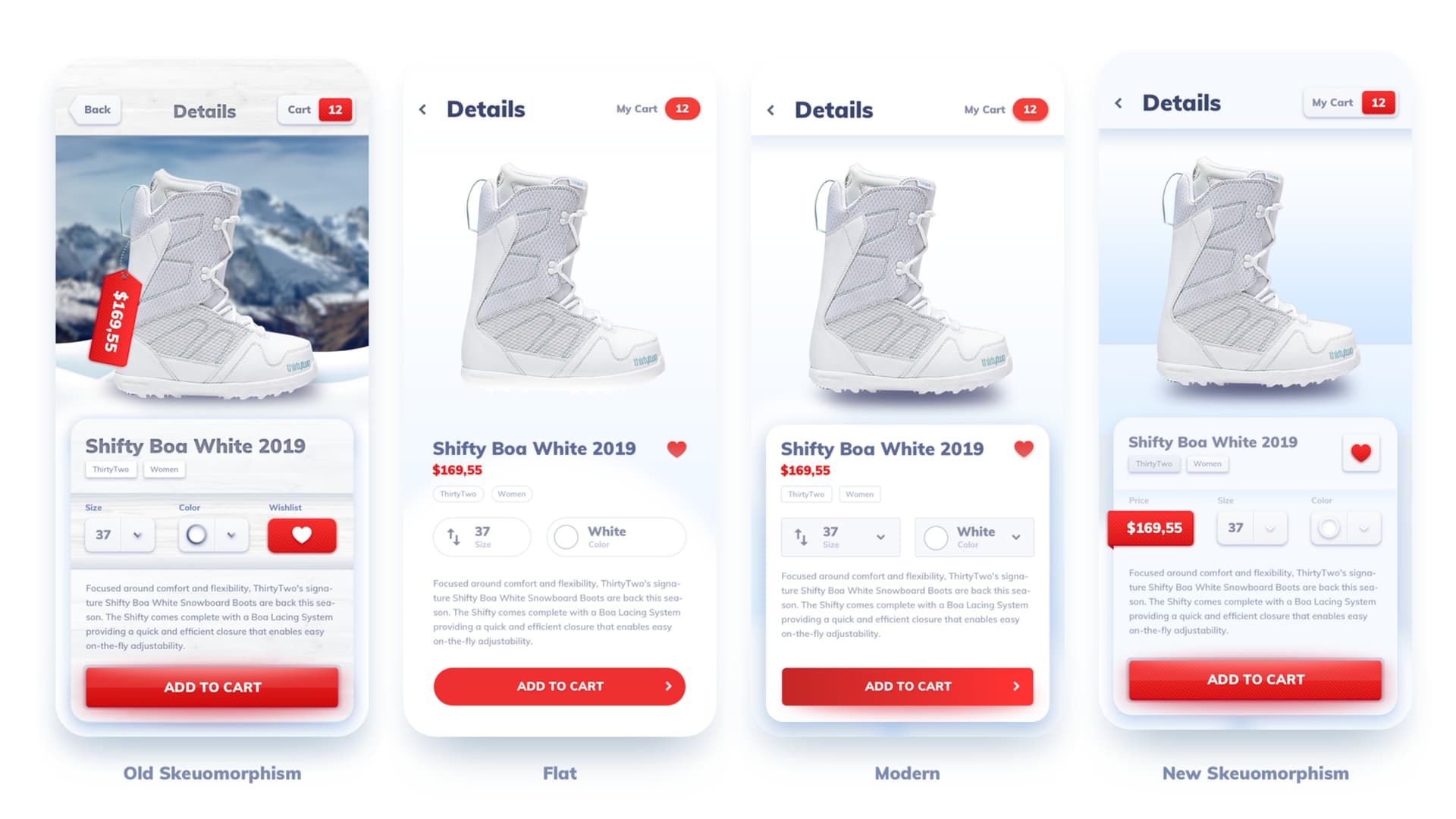
How to show grids using red squares
Since “things we know” aka heuristics allow us to make pretty good UX for most products, the neglected little brother called UI will be the focus here. But if needed we can expand the red square methodology towards “softer” ux fields than actual designing — no worries. Also I believe in research and “proper” UX methods. I just don’t think we need to apply them to EVERY possible design, as a lot of the projects differentiate in style or business model — not design per se.
So here’s a grid with red squares.

There are of course better, more professional ways to do layout (including the golden ratio) but nothing beats adding a bunch of red squares to an existing design and showing random spacings.
The image above is better (and faster) understood than grid lines or box models. That’s mainly because of two reasons:
Red is naturally associated with something wrong, so by showing it next to a too large or too small spacing the message is delivered faster.
Grid lines and box models rely on large elements spanning wide areas of the project and covering them. Even with transparency it requires our brains to go along all those edges and notice patterns. Red squares are often identified as “dots” or pixels and exist in their own right. That’s why it’s easier to quickly see the areas around them.
But red square method is more than just a simple grid
It started as a way to show grids, but transformed into a general simplification of most of the communications. “Things we know” may not sound as fancy as heuristics but we’re beyond the age of showing off (that was 2009–2011) our UX prowess. Now we’re expected to do good sh** and talk about it in a way people understand.
Otherwise they simply won’t be interested.
Implementation examples
We have used the Red Square Method in most of our beginner-facing projects, because for junior designers this technique is the fastest and easiest to grasp. The main goal of layouts should be to show hierarchy of elements. That leads to faster processing and better understanding of what the user is looking at.
You can watch this special, hidden video on it for even more detail.
We also explore this method in practice in the first part of our UI Design in Mobile Apps course.