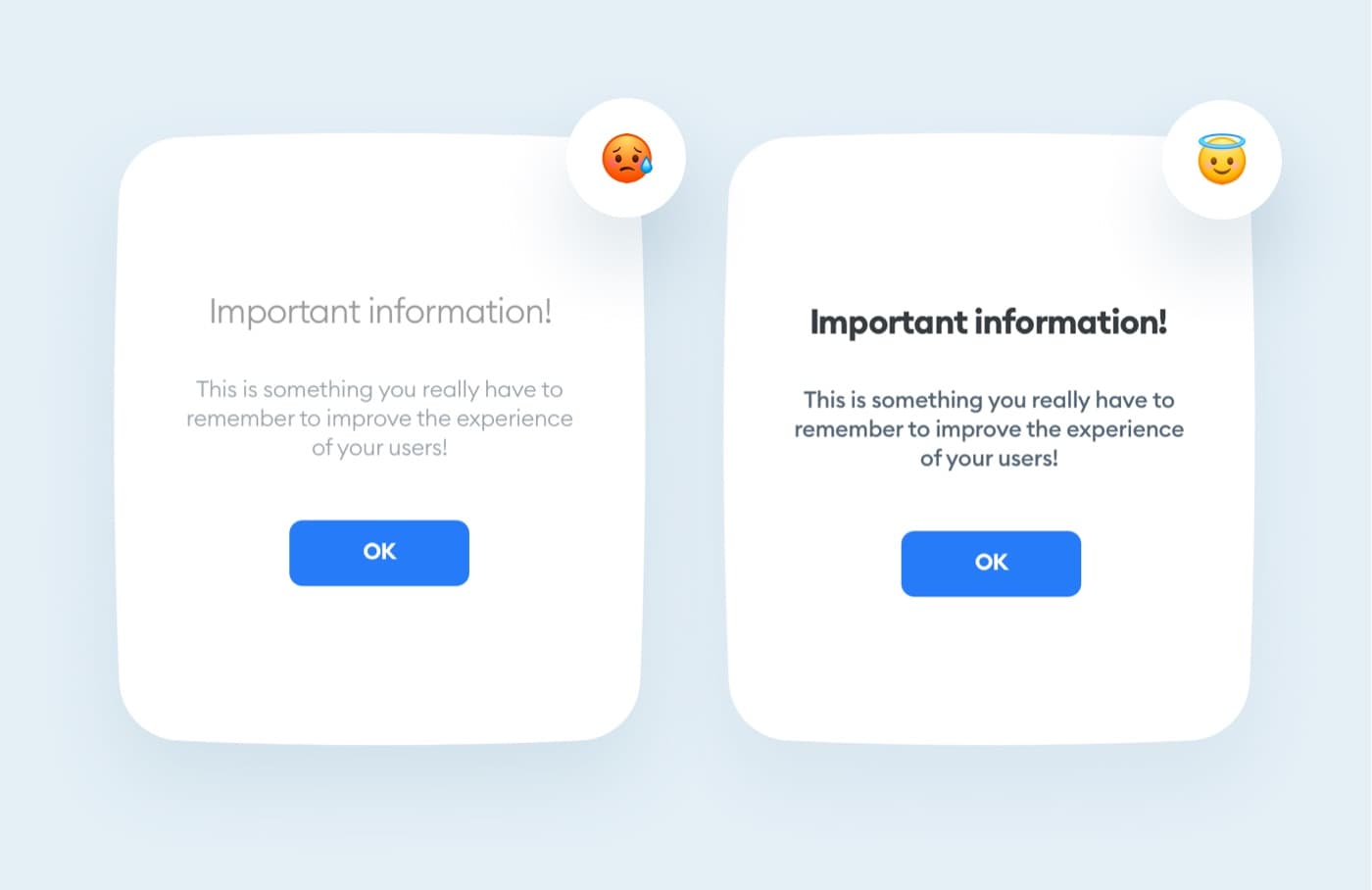
A light and thin font is very unreadable and does not imply that the information is important.
Regular, Semi-bold and Bold are better for readability & accessibility.
Avoid using thin and light fonts in your projects.

In order to log into your academy profile, please provide your email and password

A light and thin font is very unreadable and does not imply that the information is important.
Regular, Semi-bold and Bold are better for readability & accessibility.
Avoid using thin and light fonts in your projects.