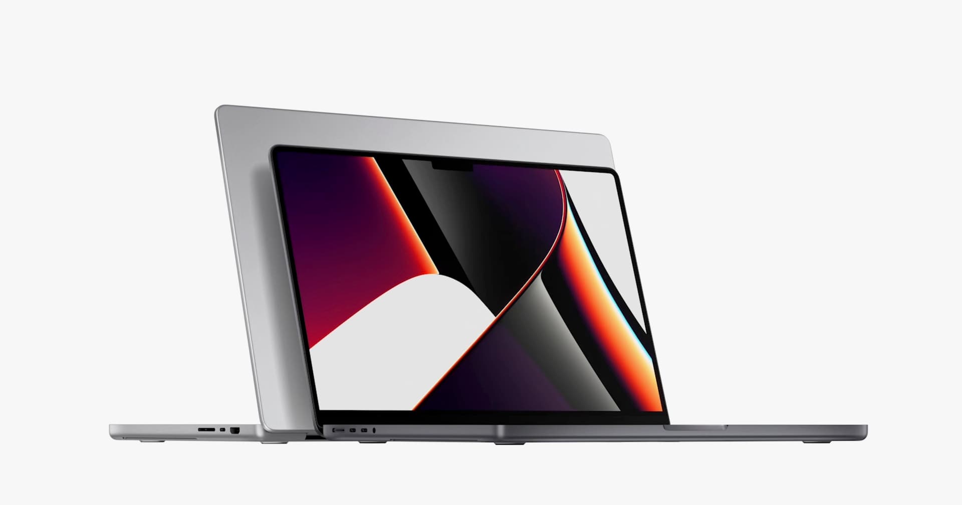
Today Apple has announced the first computer running on their own in-house made CPU. Of course, they teased it back in June and sent a nice-looking ARM-based Mac mini to developers. But now it’s real — an official machine that you can buy.

The new MBP is the one I’m getting. Source: Apple Keynote
This is actually a really big deal for designers. Over the years we fell into a typical trap in computing — the more power we had (and used) the more we realised that it’s never enough.
Let me give you a couple of examples:

Photoshop design era
When I first started to design websites, we only had Photoshop. At that time it allowed for a single “artboard” or project that you can work at the same time. Sure, you can open more “files”, but you’d have to switch between them to work. So in reality you only moved then-bitmap rectangles on one “artboard”.
There were simple vector shapes in Photoshop, but they were too constrained by the app to be useful. Most designers simply used much larger, bitmap shapes. But zooming into these shapes often resulted in the fuzzy, pixelated edge as seen on the image above.
Of course those mostly bitmap projects were also pretty heavy. An average mobile app screen in 2009 was about 50MB. That’s just one screen, now imagine an app has 50 of them.
Currently entire Figma or Sketch files, full of screens and libraries can take the same 50MB.
The limited capacity of both the displays and the computers of the early 2000s weren’t catching up with the need to design complex, multi-screen products.

Having only one ‘artboard’ visible at any given time, it led to a lot of inconsistencies, including the problem of “pixel-jumping” when you scrolled through a list of similar screens.
Screen 1 was ok, but then on a similar screen, even the base objects from the first one were a pixel or two off. Going back and forth between them gave the impression of a sloppy design (which it was) — you can see it in the GIF above.
Clients hated this as much as designers did.
Sketch days
When Sketch first appeared over 10 years ago, it radically transformed the way we think about design. There were two features that I think were the most transformational — vector shapes all the way and having multiple artboards.
When I first started working in Sketch back in 2013–2014 I was blown away by the ability to browse and edit all the screens at the same time. You could — for example — select one object on multiple screens and change it’s color or position for all of them. This one feature killed pixel-jumping once and for all.
When InVision entered our workflow you can’t even start to believe how happy it made us! Finally we were able to create complex, multi-screen prototypes inside Sketch, link the screens together with transitions and test the flows.

Craft — a plugin for Sketch that allowed the InVision integration to work was often quite slow when creating those blue connection arrows. This was visible especially on more complex pages with many visually complex screens on them.
The arrow would slightly lag before reaching the target artboard. But this was a minor annoyance at that time.
But it was a completely new way of working and it was a lot of fun.
(Of course, Axure allowed for prototype building way before that, but it wasn’t really a UI tool, so we wireframed in Sketch as well)

Symbols
Another revolution was Symbols. They’re a common UI element that can be nested multiple times and create reusable, consistent design components. But in some cases, like this cell (above) from the Analizy.pl portal, we had several nesting levels with pretty high data density and a project with at least a hundred screens and screen versions.
This portal also has a professional trader and beginner mode which modify how the entire cell looks like. There are smaller versions for comparing them side by side and countless other iterations of this general “symbol”.
That resulted with heavy nesting and multiple instances of the cell to choose from. Given, that a typical catalogue / search results screen had 20 or more of these at the same time — it was starting to make my 2017 Macbook Pro 15" fans sound like a drone about to take off.

Looks familiar?
Loading all that data was simply a big strain on the CPU / GPU of the top of the line Mac. Of course I could’ve optimized the Sketch file myself too — but when you get a chance to have the power to build complex structure, you can rarely say no to that.
Complexity rises
My UI Design book was also put together in Sketch. Trust me — 450 artboards on one page can sometimes slow the laptop down too, albeit not as much as I expected.

That’s a lot of artboards! Some of them are very complex, as most of the example designs are done “in place”
But with great power
When I was tasked with designing a product that worked on multiple platforms (from iOS, all the way to Android TV boxes and Gaming consoles) I didn’t think twice.
Created an external style library (another great innovation by Sketch) and started to build components, guides and general styles for the interface to still be familiar on every platform.

Sadly I can only show these shots covered like that. + There was a lot more screens in the project.
After a while I had to split the main project file into separate files (one for each platform) and connect the external library with the “basics” to each one.
But imagine if this didn’t have to be the case. Imagine a machine powerful enough to handle this with ease.
This is what I’m hoping these new Apple devices will finally deliver.
Continuity … but with design tools running
One of the most amazing features that Apple products have is the ability to start something on one device and seamlessly continue on another.
They just work together.
Sending text messages from your phone, but typing on your computer is something that’s very hard to put down when switching to Android.

Source: Apple Keynote
Now let’s look at it this way
If the new Macbooks will be ARM Based (On the Apple A-chip line) it means they’ll have a version of the same CPUs that you already have in your iPhones and iPads.
Once design tools start working on those CPUs, a future in which you’ll be able to just connect your phone to a mouse, display and keyboard and pick up a Sketch or Figma project you were working on are closer than you think.
With all that great power you’ll have more artboards, more nested symbols, more ways to prototype. All working seamlessly on ANY device that you have.
It’s like Samsung’s Dex, but with actually useful (for designers) apps on it.
The future is going to be fast. I already ordered my M1 MacBook Pro.


