So you’re thinking about becoming a UX/UI designer, but are afraid to start? Don’t worry. It’s easier than you think. You only need a solid foundation and a lot of dedication. I can’t help you with the latter, so let’s focus on the former.
This is going to be a part of a larger series of stories, based on the free chapters of Designing UI book. I tried to divide it into easy to digest chunks. Enjoy!
How are the images created?
Whether you’re making a low-fidelity wireframe, or a fully finalised, beautiful UI design, you’ll be using shapes and objects in a design tool of your choice. You can even use Keynote or Powerpoint to get familiar with shapes and their relations, and then do the transition to Sketch, Figma, Adobe XD or others.
All currently available UI design tools work by manipulating vector shapes. That means that all you see is represented by numbers that define it. It also means the object can be stretched and enlarged without losing any quality — it simply makes the numbers bigger and re-creates it again.
If you’re planning to design interfaces, be prepared that most of the time, it will be about moving various rectangular objects around. Rectangles are the most popular shape (right before ellipses) in all the interfaces.
The general idea of UI design is about moving rectangles around in just the right way.
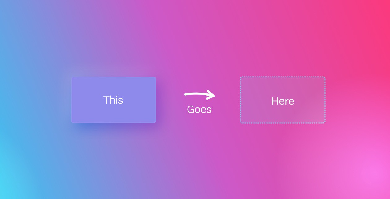
UI design is about moving rectangles around. And the skill is all in knowing HOW to move them, WHERE and most importantly WHY.
The box model
The Box model is the most basic way of defining a digital interface object both in design and in code. Most of the design we do works according to the box model, so it’s essential to get to know it well.
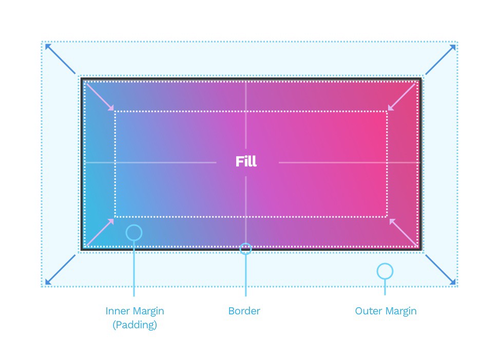
It consists of four main elements:
Fill
Border
Outer margin
Inner margin
Fill should be pretty self-explanatory. It’s the background of our element. It can be a solid color, a gradient, an image or a mix of all of these.
Border is an outline around our object. We will dive into all the different kinds of borders in the next stories from this series.
Outer margin (often just called “margin”) is the area outside of our object. It allows us to position it with enough safe space concerning everything around it. It’s the blue area outside our rectangle.
The inner margin is also called padding — this may come in handy when talking to developers. It means the more extensive it is, the bigger the safe area inside the object becomes. In the example above, it’s the darker area inside our colorful rectangle.
Defining properties
Size
Width and height (in points) define the size of an object. In most cases, we use W and H for short. As it’s a two-dimensional space, the width is a scale on the horizontal axis, while the height is a scale on a vertical one.
For short, points are not the same as pixels. The resolutions and pixel-densities are a topic for another article, so to keep it short: Points are vector representation of pixels, that are dependant on the resolution. On modern, very pixel-dense displays 1 point can be 4 pixels or more. The reason for this is to have large enough elements, but also give them enough sharpness and precision.
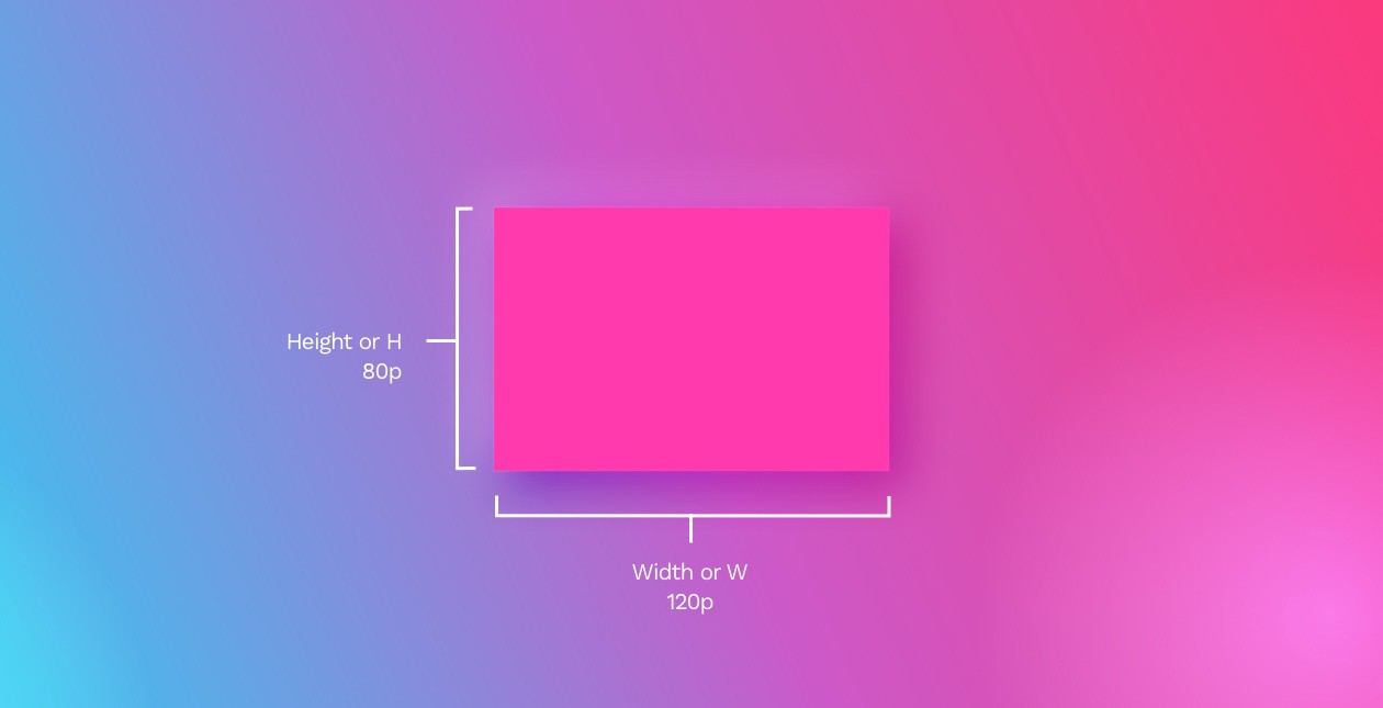
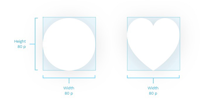
The width and height are always of the smallest possible rectangular box that can contain the object — even if the object itself has an irregular shape.
Position
The position of the object is a set of numbers on the X and Y axis, defined by the artboard that contains it. The X is the position on the horizontal axis, while the Y is the position on the vertical one.
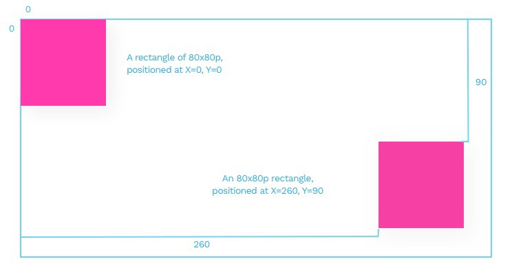
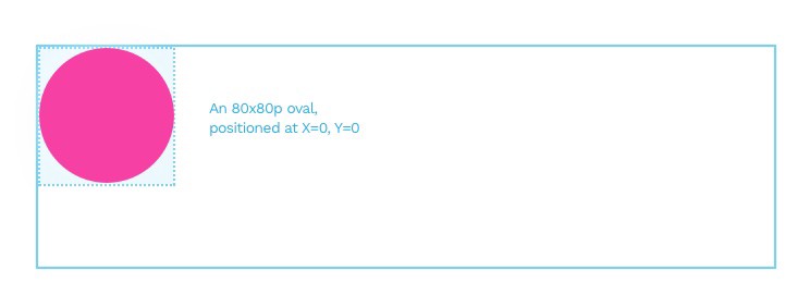
Ok, that’s easy for a square. But how about a circle? Or some random blob? Irregular objects positions are the position of their bounding box that contains the actual shape within.
Angle
Angle defines the rotation of our object going clockwise — the default being 0°. Rotation can also be a negative number. It’s worth remembering that a -15° rotation is the same as 360°-15°, which equals 345°.
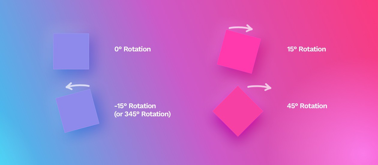
In order to have a consistent interface, it’s best not to rotate objects by hand, but instead enter the right angle from the keyboard as it is way more precise than manually turning the object point by point.
If we Flatten the object (there’s a button that “does it”), it resets the angle to 0, but it is still rotated — only the new perspective becomes the base for further rotation.
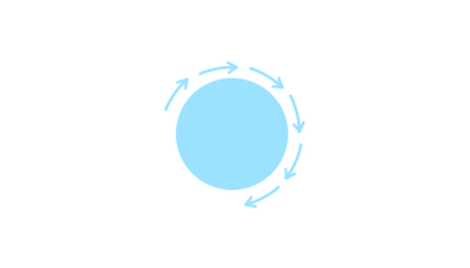
Rotating circles will of course yield no visible result, unless they are filled with a gradient or a photo.
Border radius
Many studies show, that rounded shapes are considered more friendly than sharp ones. To define the level of roundness, we use a property known as border radius (sometimes corner-radius).

A border-radius is a number. Just like the width and height, it’s also presented in points. The larger that number, the larger the roundness of the corners of our shape. You can use it for all of the edges at once or set them individually.
In general, even slightly rounded corners (between 2 and 6p) are considered more friendly than sharp ones (of 0 p). However, it’s good to have consistency in the roundness. The grid base unit that we select should define the border-radius. It should also match its surroundings.

Different border radii in the same object can make a great button if it also matches the brand guidelines (i.e., the logo also has a similar pattern).
If you decide to make your buttons that way, remember to be consistent with them across all the screens.
You can also watch me talk about these basics on video:
What’s next?
Thanks for getting this far! Hope you’re on your way to making some shapes!


