close menu button
👋

Hello there!
Log into the academy:

In order to log into your academy profile, please provide your email and password

Forgot password?

Did you previously use

Don’t have an account yet?

What’s the next UI design trend?

Most apps are starting to look the same again…

How to break the ice?

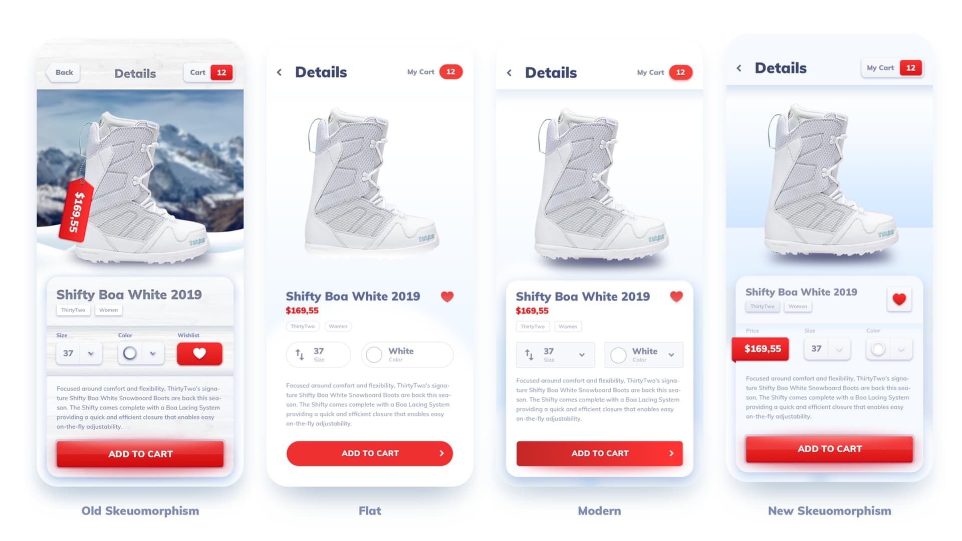
When the first iPhone launched, the idea of interacting with a small device using multi-touch gestures was quite new. To make people more comfortable with the interface, the initial designs used Skeuomorphism for the UI.

Skeuomorphism bookshelf with books on it

It basically meant they used “real world” elements like wooden shelves for books, stitched leather in notes and CD covers you flip through to give you a sense of the new digital world. By using familiar objects it was lowering the entry barrier for new users. The interface was unlike anything you’ve seen before, but it was still familiar.

People got used to touch devices.

After a while however people got used to their phones and the wood, metal and leather started to look dated and boring. We craved something new. Something fresh and slick. Something more digital.

Something flat?

It all boils down to the fact that we understand the “flatness” of our phone screens. Faux 3d elements and real-world textures mentally clash with that flatness creating some dissonance.

Let’s go flat!

So with the release of iOS 7 in 2013 Apple decided to “go flat”. Most shadows were gone. Buttons were now mostly just text-links. Everything was purely two-dimensional without pretense of the faux 3d.

And the people hated it!

By going flat the idea was that the interface is what it is — a bunch of pixels displayed on a flat surface. While accurate and modern, people understood something was missing. Some playfulness of actually “pushing” a button down instead of touching a flat surface.

Windows Phone tried this bold approach (and in a pretty beautiful way) but that sense of “no-fun” combined with almost no apps killed the platform.

Apparently we liked the deceit.

We needed the “material” to be real.

Google answered this in 2014 introducing “Material Design”. The general principle of what ultimately is a design system for Android Based digital products was to use layers. Instead of relying on purely they X and Y axis, it introduced the Z again.

The concept of cards on which other interface elements (like buttons and froms) stack up was a nice upgrade over the lifeless flatness of iOS 7. Depth gave hierarchy and purpose to the interface elements. It also helped to faster identify them for what they are. A button casting a shadow is identified as a button much easier, than just a flat shape.

Looking from the side we can see each object occupies it’s own space on the Z axis.

Material made simple.

To make it simpler, it was a mix of flat and minimal (cards) with the concept of depth refined from the Skeuomorphism era. The designers didn’t try to pretend our interface is made of wood, leather or metal anymore. It was made of “digital” cards, but with a sense of space and depth.

So in a way it was a mix of both of the previous styles, that kept the minimalism and clarity, and added the much needed “fun” element.

Since it was initially Android only, I’d count it not as a full trend of it’s own, but rather a very well executed transition to what is currently trending in design. A transition that was much needed in it’s time.

XXX

While a welcome change over flat design — most apps started looking exactly the same even faster.

Material Design however got boring even faster.

Because of strict, well documented and easy to follow rules Material Design was quickly used almost exclusively and without question all across Android.

That fact combined with a limited set of choices (aside from color you couldn’t really do much) very quickly became tiresome. It took a little over two years to get very boring and be updated by Google to include some “fun” and differentiating elements. You could now add various decorations and weird angles to make your product a bit more “yours” within the guidelines.

That didn’t help a lot…

Modern design — how to make material more “friendly” and multiplatform

Dribbble to the rescue.

It is now nearly impossible to find out which dribbble designer started the “modern” trend around 2016.

It was of course just a plan to get more likes and follows, but it caught on and here we are. 😂

By introducing soft, colorful shadows and curves it created a style of apps with a “positive vibe”. It borrows heavily from material design in the way objects are layered on top of each other, but it mixes completely flat elements with the more important ones “sticking out”. It was a lot more aesthetically pleasing than the boring card-stack of Material Design.

With the release of the iPhone X it got refined to include much larger border radii and often overcomplicated animations and transitions.

So what’s next?

We’ve been living with various takes on the modern design for close to 3 years now and we are at a point, when if you search for an “app” on Dribbble you will find 99% of them looking the same again.

This modern trend looks nice and all, but we fell into the same trap again.

Is it time to retire the Jellybean?

People like the modern design, so we stick to the use soft, colorful shadows and bold fonts on light gradients in all of our designs. And all of our designs start to look the same.

Since it’s a bit more difficult to do “right” in a real product it took a while to catch-on outside of Dribbble. But eventually this happened too and there are more and more apps starting to look the same and varying only in the colors they use.

New Skeuomorphism?

One potential for differentiation is something I call New-Skeuomorphism. It goes one step beyond modern and brings back some faux-3d, albeit not as textured and real-worldly as before.

Adding that tiny bit of 3d realism makes the apps stand out and feel “fresh” again.

Notice the price tag wrapping around the card and a very subtle texture on the button. There’s some additional depth, but no over-the-top texturing anywhere.

I think this is a more probably direction UI design will go to. Going back to 100% flat is probably not going to happen, as we like cheating ourselves.

There is however a very sci-fi option still on the table as well 😎

Morphing devices?

Since the interface is faking 3d under a flat panel of glass, maybe we weren’t looking at it from the right perspective?

What if we could create some sort of fluid / haptic / force T-1000 type glass that could actually form 3d objects and ever so slightly stick out? A button could then simply “appear” in real 3d, with the shadow added for continuity. By pressing it down we could feel the glass press down not only with a haptic sensation but actual movement.

What if the glass could bend outwards forced by the 3d UI elements?

It would surely improve typing as keyboards could appear as “physical” keys on an otherwise flat screen.

But before this happens, we’ll probably get through some completely new trends (and some familiar ones) a couple of times.

What do you think the future of UI will be?


Liked the article? Share it!

twitter iconlinked in iconfacebook icon

Similar articles

Claymorphism in User Interfaces

Claymorphism in User Interfaces

Read article

Aurora UI — new visual trend for 2021

Read article

Neumorphism in user interfaces

Read article