close menu button
👋

Hello there!
Log into the academy:

In order to log into your academy profile, please provide your email and password

Forgot password?

Did you previously use

Don’t have an account yet?

Aurora UI — new visual trend for 2021

Blurred, organic gradient backgrounds are going to be a thing this year.

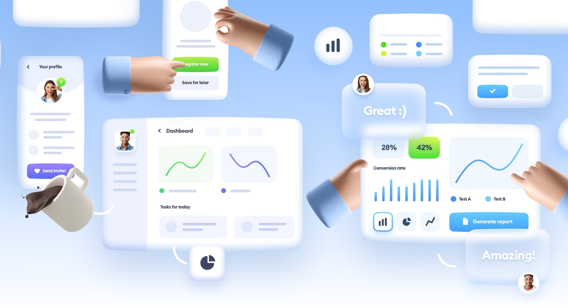
UI design and especially its more artistic, visual side is constantly evolving. While most current products repeat the same, trusted and well-known IA patterns, UI and the Value Proposition are the biggest differentiators the product can have.

Nobody is going to try and redesign a registration process that works well in thousands of other apps — we’ll tweak it, for sure, and hopefully with some research, but in the end, it will just be a copy of what the users already know.

All the morphisms

Both Neumorphism and Glassmorphism were the response to the design trend pendulum swinging back from forced minimalism. The momentum here was just as big as when it was swinging the other way around — from Skeuomorphism all the way to functional minimalism of Material Design and Modern design trends.

Before Modern/Material inspirations took hold, we had a brief time of super minimalism, that didn’t really catch on as much. Now after 2014 the pendulum is swinging back.

I’d say it takes about 7 years for a design trend to start reversing (give or take). The wooden backgrounds and stitched leather of the first iPhone (2007) gave way to minimal designs of iOS 7 (2013), and 2020 started bringing the real world, organic inspirations right back.

3D speech bubble

Sure, the last one is 3d only in the Desktop OS, but it is testing the waters for a return of 3D.

With both the usage of the frosted glass aesthetic (both Microsoft and Apple), skeuomorphic icons (Mac OS Big Sur update) people have generally reacted positively to the change.

We wanted the products we use to be “crafted” and have a soul, instead of being a utilitarian white-label from a design system (like Material Design).

In this exaggerated example, you can see that forced minimalism with just color differentiation is not enough for a product to be loved.

There’s nothing wrong with minimalism, even in its extremes, but it does make everything blend together into a mass of sameness. The design diversity has been diminishing long enough. The users want change. The Android examples above just look boring in the most utilitarian way. Some would argue that that’s ok, that boring is good. But our lives are not about just accomplishing tasks on some to-do lists. We want to be delighted.

The new, skeuomorphic drive of all of these new trends also comes from the craft culture having a revival. Instead of another minimal, uninspiring IKEA table, we crave uneven wood that has a texture and a life for our homes. Same goes for wallets, backpacks, clothing, and more. We want the things we use to be “hand-crafted” rather than mass-produced.

Both dining tables are just as functional, but most people would prefer to eat from the one on the right.

Hello, Aurora

The main problem with interfaces, however, is that they can’t really get too “funky”, or they’ll stop being functional. So how can we marry function with a form that looks beautiful and “organic”?

You know, just like the Northern Lights, which I think is a fitting name for this background type.

Aurora landscape

Photo by Mike Swigunski on Unsplash

If the interface itself (the buttons, the fields, the labels) can’t really change that much, it’s up to the backgrounds to differentiate. This is the basic principle behind all the “morphisms” and this new Aurora style.

Use the minimal design for everything that’s functional, and play around with ornamentation only. If done right, it also has the benefit of being accessible, because the actual interface — i.e. the things you use are accessible. So if someone can’t see some subtle background gradients, all they’d be missing is decoration.

As this neumorphic card shows, if all the *important* elements have proper hierarchy, the ability to see the card itself is not as important anymore.

This is also why I believe Neumorphism CAN be accessible if it’s just used for the cards and the cards have a proper hierarchy. Just don’t use it for text-fields, buttons and so on, and the contrast is going to be a non-issue.

Mixing “creative” backgrounds with minimal UI components is the best compromise between functionality and accessibility, but as with everything accessible it has to be done right.

Big Sur Wallpaper with Glassmorphism and a blurred version of the wallpaper next to it.

Glassmorphism certified

Before we get to the backgrounds, it’s worth mentioning that this style works particularly well with Glassmorphism, and Apple knew it by creating a less blurred version of irregular color patterns as their main Big Sur wallpaper.

Apple and Microsoft are leading the way in exploring these new trends, but they’re not the only ones anymore.

Stripe is a good example of a popular, mainstream company using both Aurora backgrounds AND glassmorphic elements, but keeping the important UI clear and readable.

How to start?

You can use your existing interface components with this style, as long as they have good enough contrasts, sizes and touch targets.

There are three main ways that you can use to create this effect.

Blurred shapes

The blurred shapes method is all about making irregular (preferably oval) shapes and then blurring them and mixing together to create an irregular gradient.

Aurora gradient

Multiple Gradient fills

This method is a mix of gradient fills (radial work best) with decreasing opacity towards the outer edge of the fill. Just drag the handles around to find the best mix. The more the transparent, outer-edge overlaps the more the colors will blend. You can also merge this method with the first one for something even more custom.

Just blur a photo

If you have a photo that already has a couple of soft color transitions, you can blur (with maximum blur value) the photo and have this organic effect with minimal effort.

I also made two videos on how to achieve this effect in Figma and Sketch. Here’s the first one:

Next steps

Then simply pick your preferred overlay style (glassmorphism, standard transparency or opaque) and you have yourself a nice looking Aurora style UI.

Make sure the important interface elements are all accessible, and have your UI stand out from the crowd, at least until everyone else blurs their backgrounds and the pendulum will start swinging back again.

We should still have a couple of years (of experimentation) before that happens.

🚨 Follow me on Twitter for lots of FREE Design tips 🚨 @michalmalewicz Learn design with me: 🎬 My UI Design Course / 📘 My UI Design Ebook


Liked the article? Share it!

twitter iconlinked in iconfacebook icon

Similar articles

Claymorphism in User Interfaces

Claymorphism in User Interfaces

Read article
ui trends for 2077

UI trends for 2077

Read article
Glassmorphism in User Interfaces 2021

Glassmorphism in user interfaces

Read article