James Clear has just released his first app — a habit tracker called Atoms.
While the app category was pretty obvious for a person best known for making habits stick, there is something else here that’s way more interesting.
The design hole
In 2014, to unify the way people design Android apps Google announced Material Design.
The idea was rooted in efficiency and consistency, but it quickly backfired.
What it led to was consistency alright, but also every single product looking exactly the same.

The utility is key in most products, but we as humans are visual creatures and we want “nice things”, not a copy of a copy of a copy of something we already have.
Efficiency
Businesses realised that using Material Design for everything strips them of their brand identity, but they also realised the convenience of a design system.
Especially the financial convenience of being able to build things both faster and cheaper.
Around 2017–2018 flat design took over the depth explorations of Material Design and thus all businesses went flat.
The only conceivable differences were the brand font, the accent colors, and how rounded the corners were.

This is now changing
Consumer apps are changing. I feel it has a lot to do with how bored regular people became with most products and how smaller, less constrained brands battle this issue.
Some big brands, like AirBNB, are trying to merge non-flat, delightful elements into their UIs as well.

You can read more about my thoughts on this here.
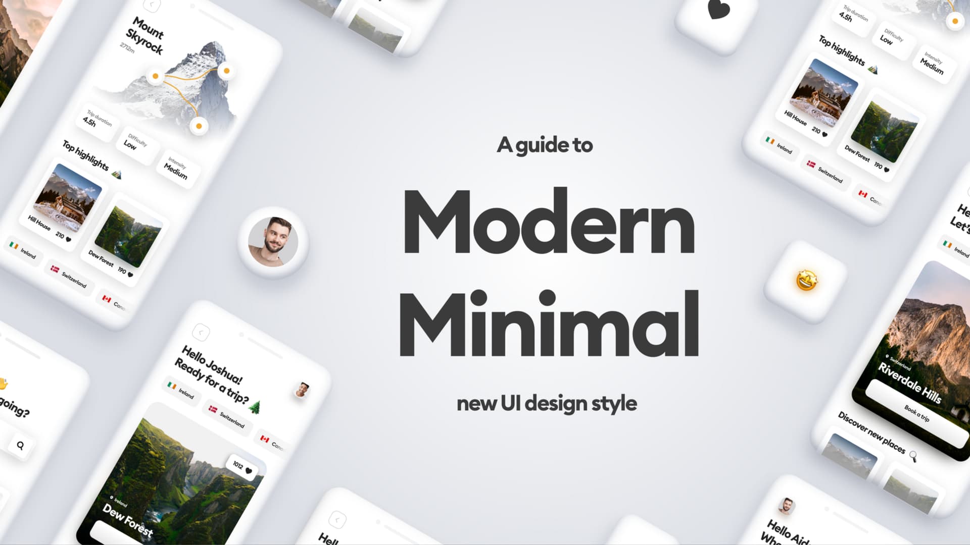
Atoms
Atoms, the app by James Clear uses three things that make it stand out from a typical flat app of the last few years.
Let’s quickly go through them.

The font
Most apps go sans-serif for everything and in most cases opt for the same handful of free typefaces. This app goes for an almost rounded serif for its titles and that completely sets the tone of the whole thing.
I mentioned this before in our levels article and video where in some B2C products it really can benefit the style to add a typeface that’s different.
Not everywhere, just for titles.

The shadow
The app also uses depth with heavily rounded objects, but what I want you to notice here especially is the soft, very heavily blurred shadow underneath the cards.
It connects with the app icon and makes the depth truly felt here.

The pattern
But by far my favorite part of this app is the background dotted pattern.
It’s barely visible and is masked by a vanishing gradient towards the sides, but it’s enough to make the interface feel different.
Little things like that are what sets products apart and once you combine functionality, market fit, AND a unique design approach you’ll likely gain very, very happy users.
There’s of course a lot more you can do in terms of visuals and sounds in an app.
But starting safe with a unique font, a little extra depth, and a pattern can already make your product stand out big time.
What do you think?