What's the need?
If you want to matter as a UI designer, you need strong design fundamentals. They are MORE important than your Figma skills because they allow you to work with any tool. UI Design fundamentals will also be essential when AI starts to get good at UI - without them, you won’t be able to evaluate AI outputs.
The Importance
This is important because the current tutorial hell with Figma creates huge FOMO and pushes designers to learn useless Figma animations, variables, or complex components. In many cases, the same people struggle with picking good fonts, having chaotic layouts and structure, no hierarchy, and horrible colors.
Here’s the list:
The logic
They say if you just do UI you don’t need to worry about logic. UX designers will do that. That’s BS and you know it! Without understanding how something works your UI won’t work.
Always make sure to completely grasp what you’re designing and WHY it works that way.
The hierarchy
Everything you design is a group. There are groups within groups in every interface. Hierarchy is there to guide the user through those groups so their brain isn’t overloaded with information.
It highlights what’s important at any given time. Want to learn more? Check out my Hierarchy strips method - it’s a perfect practice!
Layout (and grid)
Design is not abstract art. That means it needs to stick to a grid and follow it. That’s because our brain processes information by forging paths for our eyes to follow. If the path is logical and expected, then it’s easier to understand what we’re looking at.
Learn manual layout BEFORE you start using auto-layout. That’s the only way to truly KNOW how layout works and also see when auto-layout messes up.
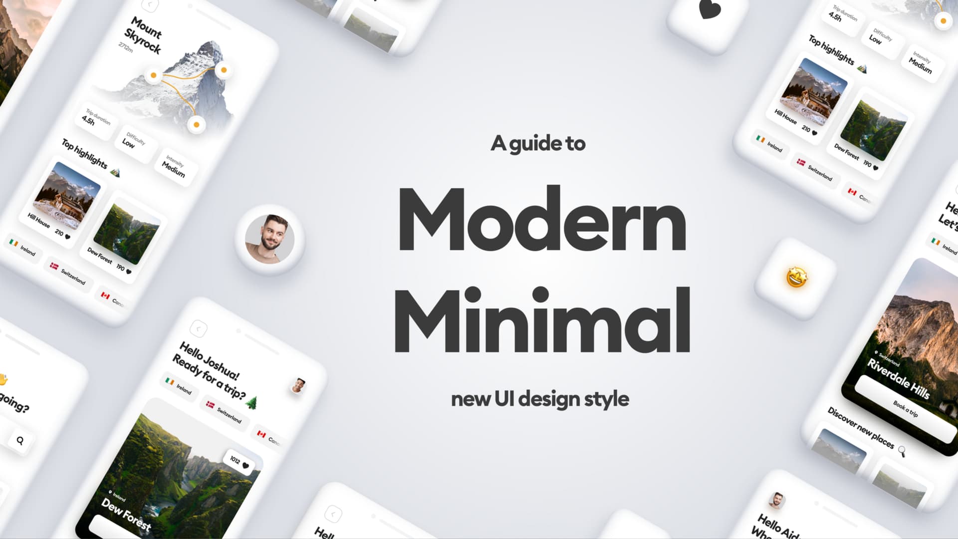
Typography
Typography is an industry of its own and as a designer, you’re not expected to be a master of type. But… You still need to understand the most fundamental truth - less is always more. For most juniors that means just ONE typeface per design (I have a safe list in my free ebook) and a maximum of 4 sizes or styles per page. Three is even better.
Colors
Colors are an important carrier of information, but there’s a problem. Many junior designers assume that having 16 million colors to choose from means we should use as many as we can. Start simple.
First year of design just do white backgrounds, dark grey text (2E2E2E), and ONE accent color with a maximum of 90% saturation. Once you get good at that, you can start adding more colors.
Are you practicing your fundamental skills? How hard is it to avoid the FOMO of fancy animations that nobody really needs?
Community Says
• uiuxsami: This is the only logical way to learn design... Master fundamentals before mastering any other thing. I learned Graphic Design before getting into Product Design & working in PS & AI helped me a lot in the manual alignment of objects by drawing squares between objects & balancing the design with my eyes sometimes. It plays an important role in building our strong base. Totally relying on tools even for the smallest things doesn't make any sense. Yes, master a tool but at least master the craft first so you don't look like a clown when your favorite tool gets replaced by some other. A tall building(successful designer) can't stand long without a strong base.
• Michal Malewicz: That is exactly right and I love the architectural analogy! Sadly most juniors fall victim to FOMO and try to recreate some figma animations that are pretty pointless and slow down their progress. It's like design has been dumbed down recently into literally drag & drop components without thinking and some flashy animations, nothing more.
• kithub_ng: For case studies templates. Should we put some visual mockups after some write-ups at different intervals to showcase our final product? (e.g after talking about the project overview, and problem statement then we put a mockup there), or we should leave all visuals till we reach the mockup section?
• Michal Malewicz: I always tell people to use what I call the "UI sandwich". Start at the very top with beautiful visuals, then write the case study with normal progress and finish off with more visuals at the bottom. That way you start and end with an emotional connection and a better impression - easier to remember you.
• amnaezija: I would like to know if you would encourage designers to step out of just screen designs and maybe one day a week go to PS or AI and try making some graphics, posters, posts, backgrounds whatever it may be. Design principles apply to all sorts of design I think it might be beneficial as design principles apply to other forms as well. What do you think?
• Michal Malewicz: Yes, especially if you plan to do the web as it uses way more decorative elements. Learning graphic design is a great skill to have in general (worth it on the job market) and it can also be a fun way to create things - so totally go for it!