After we went through all the very basics of UI design based on Designing User Interfaces free chapters it’s time to start moving those rectangles!
This is the exciting part!
When you’re just starting out, it’s good to do the “project init” screens from scratch. That will give you the practice and confidence you’ll need at this point. After a while, however, you can build your own starting templates to make the process even faster.
The first question should be:
What are you going to design?
If you’re just starting out and/or building your portfolio, it’s best to work on mobile apps first. That’s simply because due to the smaller canvas, it’s actually easier and faster to come up with something good. Making a website — and especially a landing page — requires more skill, due to the fact that the screen is larger, so you need to figure out a complex structure of content vs (often large) whitespace.
This can get tricky. So let’s start with apps, shall we?
Mobile app design
First thing to do, is deciding on the device your design will “live on”. Again, if you’re aiming to build out a UI portfolio first, it’s likely up to you, whether you’ll use an iPhone or and Android as reference.
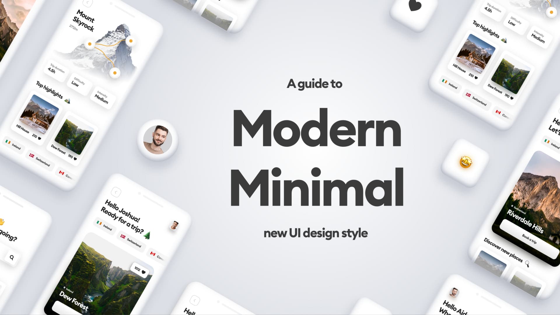
If you want a truly unique, engaging showcase of your work, you shouldn’t really use Material Design or iOS components all too much anyway. They make the project look generic, and in the fast-paced modern world people will simply scroll right through them without pause.
If you’re working on your portfolio, avoid using generic styles, and try to make it interesting. Design by Diana Malewicz
Android and iOS, although very different as platforms, are constantly moving closer to one another in terms of UI norms. There are some things that should likely still be platform-specific (like textfields in forms), but most of the design can be made platform-agnostic.
Pick your phone
So if you’re a daily Android user, design for Android. Try to pick a phone with a 16:9 or taller aspect ratio. If you’re in the Apple camp, go ahead and start with the regular iPhone Pro (not Max).
Start with the basics
For this exercise, I’m going to pick the iPhone. The first thing to do, is adding an Artboard by pressing A on the keyboard. Find the right device on the list and select it.
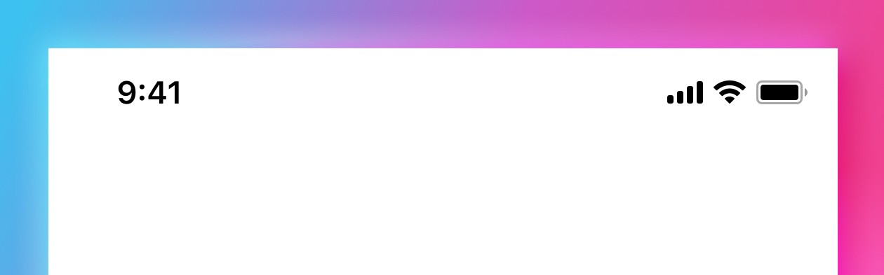
Status bar
The next thing is to add a status bar — you can do it from the build-in iOS library in Sketch. Figma also has a similar option.
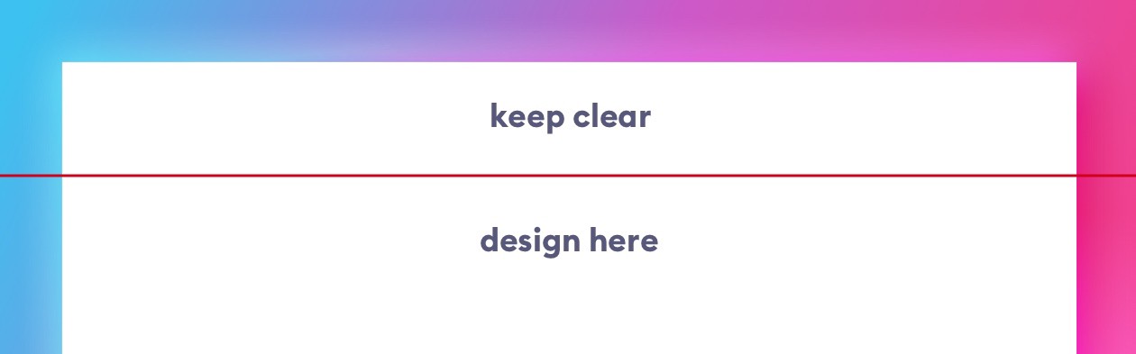
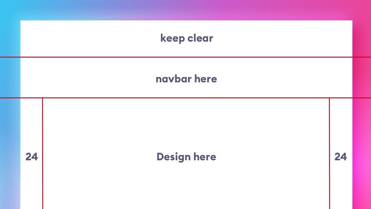
Then make a guide at the bottom of your status-bar and hide it. In showcase, portfolio designs they can be an unnecessary visual clutter, so they’re often not shown. But the guide is there so you know which line not to cross.
Navbar
Navbar, or Android’s Action bar, is the title bar just under the status bar. It can have a couple of different heights, and you can check the proper one in the guidelines. They do change every now and then, so here’s a different idea, that will help you get the right height instinctively.
Go to your phone and find an app that has the navbar and background separated. It just has to show the division. Most of the built-in Apple apps are a good pick here. I picked one of the Settings screens. Then take a screenshot and send it to your computer.
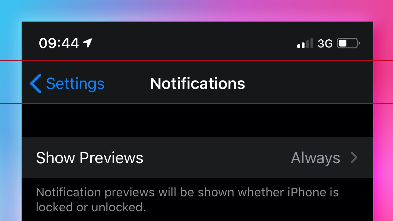
Drop that screenshot onto your artboard, set another guide where the navbar ends, and then remove it. Now you know how high it should be, based on a real, visual product. That will make it easier to remember and recall than remembering a number that changes every few years. It will also give you a lot more context of how things fit on the navbar, than simply entering some number into a box.

Margins
Grids can be scary. Coming up with the right one, and then sticking to it is something that doesn’t come easily. So instead of spending a lot of time on drawing grid-lines, make a soft-grid starting with setting the side-margins. These are “lines you do not cross”. They’re also something most designers don’t pay too much attention to.
Often, when I audit the designs you guys send me, the left and right margins are different, sometimes by just 1 or 2 points. That shifts your entire design optically to one side and has a negative impact on readability. That’s why I believe it’s a good place to start.
But what value?
The main two soft-grids right now are an 8-multiple and a 10-multiple. I prefer the former, but you can use the 10 if it’s easier to calculate. It means that 8 and 10 respectively, are usually the smallest margins your content can have. Then 16 and 20 are one step higher, with 24 and 30 being the next set of values.
Design needs to breathe, so for most mobile projects I set the margins at either 24 or 32 points. For dense projects with a lot of data in column views, it’s best to go with 24, and for simpler, less condensed screens use 32.
Then use that number and smaller numbers to set up the right hierarchy in your design.
What now?
If you have a rough idea of what you’re trying to design in mind, you can start by blockframing it. It’s a useful technique of working with “bounding-boxes” instead of content. Just make sure they’re all properly aligned.
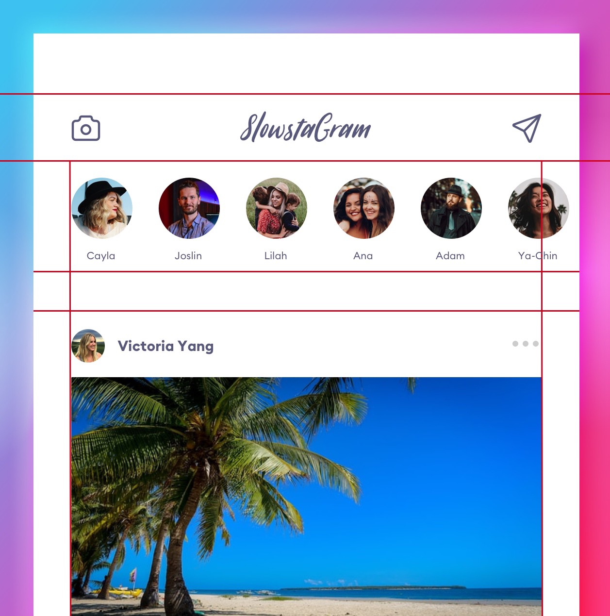
For example, if you wanted to recreate a popular photo-sharing app it would look something like this:
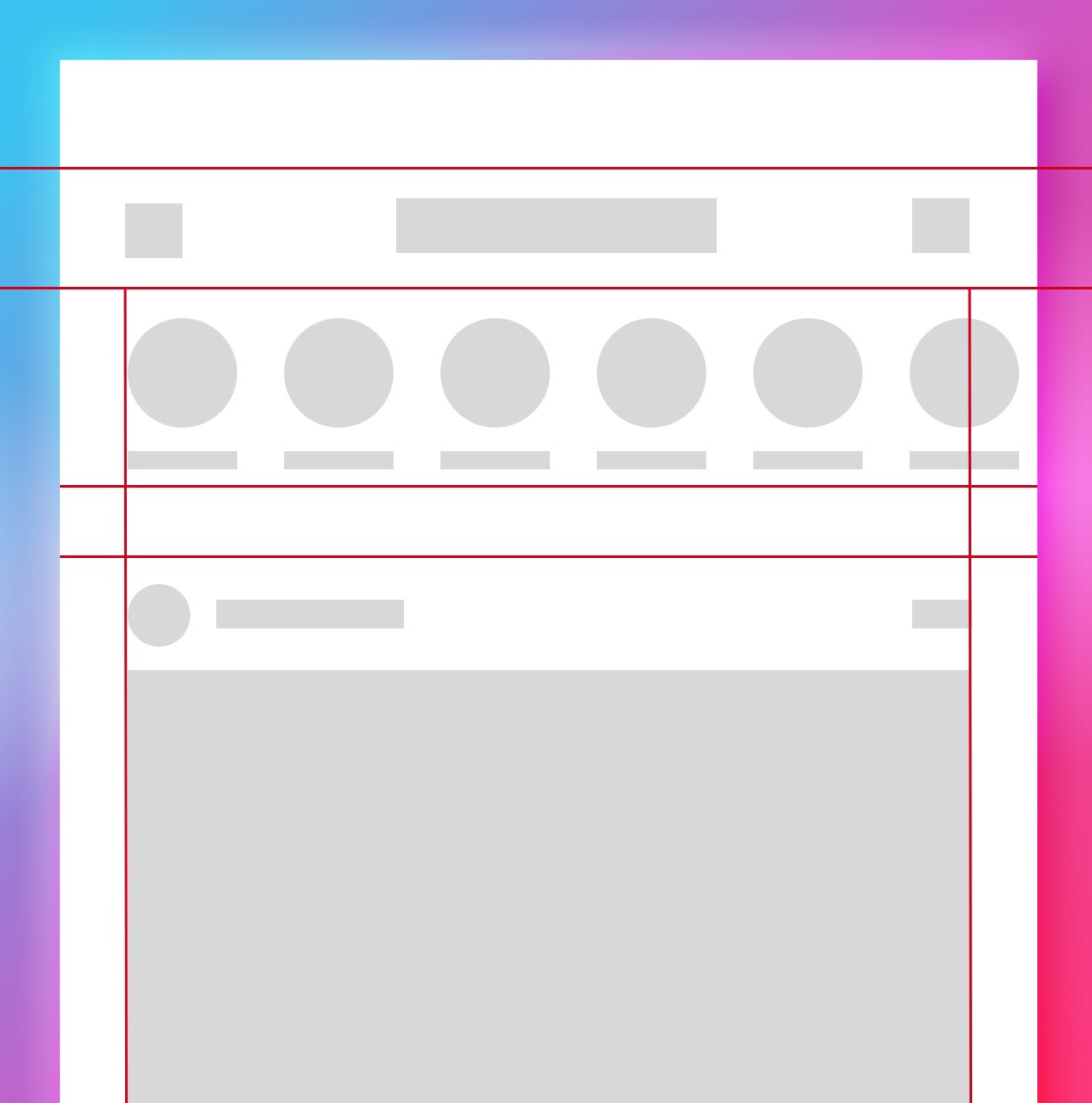
Blockframes are a good way to understanding the rigid rules behind a good design. It’s not all random artwork, as some may believe.
Each element’s height, width and position in relation to other objects should be thoughtfully calculated and planned. Don’t leave anything to chance.
Rule of Proximity is essential here. The closer the objects are, the more they are perceived as a group that belongs together. When designing a card layout, obviously the content inside the card will be closer together, than the cards themselves.
Once you have the blockframe complete, you can group it and lock it with reduced opacity (10% will be enough).
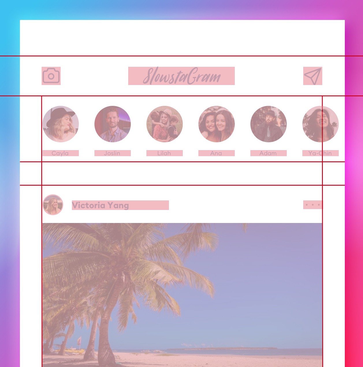
Then start adding the real content but fitting it within those strict guidelines. After you’re done with this part, simply hide the blockframe group and you’re all set to share it with the world.
After a while, build your “init-templates” that include a navbar/actionbar rectangle and pre-made grid-guides. But at the beginning of this journey it’s good to do them by hand to get the feel for how they work.
Good luck!
Liked the article? Share it!

