Whether you’re a designer or just a curious internet user, stick around and I can show you how design can guide psychology and convince you to purchase.
Websites and more specifically landing pages are the most important skills for young designers out there. Mobile apps are too expensive and not necessary for most businesses. That means most juniors will never be making an app in their first years anyway.
They will be making websites though. A lot of websites.
How do you make a website that works?

(this is what a typical website looks like)
It’s almost always wrong
Take a look at a typical website outline. It starts with some big text. That is the main slogan. The thing that’s there to get you interested.
Then it often follows up with smaller text that adds more context.
Finally — we have a Call to Action (CTA) button. This is where a business makes money. The more people click on that button the better for the company.
But what about the right side?

What most websites show there is some kind of visualisation. It’s either a product itself (and that’s good) or a pretty image. Websites selling a product should show a product there — almost always.
But, with services, or intangible things it gets trickier.

Conversion
We need to have a conversation about conversion. When working on a website, most designers focus heavily on how beautiful their website will look.
But most flashy redesigns end up with a drop in conversion. It may win some awwwards — sure. But fewer people will buy the product.
It may work for artistic sites — made for the sake of pure creativity.
Anywhere it matters financially though, visual fidelity is not the metric you should put front and center.
Yellow hoodie brand
Let’s create a fictional example brand. It sells yellow hoodies for designers. The premise is that you’ll design better with that hoodie. And charge your clients more. Awesome, right?
What most websites would do here is to show people wearing the hoodie. Make it flashy and dynamic! People jumping in the air? Sounds like a great idea!

Most designers or marketing agencies would say it’s great! It shows the dynamics! It shows youth! Energy! A perfect visual.
Keeping that in mind let’s bring back the main goal of the website:
The more people click on the CTA button the better for the business.
Combine
Let’s put our happy, jumping people in the context of the website.

Take a long look at the website above. What do you see? Once your eyes shift to the right side, they stay there in an infinite zig-zag line. All attention evaporates from the CTA button.

The dynamic image guides our eyes into a pattern that’s vertical. There is nothing on either end of it — just a black background.
Most people will completely miss the CTA button. It just disappears.
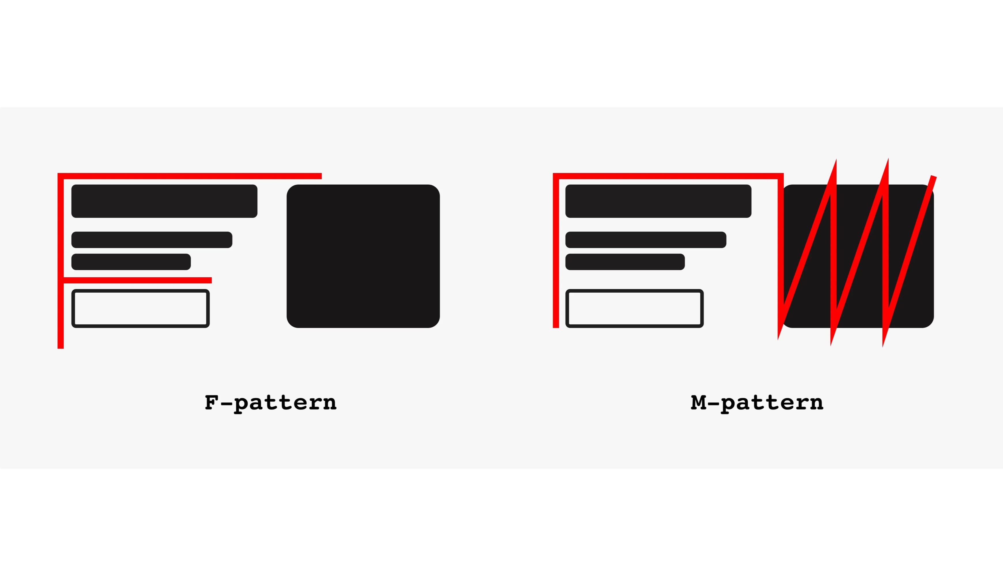
Our focus shifts from a familiar F-pattern to a semi-vertical M-pattern.
Ok. How to solve this?
Solution: The gaze principle
The gaze principle is just one of the potential solutions to our problem. When it comes to landing pages it’s one of your best options.
When a person is looking forward, almost all our attention focuses on their face and eyes. That’s our primal instinct to determine whether the person is a friend or foe. We subconsciously determine the level of danger.

But when a person looks away from us, to the side, it all changes.
Now we put the first evaluation on hold. There’s a new, more pressing matter to attend to.
What are they looking at?
Is it some kind of danger? If they averted their eyes from us, it means there’s something more important right there — on the side.
Our primal instincts strongly influence our visual psychology.
How to use it?
Let’s make a quick redesign using that principle. It changes our Yellow Hoodie page this way:

Now, this is much better. It shifts the focus away from the key visual and back to our text. Then we can continue in an F-pattern down towards the CTA image.
Let’s add an F-pattern to it and see how our gaze travels through the website.

Now we’re talking! Just this one change has added significantly more focus on the call to action part of the site. We still have a product, a model, a human touch. But now we also have attention.
With current attention spans of under 8 seconds, you can’t afford to waste users' attention on a flashy visual. Fewer sales will mean a less successful business. And designers are there to do the opposite.
Visual fidelity is not the metric you should put front and center
The best part about it is that we don’t have to resort to dark patterns and deceptive design to improve conversion. This basic psychology trick works, but it’s not “tricking” the user to do anything. It just guides what you’re looking at and in which order.
But it’s too simple!
We grew to expect more from landing pages. This single image on the right doesn’t “feel good”. It’s too simple.
What can we add to the design to maintain focus and make it more visually enticing?

Here’s what changed.
We started by adding a five-star rating and extra info on how people love the product. Social proof always helps in the header.
Then we redesigned the main slogan to focus more on the word Yellow. The sub-slogan is now a cheeky claim of “charging clients double” when wearing a yellow hoodie. That grabs attention (if true).
The main CTA is brighter and more visible — more yellow than orange.

Without taking too much attention we can also add some fabric-closeups and benefits like:
Organic cotton
You design better
And a customer satisfaction icon
Finally, the design has an extra, white arrow that guides the gaze directly towards the CTA button — just in case.

Tip of the iceberg
This is of course just a ten-minute redesign. The idea with landing pages is to start with the known principles and then refine them as you go.
The best way is to use a visual analytics tool to see how people use the website. Then adapt.
It’s a constant cycle of small updates to test whether some idea will work better. That’s what makes landing page design exciting. There’s plenty of space for creativity once we remember that functionality is the essence.
I made a full video about this lately, give it a watch.
Let’s hope more people focus on the WHY of landing pages and skip those fancy, animated headers. That’s wasting both your time and that of your clients/users.