close menu button
👋

Hello there!
Log into the academy:

In order to log into your academy profile, please provide your email and password

Forgot password?

Did you previously use

Don’t have an account yet?

The BAD UX Design challenge - Let's create horrible forms!

In this short community exercise, we explore the most ridiculous ways in which we can create a bad user experience while filling out an online form.

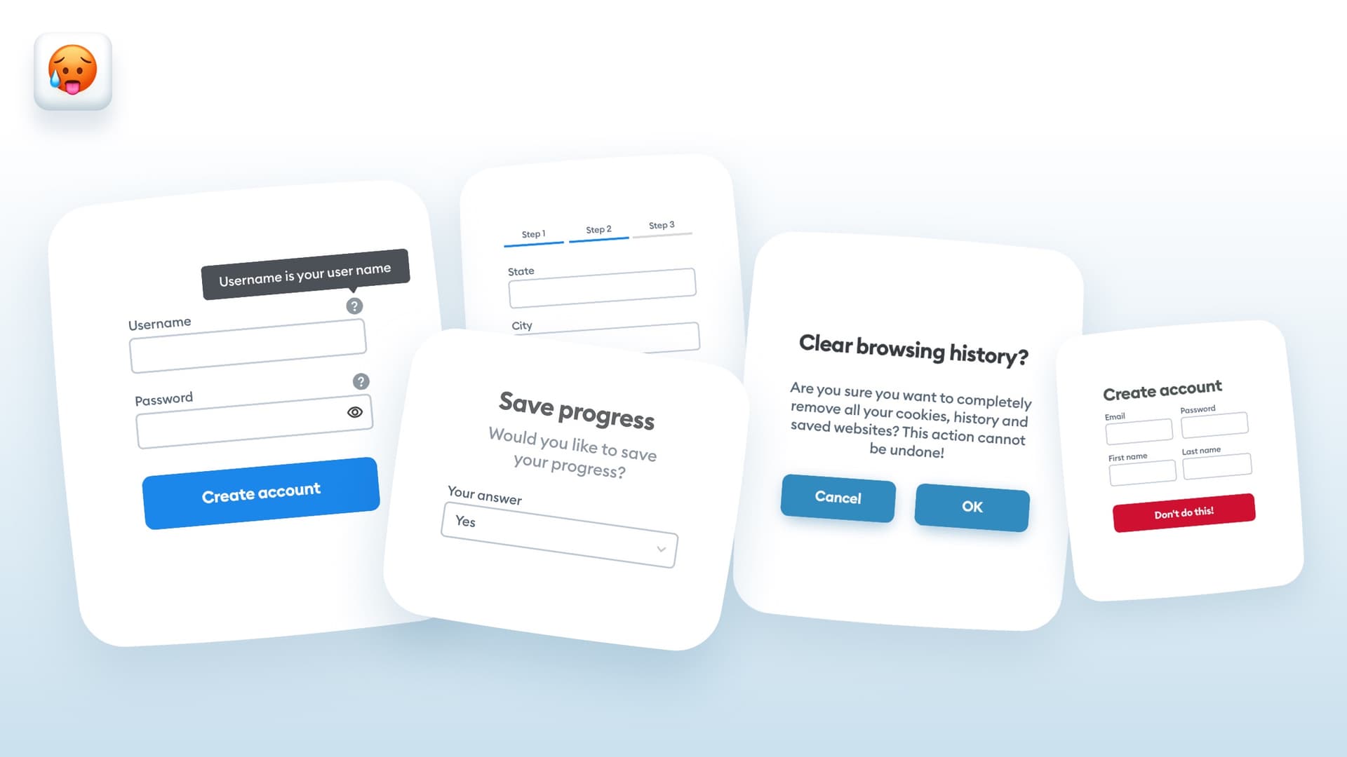
The goal of the exercise was to come up with some bad UX, while keeping the UI mostly good. We didn't want submissions with triangular buttons or weird blobs, because that would shift the focus away from the actual experience. The forms in the challenge are supposed to look "okay'ish" but be very difficult or outright impossible to complete.

Community driven

I am happy to say, that the community has delivered and we have some truly thoughtful submissions. Let's start it off by a nice form from Deni.

bad form UX design example

So much to talk about! The experience field is an attachment without any specification of what to attach, the button is just a non-underlined text link, and the salary brackets are checkboxes so you can select both of them at the same time. The phone number is split into separate fields (love it) and all the fields are required here! A final cherry on top of the cake is the super small toggle for the rules, that are not linked anywhere.

This truly nightmarish form can of course be fixed quite easily knowing all of the above, but let's leave it as it is and go to the next entry!

Bad UX design in form fields

The first thing to notice is the beautiful labels under the form fields concept. It makes reading the form a truly nightmarish experience.

Then the password confirmation is split within the form - of course it's best to keep the two fields like that close to one another.

The button says "Go" which is like the most vague possible action, go where? And don't forget we have a barely visible, completely non-accessible login button at the bottom.

And the last thing is the validation that doesn't hint on what's wrong and no indication which fields are even required.

Banner blindness on buttons and low accessibility in forms

The second form is a mobile app that starts with a submit button with a super-low contrast label. Most people will assume the button is a banner ad and struggle to figure out what to do here.

Centered form inputs are also a great way to make it difficult for people to scan it - so great approach! 👏

And of course the steps at the top don't really give any context of what to expect in the form.

One thing we didn't mention in our tips, and this anti-tip brings it to the foreground is to NOT center the text in the form fields.

How to align placeholders in text fields?

Here's why. You can see an example of a form with a couple of fields and all of them filled and centered.

Good flow of placeholders in text fields in a UX form

Scanning it down makes our eyes move diagonally, on an unpredictable path which makes it longer and more cumbersome.

If the text is left-aligned, we simply scan from top to bottom in a typical F-pattern.

Long mobile app form with bad ux patterns

This is a very good approach also because it has pretty high visual fidelity. Let's start off with something simple - all fields are marked as either optional or required. Of course it's best to just mark the optional, and if you can don't have the optional ones to make the process faster.

The validation says that some of the fields are incorrect, but you don't know which ones, which remind me of filling paper government forms and then getting them rejected with a "find what's wrong and fix it" attitude.

Let's not forget a very strong cancel button, that is actually more visible and prominent on this screen than the submit. And also the wording on the button could've been better.

A very good, very bad design 😅

Checkboxes for range selection in a form

Here let's start off with the name and username being in the same line, which is not optimal for most types of fields. 🤷‍♂️

A nice touch is the yearly income checkboxes, because as you know, you can select all the checkboxes you want, so you can specify all of those income ranges at the same time. A radio button would be the proper way of handling a question like that.

The zip code field is super long, so doesn't hint on the type of information to enter. Loving the little details in this form.

Here we also have an unhelpful validation - something is wrong speaks volumes on how many of the online forms are really designed.

Toggles above the button, especially the second one are a nice touch, and the refresh the page button made me laugh super hard - if you don't want to keep the info you entered, you can refresh the page and lose it all! Awesome!

good vs bad UX design in forms

The fifth project also included a better design next to it, but let's focus on the bad one only here.

The first thing I noticed is that the mandatory fields probably show only after clicking the button.

The form fields are also condensed to the point where the label is as close to the field it belongs to, as it is to the previous one - you can see on the Good UX version how much better that one change makes the form.

There are some fields that at the sign up stage are definitely not necessary, like the website and tell us more, and of course the country fields should probably be a dropdown.

The signup button is really small and is being crushed by the facebook login button.

The version on the right is of course a lot better!

form fields validation failure

Here we have the labels in red, which makes it look like the fields are all done in error. The expiration date, cvv and postcodes are all too long and the card number is not naturally divided into 4-number blocks like it should be.

Also, the button saying next is something we've mentioned in our tips many, many times. The Good UX version is a lot better!

An impossible to use dropdown selector in a form

This seat selector for airplanes is also pretty amazing. Normally it's done by showing an airplane layout and clicking on a seat, but of course a dropdown can be an obvious bad ux choice. Imagine having to seat at 50Z and scrolling all the way down!

very hard to use form validation captcha

This is a very nice, high fidelity design and the author already pointed out the mistakes, I especially like the phone number increase by 1 button - it would take forever to enter a number there, or a random name generator - after a while it may actually be your real name too.

The captcha with squares is something that I could probably solve, but not many people could and that makes it super hilarious.

Red button for the final submit will make you think twice and maybe go back and randomize your name again :)

vague button label in a form

And the last entry has an info tooltip in the password field and a click-me button which maybe is super friendly, especially with the hug emoji, but not very user friendly. 🤗

Conclusion

And last but not least, here's my quick example of just a tiny piece of a form 🤣

bad ux phone number

This will take a while if you have a number with a lot of nines 😎

This exercise was a lot of fun and we will be doing more of them in the future. I believe doing things purposefully wrong is a great way to actually better understand WHY these patterns are wrong and how they can be done better.


Liked the article? Share it!

twitter iconlinked in iconfacebook icon

Similar articles

Will work from home destroy work?

Will work from home destroy work?

Read article
Tesla Bot and Creative Work

Can the Tesla Bot replace a designer?

Read article