I experiment with myself a lot. The crazy diets, insane exercise regimens, mental strength practice, daily breathing — you name it. Many of these activities correlate directly with my mood.
What is mood?
It’s impossible to precisely measure the state of my mind on a given day. By impossible to measure I mean it’s only based on how I feel about that state. It’s never a definite 5/10 or 9/10 — ever.
So why would you want to measure something so imprecise?
Trends
That’s because, same as with sleep tracking, the individual values don’t matter, but assuming I roughly pick the right value each day, the trends and correlations are where it gets interesting.

Coffee?
A recent example is me quitting coffee (and all forms of caffeine) after being seriously reliant on it.
I felt terrible. Splitting headaches, feeling on the edge every day, irritable, annoying.
Now, I’ve done this a couple of times before, but I never tracked my mood until this last time. So I had no idea how long — for me — the withdrawal symptoms from caffeine lasted.
Now I know. Exactly 6 excruciating days.
Individual values don’t matter. The trends and correlations is where it gets interesting.
I used a pen and paper method of tracking my mood, by simply assinging a number to each day. But then, hiking a northern Norway mountain I had an idea and decided to quickly sketch it out.

Current solutions
Pen and paper
Writing out a number manually is the cheapest and easiest solution. But it’s also pretty boring and very easy to forget about.

Mobile apps
Apps can notify you to fill in for the day, but after testing a couple I still felt like filling a spreadsheet. Booooring!
Moodbot exploration
The idea of a single-use, minimalist device that’s easy to use has stuck in my head and when I came home from northern explorations, I decided to push it further.

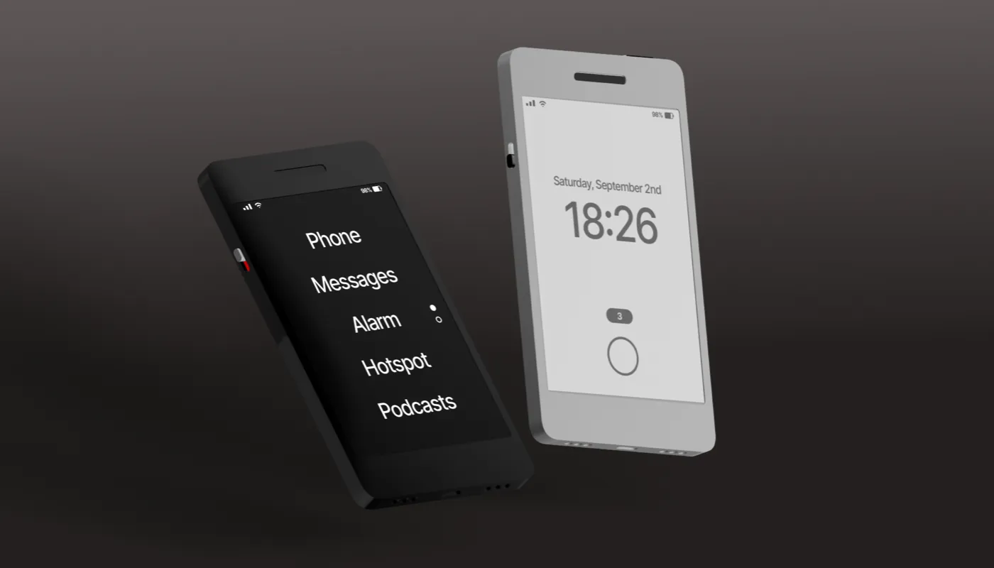
As always I started with sketching out the device. Right from the start I wanted it to be personified — meaning a companion, not just a device.
I went with the 8-bit retro aesthetic and then remembered the first Walkmans. That led to this approach.

Like with walkmans I wanted to add the buttons to the front of the device. But after exploring a quick, cardboard mockup I realised, that unless the device was VERY heavy, it would topple over on press.
Stability issues are definitely not the concept I was going for here.
Redesign 1
I went with the buttons being on the top of the device. But that led to a problem — how will the user know which button is which? Obviously, after some time it won’t matter, but the initial week is crucial for the best experience.
And then it hit me — I can color code the top parts of the buttons only!

The buttons would also have a minimalist emoticon label so they’re clear to everyone.
Then I realised, that Moodbot has three letters O, just like we have three buttons on the device. That led to a pretty quick and natural branding of the device. The handwritten text makes it more “human” and personal, and the dashed O’s connect with the functionality.

That handled the main functionalities, but I also wanted to make sure the device didn’t slide on the table, so I added a rubberized bottom pad to it and outlined the back with a charging port. Obviously it’s a USB-C, for convenience.

I also added a mute switch. Right from the start I wanted the device to respond both visually and through sound to button presses.
The 8-bit face would smile in a little animation, accompanied by a positive reinforcement sound coming from a smiley face-shaped speaker under the display.

And that is all great and positive, but what if your family is still sleeping and you woke up in a great mood? They’d have a pretty bad one from you pressing that button!
So I decided to also add a mute-switch at the back of the device.
The outcomes
While this particular case study is not really focusing on every part of the process, I had to think about how the device would save the data and present it.
The logical choice here was to go with a CSV output, that can easily be imported into any other software and parsed.
It would result in a graph that looks a little like this.

3d modelling
After the initial planning phase, I jumped into Spline and decided to model my device. The first idea was just to stick with one option — a fully white, matte-plastic model.
Something I could easily 3D-print myself. It also looked clean and would fit any kind of interior design.

But then, playing around with materials I realised that a more premium-looking, aluminium model could also be great. Sure — when eventually building it I will 3D-print the white-plastic model, but there already is some interest from people — maybe for V2 we could go METAL!
The metal model

The dark model looked very nice paired with matte plastic buttons and it blended well with a mostly black, 8-bit display.
The slightly indented speaker grill holes also look better when being a little more reflective.
Moodbot 1.0
The first stage of my moodbot exploration is now over. I teased the device online in some places to gauge interest. There definitely is a market for a small run of such devices so I decided to actually build a proof of concept.
That will come in another case study, later this year, so make sure to follow me to stay in the loop.

Once the prototype is done, I can then focus on working on the UI around it — the web-based onboarding, the data visualisation and export and more.
For now, the first step is to 3D print the case, put a Raspberry Pi inside, program some Python scripts and have functional buttons and a display.
If this works, we’re already halfway there!
This exploratory case study/article is a part of the Don’t be boring Course.