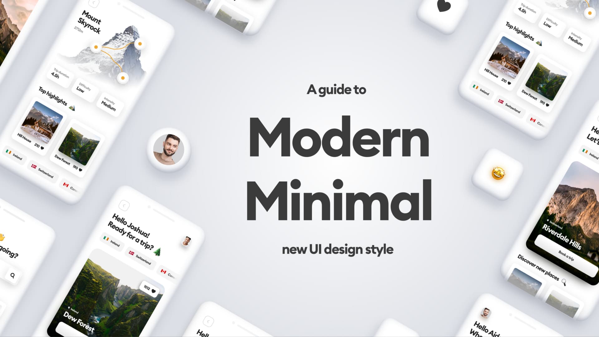
A minimalist phone?
I’ve been a Light Phone 2 user since the beginning. I noticed that smartphone addiction and constant notifications were making me anxious.
The Light Phone 2 was a great way to ditch all that noise and focus on the life outside of the screens.

I used it a lot. On and off it was my main phone for the better part of the last three years. I tried other minimalist phones too, but LP2 always convinced me to go back to it in the end.
I used it so much that the screen cracked a little, but it’s otherwise quite durable.

Minimalist Phone, Minimalist Interface
I love minimalist design. From the era of Dieter Rams, all the way through Apple and even Windows Phone — I always embraced clean, simple products.
The UI of the Light Phone is mostly text-based, with clean and clear typography, pretty big spacing and let’s say quite original flows.
The problems
After using the phone for so long I noticed some things that could be improved and make that experience even better for me. Let’s dive in.

Charging
Light Phone 2 uses Mini-USB because of its compact size. Fitting a USB-C port in there would’ve been a big compromise on the current design and cost.
But we’re living in a more USB-C world now than ever. Even the iPhone is supposedly switching to that port.
I’d say a Light Phone 3 would really need USB-C as standard.
Because USB-C is reversible, I’d also suggest switching the position of the port to the center of the device. Right now it’s on the left side, and without that reverse plug it’s a pain to plug in without looking.

Size
The size of the phone is extremely small right now. It’s due to it literally being “light” and portable but has some serious drawbacks.
The size means the battery here is really small — currently lasting for a little under two days with light (ha!) use. A bigger size and a bigger battery would be great!
It also means comfort of using the interface. Everything is very small, especially back arrows, top navigation, icons and the keyboard. The keyboard actually rotates the display around for it to fit, but then you’re left with very little space to actually type in.
Everything is very small, especially back arrows, top navigation, icons and the keyboard.
A voice to text option, which is already in there, kind of solves that, but sometimes we really want to just comfortably write.

Mute Switch
This is a minor inconvenience. But it does come in handy to be able to change the mode without looking.
Mudita pure did it great with a three-way switch between the three main modes:
Normal
Silent mode
Airplane mode
So let’s take that great idea and incorporate it in.

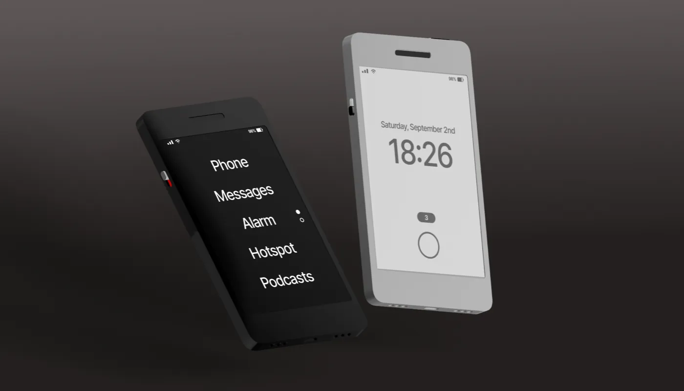
Hardware
Based on the three main issues I identified, I started to mock up the possible changes for the device. The first sketch also helped me decide on the size.

I decided to integrate the USB-C, make it the size of the iPhone 4, but without the home button, and keep all the good hardware features intact.
The next step was getting into some 3d modelling software (in my case Spline) and creating the mockups.

The mute switch is integrated on the left side at the exact same height as the volume UP button that’s on the other side of the device.
It uses a 3.5" display, and is the general size of the iPhone 4.
Small phones may not be a big thing anymore, but I believe that form factor was perfect — especially when you don’t consider doomscrolling content on the device.
It just felt great in the hand and was easily accessible.
The bottom houses a USB-C plug, a speaker for stereo sound and a microphone.

The biggest change is a much sharper, 2x resolution display. The e-ink technology has grown significantly in the last few years with most e-readers already having 2x or 3x pixel densities.
I kept the headphone jack where it was, same with the power button.
The iconic Light Phone 2 menus are still there, but I decided to slightly invert the colors. The black phone has white buttons, while the light one has black ones.
It gives it a little more character.
A small natural touch is a gold-plated power button with a fingerprint sensor inside to unlock the phone securely.

Software
The Light OS was created especially for a small display. That enforced some limitations that we’re no longer bound by. With a larger display I can start thinking more in terms of a regular phone interface at times — one that most people are already used to.
So I decided to go ahead and look at just one flow from the device and redesign it.

Status bar
With more screen real-estate we can now have a proper status bar that’s visible on all screens, not just the main ones.

Navigation
We now have more space for a navigation pattern that people are used to from both iOS and Android. I kept the height of the navbar at 44 points, so the touch targets are now nice and juicy.
It also allows for more icons on the right side of the navbar.
Keyboard
Keyboard can now exist both vertically and horizontally, adjusting to the size of the iPhone 4 keyboard, which was big enough to comfortably type on.

Smaller changes
I did some smaller flow changes too, like a contact information screen with actions on it and a different writing experience with a clear, text based “send” button.

The dream phone?
The Light Phone 2 was already a pretty great device. Adding some of these changes and as a result tweaking the UI could make it the ultimate minimalist phones.It already has all the software features I need, so the main difference is improved comfort and battery life.
I really liked looking into it, because I love the current product, so this experiment was super fun to do.
I hope you liked it too.