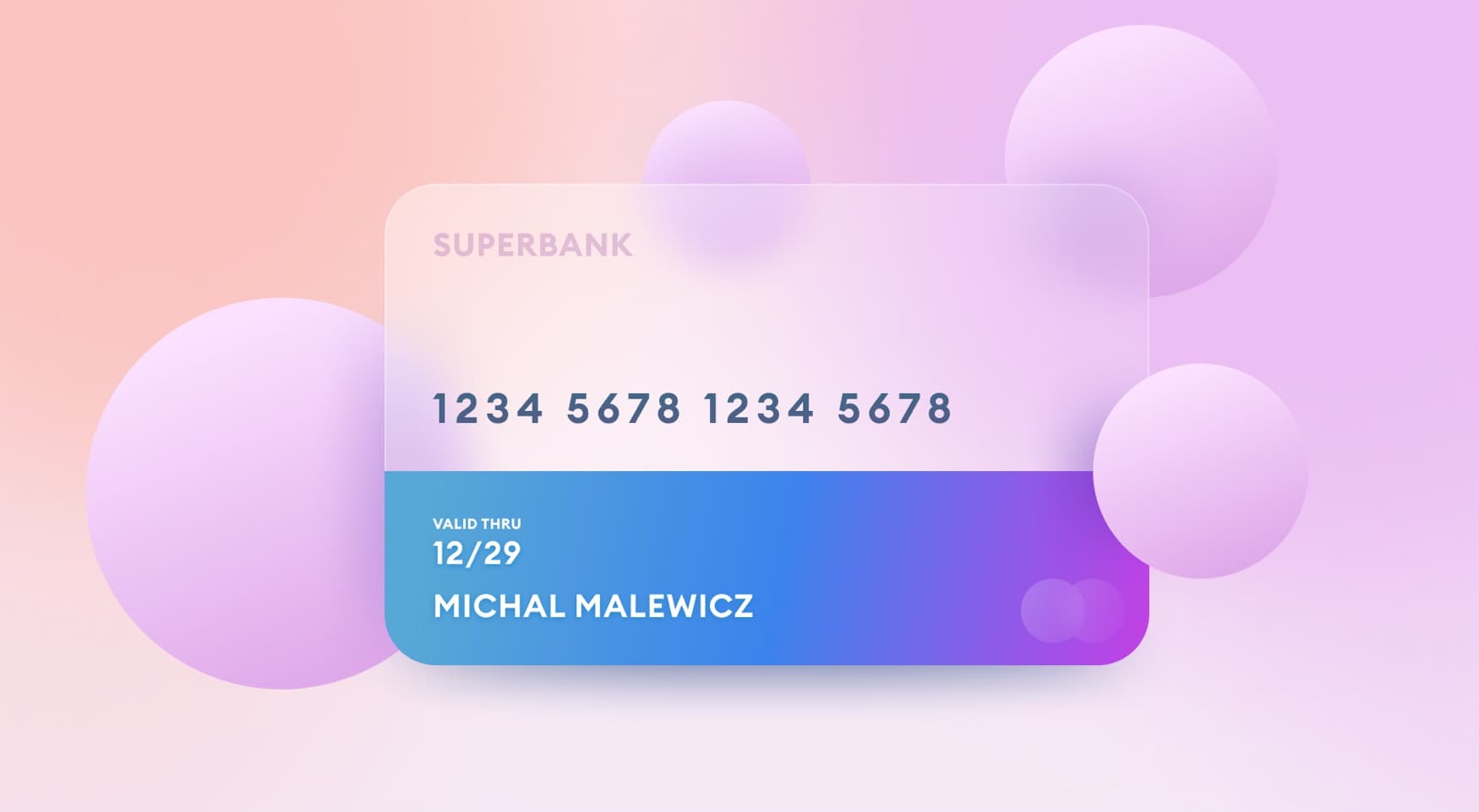
Exploring new design frontiers can be quite fun if you take a curious and inquisitive approach to it. Many designers trying spatial design follow simple glassmorphism card tutorials, but that doesn’t really get your creative juices flowing — it’s repetitive.
Start your exploration by defining a full plan of action.

Setting up
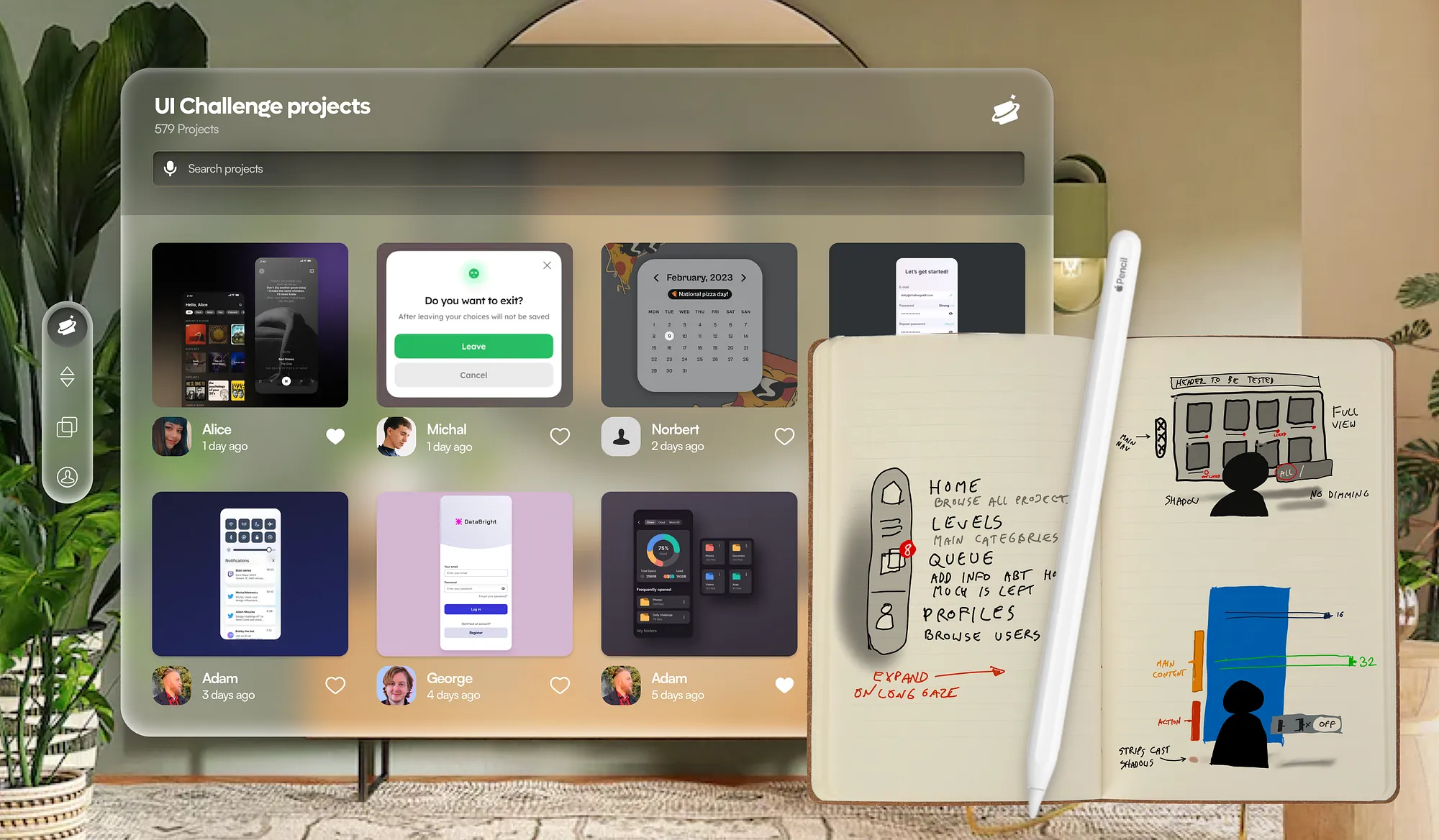
My idea was to design an immersive UI design grading experience for our existing web platform. At the moment it’s planned as a simple set of five buttons — and quite possibly it is a better idea than to move it to 3d.
Acknowledging it right from the start adds authenticity to the exploration — we aren’t doing this because we are 100% sure it will be a better AR experience. We are doing it with a plan to make it into one, but even if in the end it fails, the exploration — the path — is still worth it.

Step 1 — immersion in the case study
I wanted to avoid this feeling like a dribbble shot and instead decided to make it in the context of my own space.
No matter if your room is beautiful or not as much, grounding the entire design process in that space makes it more authentic to YOUR experience.
That authenticity makes the case study a lot more interesting because it’s not being prettified on purpose.
So I took a photo of my living room.

Being authentic doesn’t of course mean that we can’t fix a couple of things.
See the detached projector wires on the wall? Yeah, I’ve been meaning to fix that for a while, but I can’t find the time with doing all those case studies and stuff.
I took the photo to Pixelmator (you can use Photoshop if you want) and cleaned it up with generative fill.

Step 2 — Planning
Now we jump into Sketch or Figma, add a glassmorphic card on top and call it a day!
Just kidding!
I started with a Sketch, keeping in mind that most of the experience should remain flat. Adding too many layers on the z-axis adds to the cognitive load of users and won’t make the experience better.
So I started with a single window to view the projects.

The first principle of designing spatial interfaces is familiarity. No need to reinvent the wheel — let’s start with a simple grid of screens submitted by our community members.

Then I sketched out the main vertical set of tabs that will be used as secondary navigation. Main navigation in this project is actually contextual — happening from and within the main window.

Then I imagined that when you enter a category of designs you get a fully immersive, surround experience.
The room dims around you.
You swipe a carousel with a 180° field of view in front of you, but the main focus is always on the most center design.

To assign a quality level (score) to a design you focus on it and then swipe it up (to a higher level) or down (to a lower plane)
Looking at it from the side it’d look a little bit like this:

Most of the interface would be completely 2d, but I imagined this interaction of moving designs onto different levels as something that could work well in 3d space
Main spatial interaction
Having my main “spatial” a-ha moment I decided to add a little bit more detail to the card views.

The card can be rotated around to reveal a low-fidelity wireframe that was used as a base for the UI design.
It’s a switch between low fidelity and high-fidelity.

I also added an extra set of controls to turn on hierarchy strips and spacing guidelines that were used in this design.
This functionality doesn’t currently exist, but we have it planned for the future version of the platform anyway, so why not jump ahead and show it in mixed reality?
You can turn both on, or turn them on/off individually to see how the UI was structured in more detail.
Mid-Fidelity
Knowing the plan I went ahead and sketched the main screens in mid-fidelity to see how they all come together.

The main screen was fairly simple. A grid of designs, author’s name, and photo, an ability to like it.
I also added a filter box to show only liked or all projects.

The browsing experience turned out quite nicely with 3d transformed side-cards. They’re also dimmed so there’s more focus on the card in the middle — the one the user is looking at.

When fully focused on the card it comes closer to the user and reveals the extra functionalities.
Here you can also enable hierarchy strips on the design.
Material Exploration
The next step was to explore some materials. Sure — Apple has their own suggestions here and already published their UI kits. But I wanted to try something more custom, just to see where it leads me.

I pasted my glassmorphic panels onto my room photo and instantly realised it was not going to be that simple. Vision OS adjusts the windows in real-time based on the lighting conditions and general ambience.
So I had to modify it to match my space.

It’s definitely clearer and easier to read after those tweaks. The next step was all about fine-tuning the details.

Because my room has windows on the left, I modified the gradients and outlines to be lit from that direction.
It’s a trick that we consciously don’t see, but our brain does notice and process all that information.
Little details like that are what add to the immersion.
Experiments

But I wasn’t fully satisfied with that general direction. That led me to some additional material exploration and create two kinds of more rounded glass panels as seen in the example above.

That led to a pretty interesting user interface. It did have some clarity problems for the selected icons, however.
And yes, for these explorations I reverted to a more colorful, vibrant, and busy background just to be sure these new materials work well in that scenario.
Using a paradigm of physical buttons I imagined how it’d look if it was simply pressed into the glass.

I frankly loved that look! It’s distinct, makes sense in the real space, and is a very clear indicator of selection.
Why stop there?
What if I used that more rounded style only on the small menus and overlays and kept the main window simpler?

Main window looks a lot cleaner when darker and it allows it to easier shift focus from it to the navigation panels and back.
These concepts were something to be tested, but I found them interesting enough to stick with this version.
Mapping interactions

I imagined the swiping and flicking interaction as happening in 3d space as well. The card wouldn’t simply move up, but instead, it would move on a circular path in the 3d space.

Right about that point I realized that having two separate 3d planes of movement (both around and up-down) was a bit too much.
I modified the main interaction to simply be viewed horizontally in space.
The 3d-wrap around experience sounded nice on paper, but looking at it rendered in 3d it appears confusing and also a little overwhelming.
So I revised my initial concept and kept only one interaction (the swipe up/down) as happening in the full three dimensions.
That’s more than enough for an immersive experience.

Thoughts?
I found a spatial design very interesting. As one of the principles, Apple shared states: the experience needs to be authentic to the platform.
When I first heard that I remembered when Steve Jobs introduced the iPad.
He said that that new category of device has to be specifically better at some tasks than computers and phones. Otherwise, it has no reason for existing.
So the first question you should ask yourself is — is that experience going to be specifically better in mixed reality? Or just using a phone or tablet app would still be a better option.
I thought about it long and hard.
I believe that to truly analyze a set of designs like that the user require full focus. Minimizing distractions by room-dimming and making the design huge in the real space helps with focusing on all the little details.
There is of course more to explore and potentially code the experience to see how it works on the actual device.

But before that happens, it’s really good to get a little creative. By focusing on the entire experience from start to finish, I was able to better grasp some of the shortcomings of spatial interactions, our own cognitive limits, and more.
That gives a lot more context than quickly mocking up a couple of glass morphic cards and sharing it to Dribbble.
What do you think?
I made a video on my process that goes a little more in-depth. Enjoy!