Welcome Stranger, I hope you have an amazing day! Grab something to drink or eat and let us dive in.
It seems to me that the old — What’s Better? “A” or “B” design posts are getting out of their graves, I have no idea why, but it lets me think about WHY.
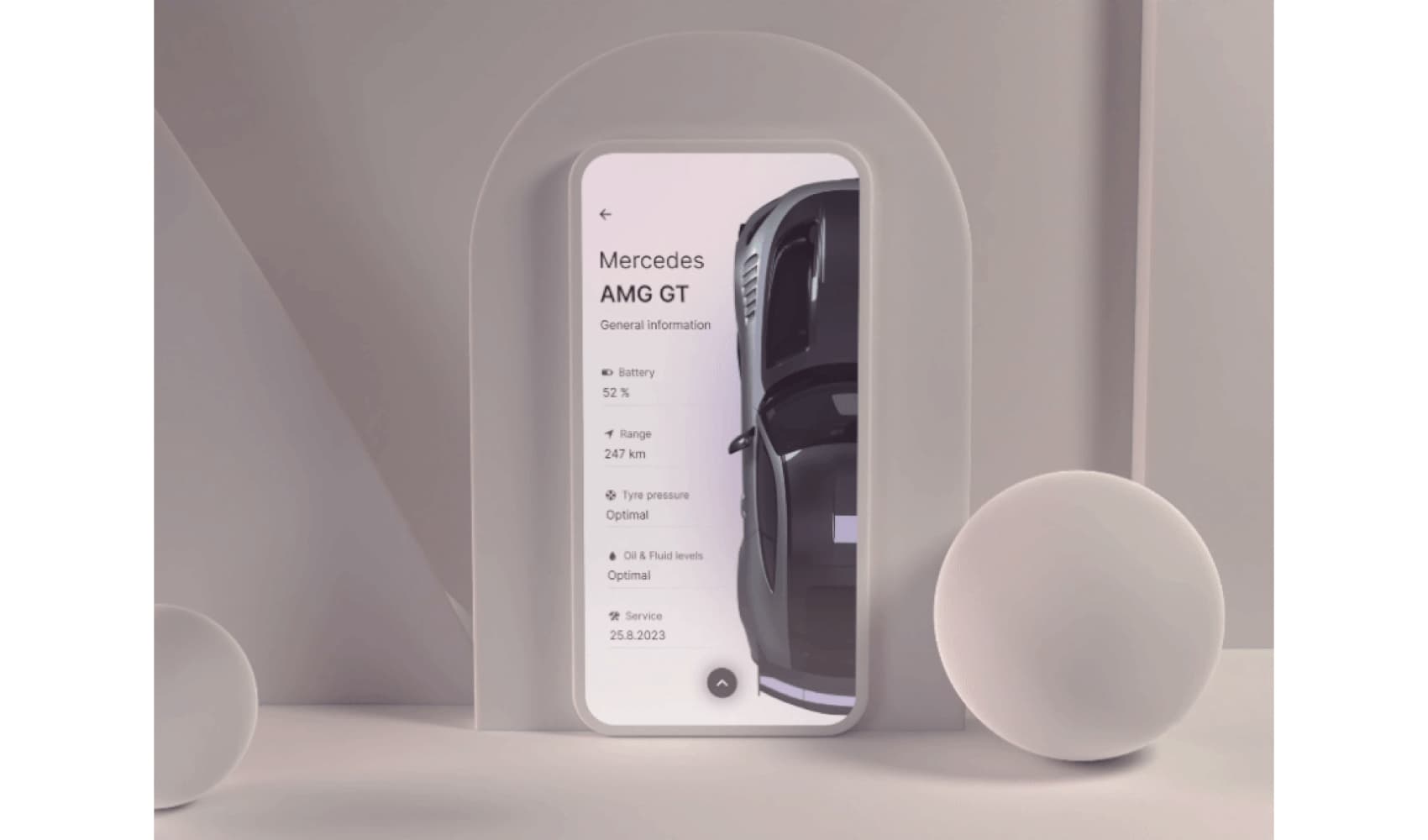
“A” or “B”
/f/117250/1400x1051/945ee885db/looks-1.webp)
Around 2 months ago I decided to scratch all the work from Behance and start new ones, not outdated design works and I got to a point where I didn’t want to create a personal project without any thoughts or meaning behind the decisions.
Hence these two screens, which one is better? “Left” or “Right”?
The answer is, how the F are you supposed to know?
You have no context as someone who’s reading this, you see just the visual. Most people would look at the screens, see AI, and say HEY! LEFT ONE.
But neither of them is better than the other, and I explained that in the case study I wrote. They both have a purpose in this world, while the left one is fancy and has my beloved AI Bobby the Bot, it would be way more expensive to implement this solution into the real app.
So with that in mind, I created a more budget-friendly version. No AI, still nice and clean design with custom icons on the bottom. It does the same thing.
The only difference is that you have to click a few more times to get to a popover or a hint in the app.
Fullscreen modal or a classic?
/f/117250/1400x1050/fc16b064bb/looks-2.webp)
What looks better? “Left” or “Right”? When I was designing these screens, I had the fullscreen modal/bottom sheet as my favorite, it just looks better. Right?!
The thing is, even though it looks better, the usability of it is poor in this case, and it’s safer to go with the left option.
What if the user scrolls down and swipes the whole modal down? How tedious will it be for someone who’s not experienced to swipe down and see more info?
The modal/sheet is meant to support quick interactions, and it shouldn’t be used for displaying complex or lengthy content.
While one may argue both could be used since we can assume most users won’t scroll in this case and just hit the button.
BUT
/f/117250/1400x1050/851507de65/looks-3.webp)
I wanted more content on that page, I wanted the user to scroll down and see similar roasts, the taste of the coffee, and the process, since these are all important to us coffee lovers.
So I simply scratched the modal/sheet view. Yes, it could be tested on users, yes, the results might be different than my assumption, but what’s important here is the thinking process. It’s not just a pretty UI.
That most of these “A” or “B” Twitter posts are
That’s it for today!

Thanks for reading my rant. I hope you enjoyed this episode. You can see the full case study here if you’re interested in the more visual side rather than the thinking process.
As always, I wish you all a beautiful day, and see you at the next one!