Welcome stranger, to the TL; DR #1
This week we’re going to talk about Useless design.
4 days ago we had a discussion in one of the Slack groups I’m in when this topic came up, and I thought that this is a great one for my second article. You may ask, what’s useless design, Adam? Is there such a thing?
Useless design is in my opinion a trend these days, so buckle up. It’s a long one today!
What is useless design and why should you avoid it?
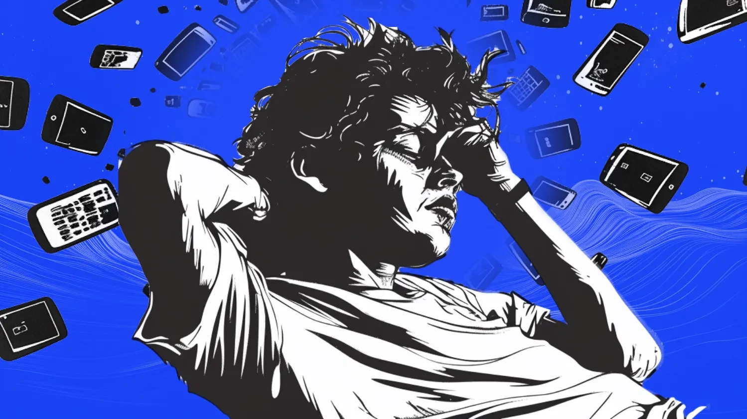
You know those IG channels or YouTube shorts or quick-a$$ 15sec videos titled “FANCY LOOKING ANIMATION IN 10SECONDS IN FIGMA!” or “BECOME A UI GOD IN 30SECONDS WITH THESE 3 SECRETS!”
I think we all know those. That’s what I call a useless design. Why useless you may ask, well here’s the thing. It won’t teach you anything! The whole purpose of it is to get likes and views and that’s it.
Everyone loves fancy UI, and cool animations, as long as it moves, and even if it’s literally a piece of sh*t, it’s entertaining.
So let’s imagine you’re a junior UI/UX designer. You don’t have a portfolio or much experience with real apps. So you go to sites like Dribbble or Instagram and save all those “AWESOME” looking shots. Then you copy it, (If you do copy, you should read my previous article) slap it on Dribbble, and wait for the likes and recruiters to come to you.
Right? Not really… you’re not learning anything by doing these, but hey, they look awesome and move!
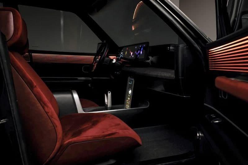
So this week, I made this

Fancy looking shot, but pretty useless. Sure it looks good, but that’s all. So let’s make something useful out of this, so it doesn’t look just “COOL” and you might actually learn a thing or two doing it.
Treat it like a real app

The thing is, without a proper process the app might look good, but there is a big chance that it’s not usable.
Do your research on the topic, create mood boards, draw wireframes, get into the user's boots, and dig deep into it.
What should be on this screen? Is it helping the user? Does this make sense? What if the user drives long distances, should there be an alert?
This way you’re thinking about the user, the flow, and the process. It’s not a useless fancy-looking design anymore, we’re building something here!

Now slow down a little, I want you to have fun doing this. That is really important. Enjoy the process, and test the initial screens. Share it on socials, design groups ask them about their opinions, rinse and repeat.
Every time you do this, the app is becoming more and more perfect.

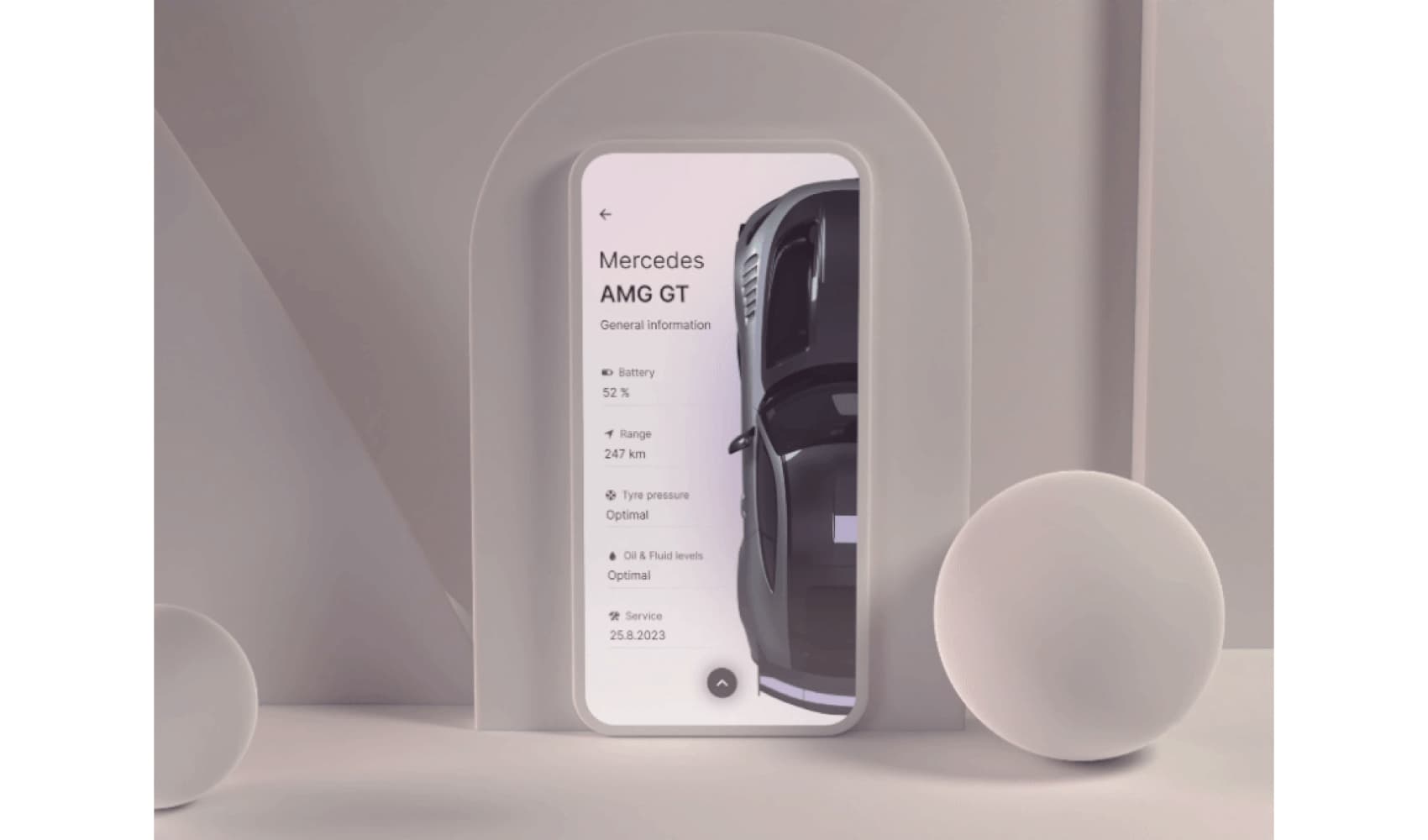
You won’t believe it, but I had so much fun doing these. So much, so that I went ahead and made my own icons! See? We are learning here and having fun.
Go above and beyond, who knows maybe a dark mode for an app like this?

Hard work pays off
So we went from a single screen to a 5–6 screens mobile app concept and guess what, now you can make a case study out of it! Yeah, you heard me, all the work you’ve put into this wasn’t for nothing! All the doodles, the research, the mood board all of it can go into your case study.
So not only we had fun during the process, but we also got our first-ever project into the portfolio, with proper logic behind it.
And I think that’s much better than doing those 15-second animation tutorials.

So in conclusion
I’m not saying, don’t do one nice-looking UI screen and move on. I do them too, if I’m learning something new and want to focus on a particular skill or a new workflow, sure I make the one-screen concept and call it a day, but please. Stop following these useless videos if you’re a junior.
Sometimes, it’s nice to build on it and have fun during the process and it can still look cool! In the end, I learned a lot during the creation process, for this TL; DR.
I guess what I wanted to say, is that you can make fancy-looking things and make them functional.
That’s it! See you next time stranger!
Have a beautiful day.