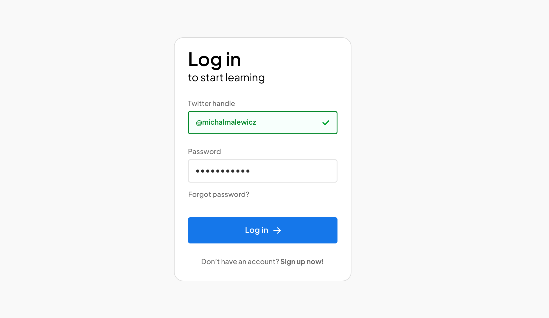
Let's explore a simple, minimal login form, with potential options for further improvement.
When it comes to Log-in forms there are many different UX design patterns that work for specific scenarios. There are cases where you can log in with a magic link, so only an email field is required.
There are social media account logins, Apple's hidden-email logins, token based logins and two factor authentication ones.
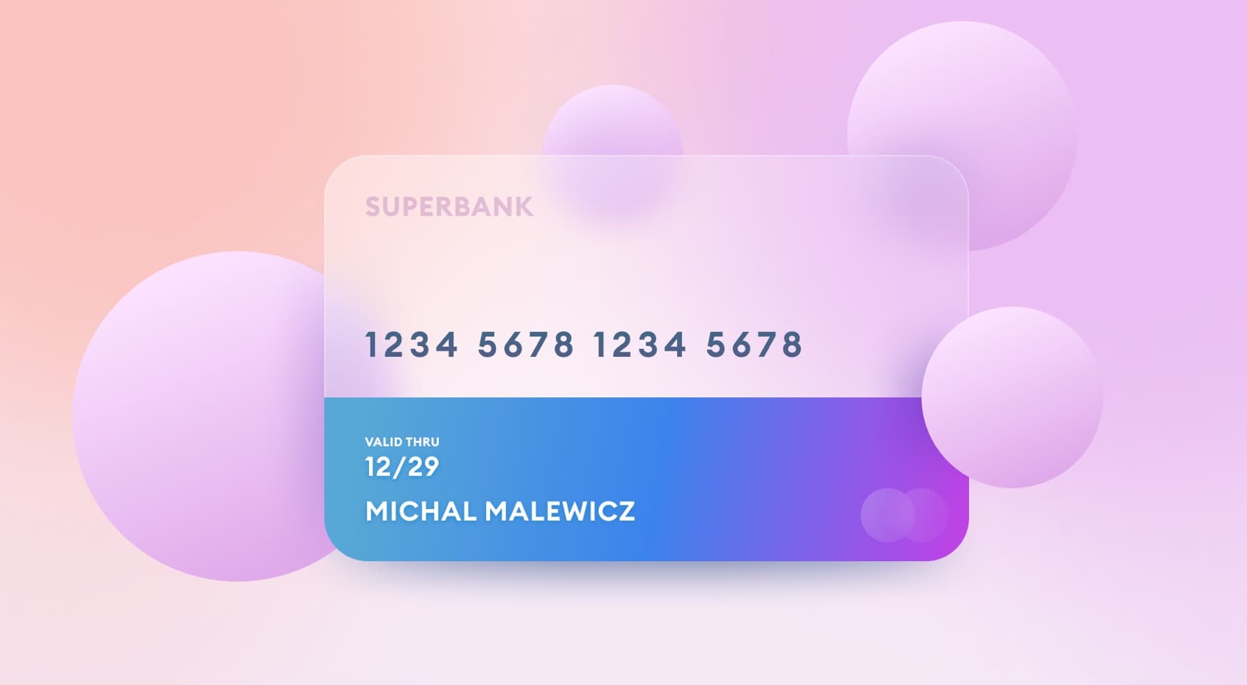
Here we're looking at a simple one, using a Twitter handle and a password. Of course the twitter handle can also be an email address and it will still work.
How many groups?
We want the user to quickly understand that there are three main groups in the form.
To make it easier to process, the final confirmation button is separated from the fields by a larger padding.
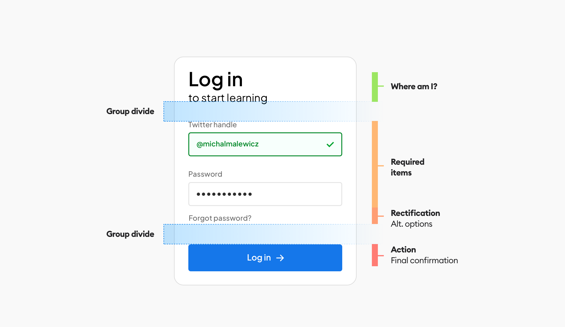
There are three main groups (steps) here with a clear separation so the user can focus on them one by one - including full focus on just the form fields before being ready to push the button.
This is why the blue distance is significantly bigger than all the other distances - to clearly separate the three main groups.
Hierarchy strips method
This divide is important to plan early on, even before you start picking font sizes, defining spacings, colors and so on. You need to be aware HOW you want the user to interact with your form - step by step. You can learn more about using the method we developed - hierarchy strips - in this post.
When this part is done we can finally
Define the grid and spacing
Many online tutorials, especially ones on Instagram just show you some pixel spacings and call it a day. Without context however, you end up with disjointed, mismatched components and a broken flow.
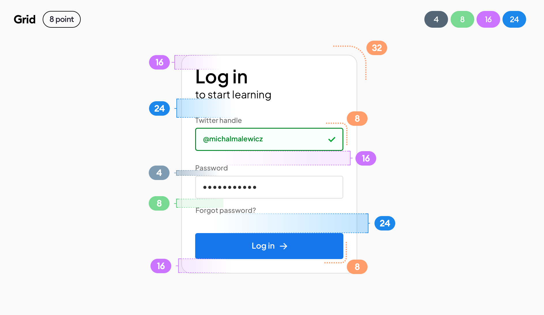
The most popular grid is the 8-point grid and this is exactly what we're going with here. But it's important to specify that grid, so other people looking / using / coding your design know the context it exists in.
I also like to specify the actual spacing values - 4, 8, 16 and 24 which are all based on the 8-point grid (with 4 being half of it). We also specify the corner-radius (roundness) that's also based on the grid.
We are using the rule of proximity to naturally group elements with smaller spacings, and space them apart as individual groups with larger ones.
The blue groups are the main ones here, setting hierarchy as outlined in the hierarchy strips before.
This is where the action is!
Individual elements
Now let's look at one of the individual elements - the form field.
It should follow the same overall guidelines, with smaller spacings because it's an internal group called the input button.
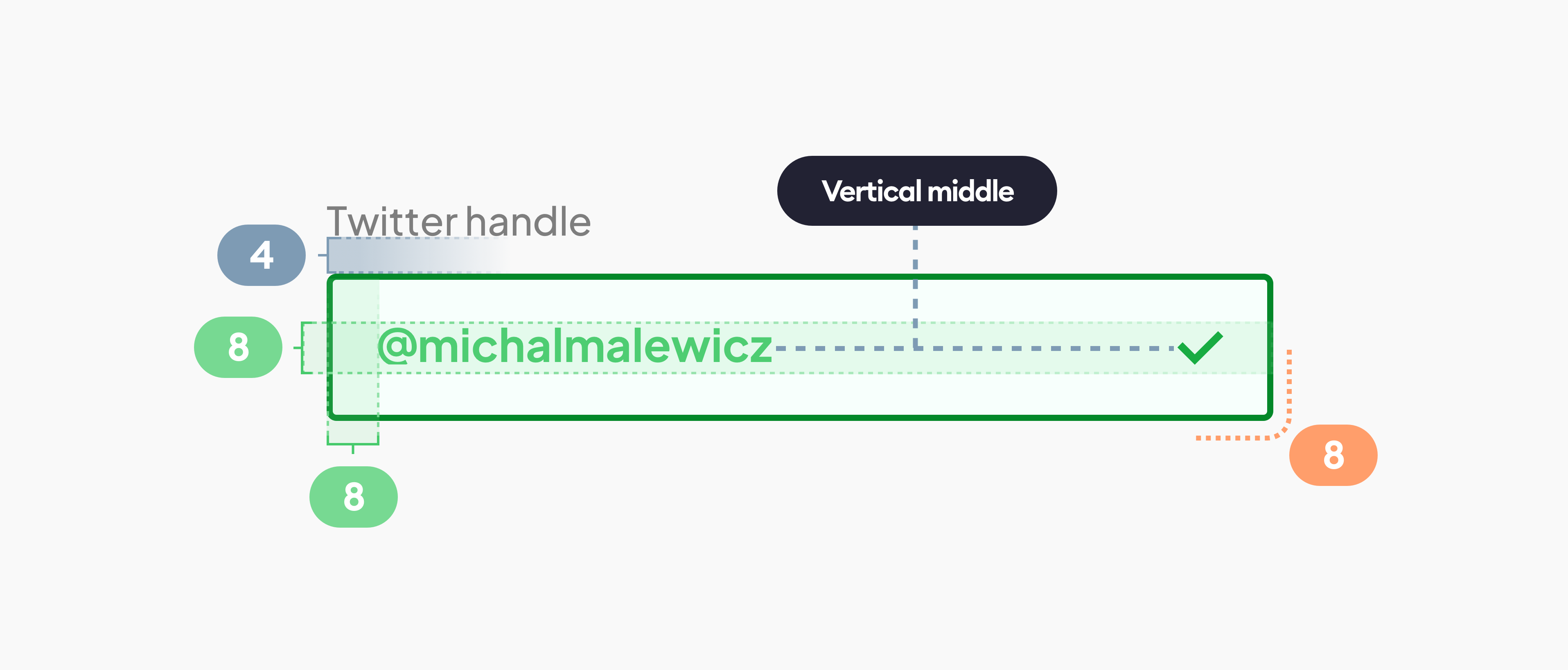
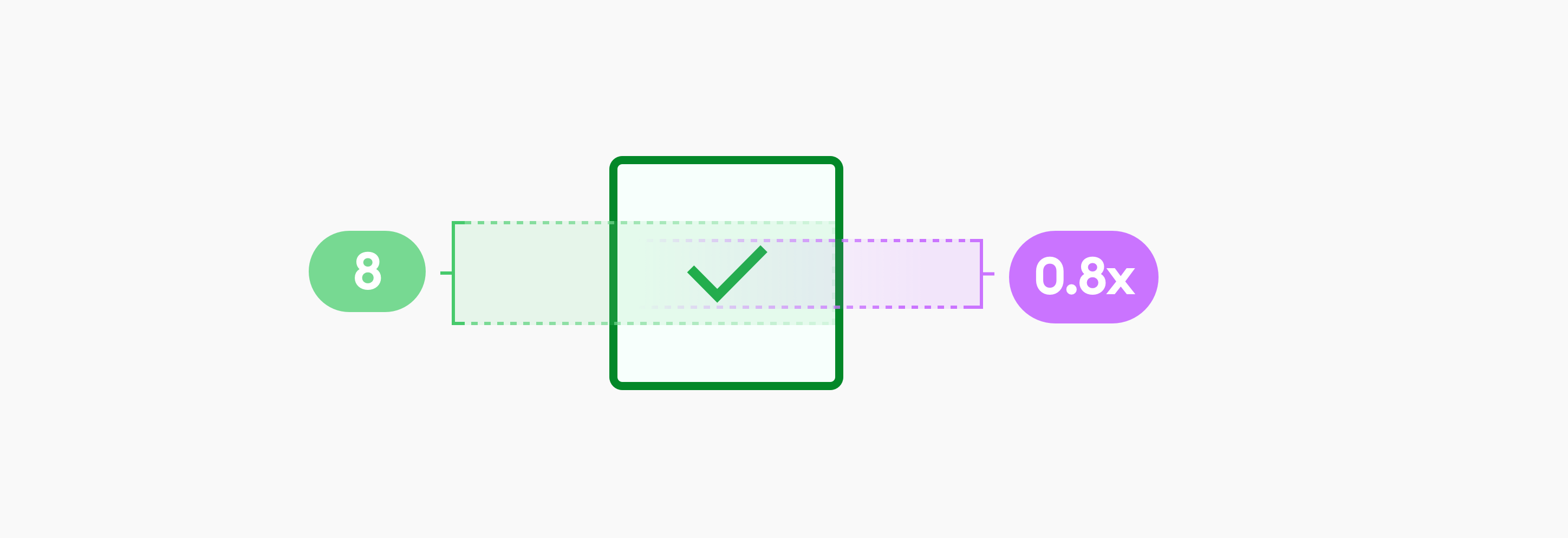
Ignore the top/bottom padding ( 🅰️ )
Depending on font size, thickness and other factors it’s more important to vertically center!
Aligning an icon within a form field can be tricky. A good rule is to use between 0.8 and 1.0 height of the capital letter of the text inside the field and make that icon this height. That way it won't overpower the text and will look good next to it.
It's a big problem when icons are comically large inside fields, and it's a mistake many junior designers do.
Use this rule to do it right! :)
Fonts
Now it's time to specify the fonts. We are using just one typeface here - Plus Jakarta Sans. It's a great choice for junior designers, as it looks great, is free and safe for most projects.
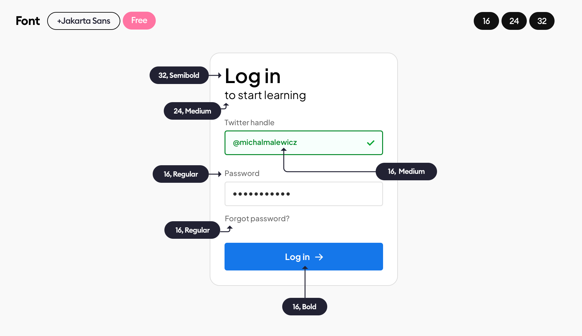
As for the sizes we are only using 16 for the actual form, with the two other sizes are for a pretty decorative heading. It's good to keep our forms as consistent as possible. You can emphasize actionable elements (like the label on the button with a bold font, keeping the size the same)
Next step?
Contrast check!
This is something most designers overlook and it is important as it helps make your forms accessible, and, when used in your portfolio it shows to recruiters and businesses that you have big attention to detail and consider every possible element.
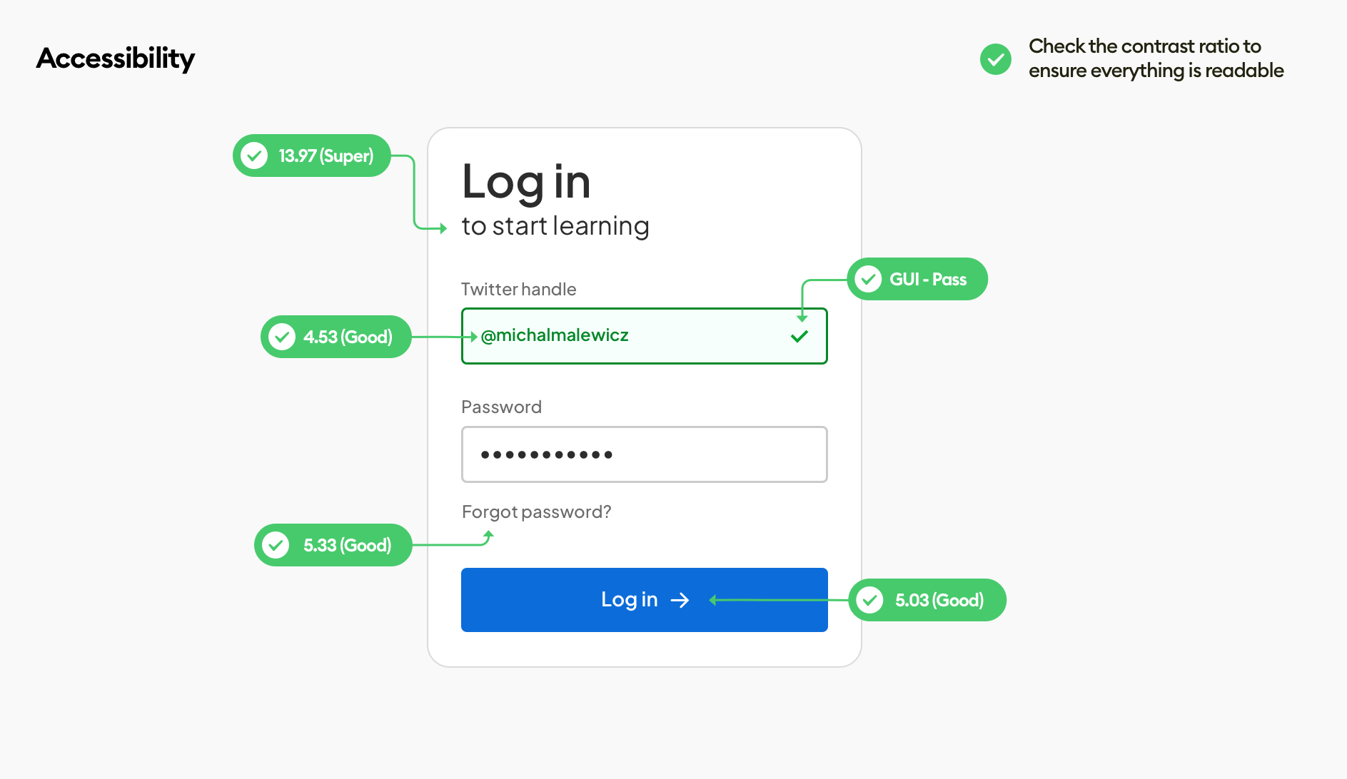
There are many online tools you can use to check the contrast, including plugins for your favorite design tools.
What's important to note is that decorative elements (like some shapes in the background) don't need to pass the contrast checks as they are fully optional.
What has to pass at least the basic contrast levels is everything actionable - things necessary to complete the form in our case.
Next steps?
Of course this can be improved further. For example you can add a link to registration for those who haven't created their accounts yet under the main button.
This thorough approach, starting with the hierarchy strips and proper, logical grouping and ending up with specifying and defining every little element of our form can work great in your portfolio and case studies.
Design is not random and it's important to make sure you cover all the little details.
Liked the article? Share it!

