Apple has announced a budget iPhone16e. The phone wasn't really anything new, but the design style Apple picked for the presentation was actually VERY interesting!
It's another merge of two design styles, with one of them being close to obsolete and having an unexpected revival.
Let's break it down and then learn how to create it ourselves!

Bento box mixed with Neumorphism?
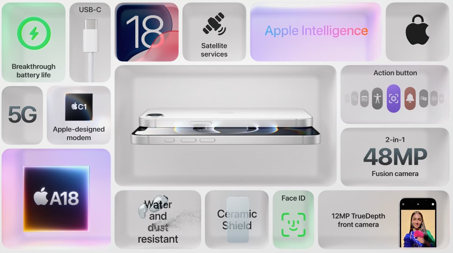
Apple has been known for using Bento boxes in their products presentations for years. They did it in both light and dark modes but they always had one thing in common.
The insides of the boxes were always a mix of 3D objects and 2d icons or typography. The bentos themselves were flat. This style popularized the bento boxes and it even became one of the most prominent design trends for 2025.
Neumorphism in 2025?
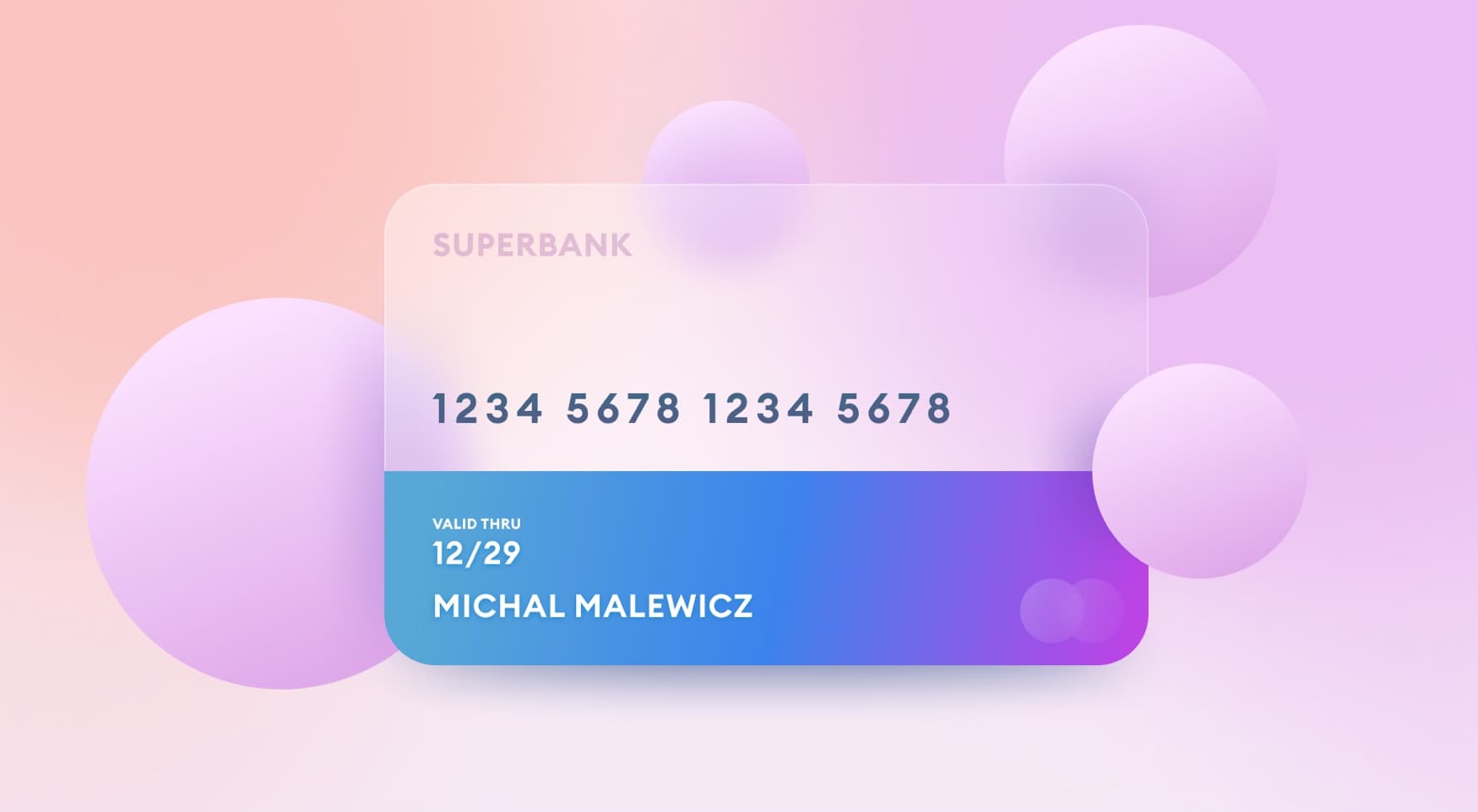
Is neumorphism coming back in 2025? The design trend I named back in 2020 was always pretty controversial. Many articles (including my own) criticized it for low contrast that can negatively impact accessibility.

However, even back then I noticed that the style had potential if it was only used for decorative elements, with clear hierarchy of the actual content.
What it means is that if the card itself is clearly planned, the neumorphic part is completely optional. It's a decorative element that won't have any impact on readability.
And this is EXACTLY what apple has done here. The bento box uses inner shadows and some basic highlights to create a depth effect between very similar colors.

The objects inside each 3d compartment are clear and readable. During the keynote they also did some nice pans and zooms showing their presenters inside those boxes.
It's a really neat idea and ties the whole keynote together. The bento actually becomes the presentation. It's both the scene and the hero.

How to achieve this 3d Neumorphism bento effect?
You can easily do a similar effect in Sketch or Figma. Of course what Apple did was completely 3d, to allow for the camera to move through it.
But a static image is actually quite easy. I quickly made one and put myself inside one of the boxes.

Each compartment is a mix of two rectangles, some blurs and a border. When we remove the content inside it looks simple and elegant like this:

Just like with Neumorphism, the main color here can't be black or white. That's because we need both a lighter and darker hue to show the depth. The lighter part is a highlight of a white border at the bottom that fades up into 0% opacity.
The darker one is for the shading inside that makes the effect of it having walls, a floor and a ceiling look realistic.

The main thing to remember here is to move the inner rectangle a little off axis.
The 3D effect will only work when each inner-box is moved a little towards the outside of the entire grid. Experiment with the positions and depth to find one that works.
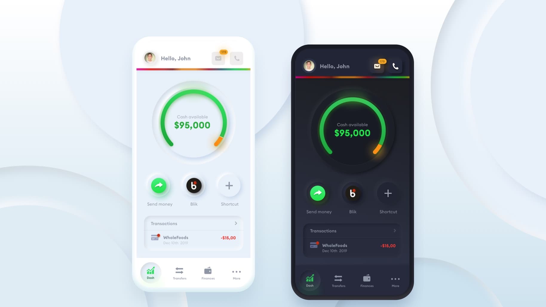
Dark Mode Bento Neumorphism
Of course, just like with regular Neumorphism you can also do this in dark mode. I think it looks even better that way.
The whole process works exactly the same, just make sure to invert the colors. The highlight in the border is done the exact same way as in the light mode though. Keep that!

Another thing you can do is make this in a single, dominant color like red and blue. It should work as well and add a nice plasticity effect to the whole bento.
Chasing UX/UI design trends
Apple is very good at finding trends and concepts and breathing some new life into them. I think that level of curiosity and experimentation is worth pursuing for everyone.
Let's have some unique interfaces and graphic designs. Of course this won't work for everything and can get boring pretty quickly.
But try it at least once. Let's have fun with interfaces again!