close menu button
👋

Hello there!
Log into the academy:

In order to log into your academy profile, please provide your email and password

Forgot password?

Did you previously use

Don’t have an account yet?

Glassmorphism in user interfaces

Another year, another UI trend is becoming increasingly popular among designers. Do you know it yet?

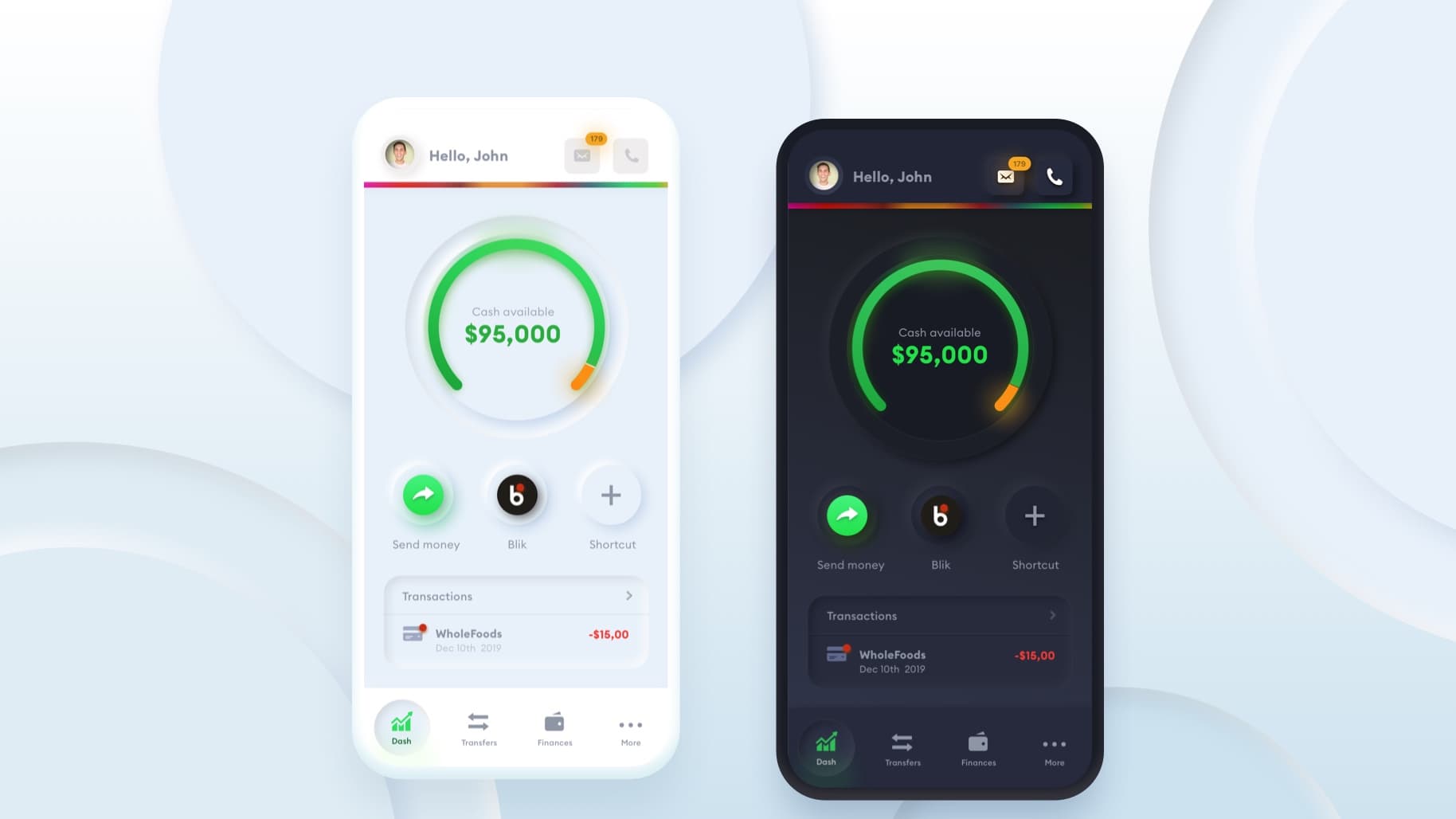
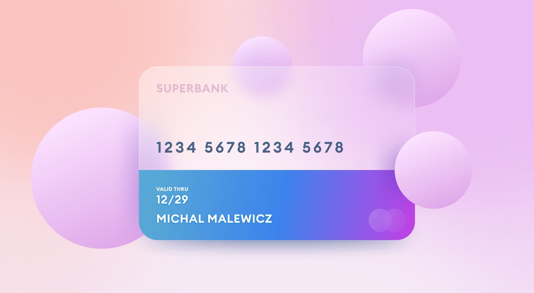
Last year I unintentionally started the craze around Neumorphism, but as I predicted then, it didn’t really take over the design scene. In that very first article, I also mentioned all the potential accessibility problems this style faces, which hopefully helped all the other articles raising accessibility issues that year :-)

Sure — there were some apps and products done in this style, but most notable, widespread uses were in some Samsung ads and in the MKBHD intro video. So not any full products, but rather smaller elements which proves my thesis that this style can work if used scarcely and if the objects on these backgrounds still hold their structure and readability without the decoration.

MKBHD used this style for his 2020 intro.

Hello, Glassmorphism

There is a new style on the block right now and it’s growing in popularity. While Neumorphism was imitating an extruded, plastic surface (but still looking like one layer), this new trend goes a bit more vertical. It’s most defining characteristics are:

  • Transparency (frosted-glass effect using a Background Blur)

  • Multi-layered approach with objects floating in space

  • Vivid colors to highlight the blurred transparency

  • A subtle, light border on the translucent objects.

That verticality and the fact you can see through it, means users can establish hierarchy and depth of the interface. They simply see which layer is on top of which, just like pieces of virtual glass.

Because of that glassy look, I believe the best way to call it is GLASSMORPHISM.

Glassmorphism the first article

History

Background blur was first widely introduced in 2013 with iOS 7. It was a pretty radical change but with all the controversy around the ultra-light fonts and ugly icons, it was one of the changes that weren’t really disputed. People seemed to like it.

Pulling down notifications quickly became a fun thing to do, as you could clearly see (when doing it slowly) how the icons fade out and blur under the new panel.

Strengthening the trend

Apple has since greatly reduced the blurry-glass effect in their mobile OS, but recently brought transparent-blurs back with Mac OS Big Sur. Just look at this Sketch window and how the blurred part of the photo above bleeds through it. I highlighted the places, where background blur is the most clearly visible.

Of course you can turn that effect off completely in the system settings.

Microsoft Fluent Design System

Microsoft’s Fluent design system goes heavy on this effect as well. They call this particular element The Acrylic and showcase it as an integral part of their design system.

Acrylic is a type of Brush that creates a translucent texture. You can apply acrylic to app surfaces to add depth and help establish a visual hierarchy. — Microsoft Fluent Design System

Dribbble analysis

Of course, as with any UI trend, it’s often overused on Dribbble. This is beginning to pick up slowly and there are already some nice looking examples. Of course they all have a lot to do with the presentation, as on an actual phone screen they won’t have an easy to see background to overlay onto. That’s simply because apps on phones are all full-screen.

Smart Calendar App by Ghani Pradita

The above example may be on the verge of readability in some places, but it’s a clear representation of this trend. The background is very subtle, yet still visible, and the shapes have a 1-point, semi-transparent white outline to simulate the glass edge.

By Ghulam Rasool

Just as with neumorphism, this style shines especially bright when it’s used on just one element — like the backgrounds in the above example. Of course — again — presentation plays a huge role here, but you could imagine a desktop web interface using a similar level of transparency for just it’s backgrounds.

By Marshall

Icons can be a bit controversial, but they are also getting the glassmorphism treatment like in the above example by Marshall.

Looking through Dribbble, they’re all currently sitting under the #glass hashtag, but I think #Glassmorphism is more fitting. A glass can simply be a glass you drink from, so I believe this style deserves a name for which it can be easier identified.

Now to achieve this effect

The effect itself is quite easy, there are however a couple of things to take into account. The first one, as with any card based layout — is that the closer the object is to us, the more light it attracts. In this case it means it’s going to be a bit more transparent.

Glassmorphism layers - how to achieve the right balance

The base for this entire effect comes from a combination of shadow, transparency and background blur. This style can only use one transparent layer, or multiple, but it’s most prominent and visible when at least two levels of translucency appear on a rather busy, colorful background.

How to set the right transparency

It’s important to remember, however, that you don’t make the entire shape transparent — only its fill. Most design tools when having the fill at 100% and the object transparency lower will simply disable the background blur.

Glassmorphism object vs fill opacity

In the example above we have the exact same background blur value of 8, yet the images look completely different. When the fill opacity is at 100%, it doesn’t matter how low the object opacity is. We simply won’t get the desired blurred background.

How to pick the right background

Backgrounds play an essential role in making this effect shine (quite literally). They can’t be too simple or dull, or the effect won’t be visible. They also can’t be too detailed

This may be the reason why Apple chose a colorful background as the default wallpaper for Mac OS Big Sur. Those easy to discern tonal differences are also easy to see when a blurry-transparent-surface sits on top of them.

When picking the background make sure it has enough tonal difference for the glass effect to actually be visible.

Final details

The last thing you can try is to add a 1p inner border with some transparency to your shape. It simulates the glass-edge and can make the shape stand out more from the background. Experiment! While elements of this style like blurred backgrounds have been around for many years now, it is just now growing in popularity, so there’s still a lot of cool, creative effects to explore here.

Glassmorphism with and without borders

Image on the left has a semi-transparent border, while image on the right is borderless.

You can also watch my short tutorial on how to create this in Sketch and Figma.

Accessibility

Just as with Neumorphism, this style is likely not as accessible, as let’s say default Material Design. The main rule from Neumorphism also translates to here — if you have good, functional hierarchy, your on-screen elements should be able to work without the backgrounds. That will ensure people with vision problems will be able to still understand the UI.

bad examples of glassmorphism

This is a BAD example — same as with Neumorphism- of abusing the effect on every possible screen element. Doing it this way makes the entire UI almost non-accessible for some users, while also making it boring and unoriginal.

That only happens, when those transparency effects are purely decorational and not an integral part of the experience. Using them for buttons or toggles should be avoided (these important objects should always have more contrast) but you can use it for card backgrounds just fine.

Just make sure the inside of your card has enough contrast and the right spacing to define the hierarchy and visually “group” all the related objects.

Glassmorphism with good accessibility - structure and hierarchy of UI design

This is a better example — this card has well defined structure, so its contents will work well even when the glass background is completely removed. This is a quick example — color contrasts can still be improved.

Glassmorphism?

Apple introducing this style into Big Sur is a sure way that it will be emulated and immitated in the months to come. It probably won’t take over all the interfaces (and that’s good), but it is going to be a bit more popular than it is right now.

We, as humans easily get bored with a trend, and every few years the pendulum swings towards the other side. We used super-minimal, nearly-flat interfaces for a while, but then they started to get more colorful, more vertical and more “in your face”.

As designers we need to explore all the potential, creative ways of making a product. In some cases a limited use of “glass” will actually make the product look better and more attractive to the users.

And while I like my interfaces black&white with no decorations and super-high contrast, I am excited to play around with this style a bit more and see where it takes me.

Because in the end — design should be fun, as that’s the only way we can explore new paths, enjoy what we do, and deliver things that are truly exceptional.

See you on the other side of the glass!

explore glassmorphism

2021 Update

Unlike Neumorphism, this trend had actually prevailed and is still being used in both Dribbble shots, and in some real-world products. Most notably, Windows 11 is using this effect extensively in their new, almost universally praised redesign.

Windows 11 glassmorphism

Most of the accessibility concerns have been adressed in real products, with lower transparency, larger blur values and higher text-contrast. The upside to this trend is definitely showing a bit more context of what's *behind the glass* but also it's a breath of fresh air in a sea of very similar product design styles.

Exploring glassmorphism in dark mode in 2021

I believe it's still worth exploring it, as long as you don't add that effect to every single on-screen element. Keep it subtle in real products, and experiment in your plagrounds instead. One of the ideas worth exploring is a dark-mode version of Glassmorphism, which on average tends to have higher text-to-background contrast and thus better accessibility.

Glassmorphism card styles

You can also explore different fill types like color, linear or radial gradients to see the effect drastically change in appearance. There's still plenty to play around, including texture overlays and more. Let's explore this trend a lot more in 2021.


Liked the article? Share it!

twitter iconlinked in iconfacebook icon

Similar articles

Claymorphism in User Interfaces

Claymorphism in User Interfaces

Read article

Aurora UI — new visual trend for 2021

Read article

Neumorphism in user interfaces

Read article