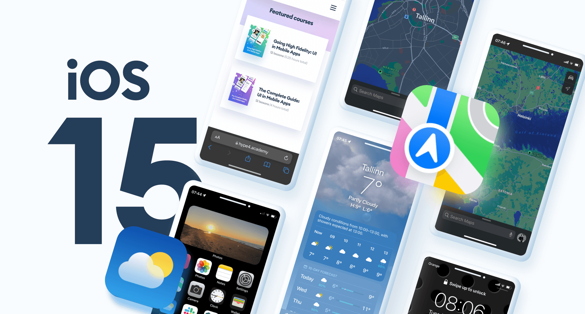
iOS 15 is here and there are some pretty interesting UI changes in the OS. The biggest visual difference on the home screen are the brand new Weather and Maps icons. The general style is going towards more cartoonish style, with a glassmorphic cloud on the weather icon, and bold, strong colors on the Maps.

The new Maps icon also shows a strong focus on the directions feature - both for driving and other modes of transport.
The Weather and Maps apps have been refreshed as well, with the former getting beautiful animations and an overall more friendly vibe even when showing more information than before. Maps are now focused on clarity of information a lot more, with some color choices that may need some getting used to.

UI Revolution?
The biggest revolution by far has come to Safari. The address bar is now at the bottom, closer to the keyboard, and you can swipe on it to go between tabs. This is truly awkward at first - after so many years - but I do see how it can actually be an easier / better way.
I also like the fact that Apple is not afraid of making a bold move like that - it's testing something that's a big departure of what we're used to. It's definitely a way to push the UI's of the future forward - especially with so many people being "forced" to use it. It may lead to some interesting discoveries on how we use the web.

Admitting to the mistake
On another hand, they also reverted back the uncomfortable in-field time-pickers. That experiment didn't work, so it's good to see a familiar, larger picker replace it. That experience, even in a small popup like this is still a lot more friendly and straightforward than scrolling inside a small text field.

What do you think about these updates? The changes in most cases are very subtle, as it's more of an iterative update, but I find it fascinating to see the process of introducing something more revolutionary (Safari) and also taking informed decisions to bring back a pattern that worked better. Who knows, maybe iOS 16 will move back Safari address bar back to the top. But at least they tried something new.


