Cars became boring
Chasing the aerodynamic shapes cars have become a little like Material Design. They simply started to look the same regardless of the manufacturer. Sure - premium brands have more luxurious interiors and better engines, but from the outside the general shapes have been merging into a "typical car shape" for a while now.

Cybertruck?
The Cybertruck was a breath of fresh air into the car industry, just because it didn't look like all the other cars. Now, its aesthetics can be debatable - some people love it, some hate it. Countless memes were created on the fact that it looks like a low-poly render. But it is different and it's a big step outside of the regular styling.
Inspired by its example I started to pay attention a little more to what the car industry is making when it comes to visual trends. I want to share a couple of these examples with you, because I think they're definitely worth knowing about.

Retro-futurism has been a sci-fi trend for a while now, and it seems like it's making it's way into the automobile industry. What it means, is that the cars are a mix of 60's or 70's style, with futuristic, modern screens. For some reason those years and the designs created then still have a very special place in our hearts.
Maybe we simply innovated too much, to end up with all that boring sameness? While the engines are going all electric, the external chassis is often going back in time and I love it!

Hyundai Grandeur Heritage
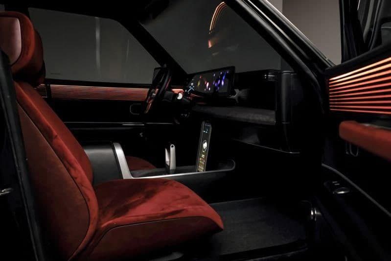
The car that made the biggest impression on me recently was this Hyundai concept EV that's like straight out of Cyberpunk 2077. The car ditches the round shape and brings us back a classic 70/80's style shape that we all know and love from countless movies.
And it does it in style! Those tail-lights look amazing!

Ford F100 concept
Ford is also coming back with some classic shapes for their F100 pickup truck. If you ever played Fallout 4, this is the kind of retro-futurism that was a big part of that game's appeal.

Hyundai Pony
Hyundai didn't stop with the Grandeur. Pony is another beautiful example of that retro style coming back!

That squared-off design is like a breath of fresh air among all cars shaped like the Apple Magic Mouse.

New trends from old trends?
In UI design, about every 7 years the pendulum swings between minimal and more "rich", slightly skeuomorphic look. In cars it took a lot longer, but it's good to see some visual variety on the roads.
Aesthetics are an important part of buying a car, so the more different choices we have, the better.
It also is a lot better for the industry, as it allows it to learn from the past, but still innovate - and that benefits all of us.


