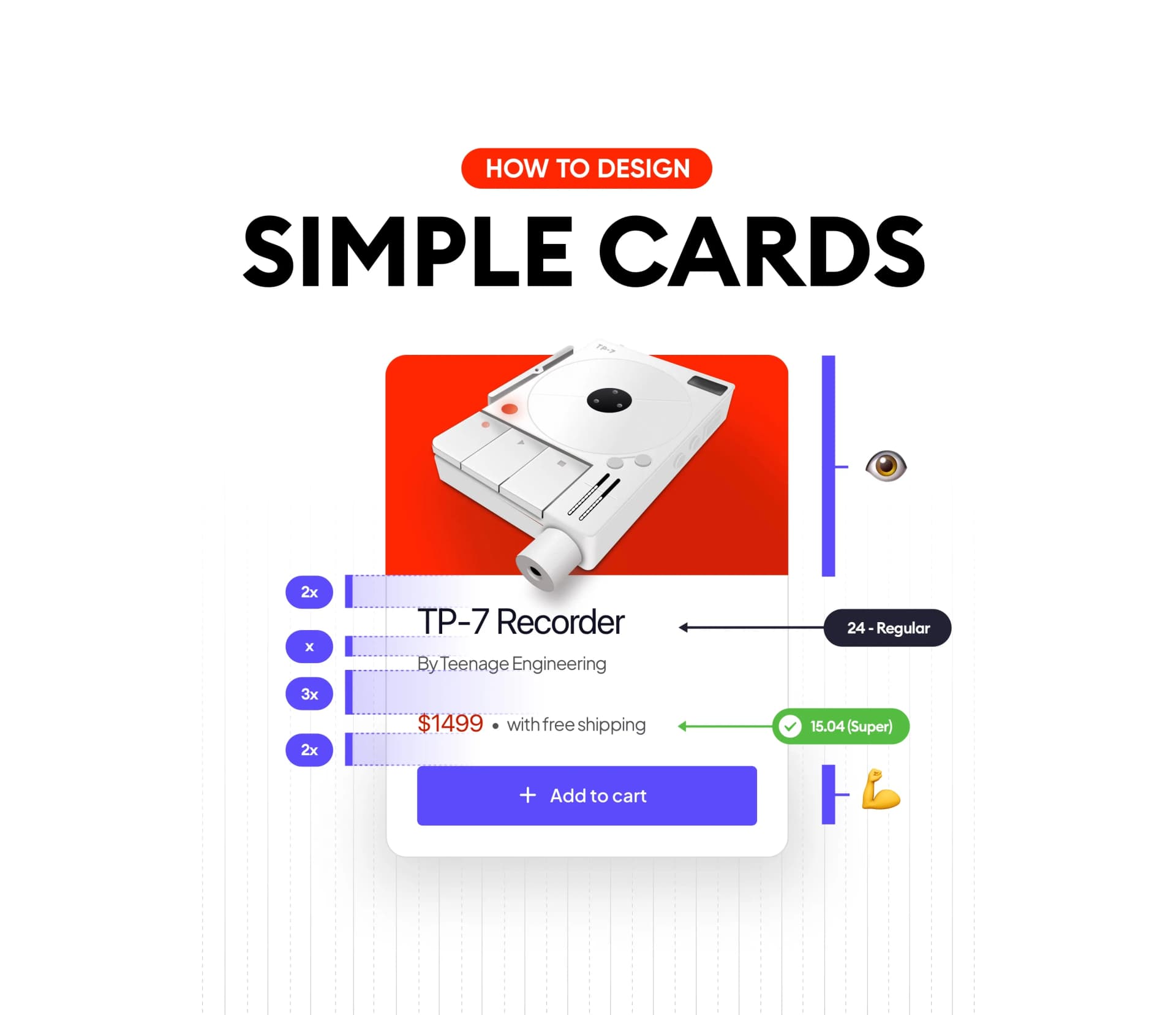
Cards can be tricky and overwhelming to design, it’s important to have just enough white space and well-balanced content to convince the user to click the CTA
Start with groups, spacing & hierarchy
Before we get to the measurements and fonts, let’s do what we should always do — figure out what is the most important information that drives the user's decision to push that final button.

What is our card about? What background does it have? Do we need one card or multiple of them?
These are all the questions and more that can drive the decision behind the photo and its background. If it’s just a card exploration it’s fine to not stress about it, but if it’s more than one, we should strive for consistency.
What is it? That’s very straightforward, the text size will depend on the length of the product/s
How much? That’s the one thing that should stand out, the price tag should be nice and visible in our card design.

The spacing
Once you figure out how to structure the information it’s time to space it accordingly, so our previously defined groups in the UI design are clearly visible. We need a clear separation between the image, title, and the rest of the interface so there’s a bit of a breath before jumping in and taking action.

Using multiples of 8 is always a safe bet when it comes to learning. You can’t go wrong with it.
The Typeface
Card components can be simple or complex, but no matter which one it is, the typeface and font sizes should be very simple.
There is no need to choose more than one typeface. It will get too hectic and shift the focus.
There’s also no need to have more than 1–3 font sizes for the entire card. Keep it simple.

The contrast
This is what I see most when it comes to card designs, poor contrast. Not readable price, the label of the button…
Make sure that all the elements have clear and readable HIGH contrast. There are tools out there nowadays that can help you and tell you instantly if the design will pass the contrast check.

Summary
If you want to design beautiful and functional simple cards, make sure that you pick the right image, and stick to one typeface and as few font sizes. as possible. Contrast-check each element within the card once you’re done.
That’s it! Have a beautiful day!