

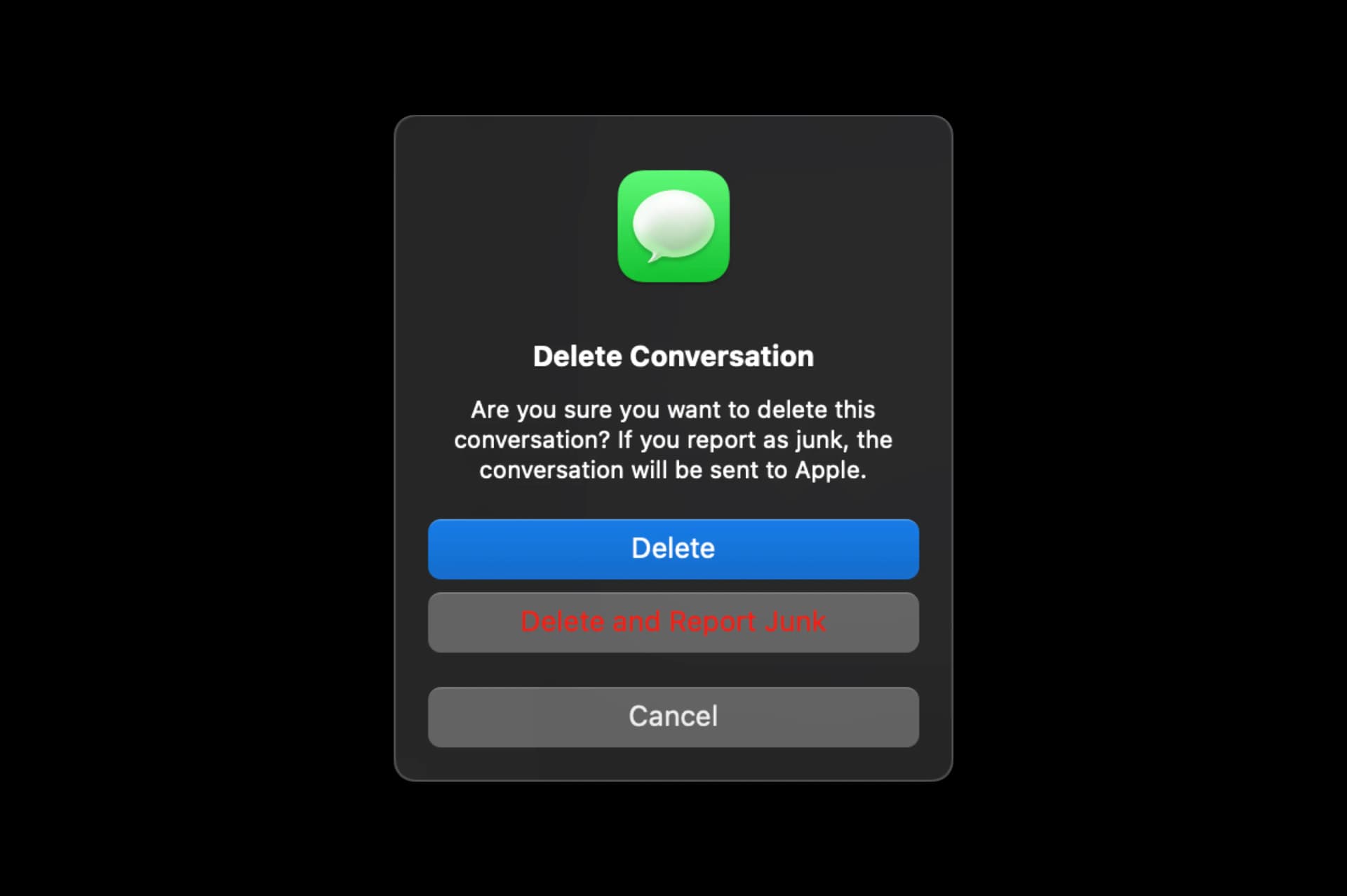
Take a look at the image above. This is a native Message removal dialog in Mac OS Sonoma 14.2.1 (the latest update). And obviously, there is a big issue with this — namely the second button from the top.
This particular combination of dark mode and a negative action button is just jarring. Let’s see what the contrast ratio has to say about this.

As you can see this fails all the major WCAG categories, and even with the coming updates to the evaluation models it will still fail.
Before we continue I need to say something. It needs to be said right here and right now, before we look further into this and propose some solutions.
I like Apple products
I’ve been an Apple user for the last 15 years. I own a MacBook Pro (M1Pro), an Apple Watch, two iPhones (15Pro and 12mini), two iPads (Pro and mini), a Mac Mini, a Studio Display, and multiple Thunderbolt displays from the past.

I picked Apple because of its attention to detail and overall better design language than the rest of the industry. This particular level of minimalism just connects with me well.
This post is not intended to mock Apple or their designers — some of the best in the industry work there.
This post’s whole purpose is to show you — a junior designer, that we’re all humans and we make mistakes — no matter our job description.
Juniors are very insecure about themselves, their work, and their skills. They often use the word “aspiring” in their bio, purposefully undermining what they do.
That’s impostor syndrome talking. I know, I’ve been there myself.
So now I hope you see that even the companies many designers look up to also make mistakes, omissions, or simple bugs. We’re all human, we err and that is ok! As long as we try to be better each day. And even with Apple it’s not a single thing, there are many…

Back to the design.
Light mode vs Dark mode
Now let’s look at the exact same dialog in light mode. Fun fact — after testing it just now I decided to switch to the light mode for a while as the dark mode has become a bit stale and boring. Brighter colors suddenly feel fresh and cool again!

This is definitely better and more readable, but does it pass the contrast checks? Let’s find out!

Well, still not quite.
But it’s Apple, right? So they are definitely not abandoning Accessibility for questionable aesthetics. Yes, that’s true. There is a plethora of Accessibility settings in the OS including much higher contrast, button and link outlines, and …
Differentiate without color
This particular setting uses a bolder font for the buttons and UI labels that would otherwise be a different color. When applied it looks like this. Better right?

The issue(s)
Anyone with vision problems can of course turn on special Accessibility modes for the entire OS and never, ever encounter that red or dark grey issue. But the thing is that I don’t have vision problems and to me that color combination is still unreadable and requires extra focus.
A bold font is a nice touch — yes, but then it makes the second button feel more important (because yes, BOLD fonts add importance) than the main Delete button.
UI Layers
Then, there’s the layers problem. I have talked about this many times when discussing dark mode because this mostly happens with dark mode designs, but here it’s the opposite.
Even with flat design, we naturally want a tiny bit of Skeuomorphism in our lives to make perception and image processing faster. That’s why the bin is still a bin, not some random flat square.

It did get modernized and “flattened” from the previous realistic bin in Mac OS, but it’s still a bin and you can’t mistake it for anything else.
Depth perception
That’s why I think it’s an odd choice for Apple to go against depth perception rules here. This is how real-life™ works and how it’s usually replicated in UIs.

For most of our devices, we naturally assume a light source from the top (the sun or ceiling lights). That means that objects closer to you on a virtual layer stack are lighter than the ones that are below.

It works right for dark mode with the dialog background being darker than the buttons, but in light mode, it’s simply reversed.
Of course, Apple may have simply specified that way in their guidelines as part of their design language for various reasons, but to me, it simply feels weird so…
Let’s redesign
I decided to make a quick redesign for you and then explain my reasoning for each version. Let’s start with dark mode.

As you can see I modified the blue button to make it red. That’s because Delete is an irreversible, negative action and it should be quickly understood as such through color.
The secondary button doesn’t use red for the color, but instead goes for simple white text.
The tertiary button is an outline because it’s outside of the main actions and shouldn’t be confused with them. There is an extra space between Cancel and the other buttons also to show that hierarchy and the fact that the two main buttons are “together”. This is why Apple did it that way and that’s why I kept it.
I also modified the button corners to better match the roundness of the window and enlarged the green icon so it’s the same distance from the top of the window and from the top of the text.

Here my main goal was to provide a clearly visible color progression. That’s why the second button is not just inverted from dark mode, but rather a white button that naturally works with the depth levels of the interface.
Cancel is still just an outline button. We could’ve gone with just the word Cancel without the outline, but that could lead to many people feeling anxiety because it’s such a small click area.
People do feel like that when something they need to click appears small and that outline is there to put them at ease.
Impostor syndrome
If you’re a junior designer, try to justify your impostor syndrome with this. We’re all humans, we make mistakes constantly. Even those big, awesome, design-driven brands we look up to still make mistakes — sometimes by human error, sometimes by strict enforcement of design systems. Sometimes both.
It’s ok to not know everything.
I make mistakes too, and my redesign likely disregarded many of Apple’s rules (on purpose) which may mean some further inconsistencies in other places of the OS.
Still, that red on that background doesn’t work. Simple as that.
But doing these exercises shows you’re not just a consumer of interfaces. As a designer, especially a junior you need to think and question everything you see. Just because it’s a big respected brand doesn’t mean you can’t propose a redesign and show your thought process.
Just do it.
Liked the article? Share it!


