Welcome Stranger, I hope you have an amazing day! Grab something to drink or eat and let us dive into today’s episode.
Last week I got asked on our Slack channel by one of our members if we keep track of the most common mistakes made by others.
I have to say, we do have designs done for these kinds of scenarios, I’ve talked about it in one of our monthly reviews.
Where we added the asset library to push the feedback to another level.
But we don’t really keep track of the most common mistakes, so in this series, I’ll explore some of the common mistakes hopefully clear them up, so we can all design great stuff!
Why?
So in this new series, I hope to clear some common mistakes when designing “X” and in this case, it’s the Log In form.
/f/117250/3480x2000/512667e6e7/community-example.jpg)
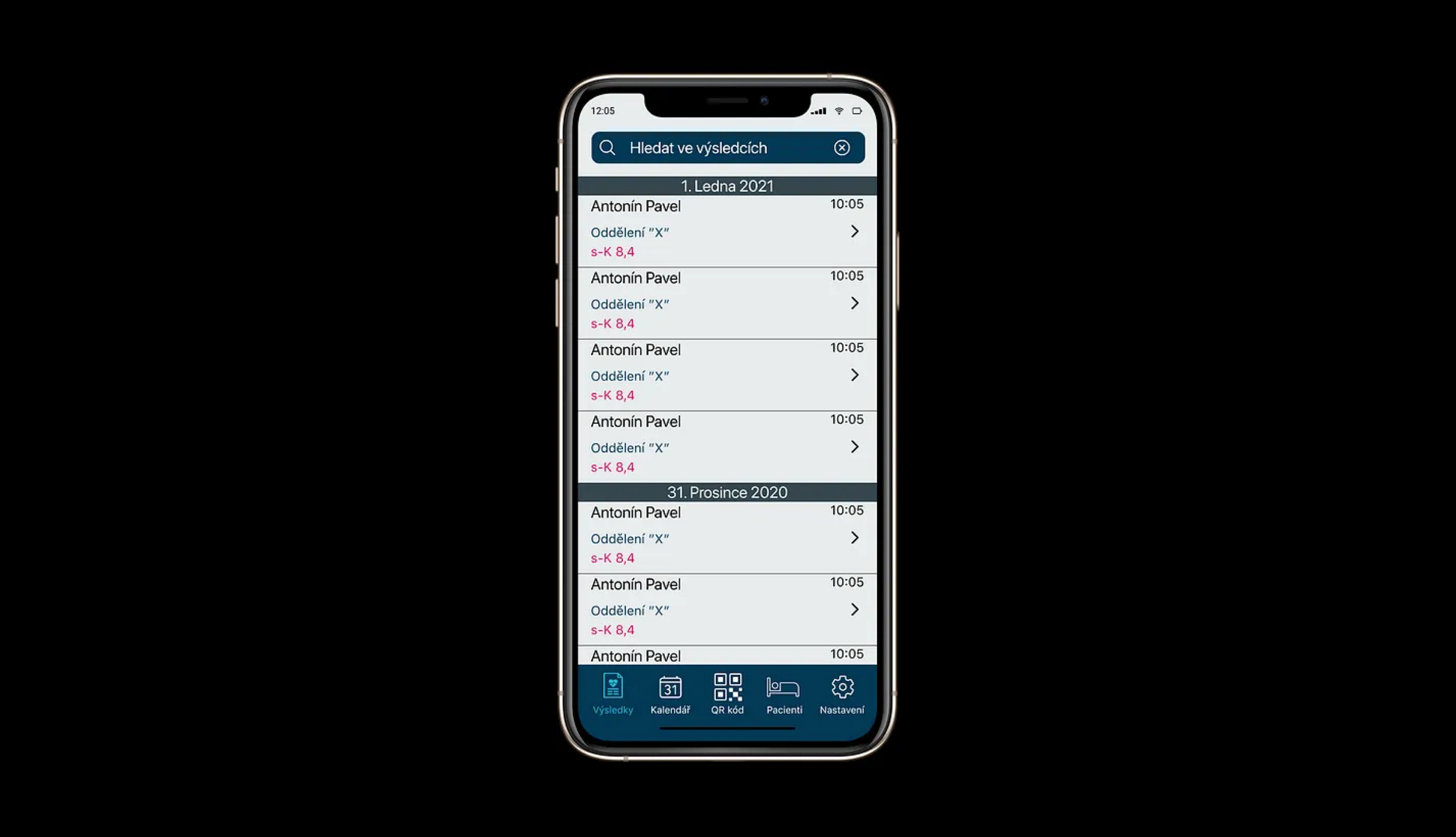
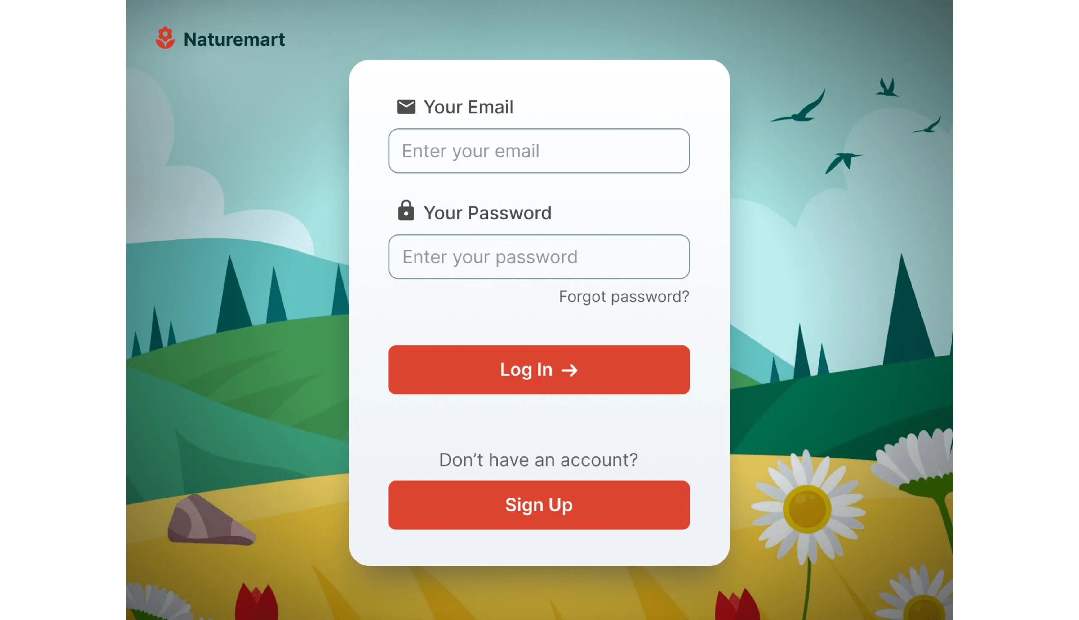
I will be using some of the submissions from Square.one. The purpose is to show the mistakes. Not to humiliate anyone, so I won’t be sharing any names.
Everyone has to start somewhere and there’s always room to be better at ANY level. The important thing is, they are designing daily and getting better day by day.
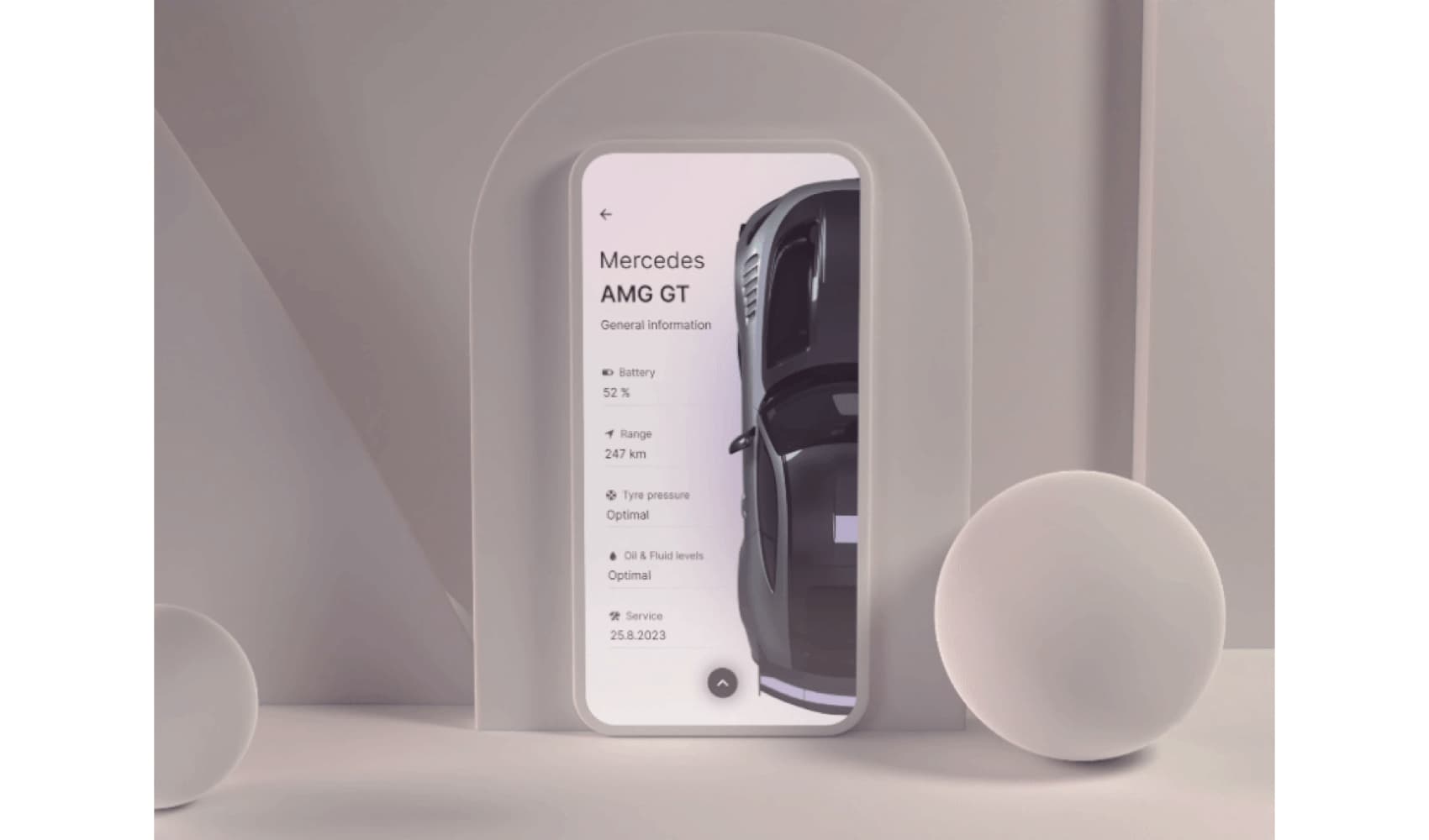
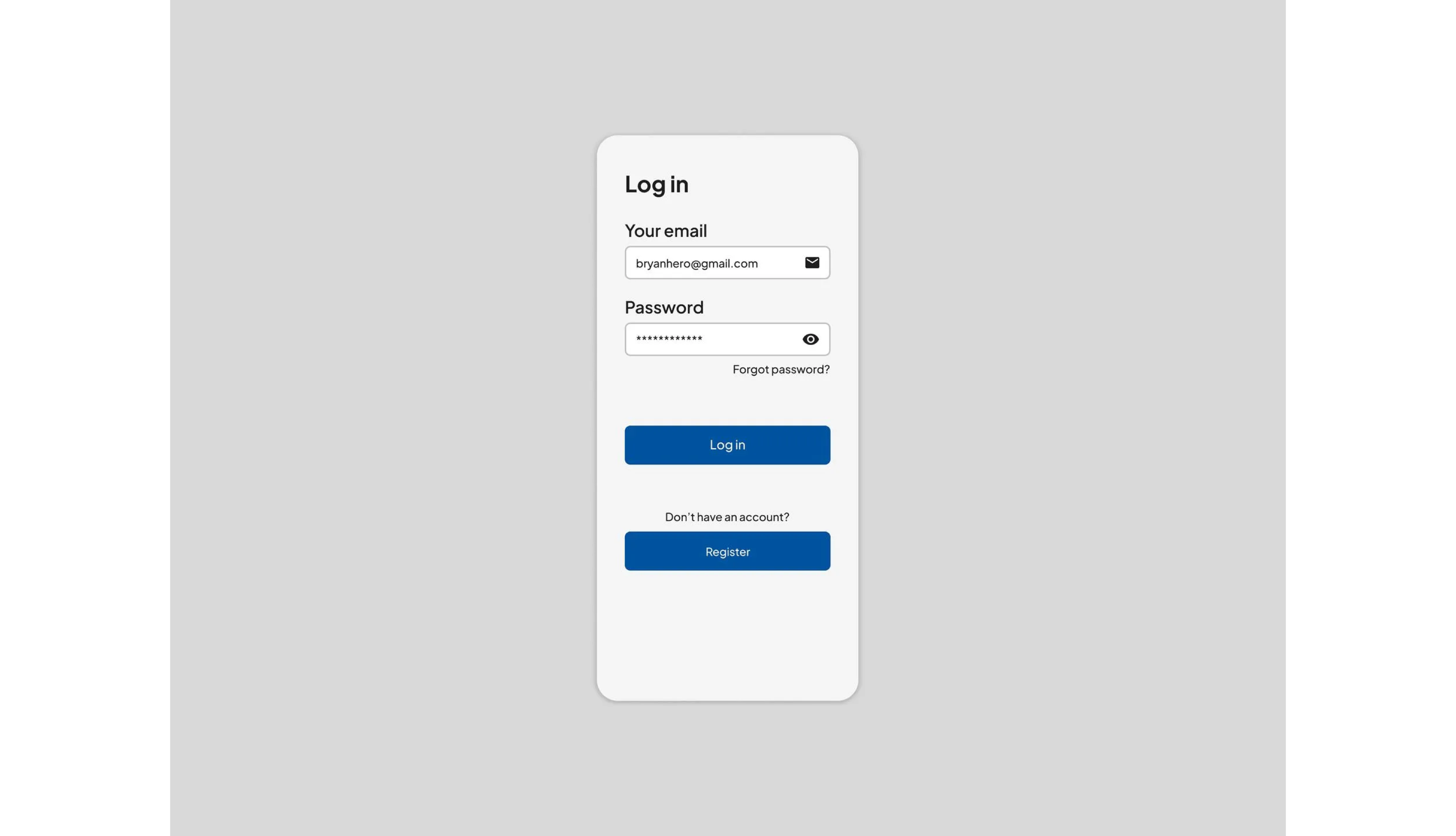
Just for comparison, this was my first-ever design, yes it sucks but that’s okay. It was the start and hard work gets you where you want to be.
With that cleared up please keep the comment section polite. Again the purpose of this series is to get an idea of what’s important and how to design better.
On the platform, the team gives feedback daily and there are over 72,000 submissions so I think we’ve seen it all now.
Hierarchy
Before we start designing, it’s important to establish a hierarchy in our design. Hierarchy helps us to decide what should be a group, and what’s outside the group. What are the crucial points of our screen?
If you don’t feel comfortable designing apps or websites just yet, this is a great method to get you started.
It clears out all the doubts, it tells you what the spacing should be and if the screen you’re doing actually makes sense.
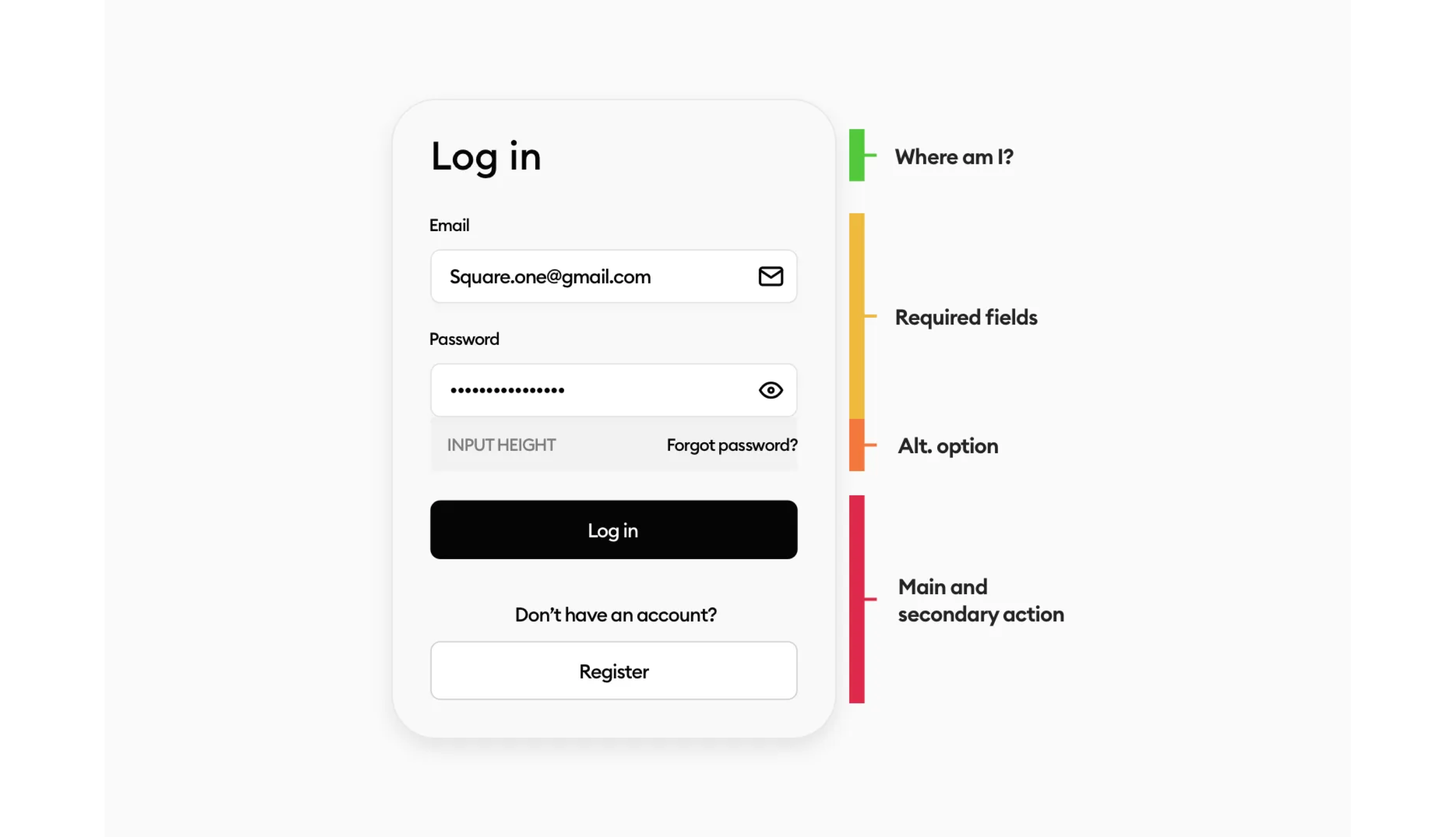
Where are we?
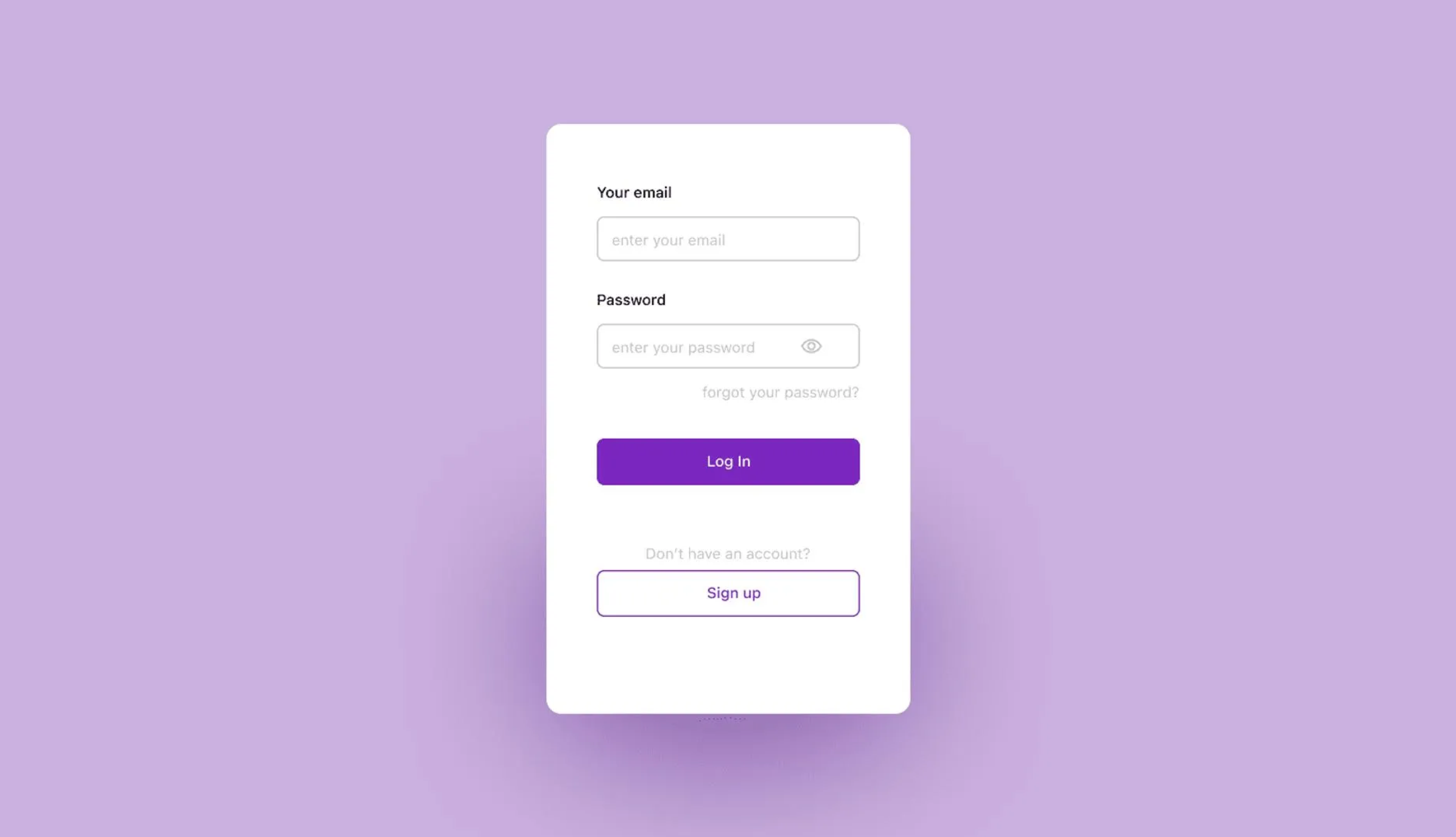
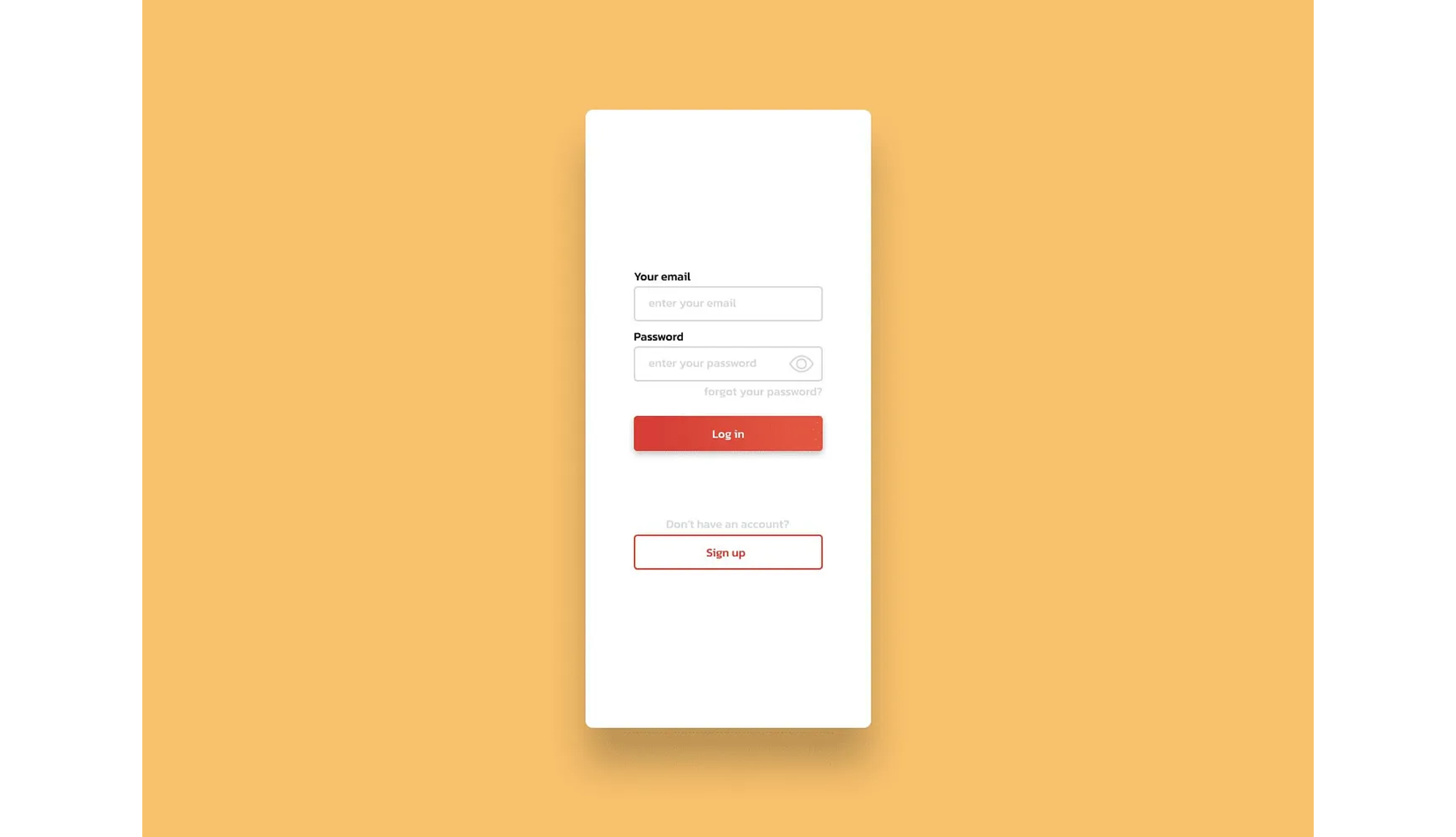
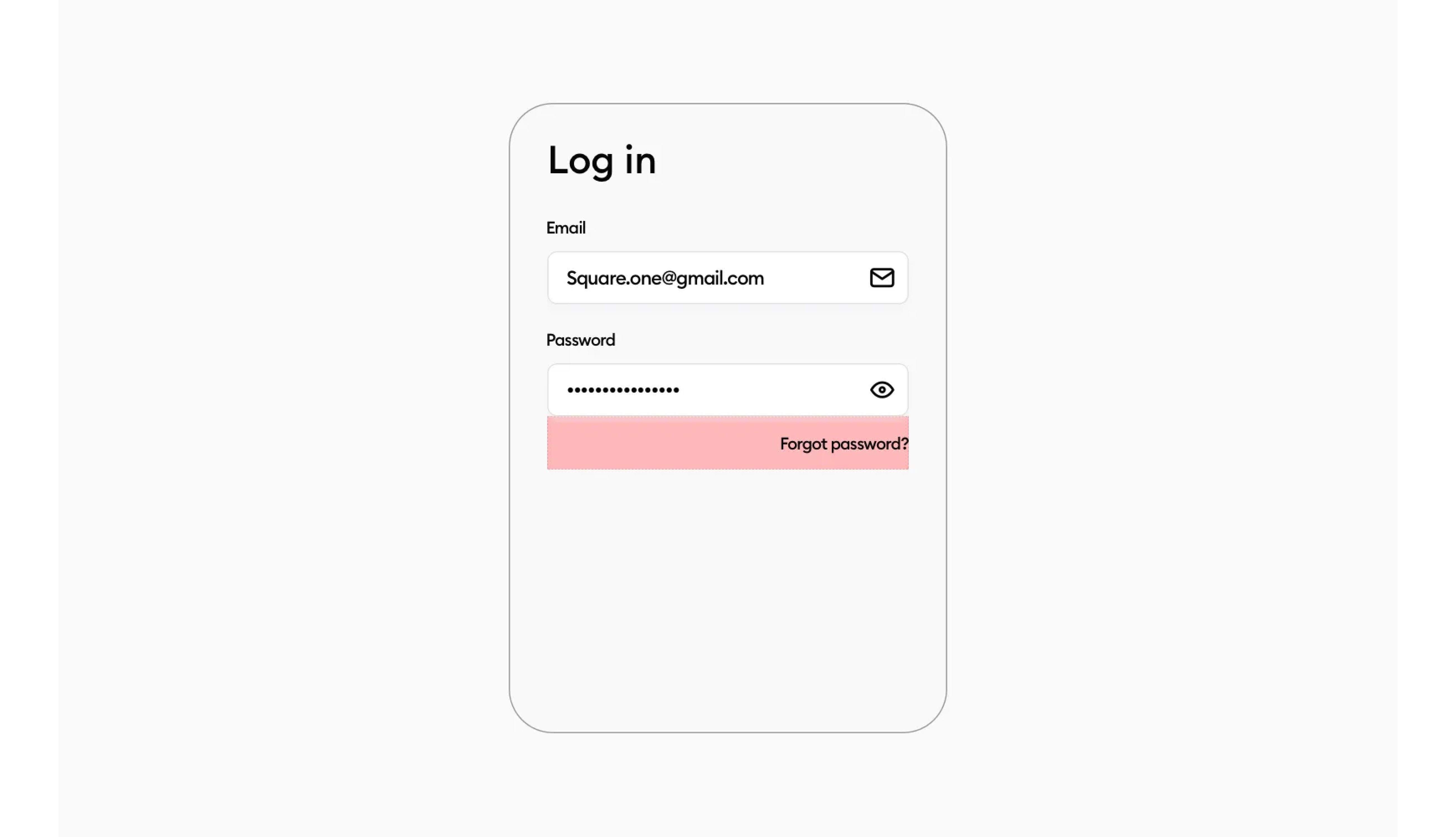
The most common mistake we see is, that there is no title, like none. It’s important to be clear about the screen, in this case, if there’s no option to go to the app without an account, this can be crucial and can confuse the user.
This results in the user closing the app and never coming back in most cases. The form needs to make sense and be clear and simple.
So let’s start with a nice and big title. Usually, a good amount of margin is 20–32pt. Depending on what you need and what the app is about.
Huge labels, small text
Now that we established clearly where we are, we can add the fields. Another common mistake is, making the labels bigger than the text in the fields.
This has been almost in every submission we’ve seen. So why is this wrong? Everyone does it so it must be the way!
Making the label bigger than the text in the field, makes the user focus on the label more than the field. It breaks the hierarchy. The most important information on the Login screen is the mail and password, right?
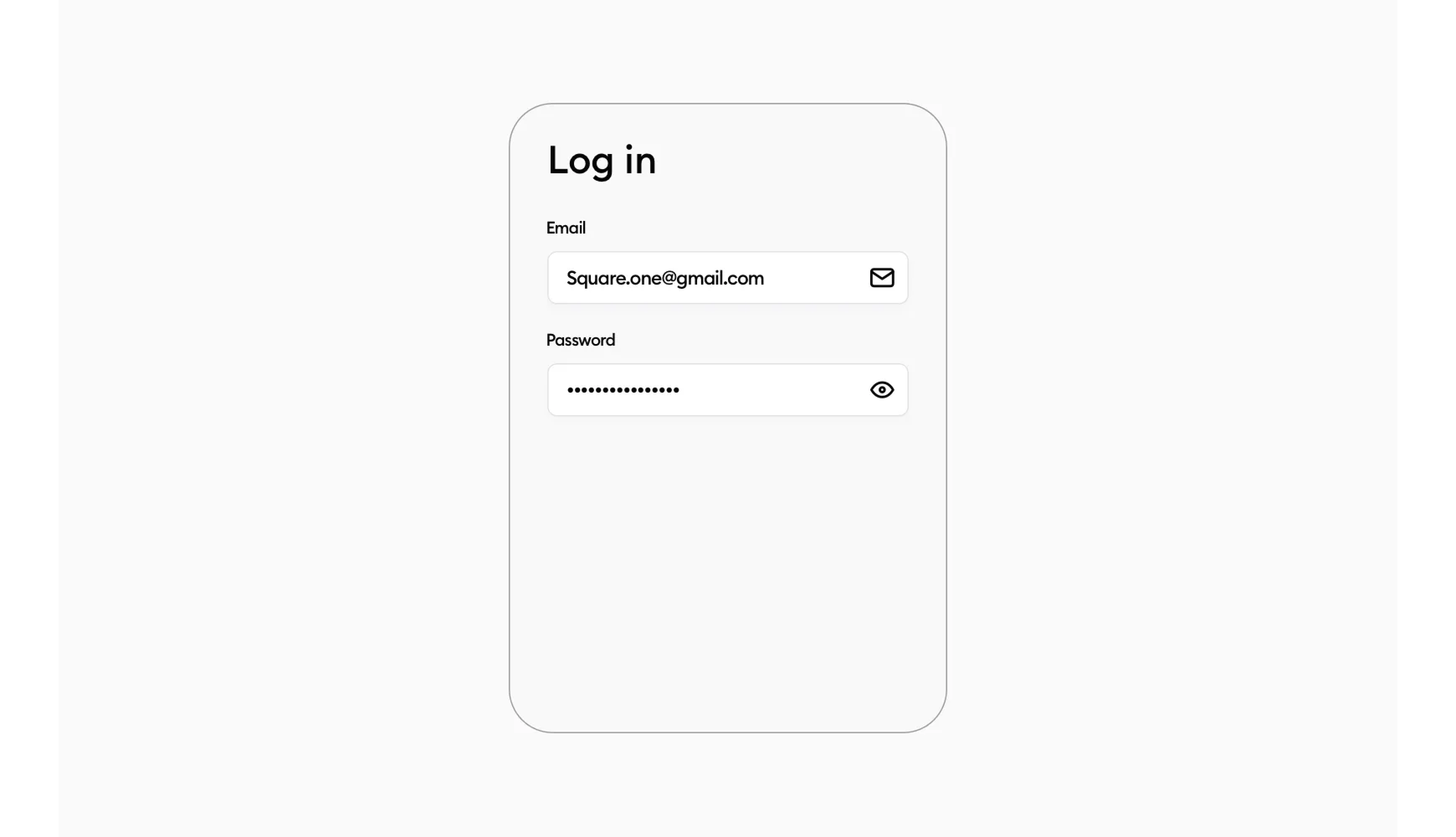
This is the first thing I’ve learned after working with Michal. Making the label 1–2pt smaller than the field text is the way to go now for my designs.
The important info sticks out the most, while the form label is still big enough to be nice and clearly readable.
The icons placement
Now this is a tough one, right? How do we position the icons in the field?! What’s the optimal spacing? How big the icon should be? So many questions about a simple icon.
I’ve actually had to look for quite a while since we’ve specified this with a red rectangle in our PRO guides a lot. So most of the users on our platform don’t make this mistake. Sometimes there’s still someone who skips the guide and doesn’t align it but that’s okay.
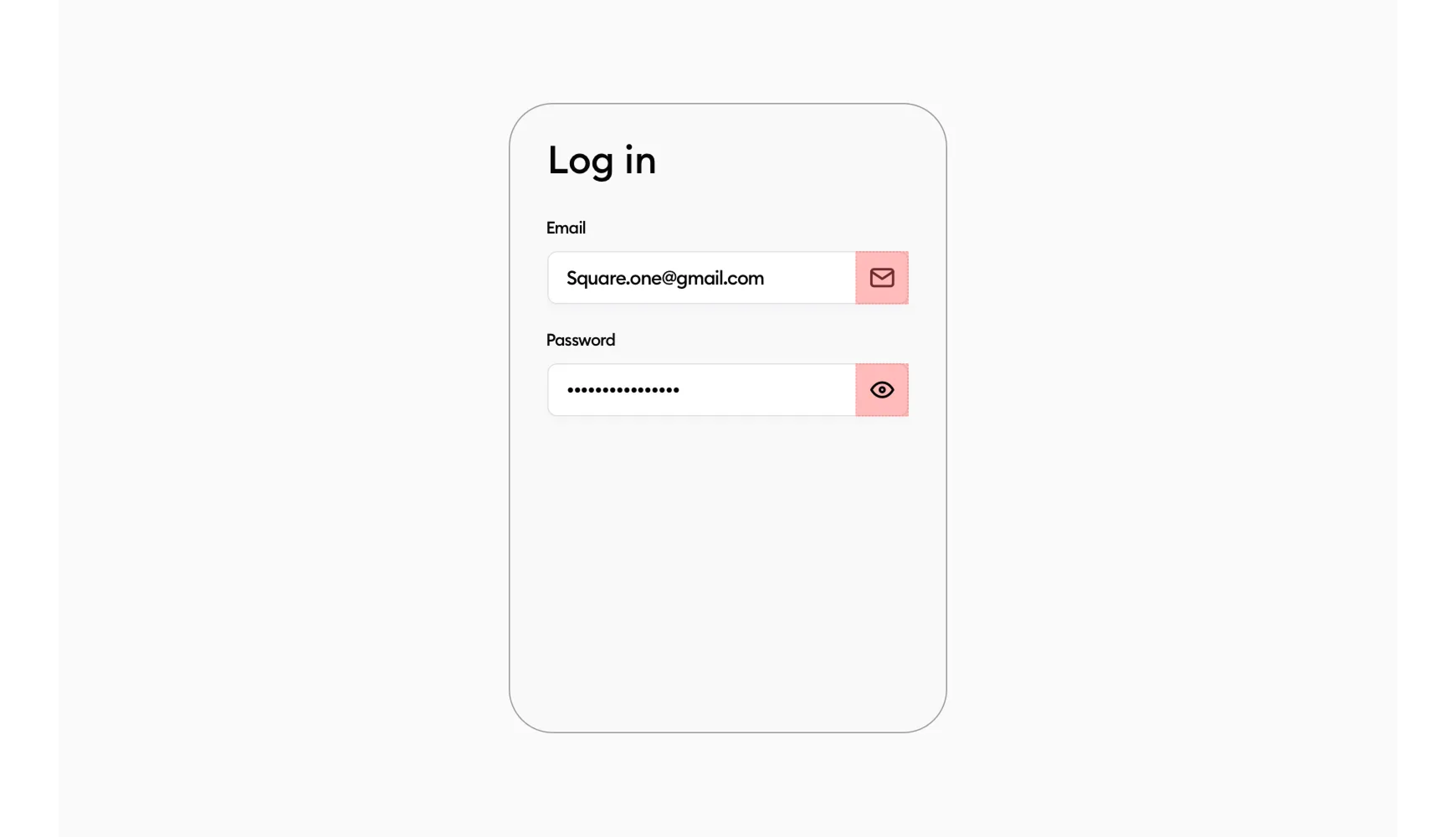
This is an ideal placement of the icon. You make a rectangle of the width of the field and align it to the right side. Then place the icon visually in the center, without auto layout. Yes, you use your eye and not the tools in your software to check if it’s visually in the center.
You want the icon to be roughly 1/4th of the fields height.
Why visually? Well things like chevrons when aligned normally in the rectangle, won’t look good.
It’s the 0.5–1pt difference. And I like that difference to be done right and not have my designs off by 1pt.
Of course, this isn’t the only way to align the icon, you can eye it and have roughly the same padding from each side of the field and that would work too. As long as it looks visually nice. But that comes with training your eye and designing.
Forgot password?
Now this is another tough one. What’s too close? What’s too far? Left aligned? Right aligned?
Fortunately, this is another very easy fix. Let’s imagine that the “Forgot password?” is a button. Which it actually is right? You click it and go to the other screen with the reset form.
So we have the ideal height already. It has to have a good touch target. Which is 44pt. This number is recommended for juniors. I personally sometimes like to use 40pt, sometimes 44, 48, 56, 60. It all depends on the type of app you’re designing.
But 44 is a safe number. So we take that number, make a shape 44pt in height, and align it like so.
Simple right? Now all it needs is a text inside, visually aligned again! And we have nicely placed “Forgot password” with a good touch target.
The buttons
In some of the examples above, we can see that the buttons are the same. Same color for both of them, small height, big height. What’s the ideal scenario?!
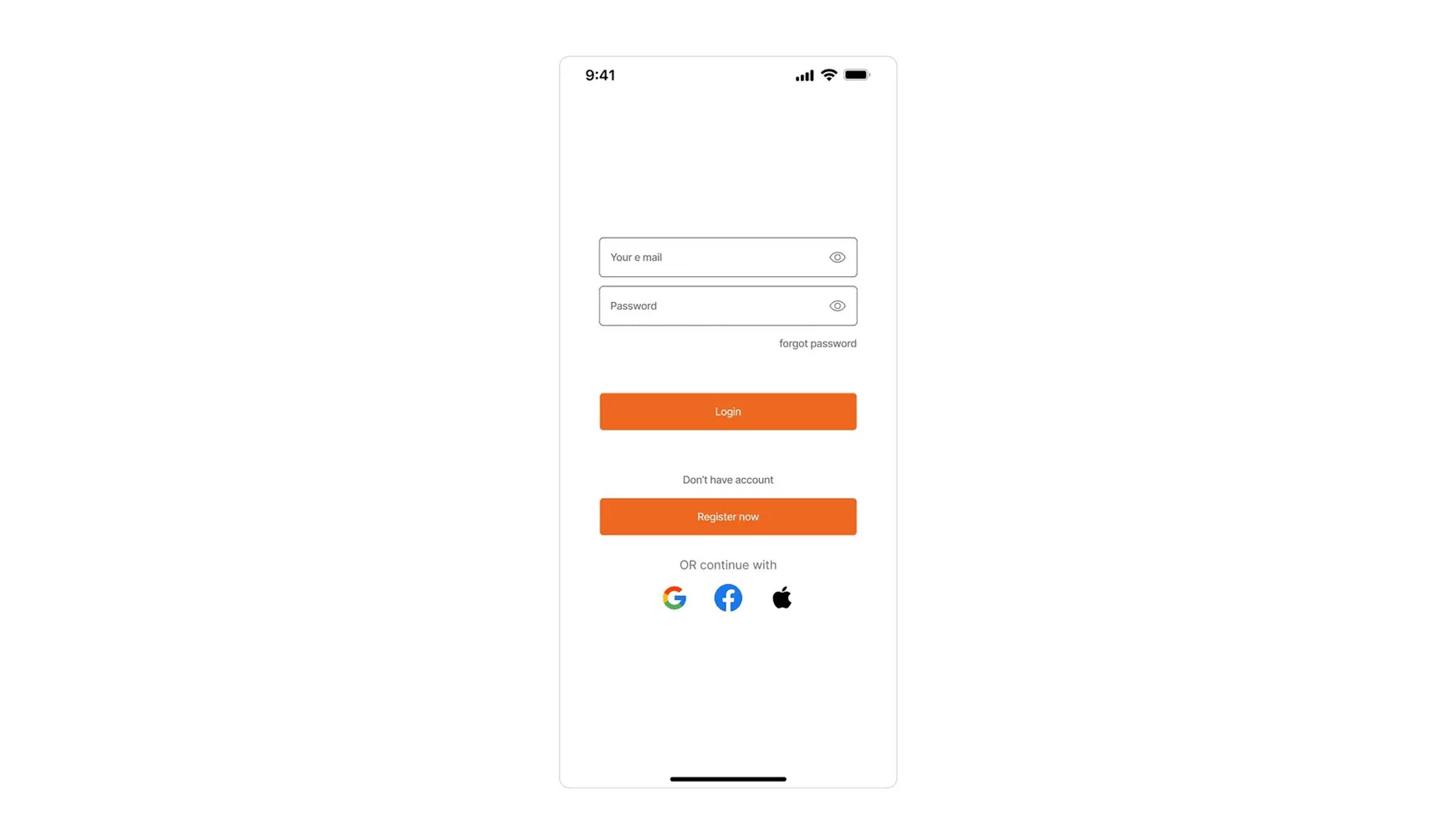
Having the buttons the same color will confuse the user. What’s the primary action? There is no visual clue on what to click first, the user needs to stop and think for a second and it kind of makes the whole flow not fluid.
Fortunately, we’ve already established that we’re at Log In flow. So the Login button is the CTA, which means that one has the primary color, and the register now is a secondary action.
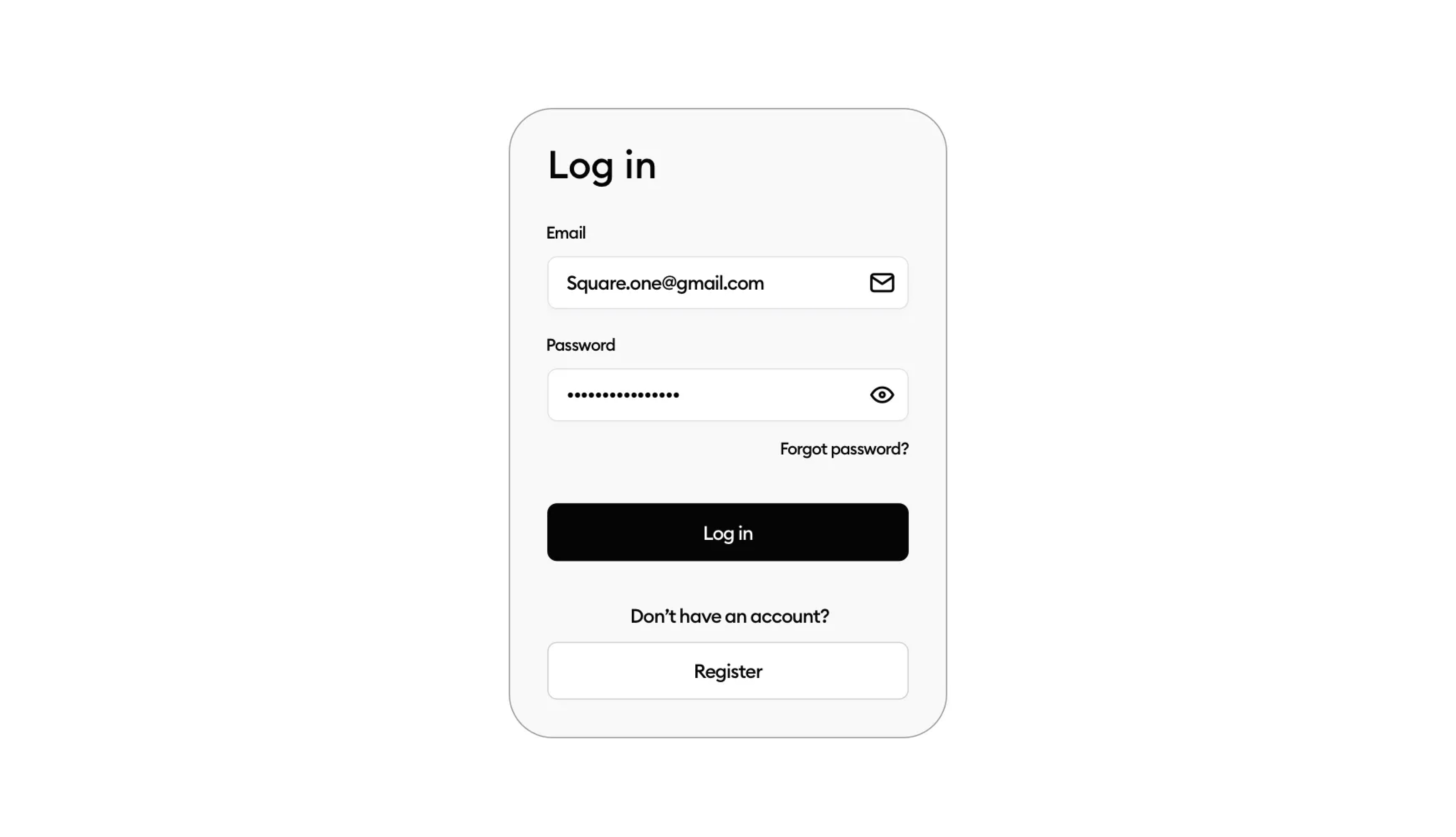
Now you can see in the image above, that my buttons are bigger than the fields. Why? Well, this is another thing I’ve learned after almost a year under Michal that it’s actually better.
It’s a slight change, but it makes the button look bigger, of course, than the fields so visually it’s another element. At least our brain thinks so and the user processes it better and it results in higher clicks on the button itself.
This applies to not just this scenario.
Now there is nothing wrong with having the buttons the same height as the fields. Which by the way should be 44pt and above again, a proper touch target…
What about the spacing?
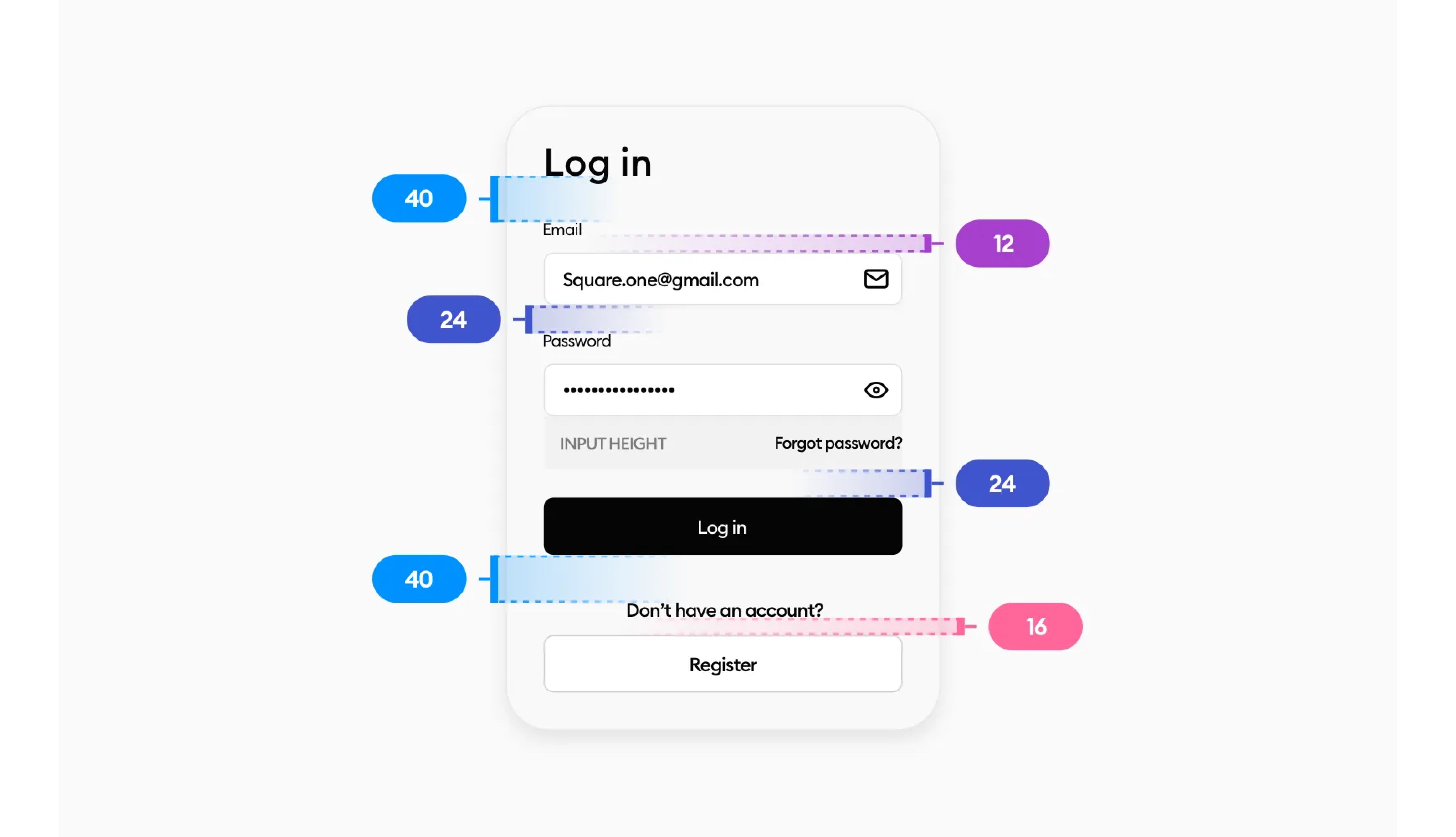
No worries I got you covered! We use an 8-point grid, which is the recommended one for juniors, and apply it to our design.
With the multiples of 8 and some 0.5x in there, we have a nicely spaced-out design.
With all these steps taken, your form game should be at a whole other level now. The same principles apply to the Registration form as well! There’s no secret there. Who knows maybe we will cover that one in the future.
I’d like to say one more thing. The tips I’ve shown here aren’t set in stone. Rules are meant to be broken and there are multiple ways how to tackle this design.
You should nitpick what I said and take only what seems valuable to you and ditch the rest.
I’m constantly learning day by day about new techniques and training my eye to be better at design. So if you have a different approach and you like it, stick with it! Don’t change things that work for you just because someone said so.
There are multiple ways how to check if this suits you or not, if this is bullish!t or not. A/B test the forms with the same button height and bigger one… and you’ll see what your target group prefers.
I hope you enjoyed the article. If you’ve found this helpful please share it with others. It helps me grow a little more.
With that being said. I wish you a beautiful day and see you at the next one.
You can find me on LinkedIn, & Twitter.
Liked the article? Share it!

