What's the big idea?
The main reason for coining the name glassmorphism was simple. The effect wasn't new (it dates back to almost 10 years ago), but each company called it something else.
From acrylic, through frosted-glass to simply "glass effect". Without a common name designers could agree on, there would be difficulty exploring the use-cases, inspirations and examples.
It would make learning a lot harder.
Luckily the name caught on, and as of today there are over 3500 Dribbble shots using the tag, with Neumorphism at 5500. Keep in mind, that Neumorphism has been around (as a name) for over a year longer than Glassmorphism.

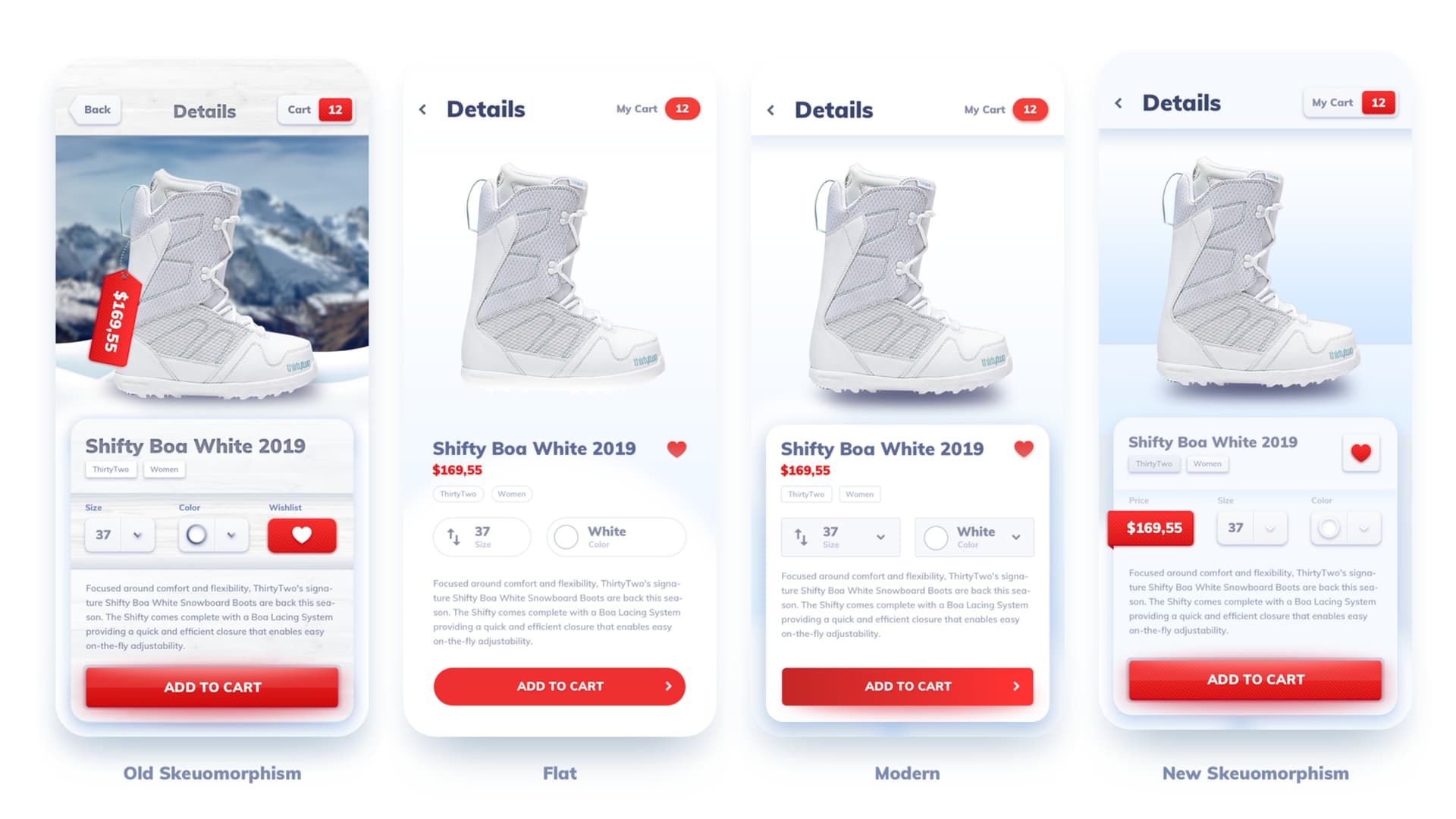
Looking through the glass
As of today, there are at least four main ways to achieving a blurred, frosted-glass style background. You can:
Use a fill with reduced opacity
Use a linear gradient with uneven (but lower) opacity
Use a repositioned radial gradient going almost to transparent on the outside
Use any of the three above with a noise-texture (image) to add that "frosted" look

Of course you can combine these effects together, even adding a couple of them at the same time.

Another differentiator is using a border, which can be a transparent color (black or white) or a gradient (linear or radial). It can be thicker or thinner, depending on the look you want to achieve.

And of course there are the different levels of blur you can go with, ranging from barely any blur, to super-blurred and everything in between.
Glassmorphism goes dark mode
When the trend started, it was clear (ha!) that most of the example of this trend featured white, "frosted" glass surfaces. Since then it has heavily evolved towards dark mode, often mixed with neon colors. I addressed it with a simple tutorial on how to create glassmorphic cards that you can watch here:
Dark mode also allowed for more prominent radial-gradients, even on darker backgrounds, as it simply makes these glass cards look a lot better than their light counterparts.
Some explorations led to color overlays on the otherwise monochromatic glass, which in turn led to even more variety in styling.

More choices equal more flexibility
I believe, that is one of the reasons why this style didn't fall into obscurity, but instead is still being used both in some real products, and in design explorations.
Mainstream uses
Microsoft has premiered the preview of their next Windows OS, that relies heavily on Glassmorphism/Acrylic to show window hierarchy. The same effect has been used in Mac OS Big Sur for a while now too, and before that in Windows Vista, iOS 7 and many others.

The current usage in both Mac OS and Windows, however, is a lot more refined, simpler and has better overall accessibility.
Accessibility
I've said it many times before - a design trend is as accessible as you make it to be. That means that even Neumorphism can be accessible if you pick the right contrast for all the important elements and keep experimenting limited to decoration.

Aurora UI
As I predicted, Aurora UI style backgrounds are gaining in popularity and mixed with this style they give the right amount of freshness to the interfaces - at least for now.
The simple, heavily blurred, intersecting ellipses seem to do the trick most of the time, but for the glass effect to really shine through, you also need some more opaque objects in the background.

Future of Glassmorphism
Unlike Neumorphism, the glass effect will likely stay with us a little bit longer. It has more uses than most of the other recent styles, merges well with both light and dark modes, and can be used with good accessibility and contrast in mind.
It's worth practicing glassmorphism UI's, but it's also important to understand that it works best when it's limited to one or two on-screen elements only.

Adding the effect to everything on the screen can have the same negative effects Neumorphism had, and can lead to boring, over-designed projects.
Keep it subtle, keep it simple and experiment!