Dark mode is now present in nearly every popular product. When Instagram, YouTube and even LinkedIn added the option, we can now say it has become mainstream.
There’s still many misconceptions about how Dark Mode should be created for the best results in terms of look&feel, accessibility, battery life and performance on all kinds of devices.
There’s more to Dark Mode than just inverting the colors. In this part of the series let’s explore colors and depth.
Colors and Depth

Saturation of accents
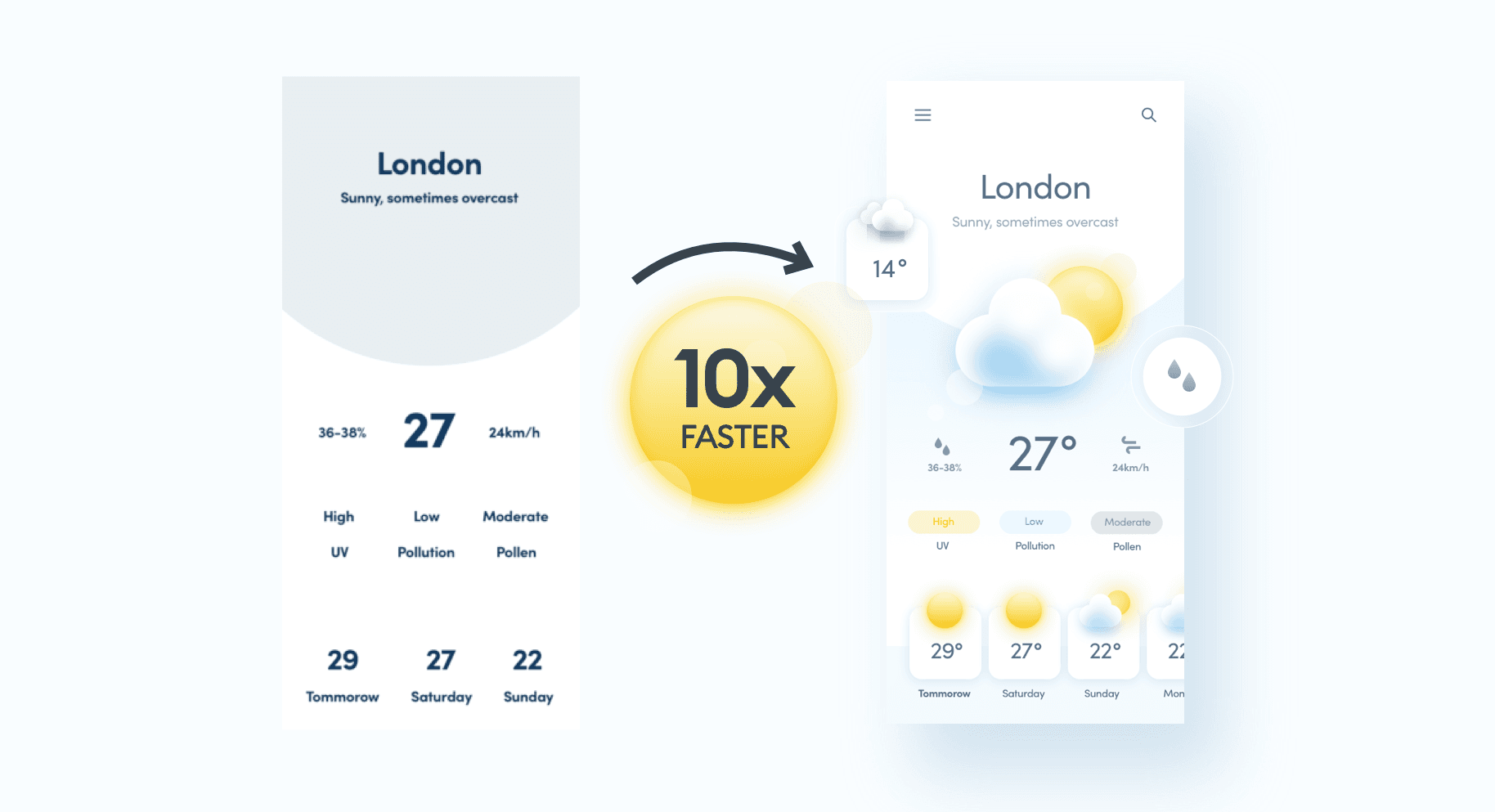
Avoid using 100% saturated accent colors, as they’re not visible on dark backgrounds. If your brand color is “strong” that way, just reduce the saturation for Dark Mode.
What I found works best is saturation decrease by about 20–30% depending on the hue. You don’t need to touch any of the other values in most cases.
As you can see in the above example, the colors in Light mode, when placed on a darker background are harsh and difficult to look at. With that simple desaturation trick, they end up being a lot easier on the eyes.

Infuse your grey with the accent
Another thing is using a color theme for your dark grey shades that’s based on the accent color. You can’t go too far with it, but when done in a subtle manner it will transform the entire design into a consistent, coherent whole.
In our case (example above) I simply added a little touch of blue to the greys, so that it matches the button (accent color) and other UI elements better.

Simulating a light source
Another important part is the hierarchy of the layers, that’s mostly created by their brightness. The typical angle at which we old our phone is around 45°, and the most natural light source is the one coming from the top — either the sun or a ceiling light.
So those fake, simulated, perceived layers are brighter the closer they are to the light source. You can use it to your advantage.
Even though the interface is completely flat, our mind still prefers to be cheated a little bit for better, easier to grasp hierarchy. This is why fake depth is important!

Unnatural lighting
This is why you should avoid objects that are perceived as “on top”, or closer to the users being darker than the background. As you can see in the example on the left, it looks unnatural and takes it longer for our brain to process the image. The one on the right is more in line with how a real stack of layers would be lit.

Layers trick
One trick in particular that does it well is simply starting with a base brightness of the background (the darkest color) and adding 8 or 10 points of brightness to each of the levels.
In most cases you’ll only need two or three layers anyway.
Using that trick you’ll have a consistent “color distance” between the layers and it will help our brain process it faster.
Video explanation
I talk more about these concepts in my recent YouTube video, so be sure to watch it and let me know in the comments if you found the knowledge useful.
Good luck exploring Dark Mode! These videos will be connected into a longer, free course right here at hype4.academy!