

I’m not a heavy LinkedIn user. But only recently I discovered how their pre-sign in landing page looks like and it blew my mind.
How is it possible for it to be that bad for such a well known brand?
Sure — it’s likely not an important part of the funnel, but come on! I’ve seen hundreds of complete beginner projects done with more attention to detail.
Let’s first break it down. Then fix it. I’ll show you both my process and a final redesign that I believe works a lot better.
Why redesign?
Redesigning existing products is a great way to boost your skills. It’s a little design, but mostly logic and common sense. The rest of the validation of changes would have to come through user research.
But practicing that common sense and logic is a great way to get better. And then you can design better for clients, or redesign your own business website for more conversion.

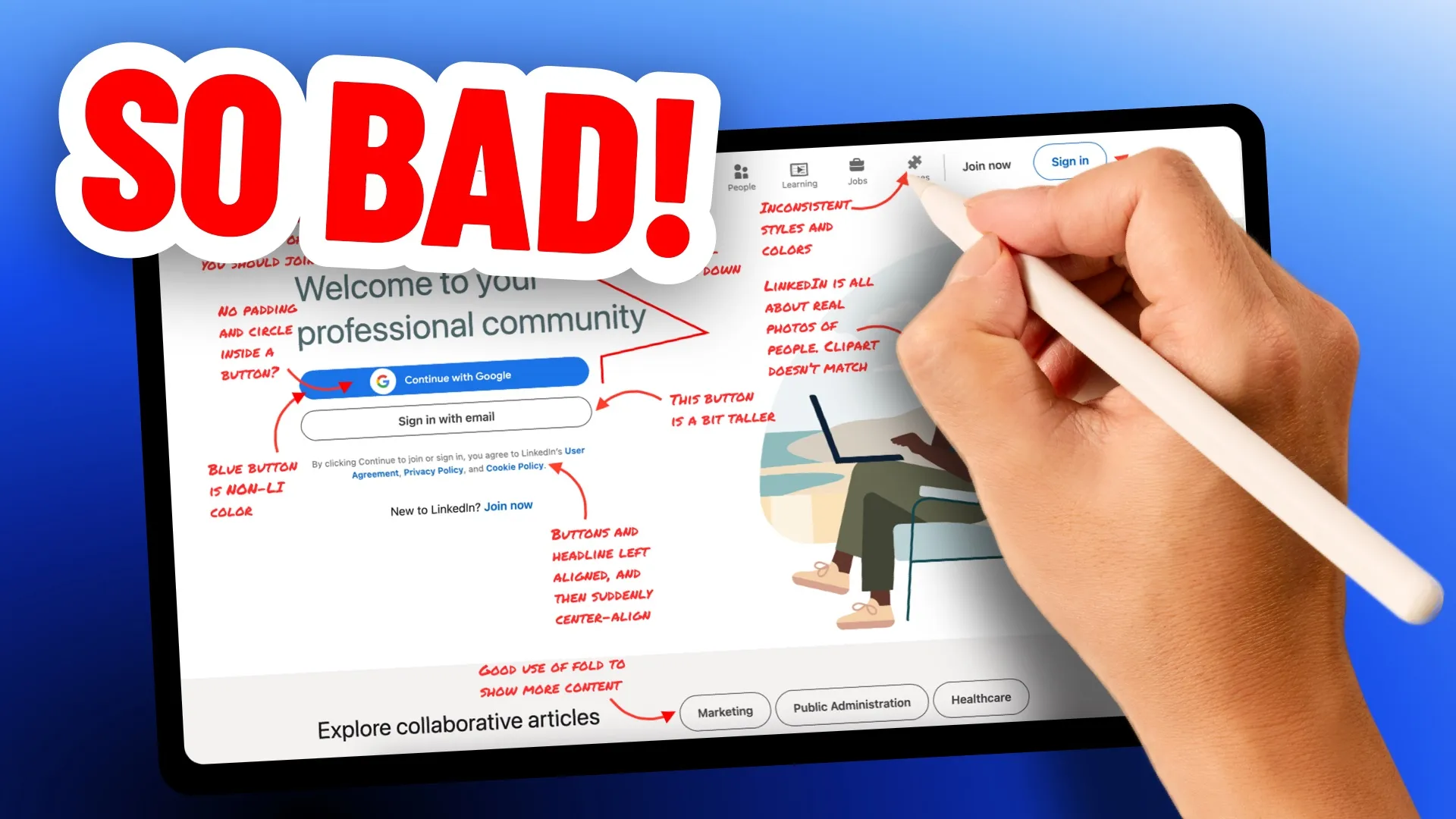
First: Annotate.
First thing to always do is annotate the key issues. But I like to do one other thing even before that.
I take most prominent content blocks and try to see where they lead the eye. In this case the left aligned headline and buttons is followed up by a center aligned smaller text.
This is extremely confusing and a bad design practice.
Then a circular shape of the graphic makes us follow it with our eyes, going away from the CTA.
The person is positioned diagonally, yet all the shelves and items behind are fully vertical.
All of this creates visual chaos. There’s no harmony here. Nothing to catch the eye and guide it.

Let’s explore the sections
When I searched for information about the platform, I realised they have over 1 billion users from over 200 countries. This is huge, yet it’s not mentioned anywhere on the site.
Not even a mention of a billion users?!

There’s a lot of issues with the design. Starting from a vague headline that doesn’t really say WHY you should join. Sure — everyone knows LinkedIn… unless they don’t.
And there’s a growing number of young people who never experienced the platform and are now joining the workforce. This doesn’t feel convincing to them.
We also have a blue button with a badly aligned Google logo inside. The blue is NOT LinkedIn blue. It’s also not Google blue. It’s just some random color. But even if it was Google blue, why the main CTA would be branded with a competing company color?

With just three buttons on the page, they all have different heights. The icons up top are inconsistent between each other in both size and style. Some are filled, other more outlined.
And why do we need games on a professional network? Especially before signing in? You think this will convert gen-Z? Really?
All of that it’s topped off by 90s style clipart graphics that doesn’t really explain what the platform is about. It just shows a guy with many hobbies (based on the shelves content) balancing a laptop on his knees in some magical way.

This can be done better!
After I annotate an existing design I usually start with a mind-map. I like doing them on paper, as it allows me to detach from a computer-mindset and think a bit more out of the box.
The markers and highlighters also serve a function. Coloring boxes is completely unnecessary, but I do it because it helps me relax while thinking what to add. It helps with focus.
Adds some extra points to creativity. And yeah, it does look good in case studies.

I divided the mind-map vertically into two main sections. The one on the right is mostly personal — as it can lead to business opportunities, connecting with peers or getting a job.
The left one is purely social. You can engage with industry leaders, read articles, follow people.
All that connects into a social network that’s huge. A Billion users is a really big selling point.
Typeframe

The next step is always a typeframe. A technique I developed a couple years ago that merges low-fidelity wireframes with high-fidelity copywriting.
What it means is that you create the text hierarchy already through proper spacing and font-sizes. Then you write the copy you believe will work best.
When working with external marketing teams, this approach allows them to better guide you with copy refinements. People simply understand hierarchical structures like that better than typical grey wires.

Redesign
This is my redesign. And yes, I admit it! I recolored LinkedIn brand. This is extremely unprofessional of me, but for some reason I just really can’t stand that color.
Of course if we were acting professionally here, it should’ve stayed on brand. Same with the button and text highlights.
Now let’s go through the redesign and explain our decisions.
Explaining your design decisions is just as important part of the process as making the design itself. This is how to become a higher-valued designer.

Always explain your work
When doing annotations of the finalised designs I always use either green or blue. The original design is annotated in red. That allows for a clear distinction of which one is the “bad” one and which one is good.
The numbers are often added for extra paragraphs written in the final report PDF.

Top menu
I removed the icons and simplified it to the three main options most people use on the platform. The rest is hidden under “more”.
The main sign up and sign in actions are smaller, so they don’t take the attention away from the CTA.
When we scroll past the main CTA, they could gain borders and a more traditional button structure to become more visible again.

Actionable hero part
We start with extreme social proof (1). It’s extreme because the numbers are both unbelievable and unreachable to the competitors. This primes the user to expect the best platform of its kind on the market.
When the numbers are that high, the headline doesn’t need to carry as much benefit itself (2). It can just focus on WHAT it is and for WHOM.
I added a short list of the main benefits of the platform under the headline (3). Initially I thought of a bullet or checkmark list, but it made the design feel too heavy.
Depending on the most common signup method, the button can lead to a Google signup directly with an option to switch to another email provider right there. (4)
The backup action (sign up) is done in text, but it’s a clear, underlined link (5).

Key visual idea
The key visual connects the social proof (1) and the WHO (3) with actually showing people.
Some of them can light up and show their profession, other can be even more muted. I understand this can also be a little overwhelming, so it’d be good to experiment with variants of this visual.
Possibly ones with bigger photos, or a moving carousel with only showing 2–3 people at one time.
There’s a lot of potential to use that 1 Billion users as they visual. They are after all what make that platform the most important one for job seekers and business people.
Key takeaways
This exercise is not about making LinkedIn better. They likely don’t care about improving because … well, they do have a Billion users already.
This is all about showing a process of logically breaking down issues and providing solutions you stand by.
They don’t need to be the perfect solution yet. This is what iteration and constant improvement is for. We redesign, test how users engage with it and constantly tweak it.
I hope you learned something Today and that you will now look at the internet with a more critical eye. Noticing many of the details you previously missed.
If so, my job here is done.
Liked the article? Share it!


