Last year I reviewed the Google UX Course on YouTube and the videos got quite popular. While I found some issues with naming conventions and a bit of unnecessary filler I quickly realised that even with all its flaws the Google UX Course is one of the best values for the money. It’s a great way to get the foundational knowledge of UX and then continue on your own.
And yes, you need to get through the very bad UX of the Coursera platform to learn from this course, so get yourself ready for a ride of confusing buttons and inaccessible content (black text on a black background on the iPad app).
The low point
While segments 1–4 were quite good, I was a bit diappointed with segment 5 — the one on high fidelity UI. Let’s start by stating the obvious — in a course aimed at complete beginners the high fidelity UI can’t be “too high-fidelity” as it’d be scary and intimidating for beginners.
Because of that I understand some of the choices Google has made in those high-fidelity designs, but what I don’t understand is why they almost completely skipped talking about the grid, layout and rule of proximity. This should be pushed super hard in a high-fidelity segment as these rules are what shapes a design.
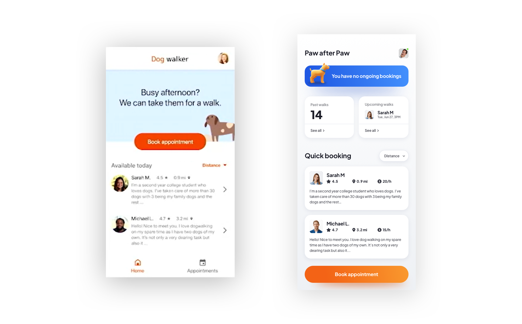
I made a video review of that course last year and back then I said that if that video gets 1000 likes, I’ll live-redesign the Dog Walking example app. A couple of days ago it got there and I livestreamed my redesign on YouTube.
What changed?
On the left you can see the original dog walking app and on the right — my redesign. Let’s explore what happened here exactly.
I want to share four changes with you specifically. There of course is more here, but these are the main differences that shape the entire app.
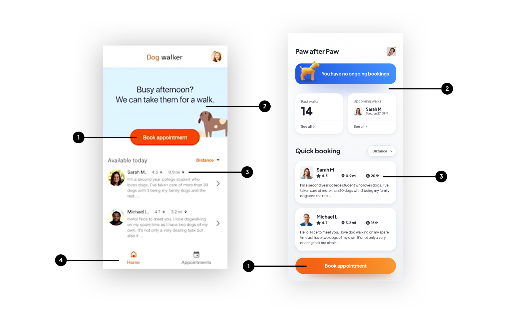
Google placed their main CTA button in the top section of the screen. This is not the optimal spot for it as it’s a lot easier to reach a button like that with our thumb when it’s closer to the bottom of the screen
The top section is just a visual filler that may be friendly, but takes up space and doesn’t provide us with any valuable information. Instead I divided the top portion into three segments: current (ongoing) booking, past bookings and ones scheduled for the future.
I made cards for the quick-book dog walker list and added a hourly rate for each person, as I think especially in the current economy price is a factor as well.
Point 2 also leads to this one. Because we now have our past bookings (and future ones) on the main screen, we don’t need a bottom menu in the app at all. Al lcan be done contextually from within one screen — and simplifying navigation like this makes the process more fluid and fun.
Flow changes
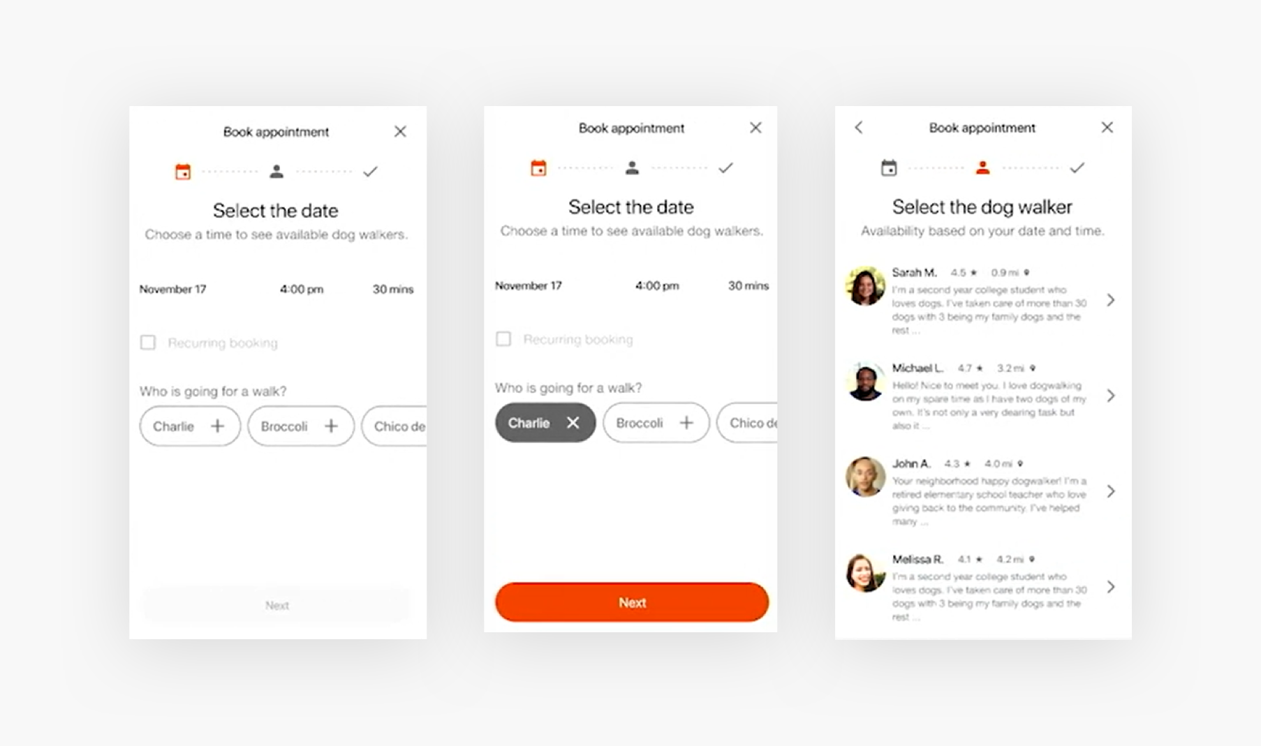
The original app started with a three-step timeline at the top and a complex date and time picker. The dog picker looks a little bland and unfun, as most dog owners would likely love to see a photo of their pup there.
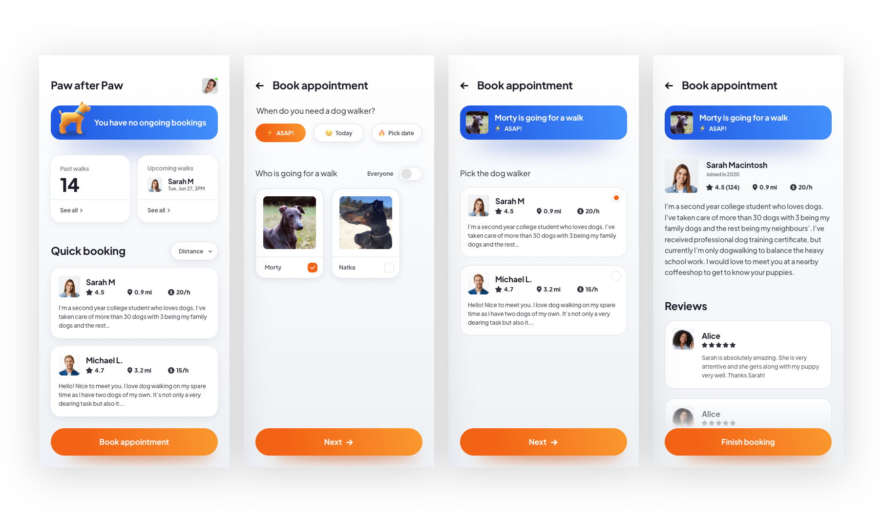
In my version the flow is simplified. You can book “ASAP”, get a call from the dogwalker to specify the details and pick your dogs from a more visual list. You also have a toggle to select all the dogs at the same time.
Then the selected dog and time stays at the top for context while you choose the person you want.
The next step is that person’s profile with reviews and more information and a final booking confirmation.
Conclusion
While my approach is a bit more high-fidelity than a beginner-oriented course should do, I still believe there should be some middle ground here. I created my mobile app UI Courses exactly inspired by the things the Google UX Course missed in the UI section.
Our exercise was more of a dare coming from 1000 YouTube likes, but focusing on layout and using the rule of proximity to define hierarchy should be in a high-fidelity UI course regardless of how complex the design is.
You can watch the full redesign stream on YouTube for free until July 7th, after that day it will only be available to the channel paid Members.