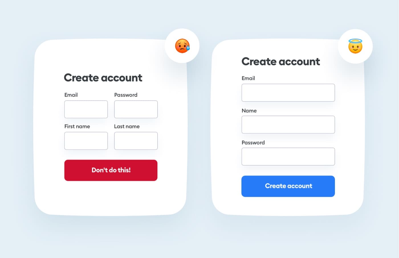
Forms that are arranged in one column are much clearer and easier to read than forms that are arranged next to each other.
Keep your forms one column for easier scanning and readability.
Avoid multi-column forms whenever you can!

In order to log into your academy profile, please provide your email and password

Forms that are arranged in one column are much clearer and easier to read than forms that are arranged next to each other.
Keep your forms one column for easier scanning and readability.
Avoid multi-column forms whenever you can!