Welcome Stranger, I hope you have an amazing day! Grab something to drink or eat and let us dive into today’s episode.
30 different designs?
In the past month, I’ve been working with the team on a landing page challenge. I knew this one would be tough. Like most of the designers out there, my focus was on mobile apps for a long time.
Luckily that changed about a year ago, but still. Practicing mobile for over 2 years and switching to the web is a challenge on its own. So I was scared and happy to work on this challenge at the same time.

In the end, we did 30 different header designs. Some were perfect from the start and some needed minor tweaks from Michal Malewicz. So what did I learn? Let’s look at some of the things very few people do when it comes to the web.
The grid
Let’s start with the most basic thing, a grid. You should always set up one for your design. You don’t have to follow it in the end. But it’s great to have an idea of how to structure one, two, or more boxes next to each other and how wide they’re going to be.
It’s as simple as that. Not everything has to follow the grid, but having one never hurts.

These settings allow you to have nice columns that are dividable by any number. Two, three four you name it. That’s most of the use cases you’ll need in there.
Also, I stole those settings from Michal, don’t tell him.
Solid base
This rule should be used for everything you do, not just landing pages or web design itself. Keeping things simple and having a solid foundation is mandatory for the design to look good.
Write things down, do wireframes (if needed), and have a solid understanding of what you’re building and what you want to achieve with it.

The example above is the perfect choice for this. It’s simple, it’s minimalistic and it’s clear. Those three things also allow you to have zero room for error. But it ticks all the boxes.
The idea is there, and the understanding of what we want to achieve is there too. It’s to convert in this case with a big red button. And those fancy effects around it are just a filler for the user's mind.
Raster edit
Raster editing is one of the essential skills to have when it comes to web design. Not only does it allow you to have infinite options, but it also makes everything way easier for you.
Don’t like the color of the shirt? No problem, let’s change it. Something in the illustrations doesn’t match. No problem, let’s change it.

You can see in the example, I’ve used my profile photo for this design. But the photo doesn’t match. It has a green background and a red shirt. Which obviously doesn’t exist in clouds right?
That’s the power you gain by spending a little bit of time playing around with vectors, cutting and masking things, and learning how different shading techniques work.
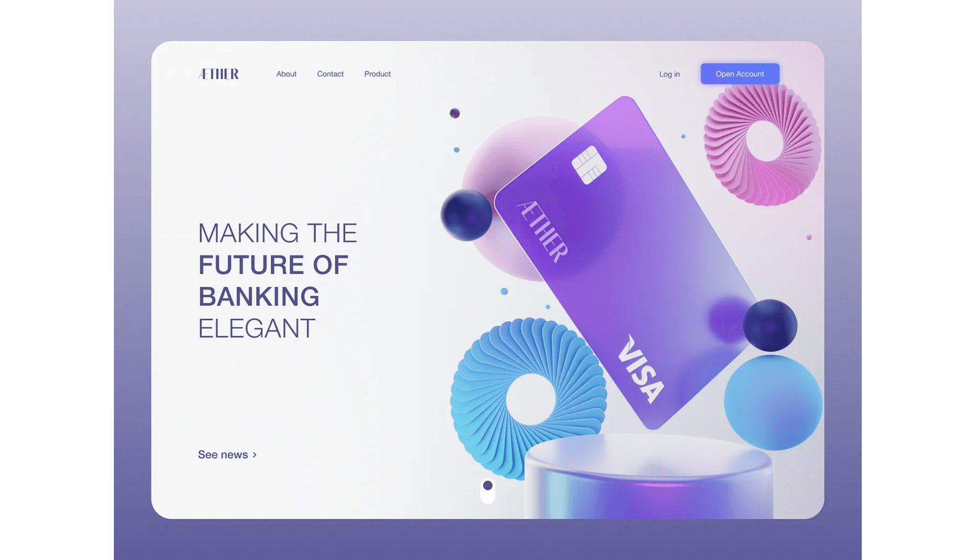
No distractions
Keeping the user in the flow that was crafted for a specific design can be tough. There is a fine line between having just enough elements and having too many of them.
Colors are the most powerful thing we can use for this. It’s also the biggest enemy. Most designs these days I see, have one common problem. They have the same button in the navigation and in the main flow.

In the example above, we break that. There’s a big CTA on the left and a subtle minimal button in the navigation. Why is that?
You don’t want to lose the users focus once you have it
What the user sees first is any of those three boxes. Most likely the big typo and then the user scans around. But with another color at the top, it wouldn’t be like that.
The color at the top would compete with the rest, dragging the user’s eye into the top right corner, which we don’t want!
It can be blue once the user scrolls down
Once the user scrolls down, make sure to make it the main CTA since there won’t be anything else important in the flow. Since the main flow is already broken.
Be crazy, Be you
Be crazy. Experiment, iterate. Don’t be afraid of breaking the bubble. If you follow all the steps above and have a solid foundation and understanding or even low-fi design already. Be you.
Obviously, there’s a fine line again. But being different and making your ideas come alive is the best you can do. We learn from mistakes.

So sometimes it’s good to break outside the comfort zone. I try to do that every day. It helps and it teaches you so much.
Now stop browsing that Dribbble tab you have opened for inspiration. Do a draft yourself first, look for inspiration, iterate, and do it all over again.
Most of the designs you see there or any other social media suck anyway. There’s only a handful of designers that do good shit. Rest is an eye candy for ego boosting.
Details matter
Look, web design is tough. No sugar-coating here. It really is. That’s why it’s so essential to start learning it. That leads me to the last thing I want to share today. Details.
Details are important, whether the user sees them or not. They matter. It’s also the most common mistake I see out there again. Empty spaces. Not filling white space properly.

It’s a big canvas, and for someone who focused on mobile for a while. It’s scary how much space there is. So most of the time those who are starting leave it empty.

Look at the difference. It’s uhm.. okay. But it’s empty. Details add a lot to your designs, and they don’t have to be visible. They can be subtle. As long as they're done right.
I hope you enjoyed the article and learned something useful. If you’re just starting your web design journey I wish you good luck!