You’ve learned how to do the landing page headers but don’t know what to do next? What’s the next section? What should it look like?
No worries, we got your back! Introducing the Social Proof web design challenge. After the LP headers, we decided it would be nice to continue the series with another crucial component.
Social proof these days is boring as Fu*k
Social proof is tough and boring these days. It’s important that your design is consistent with the header, that it fits the whole idea, and doesn’t feel out of place.
Most importantly it should be unique to compliment your brand. That’s where we come into play
Learn how to do Social Proof the right way
Continuing the PRO series, if you’ve done our first web design challenge you’re at the right place. Remember our E-mail design? Well how about instead of doing boring text as a testimonial, we turn the social proof into emails?
Empower the brand, be unique, and let the creative ideas flow.

Each day we provide you with a different thought process. The idea is simple, pair the social proof to the headers you’ve already done. Learn how to be consistent and how to craft interesting designs that stand out.
At the end of this challenge, if you follow our advice, you’ll explore yet again 30 different styles of social proof designs, for different specters of the industry.
Of course, you can stick to just a few layouts and call it a day, but what’s the fun in that?
Be creative
In the last challenge, we’ve introduced raster editing and masking and a whole lot of things to make your designs pretty. This will come in handy here as well, but…
We want to emphasize the idea first. The design can be simple and minimalistic if the idea is unique.

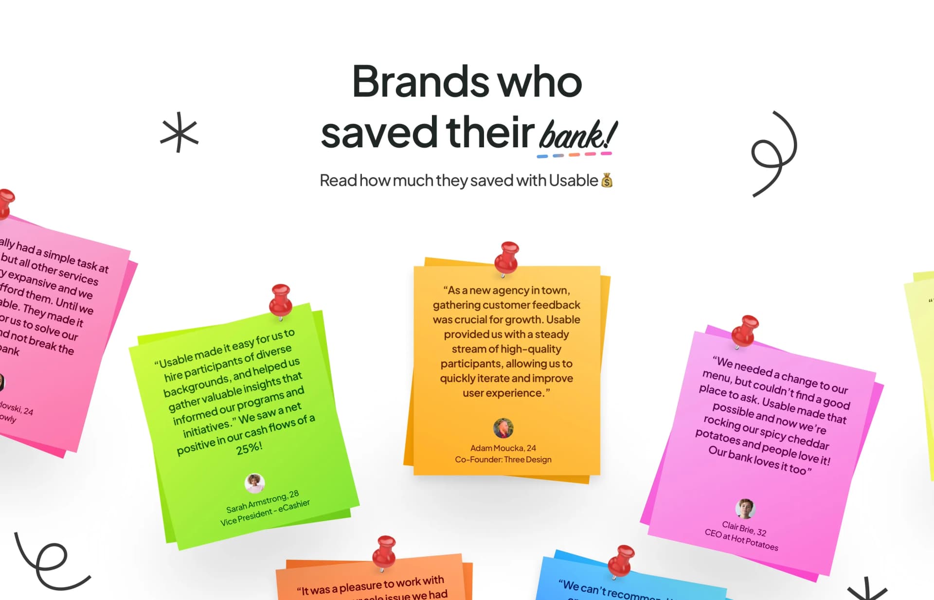
Why not just create a skeuomorphic asset for our cards? Make a paper curl for sticky notes or render a 3D bag of coffee as a testimonial?
Guides & feedback
As with any other challenge, we encourage you to try it yourself before you follow the guide. Experiment and challenge yourself.
However, if you don’t feel confident in web design and you want to practice, there is no shame in following what we did and then for another version applying the principles and creating your own stuff
We will give feedback on the challenge daily, to push you the right way or to admire what you’ve crafted.

Every challenge we prepare somehow tops what we did previously; this is no exception. Some of the designs pushed us. So enjoy it!
If you’re a PRO user, you can find the new challenge in your challenges tab soon.
If you’re not a pro user you can upgrade to PRO as the price per month is slowly rising, with more PRO people on our platform.
See you there!


