

We humans are built to respond well to a before and after. It’s a lot easier to wrap our heads around a direct comparison than just analyze the quality of the “after”.
This is why in this case I’m also starting with a before and after shot, and then we’ll dive into some more details.
If you’re not a designer, don’t worry, I won’t be using any industry jargon. This breakdown can give you an idea of how the apps and websites you use are often created.
And you know… understanding is the first step to growth (or something)

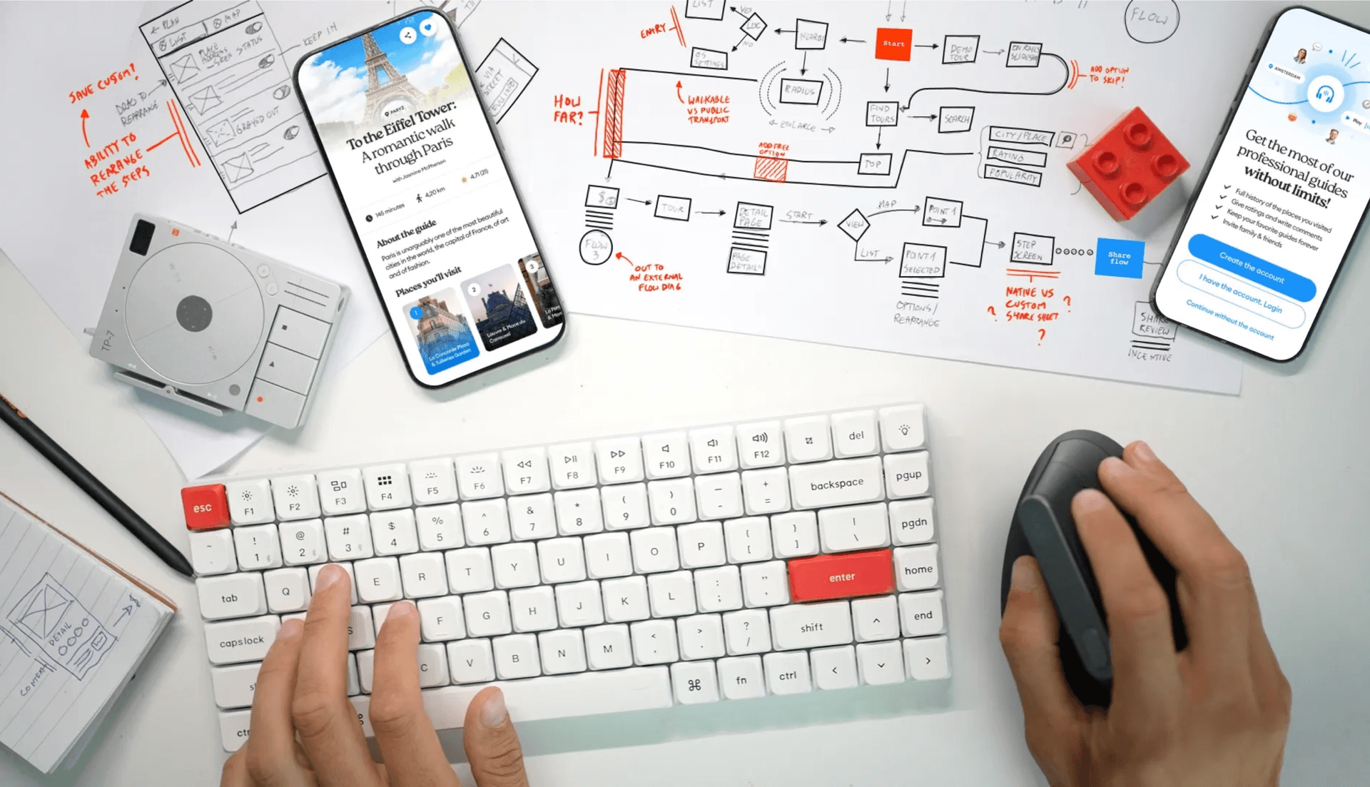
Before and After
StoryPlanetGo is a tour guide app. It creates location-based walkthroughs of cities all over the world, with commentary and special tasks to perform in each spot.
The client came to us with a coded prototype. It mostly did what the app was supposed to do, but in initial testing, the users felt underwhelmed by the look & feel of it.
The question was:
Can you make it better?
When we start a new project, we always start with a smaller, two-week exercise before we fully commit. That way both sides know whether this collaboration will be fruitful for everyone.
For us, it also shows whether we’re on the same wavelength as the client or will they interfere with our ideas in a negative way.

If your vision is significantly different than that of a client — drop the client. It’s impossible to do great work in that area (in red).
There are two reasons for this:
The client is completely oblivious to what great work is
The agency is simply incompatible with the client and someone else can help that client better.
Some gaps in vision are fine. If they’re small. If an agency wants to deliver stellar work it has to be able to work to the best of its abilities. Not bend to the client every time, because in this industry
The client is NOT always right.
It stems from the fact that we use past knowledge of hundreds of delivered projects to propose the best solution. Some clients simply “like the color pink” and want all buttons in pink. That’s not gonna work.
That client will likely get better help from another agency — there are no hard feelings or negativity in it. Just a misaligned vision.
Luckily in this case the gap was very small and the client put their full trust in us.

The normal way?
The standard way to learn about a product is through many, many Zoom calls or workshop meetings. This is how most companies do it.
Not us though.
We start async by just receiving a brief from the client and what we start with is always the main payment loop flow. What it means is we sketch a diagram of how the app makes money. It’s high level, without a lot of detail but we need to be sure we understand each other correctly.
If we don’t it can mean one of two things:
Either we completely misunderstood the brief
Or the client is unclear in places which makes it confusing
Or both.

It happens often
It’s common for a client to not have the design-related elements of their products fleshed out. It’s also pretty common for them to miss some smaller business logic quirks that come out at that stage.
The best way is to test it with a diagram and be sure.
In our case, the diagram had one missing part, outlining how there are some free tours also available, so picking one doesn’t always result in a payment. Easy peasy!

Removing complexity
To start removing complexity, we need to map out the entire user journey. That leads to a complex diagram that handles all potential paths the user can take.
Separate flows like payment, login, and others are marked with numbers and exist in different sketches to make it more managable cognitively.
When this part is done, we workshop with the client to figure out whether some screens can be combined or dropped altogether. In some cases, an extra addition can also be required.
That ends up as an annotated flow like this:

Wireframing and Typeframing
Once the flows are done we sketch out the crucial screens in low fidelity. What it means is we focus on what should be on the screen and roughly in which place. There is no focus on aesthetics and even some text is simply replaced by scribbles to roughly show how much space it will take.
It’s the planning phase before we start working on the final visuals.

But there is one more step that we invented ourselves that almost always comes into play in B2C products.
Typeframing
You can’t assume that most clients and marketing teams within the client org understand low-fidelity wireframes. Sure, they do grasp the fact that it’s a blueprint for the design — that’s easy.
But, especially with marketing, they can’t really imagine the impact of each section when everything looks exactly the same. When working with Viacom for many years (Nickelodeon and Comedy Central) we devised a method to better align with marketing teams.
I call it typeframing, as it’s a low-fidelity wireframe with proper font sizes and hierarchy.
This is an example of a sketch, a low-fidelity wireframe, and a typeframe together.

Normally typeframes are done for simple, static screens with pre-defined content. Anywhere there’s marketing copy, it’s good to start with a typeframe.
Doing it that way allows for the team to collaborate on how long the copy should be — including how many bullet points or checkmarks will fit alongside a key visual and all the necessary buttons.
This speeds up the work tremendously and allows us to propose some initial marketing copy as well. After so many years of doing this, our copy rarely gets truly changed, often just tweaked.
I believe an agency-type designer, a generalist, should be able to write good marketing copy. Especially now, with a lot of generic text created using AI tools, it’s worth writing it all with the human touch instead.

It has to be beautiful
Customers buy with their eyes. When they see a pretty product — even a digital one, like an app — they’re more likely to be interested in it.
First impressions are essential and a good-looking app sparks more trust due to the aesthetic usability effect.
Aesthetic usability effect means users perceive beautiful designs as much more intuitive than those that aren’t as pretty visually
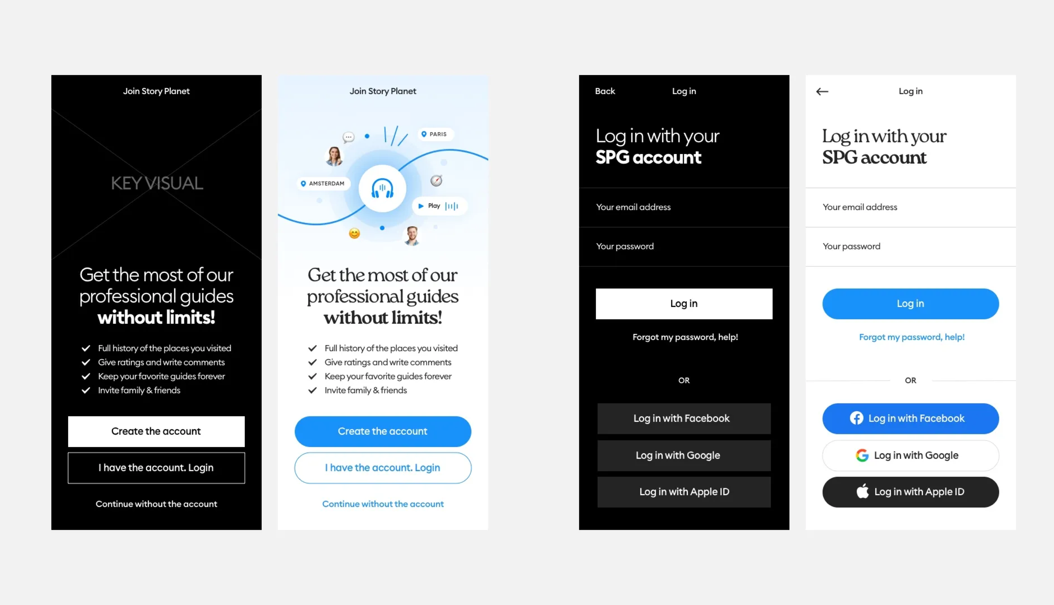
First: define
We asked the client how would they define the app in three main words. It’s a typical way for us to figure out the best visual direction.

What they came up with was: a modern, fresh, and friendly vibe.
Now, it’s easy to confuse a friendly vibe with a friendly interface. It’s not the same thing.
All interfaces should be friendly. That’s implied.
A friendly vibe means how it feels to look at it.
First “real world” tests
We created the main detail page and decided to test it out in the wild. Mocked up a location in our own town and went there to have a feel for how visible stuff on the screen is.

That revealed that we need to keep the app minimal and avoid adding decorative elements. In bright sunlight, on noisy, crowded streets of cities
It also led to us finding the perfect button size that will work as you’re walking. Some apps go with very small controls, and that’s mostly fine if you’re static. When you’re walking the traditional 44–48px height of a button may not be enough.

When buttons are too small it’s easy — they’re harder to press comfortably and can lead to frustration. But they can’t also be too large.
Too large buttons create an effect called banner blindness.
Banner blindness means an interactive element’s size is so close to a typical banner ads, our brain naturally skips over it when we’re looking at a page.
We ended up with a 56p height of our buttons and never looked back.

Friendly vibe?
Because all places have beautiful, carefully selected photos, we decided to start our friendly vibe explorations with those. The fade-out under the text was pretty natural - but we didn’t stop there.
We went with a progressive blur of the background image as you scroll. This created a nice plasticity of the interface and increased focus on the main controls.

But it was still missing something
The app looked nice. Minimal, modern, fresh. The blur did give it a bit of a friendly vibe but we felt there is something still missing here.
Some quirky little details to make the interface more unique. And then finally we got it — changing the main title into a slightly decorative, quirky typeface did the trick.
The app has now character! We got a friendly vibe!
Yay!

Iconography
The last thing I want to cover is icons. It should be clear and obvious that you need to use one, consistent icon set for your product.
Mismatched icon styles within one app look horrible and should always be avoided.
But what if your icon set isn’t fully ready for the specific app type? You add more icons by hand!

We defined a certain line thickness, fill space, and corner roundness of the icons and reworked some of them into new ones — perfectly fitting the product.
It’s not enough if you use an icon that’s just “close enough”. It has to perfectly illustrate the idea right from the start, and in almost all cases it needs a text label anyway.
Trust me, people can even confuse the heart icon’s functionality.
When working on a grocery store loyalty app for the Irish market we tested adding to favorites as a heart icon. A whopping 67% of users thought the icon meant the product was “healthy for the heart”. We added “favorite” label and the problem was solved.

Planning edge cases
Of course, we can design in a perfect world of only beautiful photos and tour titles all having the same number of characters. Then reality hits.
A beautiful design is only as beautiful as its weakest link.
This is why for essential screens we always design for edge cases. What if the screen title was longer? Shorter? Very short?

What if for some places the photo is lower resolution and not as pretty? In that case, the beautiful blur animation lets the user focus on the pretty part and ignore the bad photo.
Everything has its place here. And it’s important to anticipate the issues and plan ahead.

Handoff and delivery
We created over 100 screens (including versions and edge cases). That is about a 20% decrease in screen number from the first version of the product.
It means we managed to optimize the flows by 20%. 1/5th the clicks. That means the user's journey to most places is faster.
The next step was delivering the design to the developers and then doing Quality Assurance checks of the coded product.
Many designers believe this is where their job ends. That often leads to butchered execution without any oversight.
It’s important to remember that guiding the developers and giving them feedback is still the job of a designer. That way we can be sure we delivered the best possible work that the users will experience the same way.
The project took a little over four months with one full-time and one part-time designer from our side. The client was very happy with the work, and from the first user studies so were the users!
And that’s exactly what we like to hear.
Liked the article? Share it!

