I design everywhere. The need to constantly analyze the world around me and think about improvements has been deeply ingrained for years now.
I can’t just walk past a design. Or fly past one. Ok, enough with the jokes.
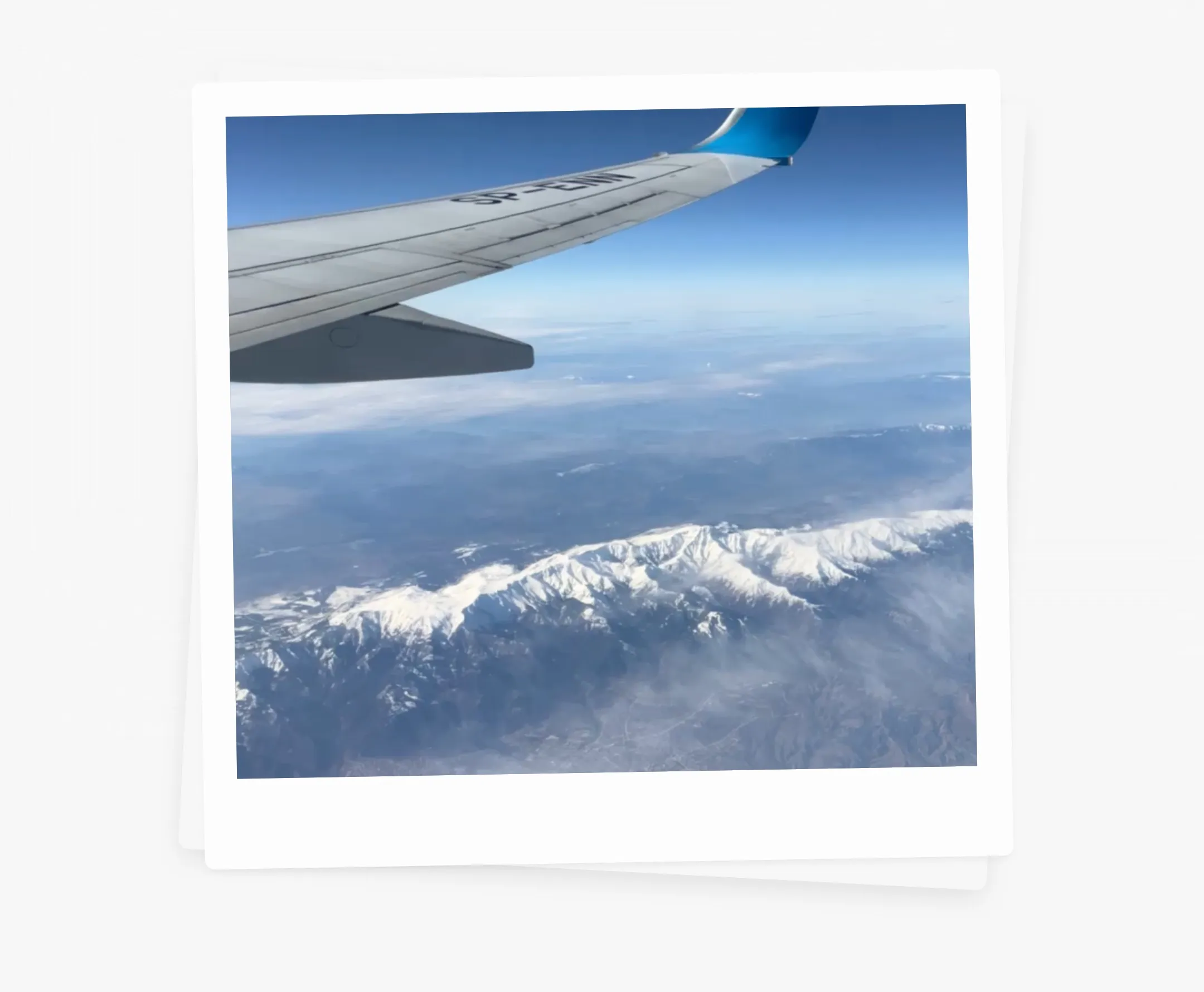
[It’s a photo from a different flight by the way ;)]
I came back to the US recently for some business meetings (and to check off some skateboarding spots). My flight from Warsaw to New York took eight hours.
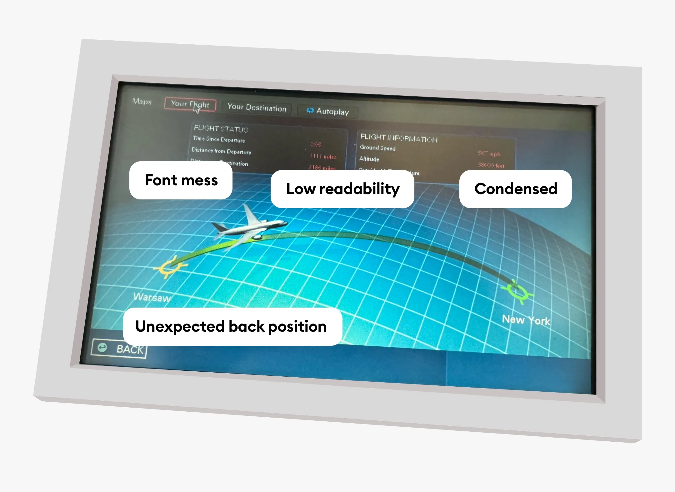
While browsing through the infotainment system I noticed how old-school it all looked. Like Flash era web oldschool. Sure — it did have some of that retro charm, but not what I would expect on a trans-continental flight. Not even close.
It kept bugging me so much that instead of watching a movie I pulled out my laptop and launched Sketch. Quickly took a photo of the original display with my phone and airdropped it to the Mac.
Identify the issues
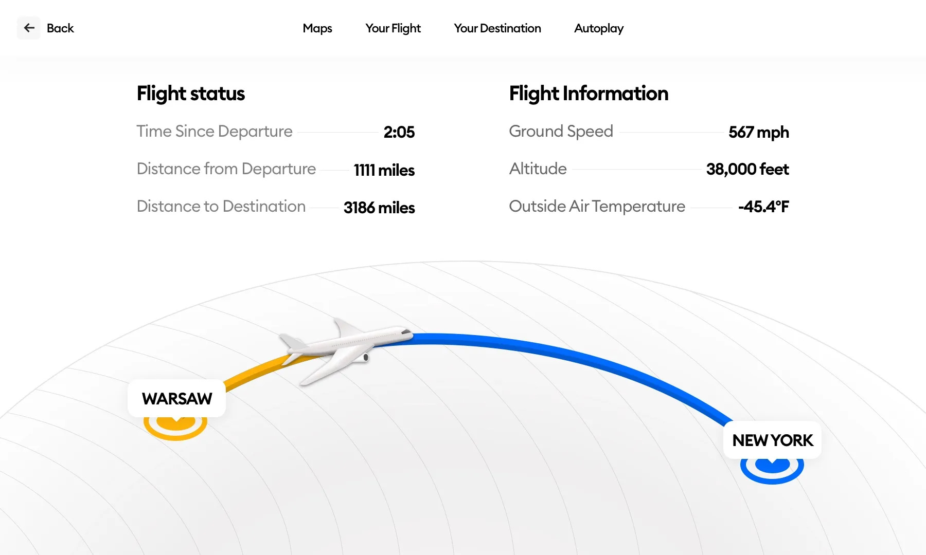
Of course, the reason why I even started the exercise is that I immediately noticed the issues with the original design. That’s step one. But in most cases, you start seeing more issues the longer you look at something.
That’s exactly what I did. The first thing I noted out is a pretty weird bottom-left corner back arrow position. Because of Jakob’s Law, we are now super-strongly used to back arrows being on the top left.
Other than the overall retro vibe of the UI the main issue was really messy fonts. Small, floating boxes with heavily condensed text made it difficult to read.
First draft
My first version was based on just “redoing” the screen as it was. Just fixing the issues but without any extra changes. That’s a good start as it allows you to see more potential solutions once you fix all those obvious things.
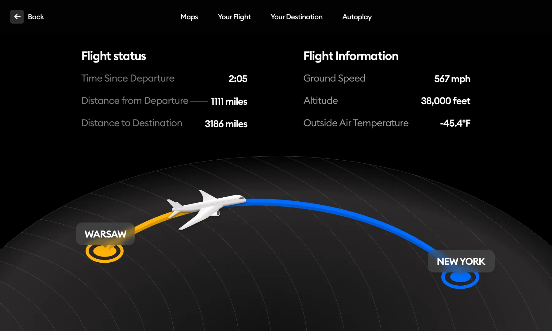
I started in dark mode and made the screen a lot simpler visually. There are still some crucial information pieces missing (like time until arrival) but at least the text is now a lot more readable.
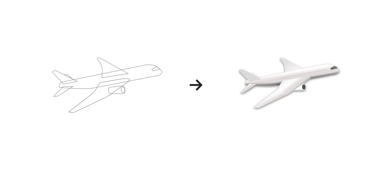
Because I was offline, I couldn’t get a nice airplane 3d model and the one from the photo I took looked like this:

An airplane isn’t really a complicated shape, so I decided to just re-draw it from scratch. Then I used simple gradients, shading and some masked blurs to create my representation. It wasn’t supposed to be an exact replica of the airplane I was in. Here the idea was purely for it to look good (enough).
Dark vs Light mode
The next step was finding out whether this interface could have a mode switch and be displayed well in both dark (default) and light mode (optional).
I quickly switched the colors. One notable difference is not using a glassmorphic effect on the city popups. It felt a bit too much on a light background.
Do we really need all that?
One thing I realized after looking at both versions is that the data grouping itself seems to be a little confusing. There is no time to destination in Flight Status and instead, we have almost irrelevant data like outside air temperature.
My next idea was to go flatter.
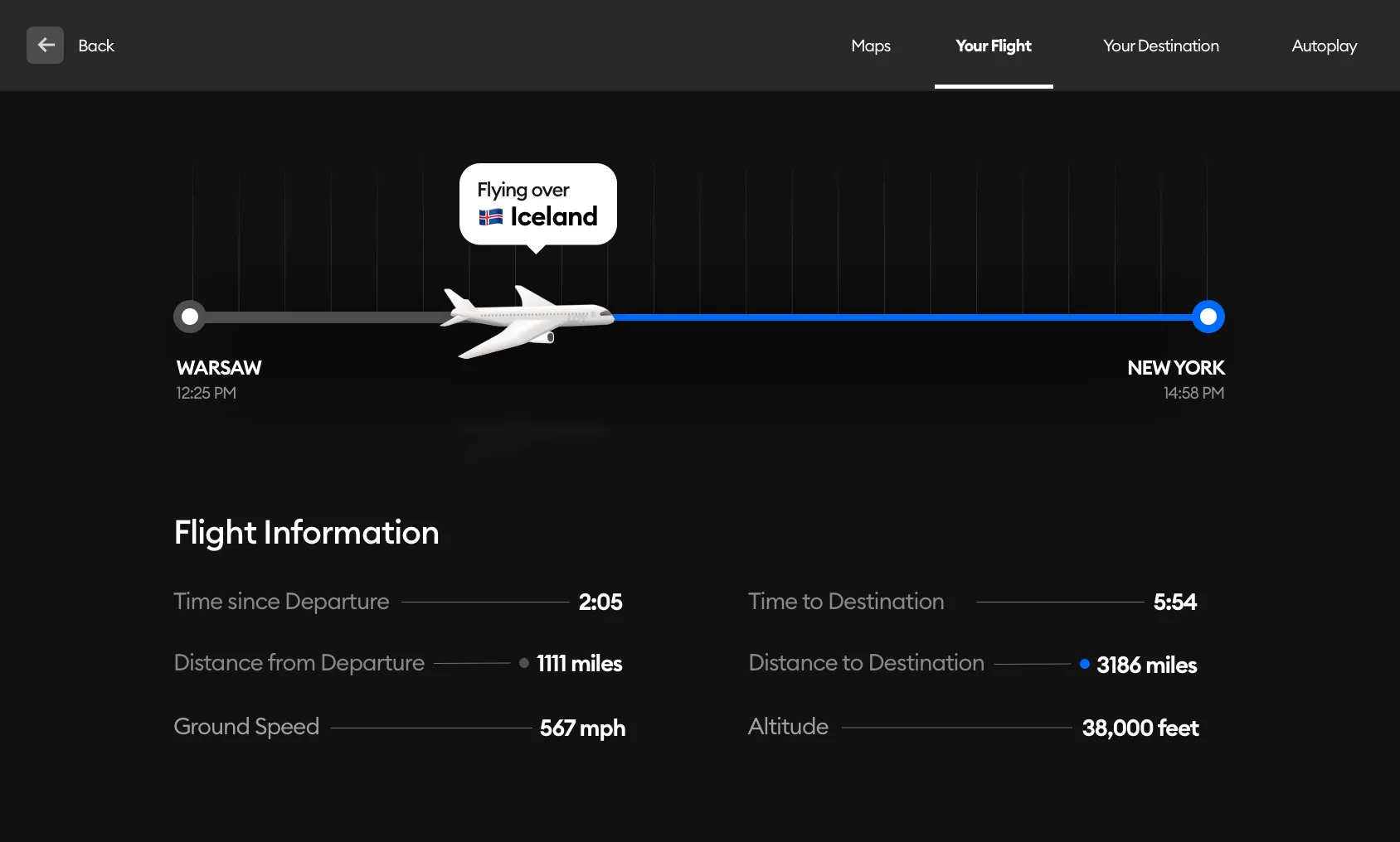
But first I removed redundancies. Essentially all of the information here is flight information because flight status is a part of flight information as well.
I arranged the departure and destination on the sides and placed the speed and altitude below. It’s not the best possible placement as it suggests speed is departure-related and altitude destination-related, but it's still a little clearer than before without completely breaking the copy.
I made the design flat with a simple timeline going from left to right. Even though we were flying west, I noticed most airplanes show the path from left to right in this view.
It may be due to the fact that progress in our cultural circle is naturally an arrow pointing from the right to the left.
I made a white version of this too.
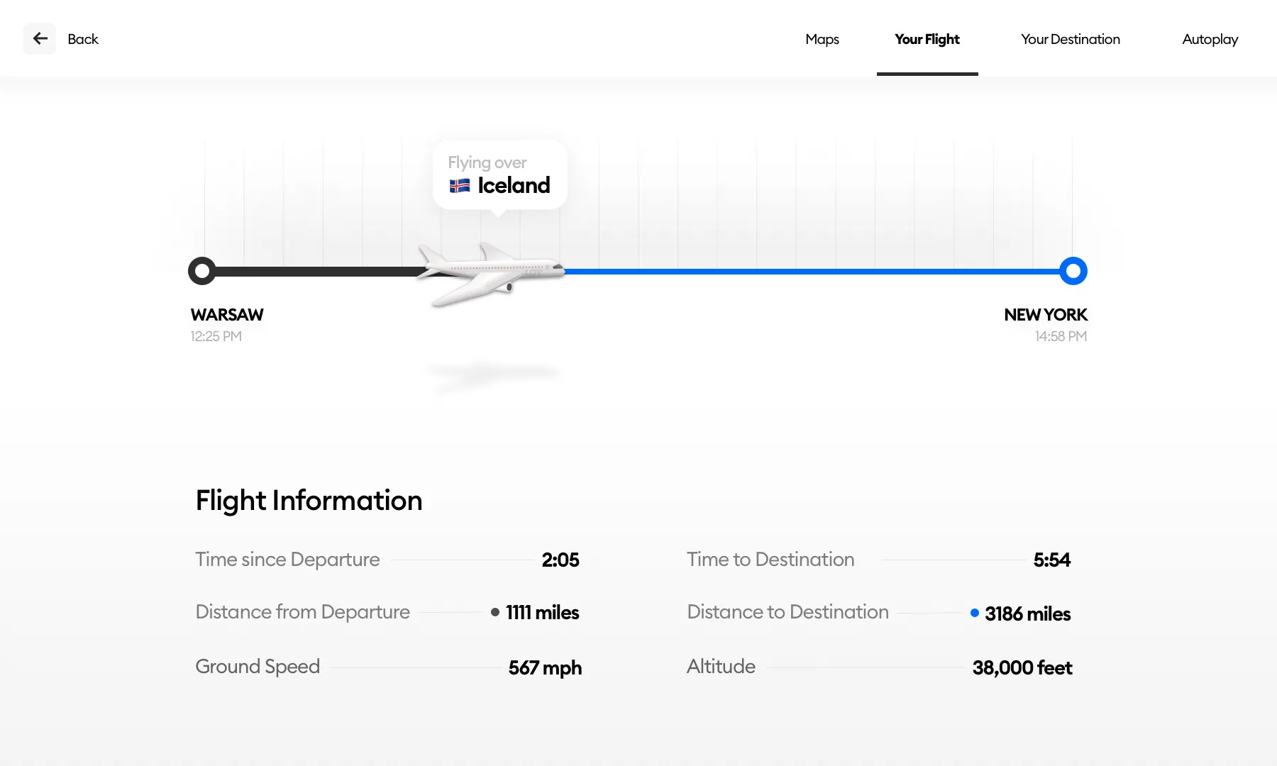
To give a little bit of context I added a little speech bubble above the airplane with high-level information on where we are (Flying over: Iceland).
For most of the flight, it would simply show “Atlantic Ocean” there but that’s ok too.
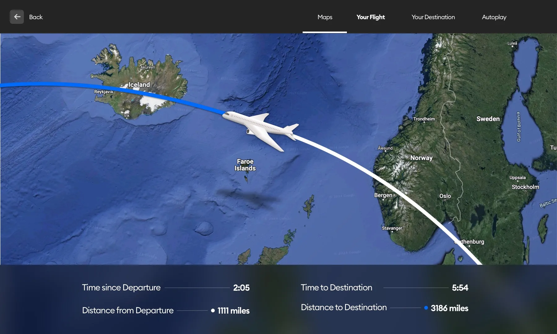
Why not a map?
I’m glad you asked! The “Your flight” tab is NOT a map view. It’s a quick, glanceable version of “Are we there yet?”.
There is a separate Maps tab that I also took a look at quickly. The map view should have a submenu with various map options but for this exercise, I decided to keep it simple and just show one view with a path.
Other controls could include zooming in / out, moving the map around, switching from a Satellite view to a regular map, and more.

I did however quickly sketch two little arrows on the sides of the simplified Flight information. They would allow you to switch from the current departure/destination set to other in-flight information that could include altitude and even outside air temperature.
Why do this?
A real designer is curious. Inquisitive. Asking questions. When faced with an interface, a designer cannot simply use it and ignore it. We always break it down in our heads and think what could’ve been.
These explorations are not always for the “better”. As a designer, I am aware that there are business reasons for a lot of decisions that seem unreasonable at first glance.
That’s ok. We don’t know those decisions, so we can base a redesign on/around what we do know. It still is all about using logic and critical thinking topped with a tiny bit of aesthetic and readability.
I do design because I care about digital products. And I do it everywhere — often unconsciously.