Many Dribbble shots have one thing in common — they’re pretty but don’t make any sense as a real product.
It’s a skill that is very difficult to master because most designers just stop at UI and roughly set the flow based on some other products they’ve seen.
But the work of a designer often encounters pretty complex problems and we’ve been tackling them at SquareBlack.com as well.
Information architecture is about structuring your content and functionality in a way that users will understand.
So let’s practice this, shall we?
Let’s teach people Flow Logic!
Today we’re launching something new on our platform.
Our 12,000 users have uploaded nearly 50,000 projects in daily UI and graphic design challenges.
Now we’re going a step further with a new challenge dedicated to arranging information in logical, user-friendly ways.
This challenge is reserved for our PRO users only.
The next challenge we do will be open to everyone.

This challenge is really different.
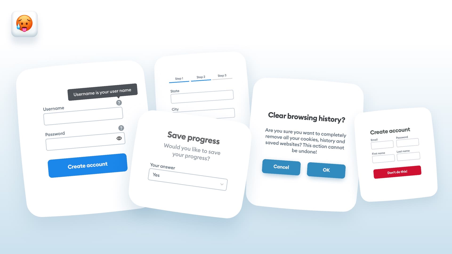
We provide you with a .fig / .sketch file with a lot of components so you can focus on just arranging them to solve a specific problem. It’s more about thinking rather than drawing boxes.
You can of course also design them from scratch if you want.
The idea here however is not about making the interface pretty. It’s about solving a problem. That’s why the components are mostly lacking color.
It’s functionality first!
Hierarchy strips
Some single-screen problems can also benefit from you trying the "Hierarchy Strips" method I created to properly outline a hierarchy within a piece of an interface. We explain how to do that in the relevant guides (a couple of first ones)

But we don’t stop there. This challenge is about merging a screen (or a couple of screens) with a flow diagram in one image.
The image you upload can also be a little taller than usual — a vertical rectangle.

Sketch the flows
This first challenge is 30 days long and is starting very beginner-friendly, up to mid-level complexity with a handful of more difficult problems to solve near the end.
However, we are limiting it to short, 2–4 screen flows (or less) so you can also create short flow diagrams before you start the actual design process.

Guides
As with all our PRO challenges we will provide you guides AND flow diagrams of our own under each challenge. However…
Don’t use them!
Start the challenge by reading the prompt and description, and do your own diagram and your own first sketch.
Then just before you upload consult with the guide and adjust where needed.
This will allow you to find gaps in your reasoning and make the next challenges better.
More than one way!
Keep in mind that there’s more than one way to solve many of these problems and we’d love to see you try a different, unusual approach if you believe it will work.

Feedback
Our PRO users are also getting feedback from us regularly, and this challenge will be no different. However, in this case, we’ll try to initiate a conversation.
If you have a mistake or an omission, we won’t just tell you “fix it like that” but instead ask a couple of questions to guide you to find that issue and solve it yourself.
The feedback is delivered by me and my team, so you can count on it being actually helpful.
If you’re a PRO user, you can find the new challenge in your challenges tab.
If you’re not a pro user you can upgrade to PRO as we only have a little over 100 cheaper seats available and the price will soon be going up from $5 to $7 per month.
However, all those that signed up for the PRO plan now, will keep the lower price forever (as long as they’re subscribed).
See you there!
I’m excited!


