Designing a great landing page or mobile app is a lot of work. There are no one-size fits all solutions, and using templates massively limits your potential to convert.
Each design needs to be tailor-made to fit specific products.
So is there anything they all have in common? Turns out there is!
The Layout Settings
At Squareblack we’ve designed well over 200 landing pages since 2009. They ranged from campaign websites for kids tv shows, all the way to complex fintech products.
And everything in between.
The internet has change significantly since then and sometime around 2010 we realised that we are using the exact same approach to the basic layout structure of nearly EVERYTHING we do.

The main shift that happened is larger screens, higher pixel density, and… the much lower attention spans of the users. Right now they’re at around 8 seconds — similar to that of a goldfish.
Back in the early 2000s, there was an obsession to keep as much content as possible above the fold. If you’re unfamiliar with the term, the fold is where the screen ends at the bottom of the browser.
What it means is how much of the website can you see.

In the example above including the client logos partially within the fold gives the user a cue that there’s more to see. So they scroll.
This technique is still valid, but it progressed from cramming as much content into each scrollable segment as possible, to just having enough so that people see that there’s more.

It used to work like in the example above. Condense sections to fit as much information as possible above the fold.
Cut off the last section a little so people know when to scroll. But then that goldfish brain of ours said…

People were frustrated with too much reading. The more information we had to process in the limited space of our screens the more difficult it became to make sense of it.
This initially pushed the second section to be slightly less visible on the screen, like in the example below.

The problem with this approach is that most businesses seeing they now have more space per section, decided to fill it with even more content.
Key visuals became higher in pixels, text became longer. More buttons. More extra social proofs. More of everything. And while it can work sometimes, it wasn’t a perfect solution as it only shifted our cognitive overload towards a single group instead of two.
Sure — it is an improvement but not a big one.
Introducing whitespace
The modern web is finally able to breathe! Most modern designs, especially for landing pages now literally bathe in the whitespace. Using our diagram example again, the change is subtle but very meaningful.

We still see a little of section 2 above the fold, but now section 1 and it’s corresponding key visual are smaller. They have less content — mostly using bigger fonts and there’s significantly more space between them both horizontally and vertically.
It just makes everything MUCH easier to read.
The Layout Settings
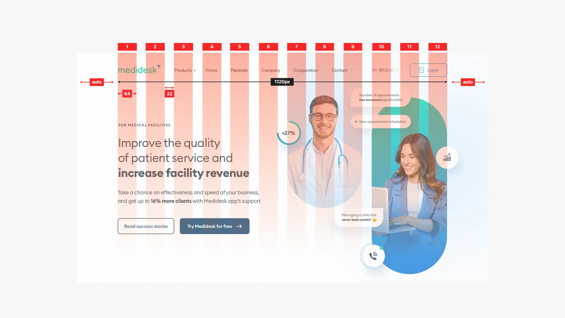
Which brings us to the WHY of those particular layout settings. We always go for 12 columns because of the flexibility they allow us. You can have a single section, two sections side by side, three, four and even six if necessary.
Each column is exactly 64 pixels wide with gutters between them at 32px. That 2:1 ratio between column and gutter may seem odd at first, but once you use it you realise how much horizontal whitespace you gain.
It’s a perfect trick to greatly increase readability.

The content width here is just 1120px and the layout works great from all screens above 1280px.
What about the margins?
The first question people ask me is about the margins. If the content is just 1120px, with many displays being 1920 or even directly 6K — wouldn’t we have huge empty space on the sides?

Yes.
And it’s actually a good thing.
Let me explain.
For maximum readability, keep it between 9 and 12 words of unjustified text per line. Fewer words will make sentences break often and introduce lots of hyphenations.
But the bigger issue is when the text is too wide.
Above 12 words per line the ability to understand written text decreases greatly. We don’t want that. When this happens people stop reading.
That proves, that there’s no need to make wider layouts just for the sake of filling the screen real estate.
If we could process long lines of text, we would’ve had wider books, right?

Take a look at the article you are reading right now. How many words per line are there?
I counted.
Between 10 and 12, and there’s plenty of space on the sides. That whitespace grounds the reading experience and makes it easier to process information.

Inner grid for subsections
When designing subsections you can create an inner grid of 32x32 column and gutter ratio. That will allos for the content to be spaced out nicely within a logical group.
That 32 space can also define grouping within a section. If you use a smaller spacing like 16 (half) between content blocks they naturally appear like they belong together.
That means that our brain skips going over that larger spacing and processes a single group first.
Then, it takes the jump to the next one and processes it next.

What about a TV?
If you have a 4, 6 or 8K TV that can display websites, there is a simple way to make it work. Just upscale everything 2x.
Your layout width goes from 1120 to 2240px and everything gets bigger. That is a much better idea especially since TV’s are experienced from a few feet away — from the couch.
Making the content bigger makes it easier to read while still keeping the 10–12 words per line ratio.

What about mobile?
For now let’s just focus on making the same website we used this layout on fully responsive. What we do here is just define the outer gutter at the same 32px value.
Mobile works best in a single column for increased readability in one direction (top to bottom). If you really need two columns defined, you can add a smaller (24px) space between them to retain hierarchy.
In case of longer pieces of content the entire experience can be scaled down, but that’s also something we can cover separately next time.

What are the exceptions?
These layout settings work great for 99% of landing pages. They are not recommended, however, for most web apps, especially ones that are content-heavy.
In that case, having multiple columns of charts, graphs and numerical data your layout can even be 1400–1600px wide, with smaller gutters.
If you’re designing a landing page with a goal to convert users into sales, more whitespace and generous gutters are a way to go!
By decreasing cognitive overload and increasing readability, it’s a lot easier to guide the user to a desired action.
We don’t want them overwhelmed. And that’s exactly why these layout settings are the best option to start your website designs with.
Of course, what you build on top of that foundation needs to be thought out, planned and designed well. It needs to match the target market and show that your product or service solves a problem.
But at least the foundation doesn’t need to be different every time.
Enjoy!


