I've put five designers against each other. The battleground is a checkout form of a cool product.
There are five levels of design skills when it comes to interfaces, but they are especially visible with forms, the most important element in UI of any kind because usually, a form is something that makes people money.
So come on this journey with me and see how the users are getting progressively less frustrated the better the form gets.
Level 1
Okay, let's go.
People with blue faces look sick and ugly, so don't ever color your photos like that. The color choices are pure chaos, mismatched, clashing and just plain ugly.
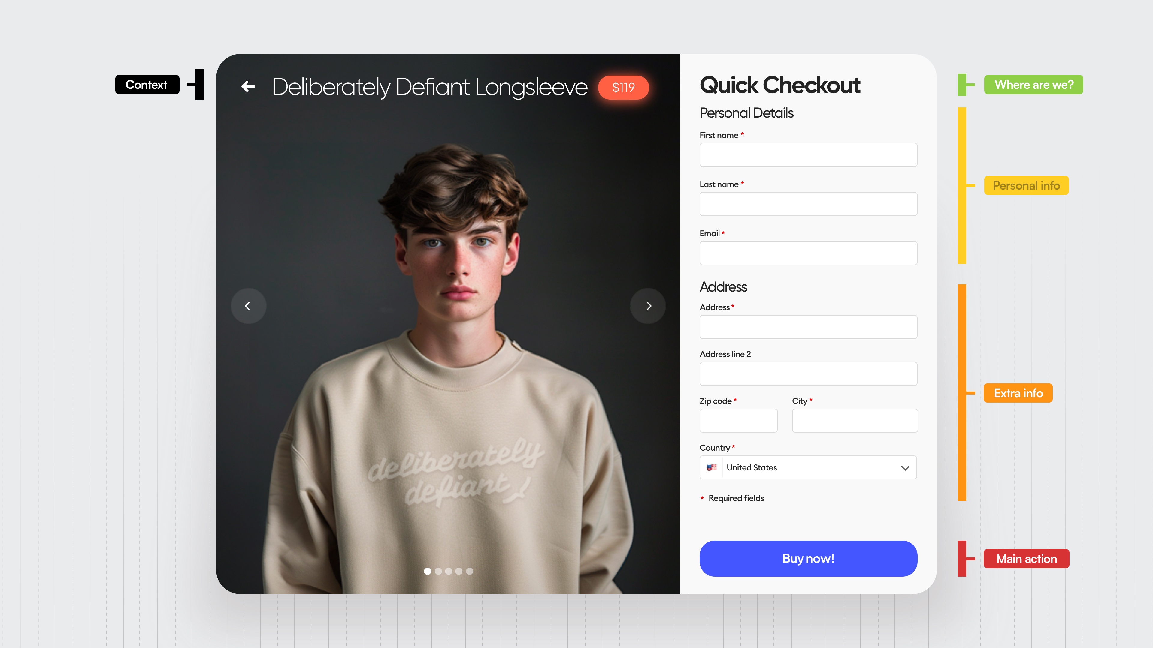
Adding hierarchy strips reveals this huge mess there on the right side. The required field element is just completely out of place, just hanging there, and the whole form is clumped together, chaotic, and difficult to read.
And that shows in the spacing cause it's completely chaotic. There are like a gazillion different numbers here and nothing matches.
Obviously there is no grid.
We use the left edge of the form to guide our eyes down the form and see how each element is at a different distance from the line.
That's crazy.
There are seven different typefaces here and multiple different styles.
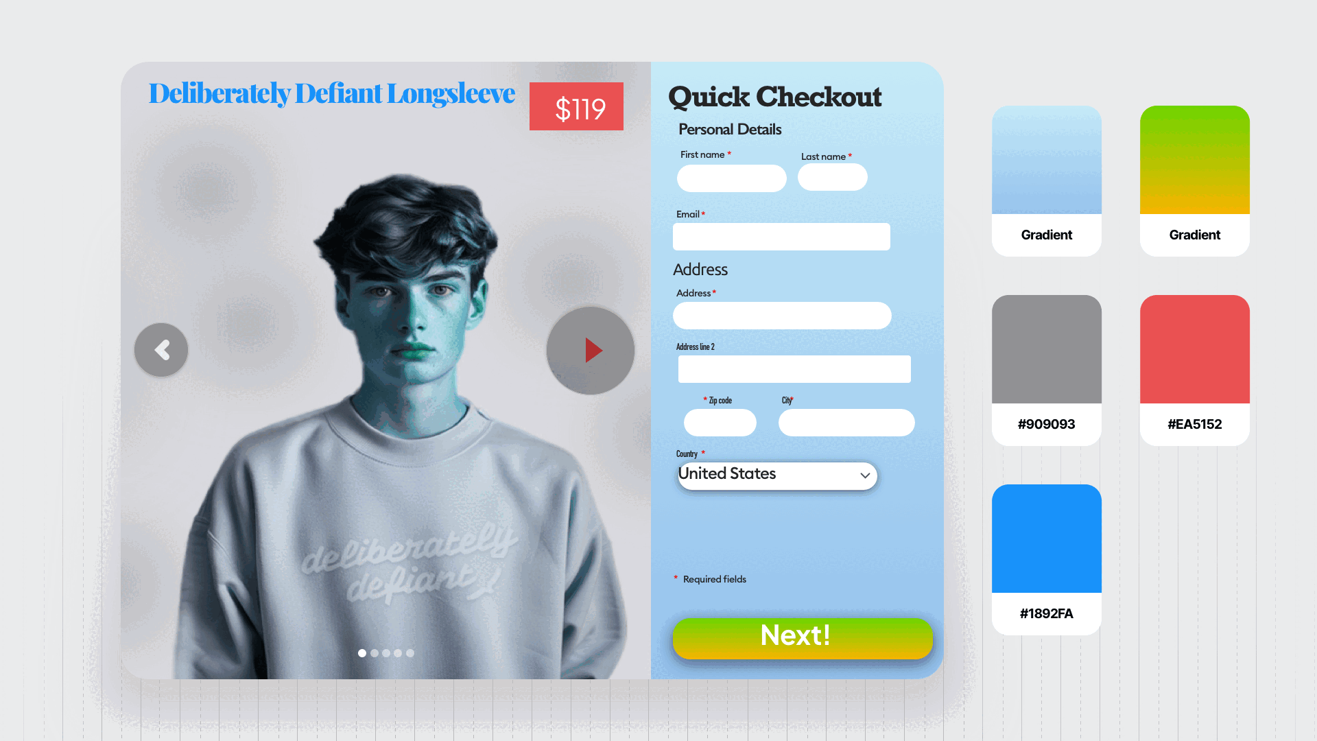
That makes it impossible to read. And of course, a lot of the contrasts are wrong too.
This level is very, very rare, and I am glad.
Level 2
Level two is slightly better. It still uses seven different typefaces, multiple styles, and sizes, and very, very weird spacing.
But it does do a couple of things better than level one.
For example, the button, even though non-accessible, looks a lot better, a lot more like a real button.
Same with the carousel that slides left to right. The color scheme is all over the place, but it's still better than in level one.
Obviously there are some contrast issues, especially in the main CTA button, which is really important, but the hierarchy of this is actually way better than in the first one because you can clearly see each individual group of the form.
Level two happens more often than you might think. And it's definitely not a place to be to either be successful as a designer or keep your users happy.
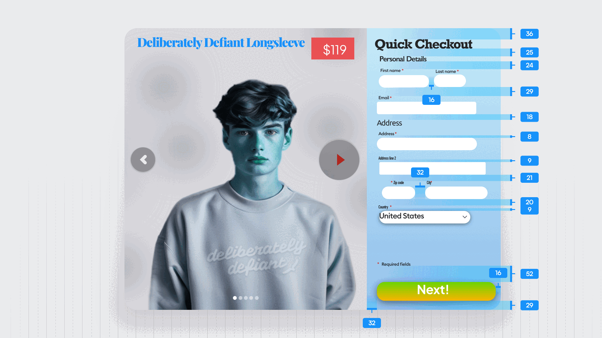
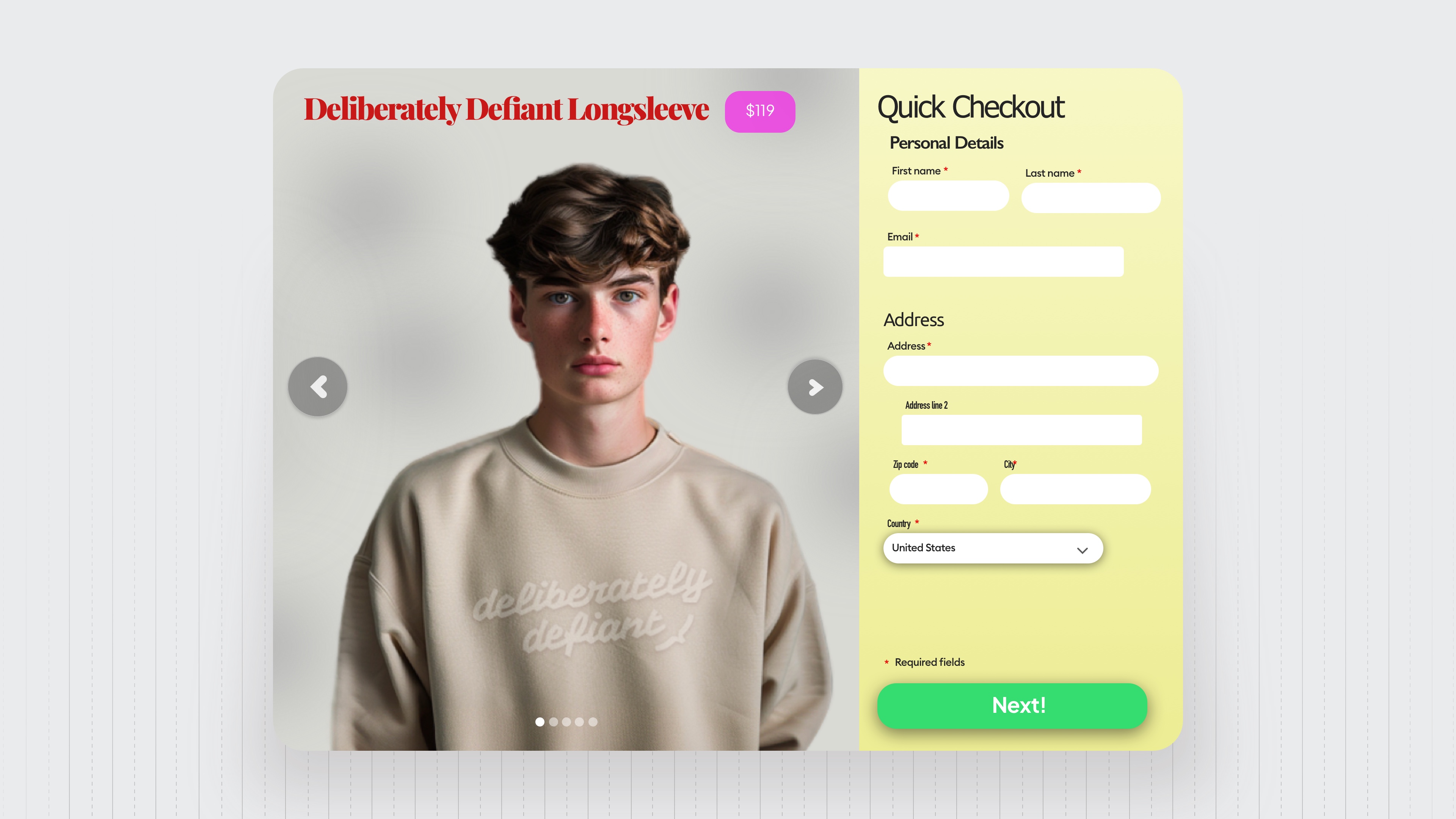
Level 3
Level three is where most designers are at.
There are six typefaces, so way too many still, and of course still way too many styles.
The color separation is a lot better here, but still, mixing red and green in one design, I mean, come on.
The hierarchy is of course clearer here as well, but still, that required fields element just sticking at the end like that doesn't look good.
The spacing is still chaotic, but because a lot of the numbers are fairly similar, it doesn't look as bad as on the other levels. We notice that the left edge is finally aligned too. Bravo.
And there are still some pretty big contrast issues, especially with the main CTA.
Now let's take a look at the photo.
The background color is very similar to the color of the product itself, making it barely visible.
And those little highlights in red are completely useless.
Adding a carousel in this step is also not a good idea because we want the user to complete the form quickly and efficiently without any distractions like scrolling through images.
Again, level three is where most designers are at, and sadly, a lot of established businesses also make some of those form mistakes.
You really need to be higher than that level.
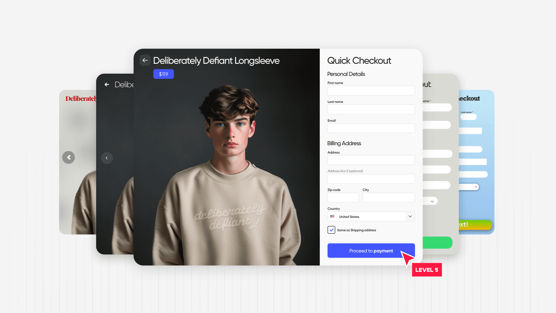
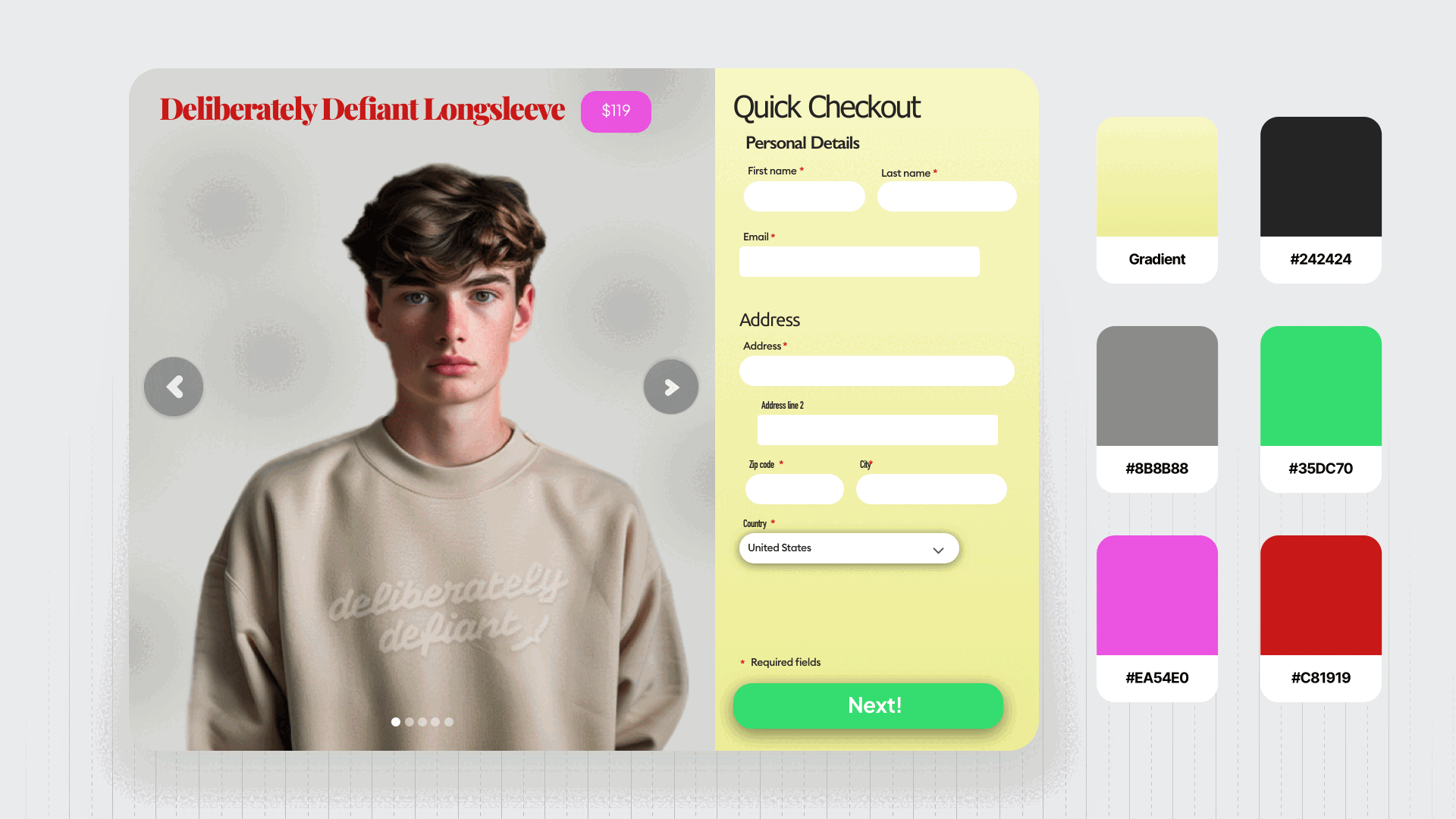
Level 4
Level four is where your design starts to matter.
We finally have really clearly divided hierarchy. As you can see every group has a spacing between them and that spacing is really visible, the required fields bit is finally where it belongs, next to the form, not the button.
Because of the better hierarchy, the spacing is generally better, especially the vertical one.
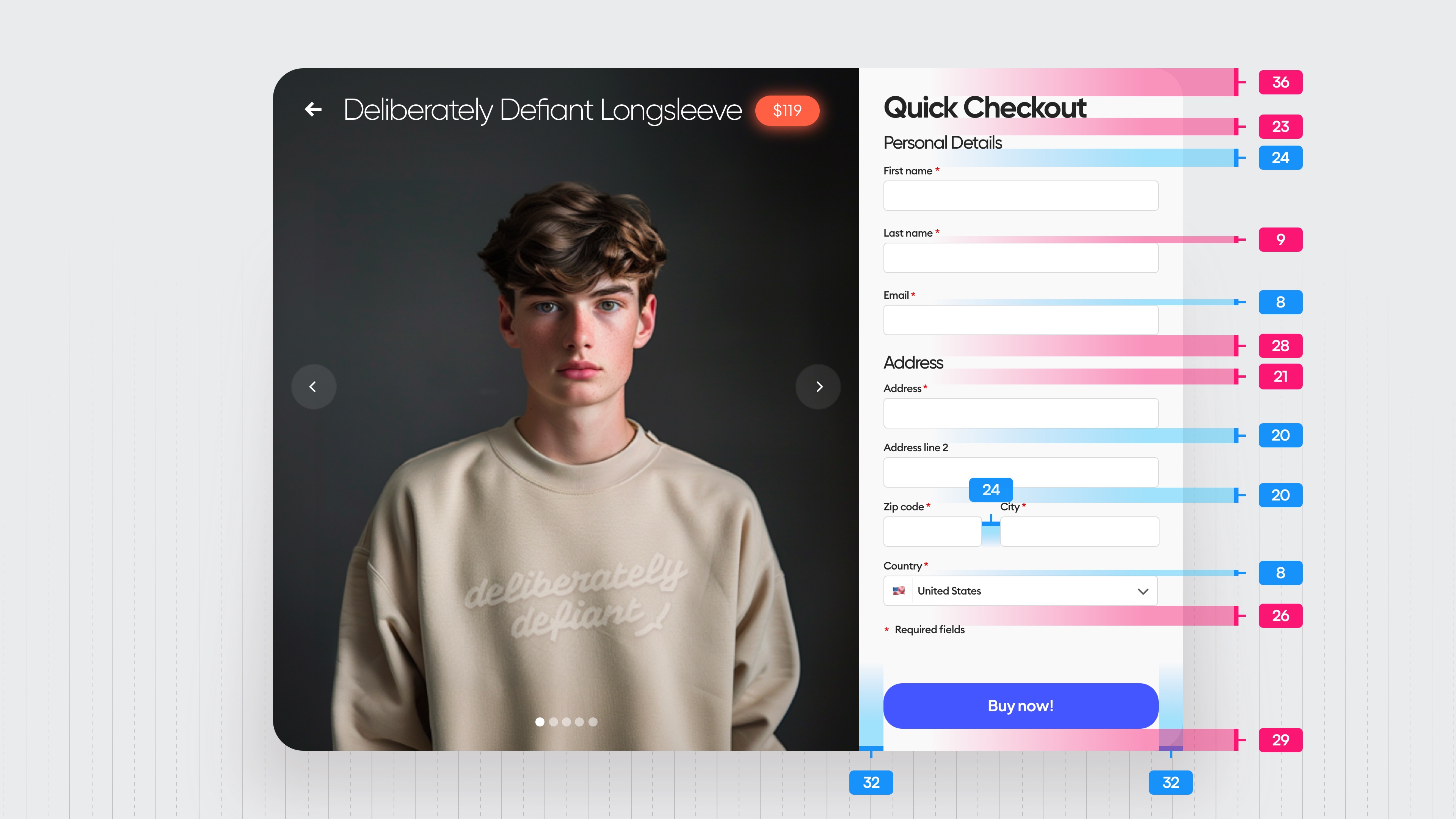
The spacing values marked in red are still pretty random numbers, not really matching the grid, but they are close enough to actually fool most users.
There's just two typefaces here, but that second one on the button really is unnecessary.
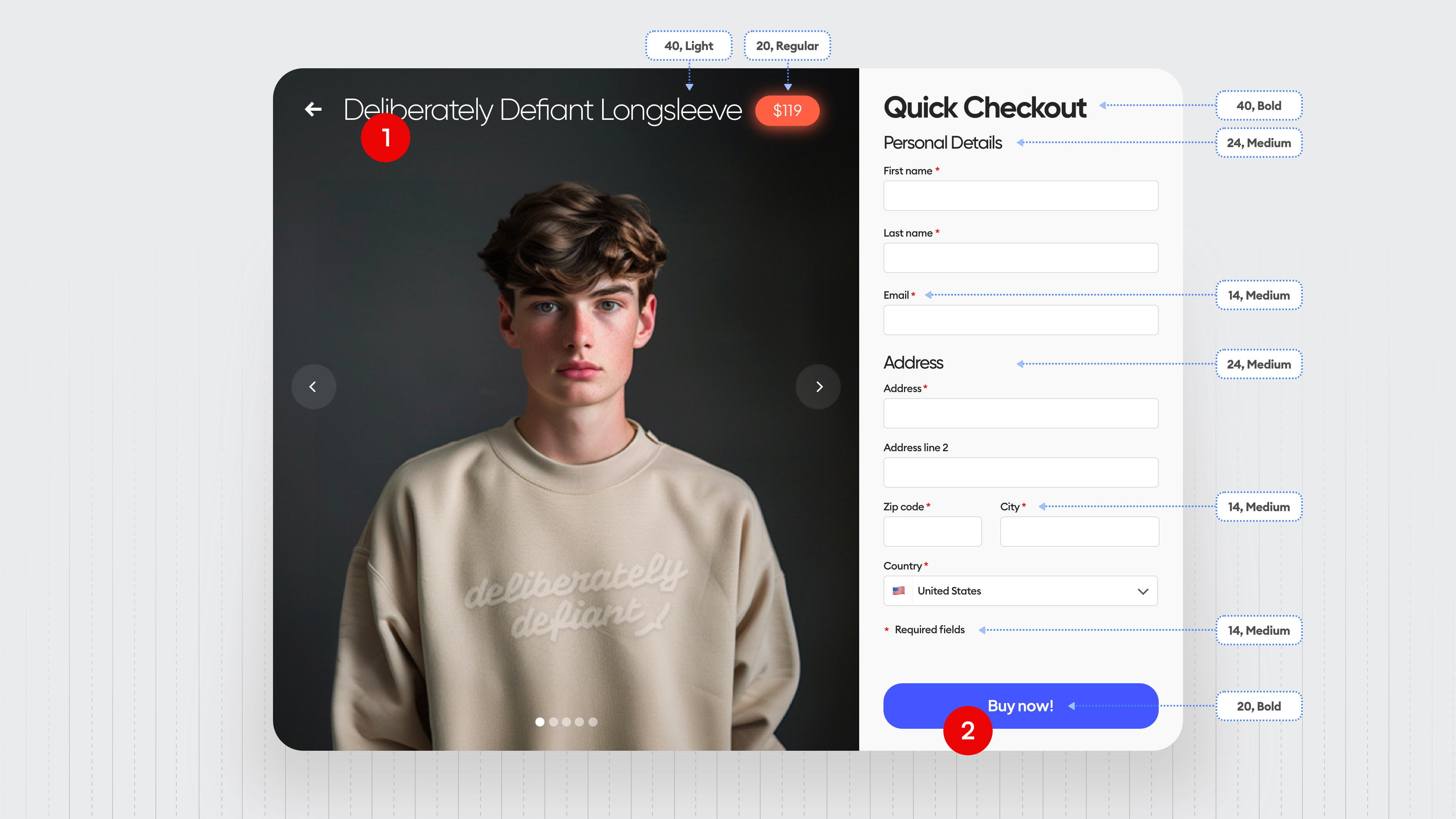
It looks like a mistake and a handful of styles that probably should have been limited to a smaller number.
The color palette is a lot better, but that red there is unnecessary because the price catches more attention than the button itself, which makes the form a little bit longer to fill and some people might actually quit filling it.
We have a much better photo now though, because the background color differs enough from the product color.
So the product is really visible front and center, and once again adding interactive elements on the left side like a carousel that allows you to scroll through the photos adds an extra action.
And we want people to just be focused on the form here so that part is also unnecessary.
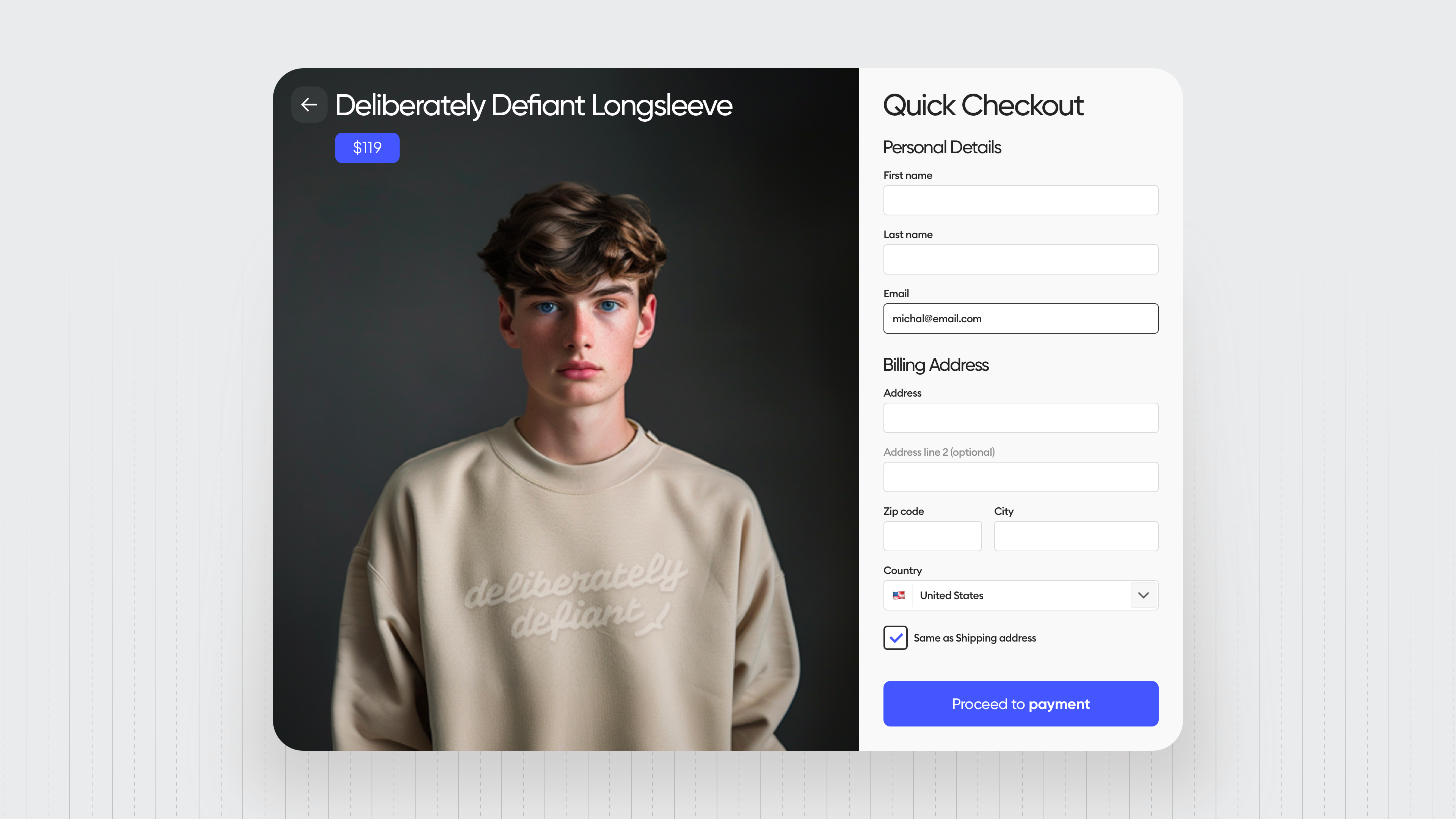
We still don't have the option to choose a billing and a shipping address and for many people those two are different.
So that could be a confusing part in which people just will quit the form and not buy anything.
The contrast levels are fine except for that glowing little price that also catches too much attention.
Anyway, this is what you should be aiming for.
This is like the base minimum of a good design and good enough for your users not to be 100% frustrated if you're on this level. Congrats.
But you should be aiming for level five because there are still some small conversion blockers on this level.
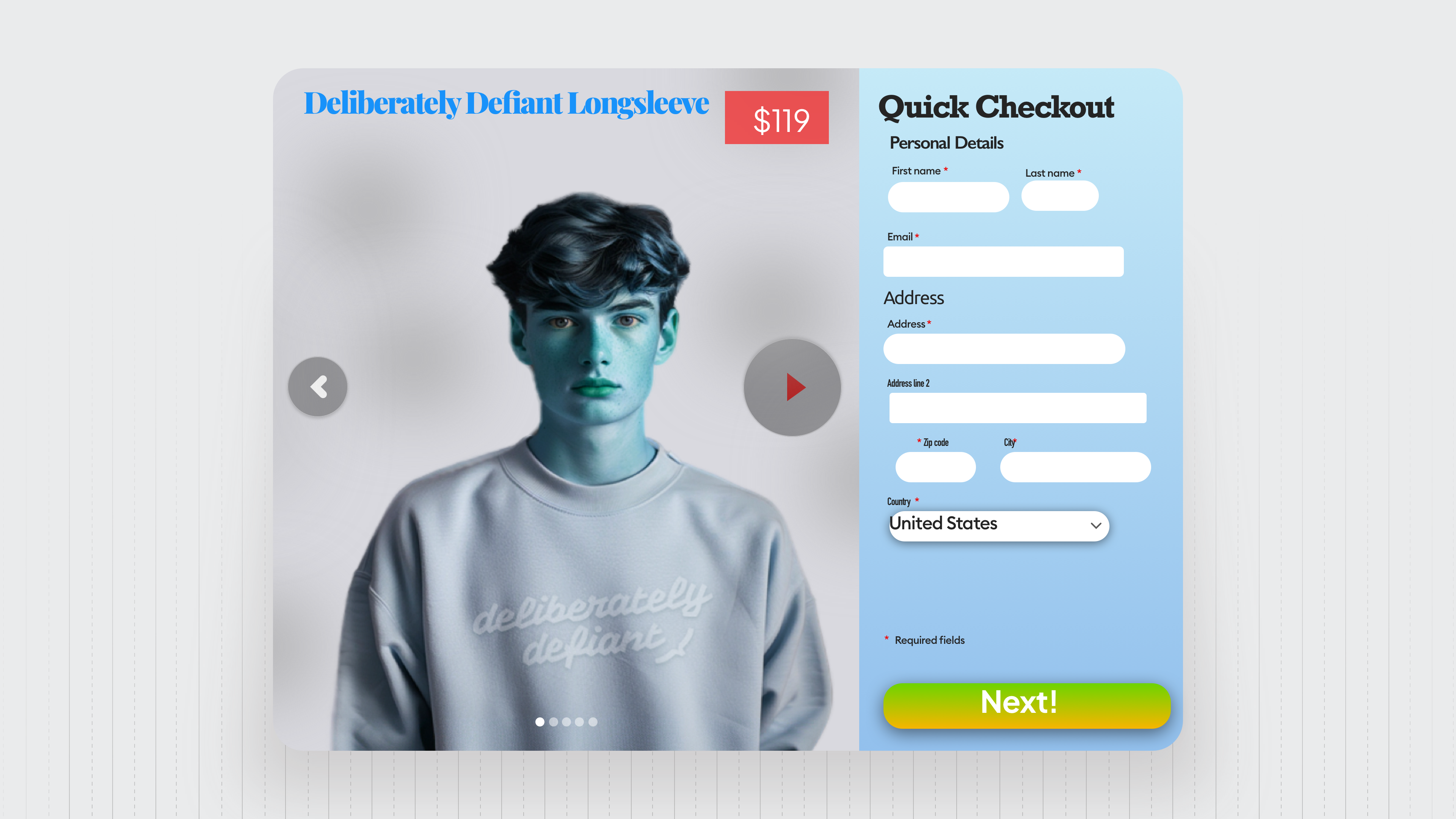
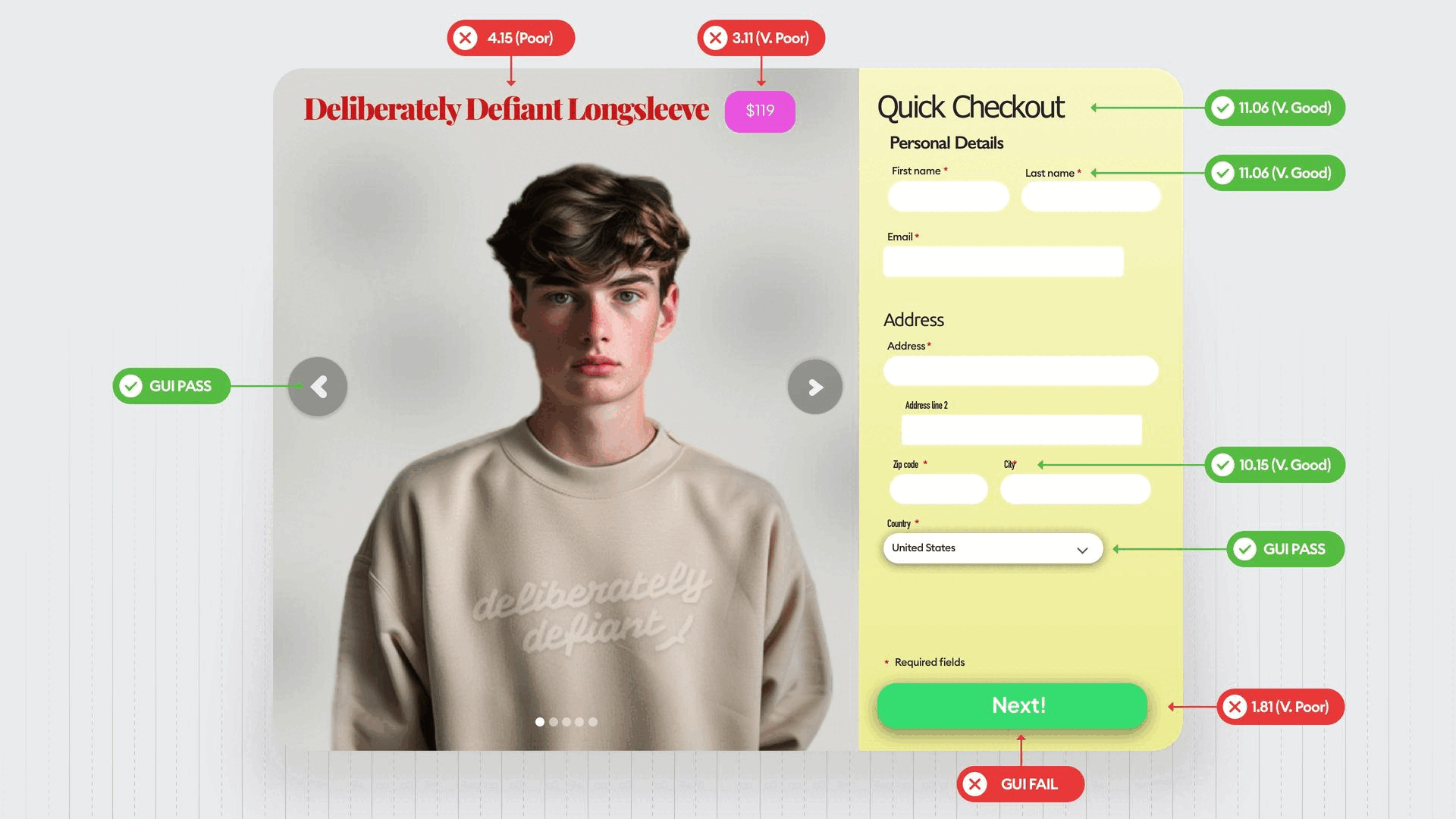
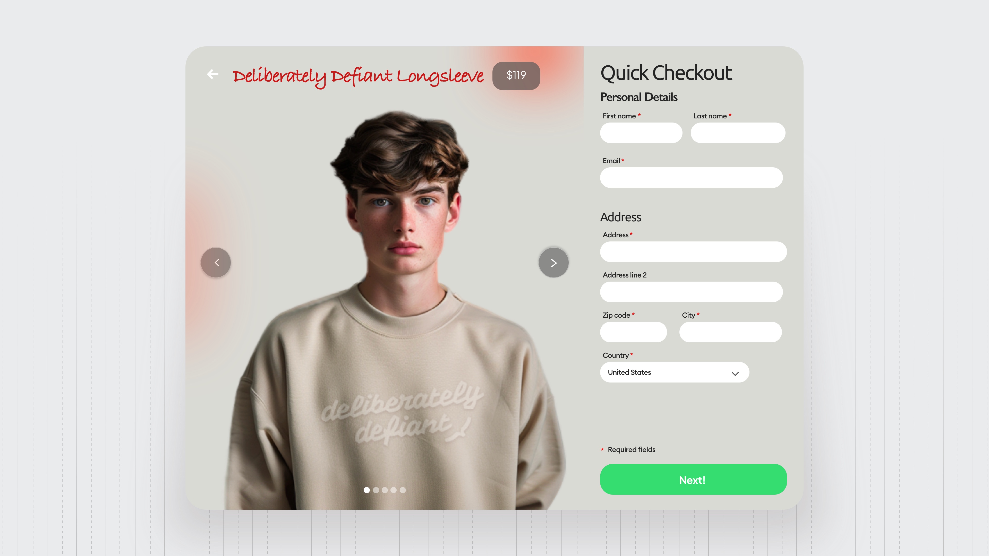
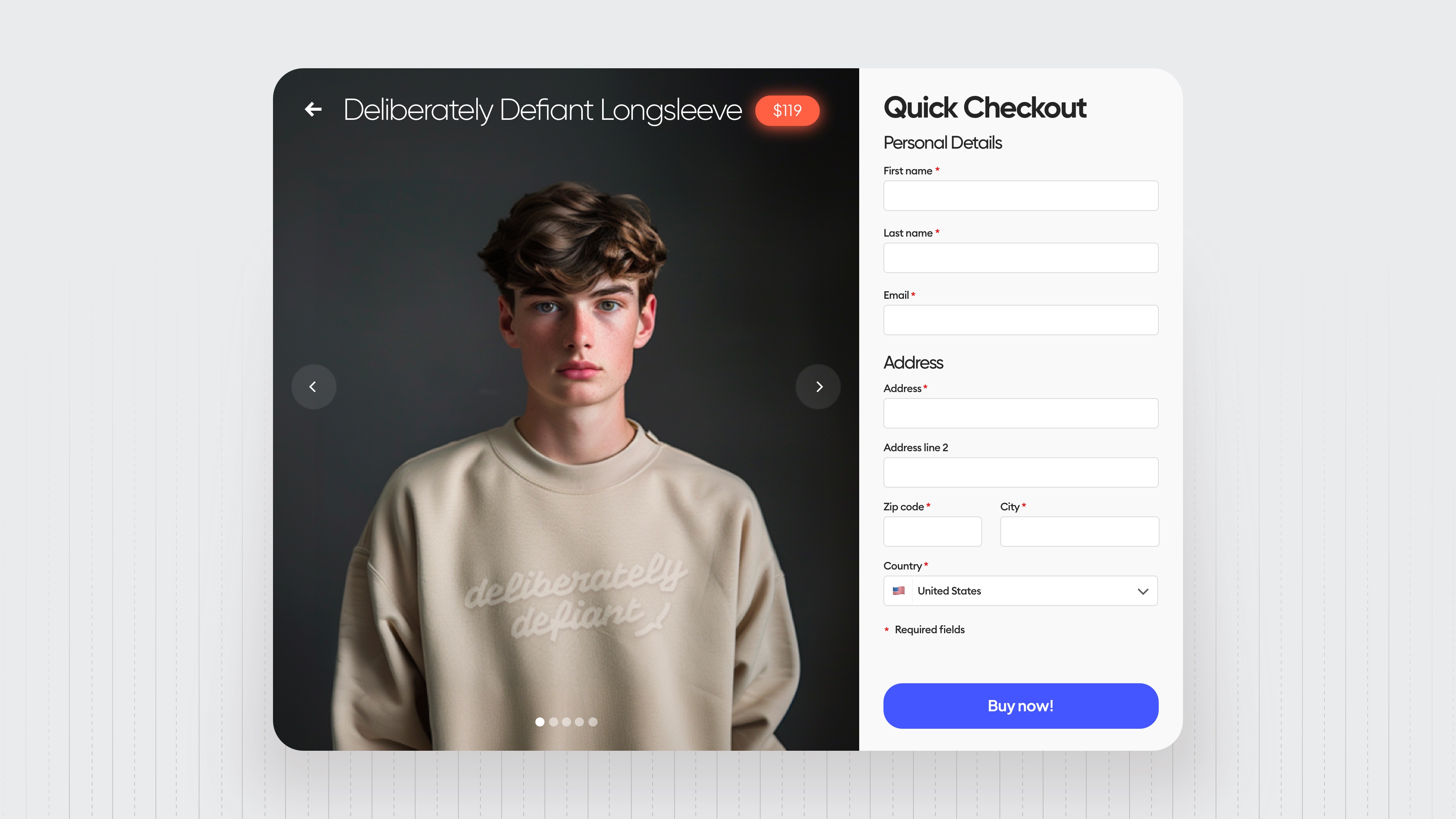
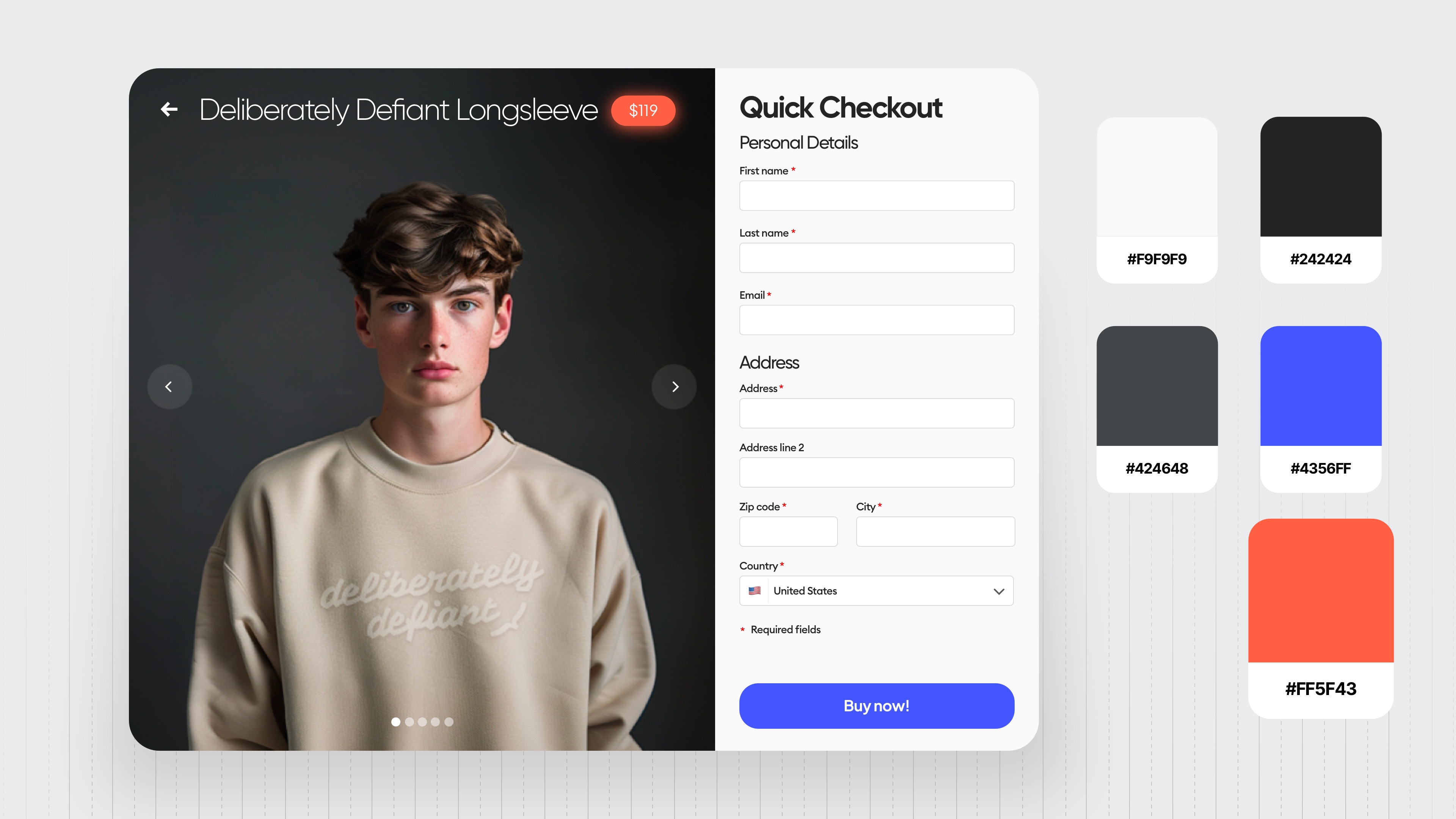
Level 5
Right before we get to all the usual stuff, look at two little things that a level-five designer spotted in the photo.
The first one is a little smudge that was on the background in the level four design, but we also took the time to recolor the eyes of the model from brown to blue because eyes naturally are catching attention of people.
So we tend to look into the eyes of people in photos and we want that association to happen also with the most important thing that we want them to click here and that guiding accent color is going diagonally across the design to the main button.
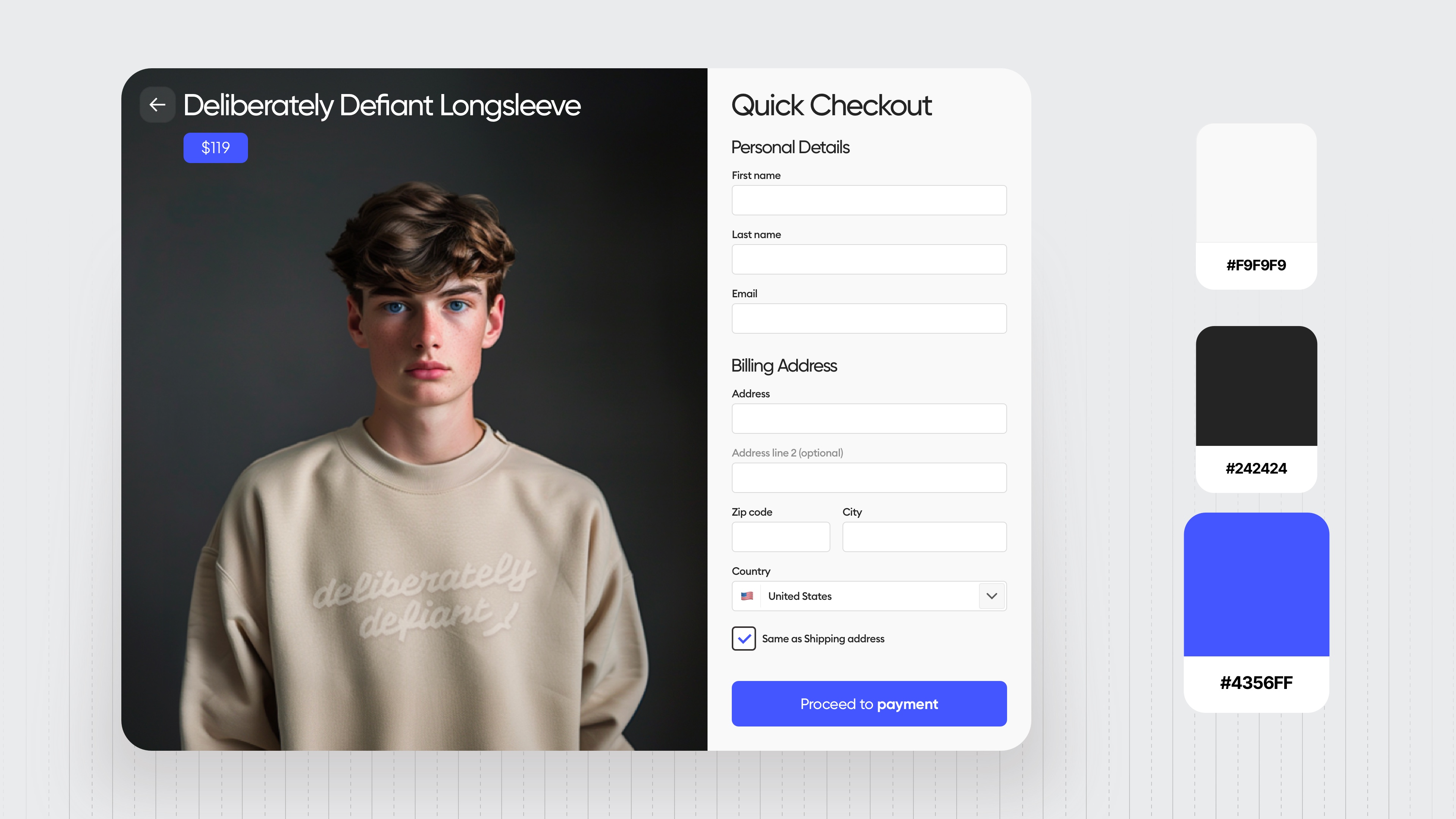
The main color palette is super simple, elegant, and has a matching, very visible accent.
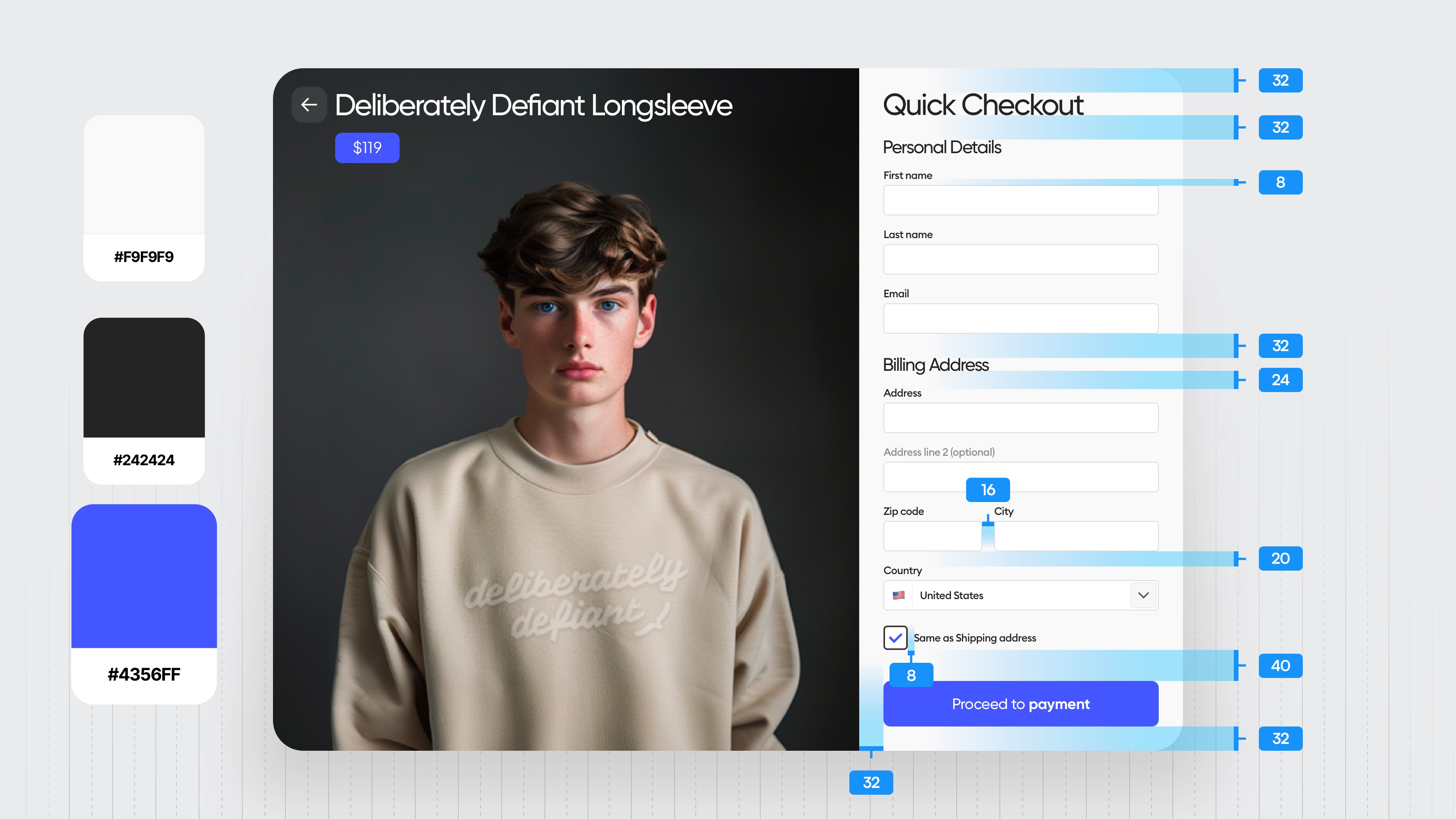
Hierarchy strips show that all the groups have enough spacing between them to be treated individually and that helps with processing.
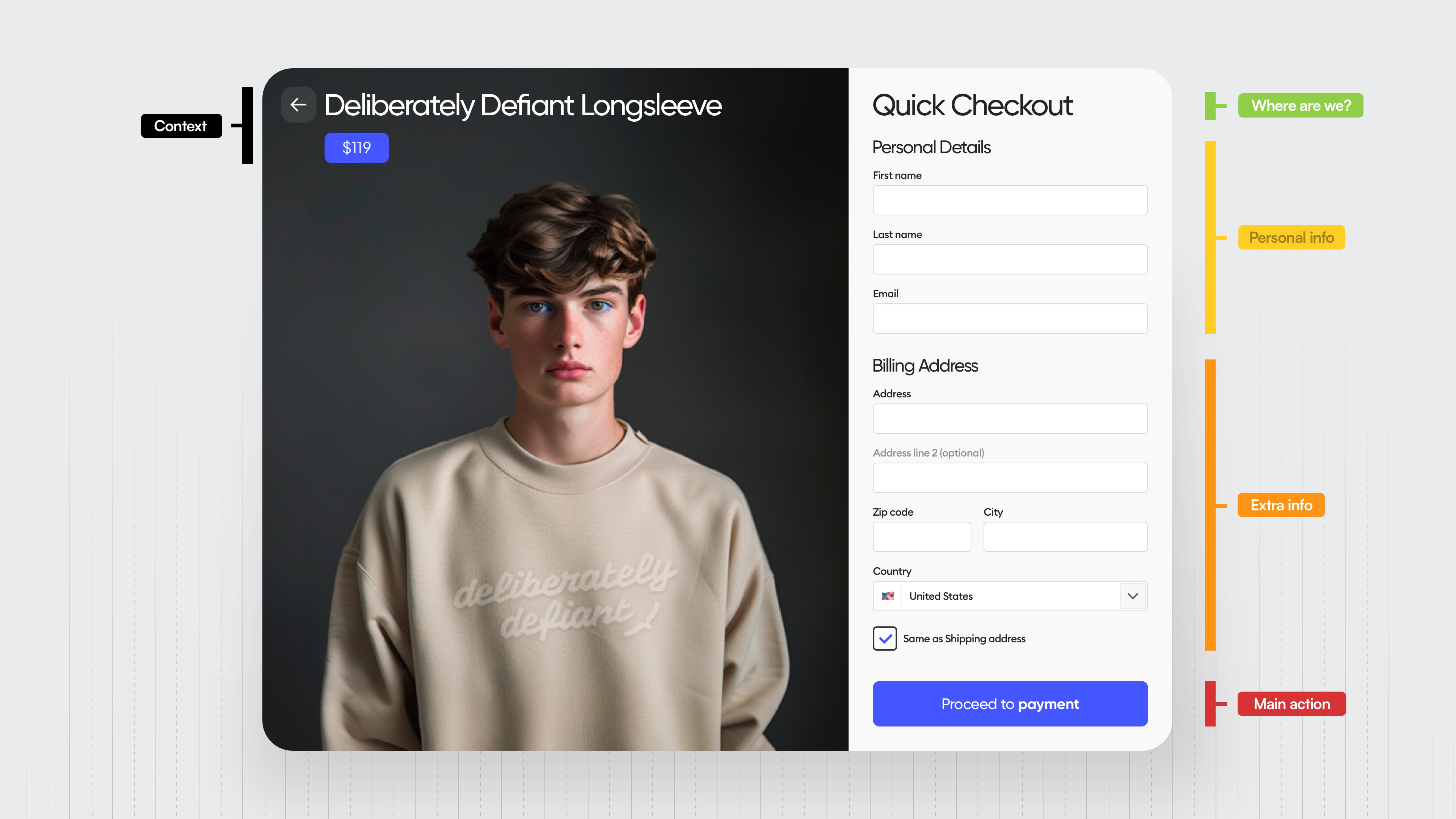
Speaking of spacing, every value here matches our eight-point grid.
And notice how the distances between all of the main sections are larger than the other distances.
And the one right before the button is the biggest because we want people to be sure that they filled everything correctly before they proceed.
We have one typeface across the entire design and most of it is actually in the medium style.
There is one bold on the button and one regular in the price because we don't really want people to focus as much on it anymore.
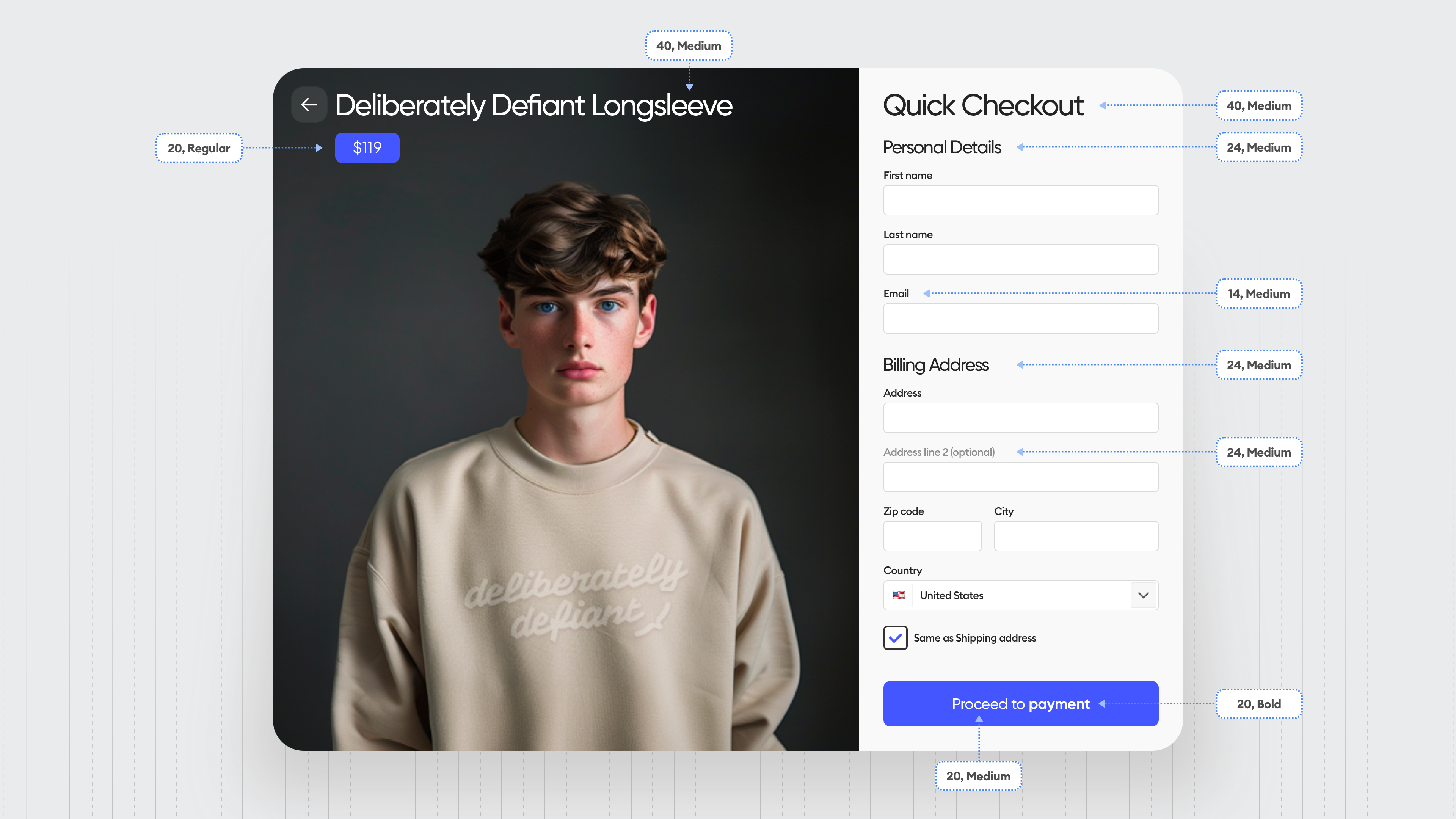
They've seen it in the previous step.
The contrasts are mostly good, they could be improved a little bit, but we have a very visible active field selection.
The back arrow has a little transparent rectangle underneath it because it feels that it's bigger and it's gonna be easier to tap or click.
And that leaves out a little bit of the anxiety that people might miss it.
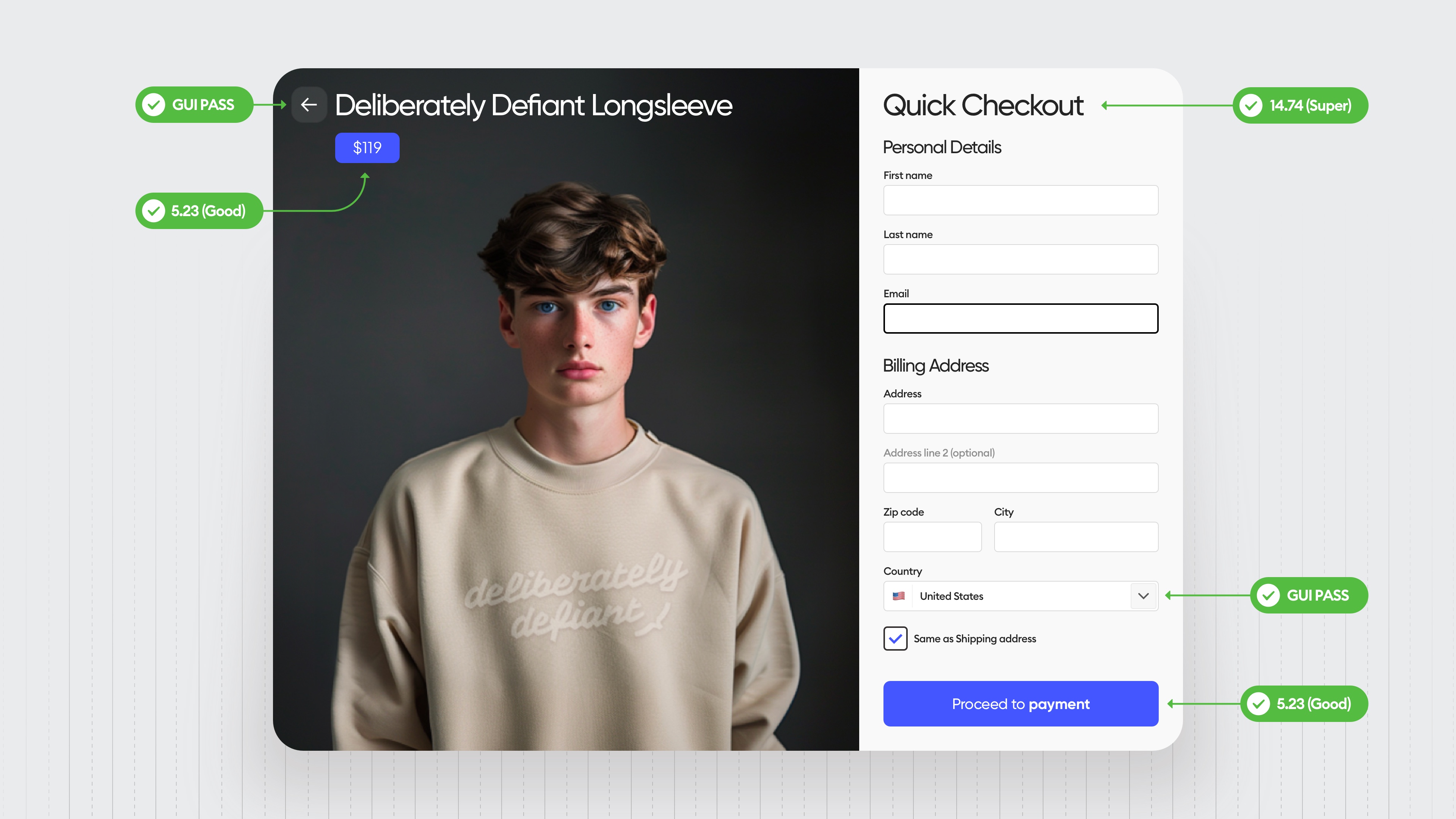
Same with the checkbox. It's big enough and comfortable so people won't have to find it with their mouse cursor or their finger.
Little details like that remove little frustrations.
Now, this is where it's at.
Implement it and test it regularly on your users so you can make small tweaks and adjustments to make it even better.
Because the design is never fully done.
Liked the article? Share it!
