Welcome to another episode of Let’s Get Real, where I will show you behind the scenes of real client projects from my design studio https://three.design/
If you’re not a designer, don’t worry; I won’t be using any fancy industry words. I want to show you our raw process so you may get an idea of how some apps and websites are built.
Tails, Co is a pet care provider that matches you with the best Pet parents in Chicago. These providers are tailored and matched based specifically on your pet needs.
One thing to note is that I won’t go over the process of choosing the client and the first two weeks. You can read more about it in the first article I wrote.

Worry-free pet care
It’s important to remain human in the world of pets. They’re like a family to us. The NO. 1 issue is that the market lacks trust and authenticity. There is too much news about how pet care services out there abuse dogs or don’t take proper care of pets.

It is very frustrating to see this. Researching this topic was crucial to understand what needs to be done to prevent it and tell the user that Tails is different, it’s a place built on trust first and foremost.
Research and iteration
Understanding the niche before any design takes place is the best thing to do, and that’s what should happen every time.
You always want to understand your client and the competition and know more about the industry.
After the research, I talked to Pawel, and we came up with a few features that should make Tails unique and establish them as the personalized human-centered pet care provider that can be trusted.
What makes Tails unique:
• Trust waterfall — establish trust in 3 simple clicks
• Daily reports with photos
• Algorithm that picks the best option suited for your pet
• Hand-picked providers by Pawel himself

After that, I wanted to know if there were any flows done. This time, Pawel (Tails,Co Co-Founder) has done a very thorough research and came to us prepared with plenty of documentation and user flows.
I still analyzed the user flows Pawel sent me alongside the competitive research. Sometimes, there may be unclear ideas or missed business-related pieces.
When I wasn’t sure of something, I simply asked Pawel, who is very passionate about his product, and he cleared things up.
All of this helps me to understand the client needs, what problem are we trying to solve & does this make sense for the target market?
It also allows me to make decisions so that the brand stands out from the competition.

After a thorough look, I had some questions regarding the flow, like —

It was the first time I saw emotions being implemented in the flow. This made the project immediately worth taking on. I like challenging projects and being outside my comfort zone. It’s the best environment to learn and show what’s in you.
The best outcomes are born outside your comfort zone
I went ahead and sketched out bits and pieces from the flow for myself to understand the product better and see if it all made sense.
The flow was huge, so it wasn’t possible to do everything on one piece of paper. Hence, I divided it into multiple parts before each design sprint.

Finding the style
Main feed ideation
Visual identity is crucial for every brand. I always like to start with the most important screen/s when finding the style of the app.
The landing screen and the feed are the most important parts of the application. In this case, it has to meet quite a few requirements and it has to be easy to use as well.
I always like to do more than just one design to get the ideas out and see what works and what doesn’t. It’s important to experiment and get ideas out quickly without thinking.
This helps to explore more than just the logical choices or most obvious choices. In this case, I went over more than 6 iterations of the main feed.

Each of these has something similar and something different. For example, exploring a clean look in the first screen or switching the focus and highlighting the top elements on the next one.
Big or small cards, I play around with different element positioning and of course, testing it out on my phone to see how it feels.

Iterate & Combine
In the end, I ended up going a completely different route. I’ve decided to add an extra screen before this view so the user can comfortably see and choose what pet they want the service provider to be tailored with.
This allowed more space on the explore tab (main feed) while keeping the nice big cards to really highlight the individual pet sitters and their perks.
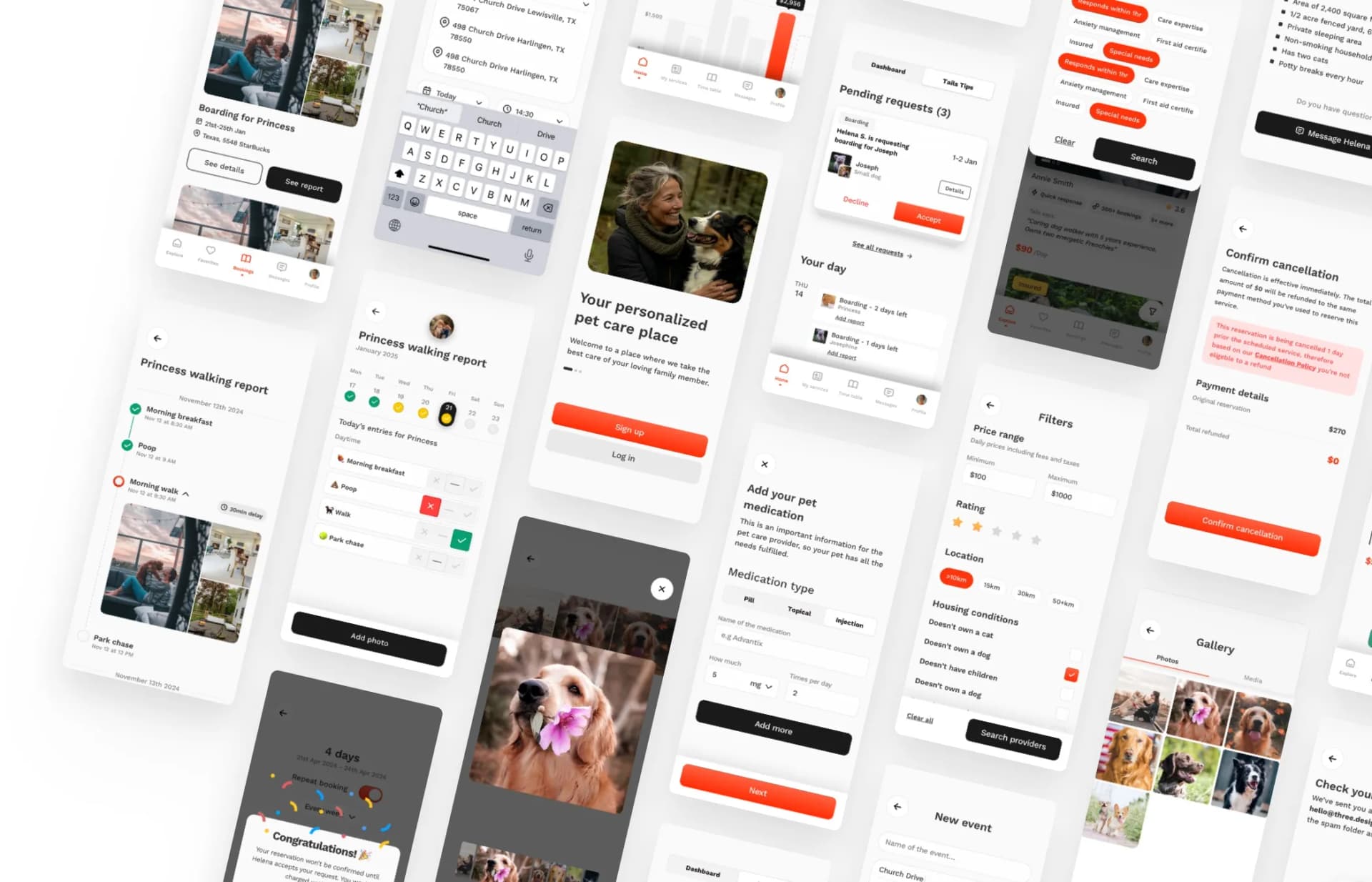
All the icons you see are hand-made to ensure the brand is unique and stands out in the market.

One thing to note is that small message “Tails says” under each photo. This is one of the components of the trust waterfall that Pawel designed and tested out.
It is a message written by Tails about the provider to start the trust cycle. Showing that Tails' focus is on the trust and hand-picked providers to ensure peace of mind for the user.
Details matter
As I said, visual identity is what makes the brand unique and memorable. That’s why I decided to make everything from scratch. From icons to onboarding illustrations.

This gives the app a friendly feeling and makes it feel fresh. It also solved a big issue I was worried about. You see, when ensuring trust and safety, you often want a lot of information before the user can test the app.
This can be very tedious, especially in onboarding. That’s what makes or breaks the app flow. If your onboarding sucks, 90% of users will drop out on the first screen and never come back.
Something as simple as an encouraging message between the flows or a meme can make the user stay and fall in love with the design.

Talking about personality, it’s hidden everywhere in the design. As I said, Tails is a pet care provider, so it was obvious to me that I had to make a little “tail-like” message in the chat to give the app more personality.
Most people won’t spot it and that’s okay. It adds up to the overall experience nevertheless.
Crucial screens
The time has come. I knew there would be two crucial screens apart from the onboarding flow.
The calendar and the reports screens
We’re not talking about just showing the calendar view. I had to think about both sides, the providers and the users'.

The calendar has automatic repetition. This means the booking can repeat itself based on the days in the week.

The problem for the provider side was to show all the services booked in the calendar. That may sound easy, but each service can have a different price. On top of that, each price can be modified to be different if it’s a holiday or an exclusive solo-day booking for one pet.
Not so easy now is it?
After a few iterations (it was a lot, really…) and a brainstorming session with Michal, it finally clicked.

Dots, grid view, and horizontal view. The first thing dealing with the calendar was the amount of information to display.
So I needed a clean and sleek way to display the services, without overwhelming the user. That’s where little colorful dots come into play.
Second was to remove the price and show price only if the price has been modified for the specific day.
Third was to make a horizontal view with more information, pet profiles and the prices. This one is more focused on the week ahead instead of a monthly view.

The reports were easy to do for the user side, but the provider's side had to have a clean, intuitive approach to it. So sending the report is quick and takes as little time as possible.
Otherwise, nobody would do them, which would result in failing the trust waterfall and making Tails just another pet care app.
Tracking days at the top, with quick YES or NO options, won’t take more than 30 seconds to journal. This makes the % of the provider sending and filling the reports really high.

The website
After I’ve finished the mobile app. Which by the way, came to 250+ screens from the initial 30+. Pawel came to me with a follow-up inquiry about a web design to go with the app.
The purpose of the website, in this case, is to sell the app. Introduce the application, show the most prominent features, and make it easy to download once the user wants to try it out.

The header direction was clear from the start. Big chunky download app button supported by happy users and their pets on the left. In the end we’re human and work with other humans.
This makes the connection complete.
Next up in line are the features that stand out on the market. That is the reports, tailored matching, and meet & greet.
The last one is important. Tails offers a mandatory free meet & greet with both parties to get to know each other. It’s way easier to decide if you want to trust the other person once you've met them IRL.

Followed up by a clean feature overview.

Of course, we can’t forget to make it easy to download the app. Many people may be on desktops, not on their phones.
So, adding a QR Code to go to the App store makes it easy and accessible for anyone who wants to try it without hassle.

It’s important to test your designs on initial users. How else will you know if they like it? That’s what Pawel did the whole time.
Every time I delivered a batch of screens, he tested it on his friends, family, and strangers in the park.

Everyone loved it, and you can see his review here
Nothing can replace the feeling when someone loves your work and finds it FANTASTIC.
That’s it for today! Thank you for your time I hope you enjoyed the case study. Have a beautiful day