

Registration forms are one of the most important pieces of design you'll ever make (right next to checkout forms) because this is how the users get into our product ecosystem. It is important to do them right!
Of course there are many ways to do registration, and in this post I'll focus on just one - a simple form with an email input and one password field.
The repeat password controversy
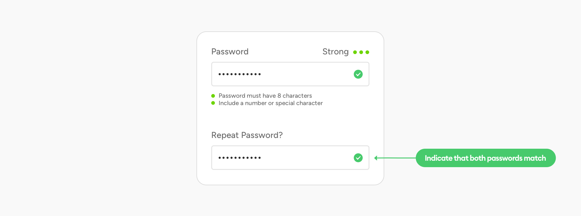
Many designers get confused with the lack of a "repeat password" field. Shouldn't we include it so the users can be sure they entered their password right? After all if they do it wrong, they'll have to reset it, which is cumbersome and takes time.
While in some specific cases having that second field can make sense, I believe that right now with browser/OS built in password managers and suggested strong passwords one field is more than enough because the password is likely already saved in a keychain - whatever it is.
But it's important to understand your users - if you're making a product for less tech-savvy people, then including a password repeat field can be a good idea.
Now that we have that part out of the way we can get to...
Hierarchy strips
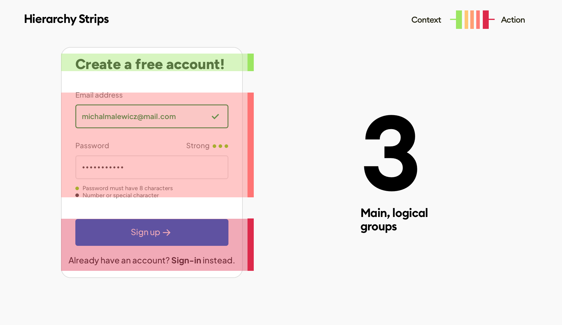
The first step is to think about how many groups we have. In forms like the registration it's usually quite simple (unless we have some terms or privacy checkboxes to take care of).
We should group relevant information together, which in this case brings us to three main groups.
The three main groups here are:
the context (or the title) which tells us what kind of screen/page it is
the form fields that the user needs to fill - grouped together because we go through them together
The actions - a main action that goes forward, and a secondary action that allows to go back and switch to a different option - in this case logging in
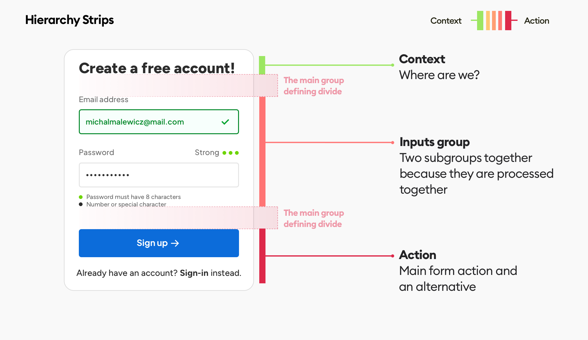
This is where we should try and specify the main divide - which will be a large enough space between the groups, so they are clearly processed individually.
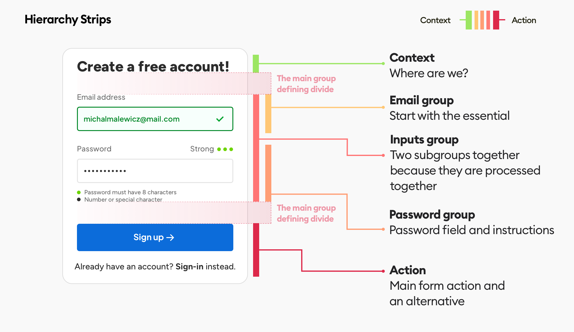
Then we can dig a little bit deeper within the groups and identify subgroups. I purposefully left one set of subgroups out of the image above - can you spot and name it?
This fully annotated approach is a great way to show your design decisions in your case studies - because people browsing them will know that those main, bigger spacings are not random, but rather calculated to guide the users focus between groups.
The main divides are the biggest spaces between the most important logical groups in an interface
It helps with setting proper hierarchy, and those groups within groups (subgroups) should follow a similar, grid-based spacing model, simply using smaller spaces to show that they are subgroups.
Remember the rule of proximity here.
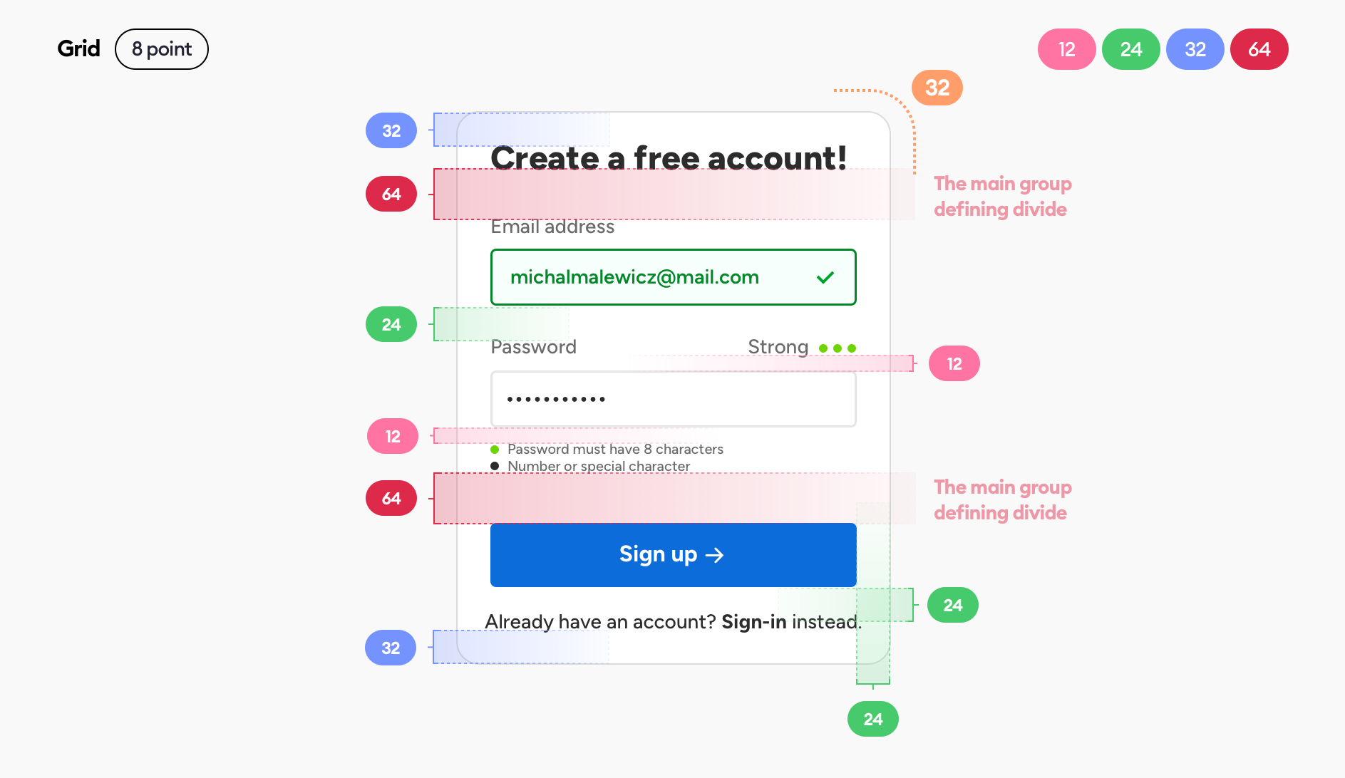
Define a grid
Before you jump right into annotating some pixel distances between elements, make sure that you define which grid you're using. I always go with an 8-point grid, but if you're using a 10-point make sure to adjust to it.
The numbers you use for spacings should follow your grid and the rule of proximity at the same time.
That means the spacings should be smaller for elements that logically belong together, and larger with elements that are separate.
The numbers you use for spacings should follow your grid and the rule of proximity at the same time.
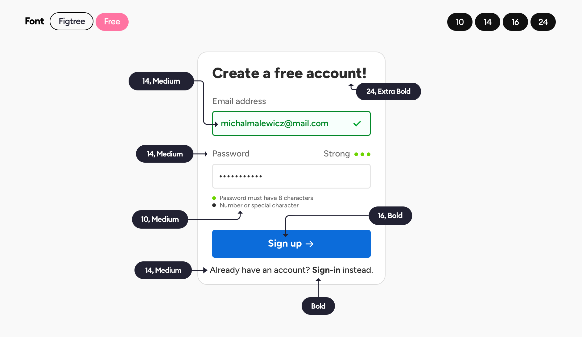
Fonts
I used a free Figtree font here throughout the entire interface.
When you're just starting to learn UI design it's important to just pick one font per interface. Font pairing is really difficult to pull off, so it's best to stick to the safe choices before you gain enough experience to do it right.
The second rule is to limit the number of sizes and styles to a bare minimum.
Arguably, the little meta information for the password field could also be done using a 14 size font, keeping our sizes to just three (recommended), but it can be smaller due to it being a completely different type of element than the other labels.
Main thing to remember about fonts - less is more.
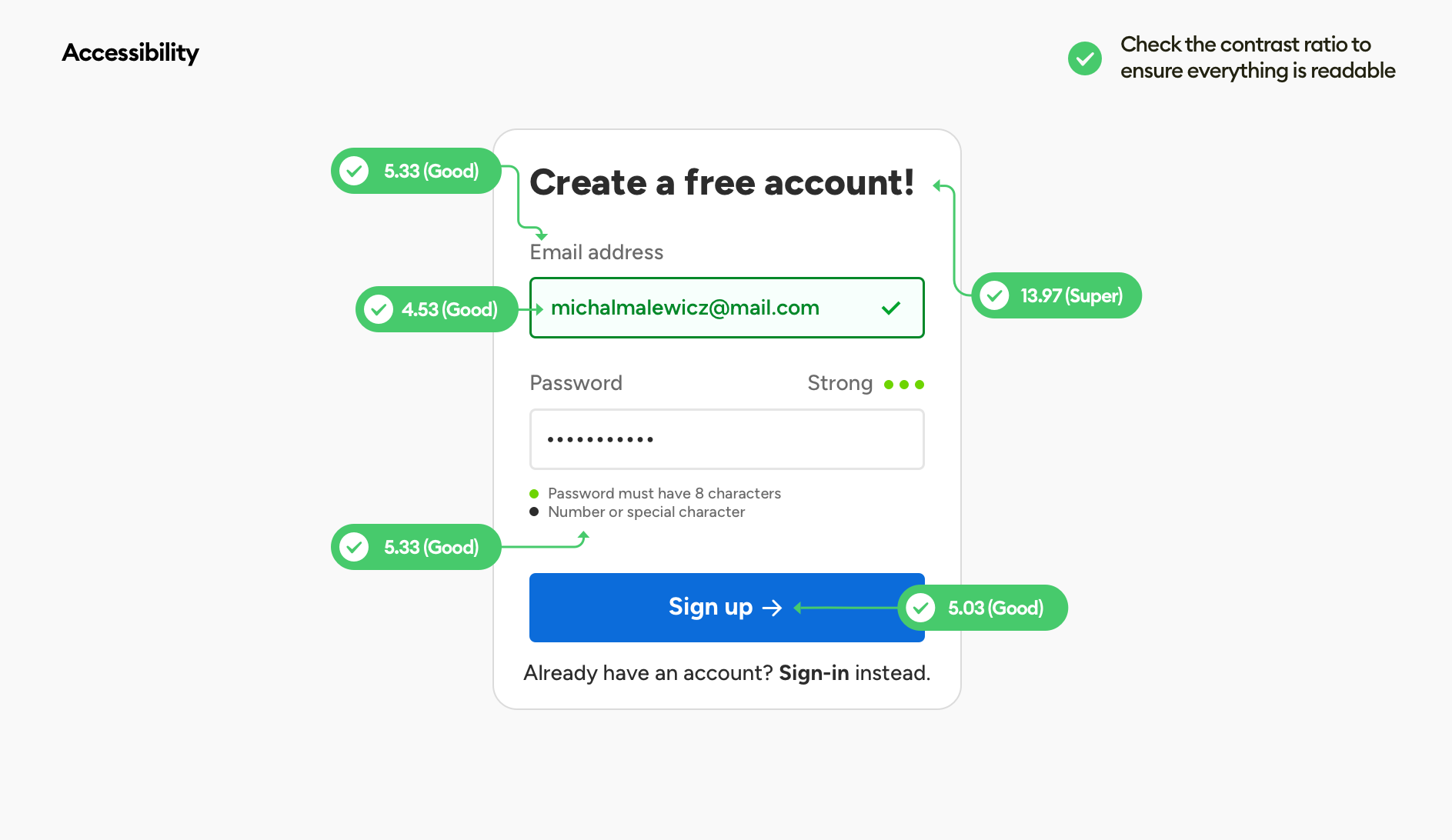
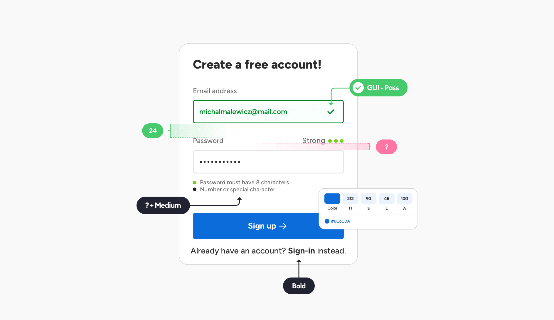
Accessibility and Contrast Check
The final step is to make sure everything is accessible. One of the ways to achieve it is by using a contrast check. There are countless plugins and free web-apps that allow you to test the contrast of any two colors (foreground and background) to see if it passes.
Use those checkers on all essential UI elements. You can skip them for decoration or non-essentials that won't affect the form completion.
But contrast alone is not the only thing to consider regarding accessibility.
Look at the wording you used in the labels and description. If possible test it on some users and see if everything is properly understood. Clear messaging is also a part of accessibility and it's important to communicate as clearly as possible.
Assuming the business logic is in place here, the next step is coding the form and tracking how it works over time. That can lead to further improvements down the road, because of course a design is never done.
It can be started well however, based on established good practices that I tried sharing with you here.
Thank you for reading and have a beautiful day!


