

Many designers try to jump to dark mode before learning enough about the light mode, building a strong foundation and understanding hierarchy. Not many also know that light mode is way harder than dark mode.
Despite all of this, dark mode looks cooler in many users' eyes, so let’s have a look at glass morphic dark mode design with proper layers and structure.
Hierarchy strips
You should always start your design by grouping the elements together and establishing a strong and clear hierarchy. This allows the user to scan the design easily.

Clear, large spacing between each of the four main sections creates a hierarchy in groups. Making the design nice and clean.
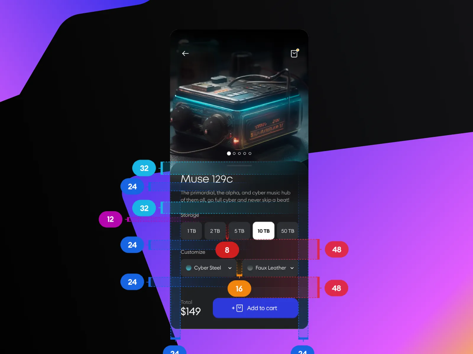
The grid
Now let’s explore the spacing for our design. You can pick any grid you want for this it can be a 4-pt grid, 8-pt, or even 10-pt. I’ll stick to my recommendation for most beginners which is the 8-pt grid.

The 48 spacing here is what clearly divides the form selectors and call to action. This spacing is what sets up the hierarchy.
It also allows the design to breathe. The design is not too tight nor too loose, it feels just right.
The colors

The NO.2 mistake is not establishing the correct hierarchy between colors. Resulting in a weird-looking design where things don’t look like from the real world.
When a user is holding the phone it’s usually at a 45° angle, with the light coming from the top.
That means the virtual layers that are closer to you are lighter than the ones in the back.

See the difference? The one on the left looks way more visually pleasing and also more readable, due to the correct hierarchy between colors.
The font
As usual, keep the design as simple as possible. Less is almost always better.

Here we have three font sizes with two font weights. A clear font progression helps with processing. There is no need to have more than three sizes in this particular case.
The accessibility
It is important to always check the contrast for your elements, and make sure the important ones are clear, readable, and have high enough contrast.
Nowadays there are a variety of tools such as the WCAG standards to help you understand if the contrast is there and if the design is nice and readable.

And that’s it! From now on, you are ready to tackle the world of dark mode.
Have a beautiful day!
Cheers.
Liked the article? Share it!


